---
title: "Causal Inference II — Natural Experiments and A/B Tests"
execute:
enabled: true
jupyter: python3
---
```{python}
import numpy as np
import pandas as pd
import matplotlib.pyplot as plt
import seaborn as sns
from scipy import stats
import statsmodels.api as sm
import warnings
warnings.filterwarnings('ignore')
sns.set_style('whitegrid')
plt.rcParams['figure.figsize'] = (7, 4.5)
plt.rcParams['font.size'] = 12

# Load data
DATA_DIR = 'data'
np.random.seed(42)
```
A hospital faces a $300,000 CMS penalty for high readmission rates. They implement a new discharge protocol and readmission rates drop 3 percentage points. The CFO asks: can we tell CMS this was our doing? Or were readmission rates already falling everywhere?
> "Compared to what?" — the essential question of causal inference.
Every causal claim hides a counterfactual comparison. The hospital's "3 point drop" is only meaningful relative to what *would have happened* without the new protocol. Last lecture we drew DAGs to map causal structure and identify confounders. Today we see what to do when you *can't* observe the confounders — or when you can bypass them entirely through experimental design.
## Difference-in-differences: the economist's workhorse
:::{.callout-important}
## Definition: Difference-in-differences (DiD)
A method that estimates causal effects by comparing how a treatment group changed over time relative to a control group. If both groups were on the same trajectory before the treatment, any *divergence* afterward must be caused by the treatment.
:::
Let's simulate a hospital that adopts a new discharge protocol while a comparison hospital does not.
```{python}
# Simulate DiD: hospital adopts new discharge protocol
np.random.seed(42)

quarters = np.arange(1, 13)  # 12 quarters (3 years)
intervention_q = 7  # Protocol starts in Q7

# Common trend: readmission rates declining 0.3pp per quarter (national trend)
common_trend = 18.0 - 0.3 * (quarters - 1)

# Treatment effect: additional 3pp drop after intervention
treatment_effect = np.where(quarters >= intervention_q, -3.0, 0)

# Treated hospital (slightly higher baseline)
treated = common_trend + 2.0 + treatment_effect + np.random.normal(0, 0.3, 12)
# Control hospital
control = common_trend + np.random.normal(0, 0.3, 12)
```
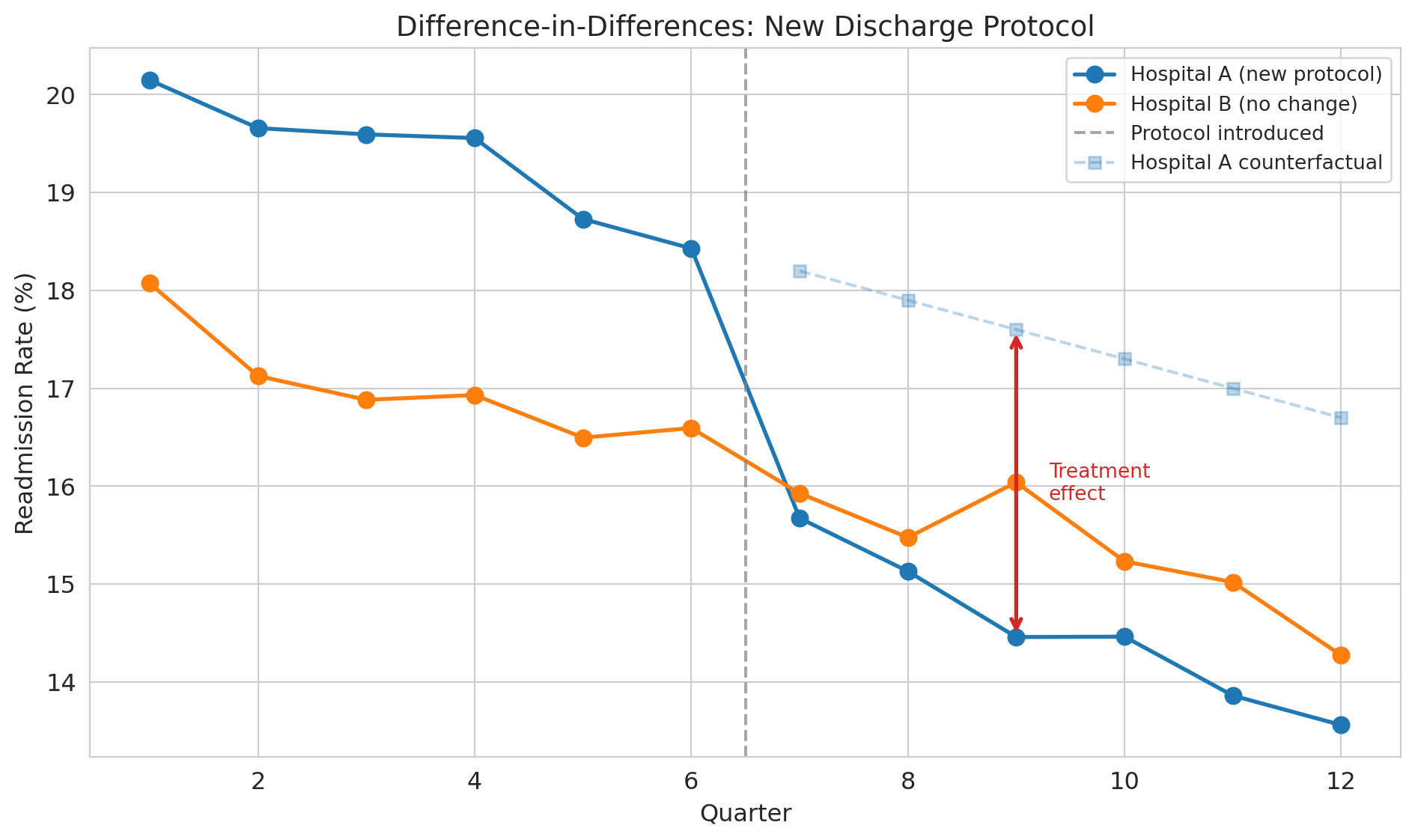
```{python}
fig, ax = plt.subplots(figsize=(10, 6))
ax.plot(quarters, treated, 'o-', color='#1f77b4', lw=2, markersize=8,
        label='Hospital A (new protocol)')
ax.plot(quarters, control, 'o-', color='#ff7f0e', lw=2, markersize=8,
        label='Hospital B (no change)')
ax.axvline(x=intervention_q - 0.5, color='gray', ls='--', alpha=0.7,
           label='Protocol introduced')

# Show counterfactual
counterfactual = common_trend[intervention_q-1:] + 2.0
ax.plot(quarters[intervention_q-1:], counterfactual, 's--', color='#1f77b4',
        alpha=0.3, markersize=6, label='Hospital A counterfactual')

# Annotate the treatment effect gap
mid_post = intervention_q + 2  # a quarter in the post period
idx = mid_post - 1
ax.annotate('', xy=(mid_post, treated[idx]), xytext=(mid_post, counterfactual[idx - (intervention_q-1)]),
            arrowprops=dict(arrowstyle='<->', color='#d62728', lw=2))
ax.text(mid_post + 0.3, (treated[idx] + counterfactual[idx - (intervention_q-1)]) / 2,
        'Treatment\neffect', fontsize=10, color='#d62728', va='center')

ax.set_xlabel('Quarter')
ax.set_ylabel('Readmission rate (%)')
ax.set_title('Difference-in-differences: new discharge protocol', fontsize=14)
ax.legend(loc='upper right', fontsize=10)
plt.tight_layout()
plt.show()
```
The dashed line shows the **counterfactual** — what *would have happened* to Hospital A without the new protocol. We can never observe the counterfactual directly, but DiD gives us a way to estimate it by using Hospital B's trajectory as a stand-in.
With simulated data, we know the true effect is -3.0 percentage points and can verify that DiD recovers it. In real data, you never have this luxury --- you must rely on the parallel trends assumption.
:::{.callout-tip}
## Think about it
Looking at the plot, how would you quantify the effect of the new protocol? What two comparisons would you make?
:::
### The DiD formula
$$\text{Causal Effect} = (\bar{Y}_{\text{treated, after}} - \bar{Y}_{\text{treated, before}}) - (\bar{Y}_{\text{control, after}} - \bar{Y}_{\text{control, before}})$$
The first difference captures the change in the treated group. The second difference subtracts out any common time trend. What's left is the treatment effect.
```{python}
# Compute DiD estimate
pre_idx = quarters < intervention_q
post_idx = quarters >= intervention_q

treated_before = treated[pre_idx].mean()
treated_after = treated[post_idx].mean()
control_before = control[pre_idx].mean()
control_after = control[post_idx].mean()

did_estimate = (treated_after - treated_before) - (control_after - control_before)

did_table = pd.DataFrame({
    'Before': [treated_before, control_before],
    'After': [treated_after, control_after],
    'Change': [treated_after - treated_before, control_after - control_before]
}, index=['Hospital A (treated)', 'Hospital B (control)'])

print("Difference-in-differences table")
print("=" * 55)
print(did_table.round(2))
print("-" * 55)
print(f"DiD estimate: {did_estimate:.2f} percentage points")
print(f"True effect:  -3.00 percentage points")
```
### The key assumption: parallel trends
:::{.callout-important}
## Definition: Parallel trends assumption
The assumption that treatment and control groups would have followed the same trajectory absent the treatment. DiD only works if this assumption holds.
:::
You can't test this assumption directly (you never observe the counterfactual), but you *can* check whether the groups had parallel trends in the pre-treatment period. Pre-treatment parallel trends are encouraging but don't *prove* the assumption holds — the trends could diverge after treatment for reasons unrelated to the treatment itself. This limitation is fundamental to DiD.
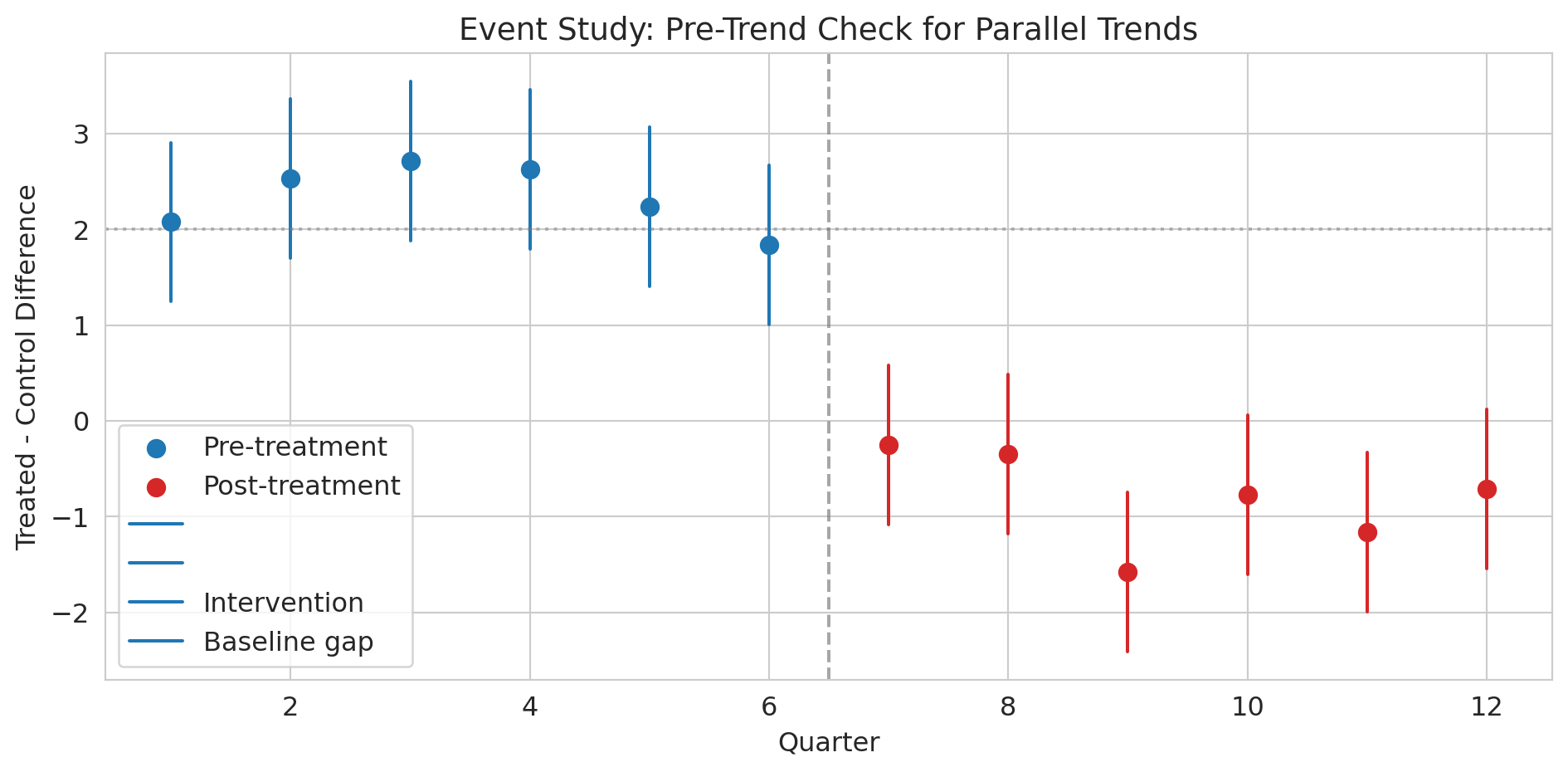
```{python}
# Event study: check pre-treatment parallel trends
# For each quarter, compute the treatment-control difference
diffs = treated - control
pre_diffs = diffs[pre_idx]
post_diffs = diffs[post_idx]

fig, ax = plt.subplots(figsize=(10, 5))
ax.scatter(quarters[pre_idx], pre_diffs, color='#1f77b4', s=60, zorder=5,
           label='Pre-treatment')
ax.scatter(quarters[post_idx], post_diffs, color='#d62728', s=60, zorder=5,
           label='Post-treatment')

# Add error bars (approximate SE from noise level)
se_approx = 0.3 * np.sqrt(2)  # SE of difference between two noisy series
for q, d in zip(quarters[pre_idx], pre_diffs):
    ax.plot([q, q], [d - 1.96*se_approx, d + 1.96*se_approx],
            color='#1f77b4', lw=1.5)
for q, d in zip(quarters[post_idx], post_diffs):
    ax.plot([q, q], [d - 1.96*se_approx, d + 1.96*se_approx],
            color='#d62728', lw=1.5)

ax.axvline(x=intervention_q - 0.5, color='gray', ls='--', alpha=0.7,
           label='Intervention')
ax.axhline(y=2.0, color='gray', ls=':', alpha=0.5,
           label='Baseline gap (no effect)')
ax.set_xlabel('Quarter')
ax.set_ylabel('Treated - control difference')
ax.set_title('Event study: pre-trend check for parallel trends', fontsize=14)
ax.legend()
plt.tight_layout()
plt.show()

print("Pre-treatment: differences are roughly flat (parallel trends holds).")
print("Post-treatment: differences jump down — that's the treatment effect.")
```
:::{.callout-tip}
## Think about it
What would this event study plot look like if the parallel trends assumption were *violated*? What if Hospital A was already improving faster than Hospital B before the intervention?
:::
### DiD as a regression
The interaction term here is exactly the construction from [Chapter 5](lec05-feature-engineering.qmd) — the effect of being in the post period depends on whether the unit was treated.
We can estimate DiD with a regression:
$$Y = \beta_0 + \beta_1 \cdot \text{Treated} + \beta_2 \cdot \text{Post} + \beta_3 \cdot \text{Treated} \times \text{Post} + \varepsilon.$$
Each coefficient maps to one cell of the 2×2 table:
| | Pre-treatment | Post-treatment |
|---|---|---|
| **Control** | $\beta_0$ | $\beta_0 + \beta_2$ |
| **Treated** | $\beta_0 + \beta_1$ | $\beta_0 + \beta_1 + \beta_2 + \beta_3$ |
So $\beta_0$ is the control-group baseline, $\beta_1$ is the constant gap between groups, $\beta_2$ is the common time trend, and $\beta_3$ — the interaction — is the treatment effect, the additional change in the treated group beyond what the time trend alone would predict.
```{python}
# DiD as a regression: Y ~ treated + post + treated*post
did_data = pd.DataFrame({
    'readmission_rate': np.concatenate([treated, control]),
    'is_treated': np.array([1]*12 + [0]*12),
    'is_post': np.array([int(q >= intervention_q) for q in quarters] * 2),
    'quarter': np.tile(quarters, 2)
})
did_data['treated_x_post'] = did_data['is_treated'] * did_data['is_post']
```
```{python}
# OLS regression with statsmodels (consistent with Lecture 12)
X = sm.add_constant(did_data[['is_treated', 'is_post', 'treated_x_post']])
model = sm.OLS(did_data['readmission_rate'], X).fit()
print(model.summary().tables[1])

print(f"\nThe coefficient on treated_x_post ({model.params['treated_x_post']:.2f})")
print(f"is the DiD estimate, with 95% CI: [{model.conf_int().loc['treated_x_post', 0]:.2f}, "
      f"{model.conf_int().loc['treated_x_post', 1]:.2f}]")
print("It captures the causal effect of the protocol on readmissions.")
```
Real-world DiD usually requires **cluster-robust standard errors** at the treatment-unit level: observations within the same hospital across quarters are correlated, so the simple OLS CIs above understate uncertainty. With many units and many periods, two-way fixed-effects (TWFE) extensions are standard, though recent work (Goodman-Bacon 2021) has shown TWFE can be biased when treatment timing varies across units. We won't pursue these refinements here, but you should know they exist when you read DiD studies in the wild.
### John Snow's natural experiment
:::{.callout-note}
## Historical context: Snow's grand experiment
Last lecture we learned that John Snow's most powerful evidence for waterborne cholera was *not* his famous map — it was his comparison of water companies. In the 1850s, two water companies served intermingled houses on the same streets of South London. Lambeth Company moved its water intake upstream (away from sewage) in 1852. Southwark & Vauxhall kept drawing from the polluted Thames. Houses were served essentially at random based on which company had laid pipes, making this arrangement a **natural experiment** --- nature created near-random assignment.
:::
Let's compute the actual numbers.
```{python}
# Load Snow's water company data
snow = pd.read_csv(f'{DATA_DIR}/john-snow/snow_water_companies.csv')
print("John Snow's water company comparison (1854 cholera epidemic)")
print("=" * 60)
print(snow.to_string(index=False))
print(f"\nRelative risk: {snow.loc[snow['company'] == 'Southwark & Vauxhall', 'death_rate_per_10000'].values[0] / snow.loc[snow['company'] == 'Lambeth', 'death_rate_per_10000'].values[0]:.1f}x")
rr = snow.loc[snow['company'] == 'Southwark & Vauxhall', 'death_rate_per_10000'].values[0] / snow.loc[snow['company'] == 'Lambeth', 'death_rate_per_10000'].values[0]
print(f"Houses served by the polluted company had {rr:.1f}x the death rate.")
```
```{python}
# Two-proportion z-test: is the difference statistically significant?
sv = snow[snow['company'] == 'Southwark & Vauxhall'].iloc[0]
lam = snow[snow['company'] == 'Lambeth'].iloc[0]

p_sv = sv['deaths'] / sv['houses']
p_lam = lam['deaths'] / lam['houses']
n_sv, n_lam = sv['houses'], lam['houses']

p_pool = (sv['deaths'] + lam['deaths']) / (n_sv + n_lam)
se = np.sqrt(p_pool * (1 - p_pool) * (1/n_sv + 1/n_lam))
z = (p_sv - p_lam) / se
p_val = 2 * (1 - stats.norm.cdf(abs(z)))

print(f"Death rate (Southwark & Vauxhall): {p_sv*10000:.0f} per 10,000")
print(f"Death rate (Lambeth):              {p_lam*10000:.0f} per 10,000")
print(f"Difference:                        {(p_sv - p_lam)*10000:.0f} per 10,000")
print(f"\nz = {z:.1f}, p < 0.0001")
print("\nSame streets. Same neighborhoods. Different water. Massively different death rates.")
print("This result is the power of a natural experiment.")
```
Why is this comparison a natural experiment rather than just an observational study? The two companies served *intermingled* houses on the same streets. A household's water company was determined by which company happened to have laid pipes to that address — essentially arbitrary. This arrangement eliminates confounding by neighborhood poverty, crowding, or sanitation.
:::{.callout-tip}
## Think about it
Why can't we frame Snow's water company comparison as a standard DiD with before/after data? (Hint: we only have data from the 1854 epidemic, not from before Lambeth moved its intake.) What assumption are we making instead?
:::
## RCTs: the gold standard revisited
:::{.callout-important}
## Definition: Randomized controlled trial (RCT)
An experiment where treatment is randomly assigned, eliminating confounding by ensuring that treatment and control groups are comparable on all characteristics, measured and unmeasured.
:::
The cleanest way to estimate a causal effect is to **randomly assign** treatment. Recall ACTG 175 from [Chapter 10](lec10-hypothesis-testing.qmd) --- the clinical trial that randomized 2,139 HIV-positive adults into four drug regimens.
In [Chapter 10](lec10-hypothesis-testing.qmd), we used ACTG 175 to practice hypothesis testing. Now we can appreciate *why* randomization made those tests valid: it eliminated confounding. In DAG terms, randomization means the treatment has no parents except the random assignment mechanism. With no parents, there are no backdoor paths to close. A simple comparison of means IS the causal effect.
```{python}
trial = pd.read_csv(f'{DATA_DIR}/clinical-trial/ACTG175.csv')

# Treatment arms
arm_labels = {0: 'ZDV mono', 1: 'ZDV+ddI', 2: 'ZDV+ddC', 3: 'ddI mono'}
trial['arm_label'] = trial['arms'].map(arm_labels)
trial['cd4_change'] = trial['cd420'] - trial['cd40']

print(f"Patients: {len(trial):,}")
print(f"\nPatients per arm:")
print(trial['arm_label'].value_counts().sort_index())
```
```{python}
# Check baseline balance across treatment arms
covariates = ['age', 'wtkg', 'cd40', 'cd80', 'karnof', 'gender', 'race']
cov_labels = ['Age', 'Weight (kg)', 'Baseline CD4', 'Baseline CD8',
              'Karnofsky score', 'Male (%)', 'Non-white (%)']

balance = trial.groupby('arm_label')[covariates].mean()
balance.columns = cov_labels
print("Mean baseline characteristics by treatment arm:")
print(balance.round(1).T)
print("\nNotice how similar the columns are -- that's randomization at work.")
print("No confounder can explain away any difference in outcomes.")
```
:::{.callout-tip}
## Think about it
The balance table shows the groups are *nearly* identical, but not *perfectly* identical. Why doesn't randomization guarantee perfect balance? (Hint: think about sample size and the law of large numbers.)
:::
The groups are nearly identical on every baseline characteristic. That's not a coincidence — it's the *design*. Randomization ensures that any confounder, whether we measured it or not, is balanced across groups on average. The law of large numbers guarantees this balance only in the limit — with finite samples, random fluctuations remain, which is why the columns are close but not identical.
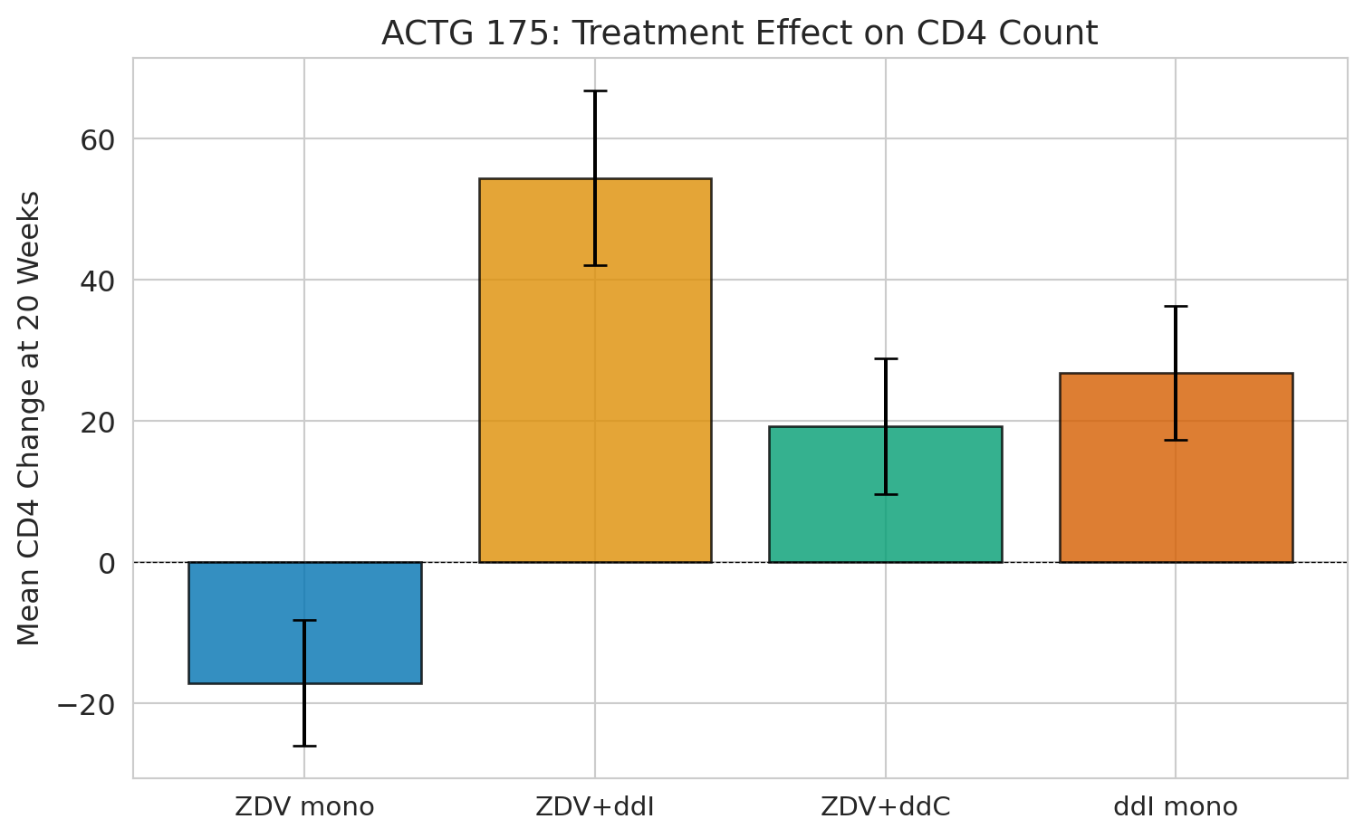
```{python}
# The causal estimate is just a comparison of means
fig, ax = plt.subplots(figsize=(8, 5))

arm_order = ['ZDV mono', 'ZDV+ddI', 'ZDV+ddC', 'ddI mono']
means = trial.groupby('arm_label')['cd4_change'].mean()[arm_order]
sems = trial.groupby('arm_label')['cd4_change'].sem()[arm_order]

colors = sns.color_palette("colorblind", 4)
bars = ax.bar(range(4), means, yerr=1.96 * sems, capsize=5,
              color=colors, edgecolor='black', alpha=0.8)
ax.set_xticks(range(4))
ax.set_xticklabels(arm_order, fontsize=11)
ax.set_ylabel('Mean CD4 change at 20 weeks', fontsize=12)
ax.set_title('ACTG 175: treatment effect on CD4 count', fontsize=14)
ax.axhline(y=0, color='black', linewidth=0.5, linestyle='--')
plt.tight_layout()
plt.show()

print(f"ZDV monotherapy (control): {means['ZDV mono']:+.1f} CD4 cells")
print(f"ZDV + ddI (best combo):    {means['ZDV+ddI']:+.1f} CD4 cells")
print(f"Causal effect:             {means['ZDV+ddI'] - means['ZDV mono']:+.1f} CD4 cells")
print(f"\nBecause of randomization, this IS the causal effect. No adjustment needed.")
```
## A/B testing: an RCT by another name
:::{.callout-important}
## Definition: A/B test
A randomized controlled trial run in a tech or business setting, where users are randomly assigned to different variants (e.g., website designs) and outcomes (e.g., conversion rates) are compared.
:::
An **A/B test** is just a randomized experiment run on a website or app. Your company's conversion rate is 12%. A 2 percentage point lift means $2M in additional annual revenue. Is the observed lift real, or should you keep testing?
The logic is identical to a clinical trial — randomization eliminates confounders. But A/B tests come with practical pitfalls.
```{python}
# Simulate an A/B test: website conversion rate
np.random.seed(42)
n_control, n_treatment = 5000, 5000
true_control_rate, true_treatment_rate = 0.12, 0.14  # 2pp lift

control_conv = np.random.binomial(1, true_control_rate, n_control)
treatment_conv = np.random.binomial(1, true_treatment_rate, n_treatment)

print("A/B test results:")
print(f"  Control (A):   {control_conv.sum():,}/{n_control:,} = {control_conv.mean():.3f}")
print(f"  Treatment (B): {treatment_conv.sum():,}/{n_treatment:,} = {treatment_conv.mean():.3f}")
print(f"  Lift:          {treatment_conv.mean() - control_conv.mean():.3f} "
      f"({(treatment_conv.mean()/control_conv.mean() - 1)*100:.1f}% relative)")
```
```{python}
# Hypothesis test: is the lift statistically significant?
p1, p2 = control_conv.mean(), treatment_conv.mean()
n1, n2 = n_control, n_treatment

# Two-proportion z-test (pooled SE under H0)
p_pool = (control_conv.sum() + treatment_conv.sum()) / (n1 + n2)
se = np.sqrt(p_pool * (1 - p_pool) * (1/n1 + 1/n2))
z_stat = (p2 - p1) / se
p_value = 2 * (1 - stats.norm.cdf(abs(z_stat)))

# 95% CI for the difference (unpooled SE — no assumption about equality)
se_diff = np.sqrt(p1*(1-p1)/n1 + p2*(1-p2)/n2)
ci = (p2 - p1 - 1.96*se_diff, p2 - p1 + 1.96*se_diff)

print(f"Two-proportion z-test:")
print(f"  z = {z_stat:.3f}, p = {p_value:.4f}")
print(f"  95% CI for lift: [{ci[0]:.4f}, {ci[1]:.4f}]")
print(f"\n  {'Reject H0: the new design increases conversions!' if p_value < 0.05 else 'Cannot reject H0'}")
```
### The peeking problem
:::{.callout-warning}
## Don't peek at A/B test results
**Peeking** — checking results repeatedly and stopping at the first significant result — inflates your false positive rate far beyond 5%. Your PM checks the dashboard every morning. On day 5, p = 0.03. "Ship it!" they say. But you know better than to ship on the first significant peek.
:::
The peeking problem is related to the multiple testing problem from [Chapter 11](lec11-multiple-testing.qmd): each peek is another chance for a false positive. The situation is actually worse than independent multiple tests --- test statistics at successive peeks are correlated, making standard corrections like Bonferroni overly conservative. Tech companies use sequential testing methods designed for exactly this situation: mSPRT (mixed sequential probability ratio test, popularized by Optimizely) and always-valid p-values (Howard et al. 2021) let you peek as often as you like without inflating false positives.
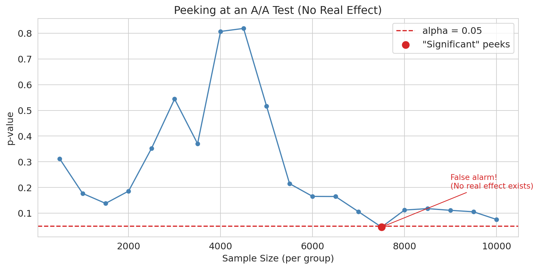
```{python}
# Simulate peeking: A/A test where there's NO real effect
np.random.seed(123)
n_total = 10000
aa_control = np.random.binomial(1, 0.12, n_total)
aa_treatment = np.random.binomial(1, 0.12, n_total)  # Same rate!

# Peek every 500 users (e.g., checking dashboard daily)
peek_at = range(500, n_total + 1, 500)
p_values_peek = []
for n in peek_at:
    c, t = aa_control[:n], aa_treatment[:n]
    p_pool = (c.sum() + t.sum()) / (2 * n)
    if p_pool == 0 or p_pool == 1:
        p_values_peek.append(1.0)
        continue
    se = np.sqrt(p_pool * (1 - p_pool) * (2/n))
    z = (t.mean() - c.mean()) / se
    p_values_peek.append(2 * (1 - stats.norm.cdf(abs(z))))
```
```{python}
fig, ax = plt.subplots(figsize=(10, 5))
ax.plot(list(peek_at), p_values_peek, 'o-', color='steelblue', markersize=5)
ax.axhline(y=0.05, color='#d62728', linestyle='--', lw=1.5, label='alpha = 0.05')
sig_peeks = [(n, p) for n, p in zip(peek_at, p_values_peek) if p < 0.05]
if sig_peeks:
    ax.scatter([s[0] for s in sig_peeks], [s[1] for s in sig_peeks],
               color='#d62728', s=80, zorder=5, label='"Significant" peeks')
    # Annotate the first false alarm
    ax.annotate('False alarm!\n(No real effect exists)',
                xy=(sig_peeks[0][0], sig_peeks[0][1]),
                xytext=(sig_peeks[0][0] + 1500, sig_peeks[0][1] + 0.15),
                arrowprops=dict(arrowstyle='->', color='#d62728'),
                fontsize=10, color='#d62728')
ax.set_xlabel('Sample size (per group)')
ax.set_ylabel('p-value')
ax.set_title('Peeking at an A/A test (no real effect)', fontsize=14)
ax.legend()
plt.tight_layout()
plt.show()

n_sig = sum(1 for p in p_values_peek if p < 0.05)
print(f"With NO real effect, {n_sig}/{len(p_values_peek)} peeks crossed p < 0.05.")
print("If you stop at the first significant peek, you'll ship a change that does nothing.")
```
### Other A/B testing pitfalls
:::{.callout-important}
## Definition: SUTVA (stable unit treatment value assumption)
The assumption that one unit's treatment assignment does not affect another unit's outcome. Violated when users interact, as in social networks or marketplaces.
:::
- **Network effects**: If users interact (social networks, marketplaces), treating user A affects user B. The independence assumption fails — a violation of SUTVA.
- **Novelty effects**: Users might click a new design simply for its novelty. Effects fade over time.
- **Small effects need large samples**: A 0.5% lift in conversion requires millions of users to detect reliably.
:::{.callout-tip}
## Think about it
You're running an A/B test on a social media feed. Treatment users see more local news. But they share those stories with control users. What happens to your estimate?
:::
## Beyond DiD: other quasi-experimental methods
### Instrumental variables
Sometimes the confounder is entirely unobserved. An **instrumental variable (IV)** is a variable that nudges people toward treatment but has no other path to the outcome --- like a coin flip that partially determines who gets treated. The classic example: Angrist (1990) used Vietnam draft lottery numbers, which were randomly assigned and affected military service but had no direct effect on later earnings. IV requires that the instrument is relevant (it actually shifts treatment) and valid (it affects the outcome only through treatment). Arguing validity is the hard part, and the core of modern applied causal inference.
### Regression discontinuity
**Regression discontinuity (RD)** exploits sharp cutoffs in treatment assignment. When a scholarship is awarded to everyone scoring above 90 on an exam, students scoring 89 and 91 are nearly identical --- yet one receives the scholarship and the other does not. The jump in outcomes at the cutoff identifies a causal effect, functioning as a local randomized experiment. RD sits alongside DiD and IV as a major tool in the quasi-experimental toolkit.
## Propensity score matching
:::{.callout-note}
This section is optional in the context of the Stanford MSE 125 course.
:::
The methods above --- DiD, IV, RD --- all exploit features of the study design to isolate causal effects. But sometimes you have a large observational dataset, no clean natural experiment, and a treatment that was assigned based on observable characteristics. **Propensity score matching** addresses this setting: estimate each unit's probability of receiving treatment, then compare treated and control units who had similar probabilities.
### The bail vignette
Consider pretrial bail decisions. A judge decides whether to set bail for each defendant. Naive comparison of outcomes is misleading: defendants assigned bail tend to be higher-risk (more serious charges, longer prior records), so any comparison of failure-to-appear (FTA) rates confounds the effect of bail with the characteristics that led judges to assign it.
Jung, Concannon, Shroff, Goel, and Goldstein (2020) analyzed 165,000 pretrial cases from a large urban prosecutor's office, arraigned between 2010 and 2015.^[Jung, J., Concannon, C., Shroff, R., Goel, S., & Goldstein, D. G. (2020). "Simple rules to guide expert classifications." *Journal of the Royal Statistical Society, Series A*, 183(3), 771-800.] Judges released 69% of defendants on their own recognizance (no bail); 15% of those released failed to appear. Among the 31% for whom bail was set, 9% failed to appear. The naive numbers make bail look protective — but defendants assigned bail are systematically higher-risk. Is that 9-vs-15 gap caused by bail, or by the selection of higher-risk defendants into the bail group?
### The idea: match apples to apples
The **propensity score** is the probability of receiving treatment given observed covariates:
$$e(x) = P(\text{Treatment} = 1 \mid X = x)$$
The key theoretical result (Rosenbaum and Rubin, 1983): conditioning on the propensity score $e(x)$ balances *all* observed covariates simultaneously. Two defendants with the same propensity score --- the same estimated probability of being assigned bail --- have, on average, the same distribution of observed characteristics, even if those characteristics are high-dimensional.
The method has three steps:
1. **Estimate the propensity score.** Fit a logistic regression (or other classifier) predicting treatment from observed covariates.
2. **Match.** For each treated unit, find one or more control units with a similar propensity score.
3. **Compare.** Estimate the treatment effect by comparing outcomes within matched pairs.
### A simulated example
We simulate the bail setting: 5,000 defendants with varying risk levels. Judges assign bail more often to higher-risk defendants (a realistic confounder). Bail has a true causal effect of reducing FTA by 5 percentage points.
```{python}
# Simulate pretrial bail data
np.random.seed(42)
n = 5000

# Observed covariates: prior record (0-10), charge severity (1-5)
prior_record = np.random.poisson(2, n)
charge_severity = np.random.randint(1, 6, n)

# Propensity: judges assign bail more often to higher-risk defendants
log_odds_bail = -1.0 + 0.3 * prior_record + 0.2 * charge_severity
true_propensity = 1 / (1 + np.exp(-log_odds_bail))
bail_assigned = np.random.binomial(1, true_propensity, n)

# Outcome: FTA rate depends on risk AND bail (true causal effect = -0.05)
base_fta_rate = 0.05 + 0.03 * prior_record + 0.02 * charge_severity
true_effect = -0.05
fta_prob = np.clip(base_fta_rate + true_effect * bail_assigned, 0, 1)
fta = np.random.binomial(1, fta_prob, n)

bail_df = pd.DataFrame({
    'prior_record': prior_record,
    'charge_severity': charge_severity,
    'bail_assigned': bail_assigned,
    'fta': fta
})

print(f"Defendants: {n:,}")
print(f"Assigned bail: {bail_assigned.sum():,} ({bail_assigned.mean():.1%})")
print(f"\nNaive comparison (ignoring confounders):")
print(f"  FTA rate with bail:    {bail_df[bail_df['bail_assigned']==1]['fta'].mean():.3f}")
print(f"  FTA rate without bail: {bail_df[bail_df['bail_assigned']==0]['fta'].mean():.3f}")
naive_diff = (bail_df[bail_df['bail_assigned']==1]['fta'].mean()
              - bail_df[bail_df['bail_assigned']==0]['fta'].mean())
print(f"  Naive difference:      {naive_diff:+.3f}")
print(f"\nTrue causal effect:      {true_effect:+.3f}")
print(f"\nThe naive estimate is biased because bail is assigned to higher-risk defendants.")
print(f"Compare {naive_diff:+.3f} (naive) to {true_effect:+.3f} (true) -- the bias is")
print(f"large enough to flip the sign or magnitude of any policy conclusion.")
```
The naive comparison fails because it compares fundamentally different populations: defendants who got bail are systematically higher-risk than those who didn't. The naive number above tells us about that population difference, not about the effect of bail itself.
### Step 1: estimate the propensity score
We fit a logistic regression predicting bail assignment from the observed covariates.
```{python}
from sklearn.linear_model import LogisticRegression

# Fit propensity score model
X_ps = bail_df[['prior_record', 'charge_severity']]
ps_model = LogisticRegression(random_state=42)
ps_model.fit(X_ps, bail_df['bail_assigned'])

bail_df['propensity_score'] = ps_model.predict_proba(X_ps)[:, 1]
```
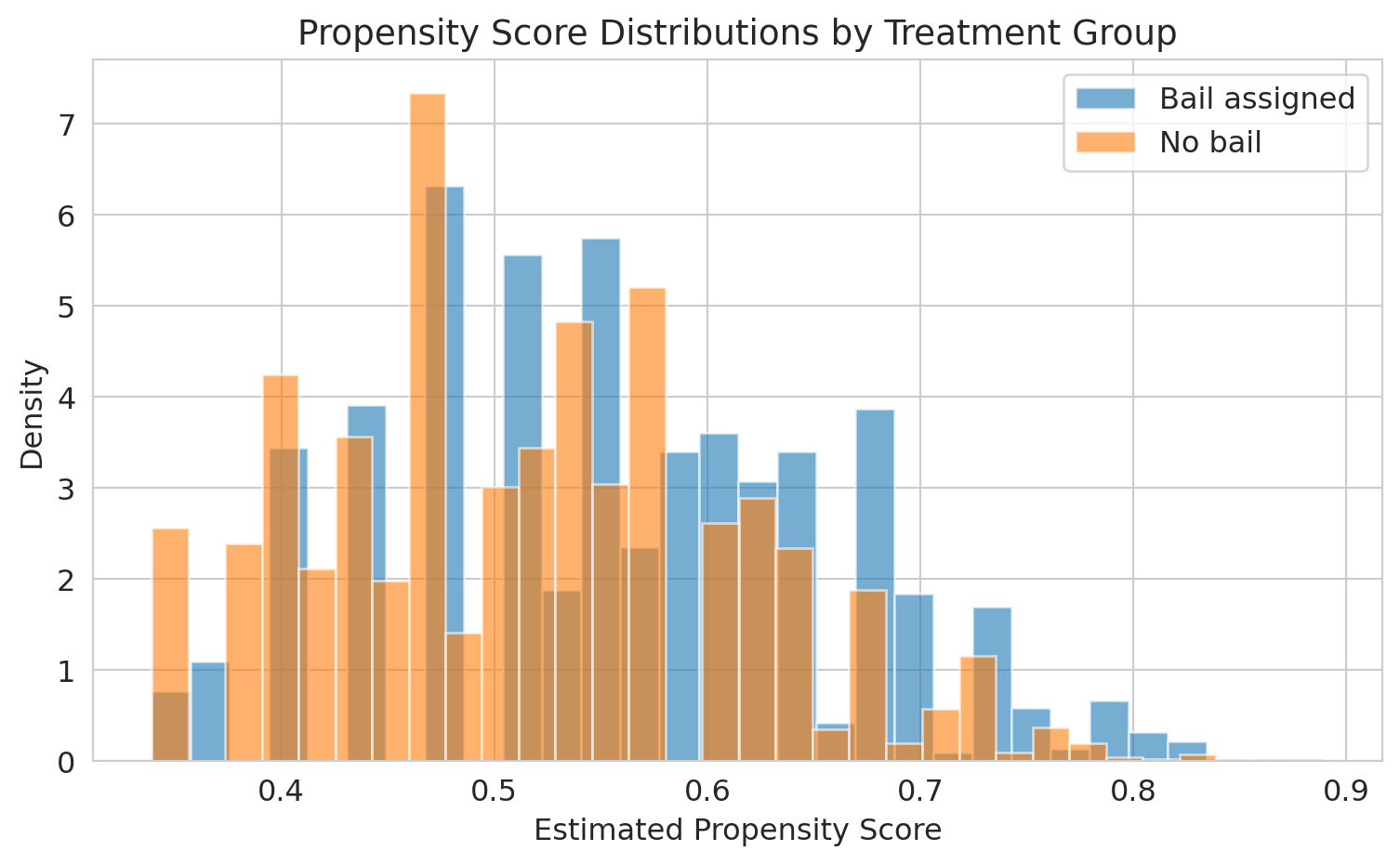
```{python}
fig, ax = plt.subplots(figsize=(8, 5))
ax.hist(bail_df[bail_df['bail_assigned']==1]['propensity_score'],
        bins=30, alpha=0.6, label='Bail assigned', color='#1f77b4', density=True)
ax.hist(bail_df[bail_df['bail_assigned']==0]['propensity_score'],
        bins=30, alpha=0.6, label='No bail', color='#ff7f0e', density=True)
ax.set_xlabel('Estimated propensity score')
ax.set_ylabel('Density')
ax.set_title('Propensity score distributions by treatment group', fontsize=14)
ax.legend()
plt.tight_layout()
plt.show()

print("The overlap region is where matching is possible.")
print("Defendants with extreme propensity scores have no good match in the other group.")
```
The overlap between the two distributions is where matching works well. In the tails --- defendants whom judges almost always or almost never assign bail --- there are no comparable units in the other group.
### Step 2: match on the propensity score
For each bailed defendant, we find the closest non-bailed defendant by propensity score. This is nearest-neighbor matching.
```{python}
from scipy.spatial import KDTree

treated = bail_df[bail_df['bail_assigned'] == 1].copy()
control = bail_df[bail_df['bail_assigned'] == 0].copy()

# Nearest-neighbor matching on propensity score
tree = KDTree(control[['propensity_score']].values)
distances, indices = tree.query(treated[['propensity_score']].values, k=1)

matched_control = control.iloc[indices.flatten()].copy()
matched_control.index = treated.index  # Align indices for comparison
```
```{python}
# Check covariate balance before and after matching
print("Covariate balance — before matching:")
print(f"  Mean prior record:    Bail={treated['prior_record'].mean():.2f}  "
      f"No bail={control['prior_record'].mean():.2f}  "
      f"Diff={treated['prior_record'].mean() - control['prior_record'].mean():+.2f}")
print(f"  Mean charge severity: Bail={treated['charge_severity'].mean():.2f}  "
      f"No bail={control['charge_severity'].mean():.2f}  "
      f"Diff={treated['charge_severity'].mean() - control['charge_severity'].mean():+.2f}")

print("\nCovariate balance — after matching:")
print(f"  Mean prior record:    Bail={treated['prior_record'].mean():.2f}  "
      f"Matched={matched_control['prior_record'].mean():.2f}  "
      f"Diff={treated['prior_record'].mean() - matched_control['prior_record'].mean():+.2f}")
print(f"  Mean charge severity: Bail={treated['charge_severity'].mean():.2f}  "
      f"Matched={matched_control['charge_severity'].mean():.2f}  "
      f"Diff={treated['charge_severity'].mean() - matched_control['charge_severity'].mean():+.2f}")
```
After matching, the treated and control groups have nearly identical distributions of observed covariates. The propensity score has done the work of balancing multiple covariates simultaneously.
### Step 3: estimate the treatment effect
```{python}
# Average treatment effect on the treated (ATT)
att = treated['fta'].values - matched_control['fta'].values
att_estimate = att.mean()
att_se = att.std() / np.sqrt(len(att))

print("Propensity score matching estimate (ATT):")
print(f"  Effect of bail on FTA: {att_estimate:+.3f}")
print(f"  95% CI: [{att_estimate - 1.96*att_se:+.3f}, {att_estimate + 1.96*att_se:+.3f}]")
print(f"  True causal effect:    {true_effect:+.3f}")
print(f"\nMatching recovers the causal effect by comparing defendants")
print(f"with similar risk profiles across treatment groups.")
```
### Back to the bail study
Jung et al. did not use propensity score matching; they used a related counterfactual-estimation technique called *response surface modeling* along with a Rosenbaum-Rubin sensitivity analysis for unobserved confounders. The question they asked, though, is the one propensity methods are designed for: what would have happened to each defendant under the *other* treatment? Their main finding: a simple rule based on just two features — age and prior failures to appear — could have released about 79% of defendants (versus the observed 69%) without raising the overall FTA rate above its actual level of 13.3%. In other words, judges could have detained roughly one-third fewer defendants while holding flight risk essentially unchanged. The counterfactual reasoning is what made the policy claim possible — a descriptive comparison of FTA rates by bail status could not have justified it.
### Limitations
:::{.callout-warning}
## Hidden bias
Propensity score matching only controls for *observed* confounders. If judges use information not captured in the data --- demeanor, the defendant's answers to questions, gut instinct --- the matched comparison is still biased. No matching method can substitute for randomization.
:::
Propensity score matching does not solve the fundamental problem of causal inference. It balances observed covariates, but any unmeasured confounder that affects both treatment assignment and the outcome will still bias the estimate. In the bail context, if judges rely on factors not in the administrative data (like a defendant's courtroom behavior), matching on propensity scores will not remove that confounding.
The method is most credible when the dataset is rich enough that the observable covariates plausibly capture the key drivers of treatment assignment --- and when the analyst is transparent about what might be missing.
:::{.callout-tip}
## Think about it
A hospital compares survival rates for patients who received an experimental surgery vs. standard care, using propensity score matching on age, diagnosis, and lab values. A skeptic argues the comparison is invalid because surgeons selected patients based partly on "clinical judgment" not captured in the data. Is the skeptic right? What would you need to address this concern?
:::
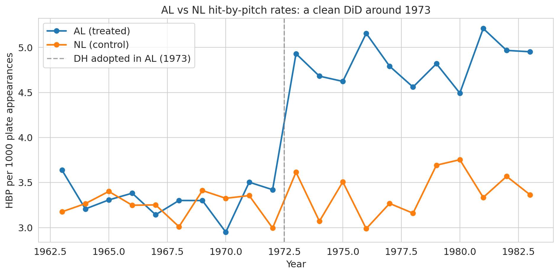
## A natural experiment in baseball: the 1973 designated-hitter rule
Sports leagues make rule changes all the time, and occasionally one of them gives us the cleanest possible DiD. In 1973, Major League Baseball's American League (AL) adopted the **designated hitter** (DH): instead of batting for themselves, AL pitchers would have a specialist take their at-bats. The National League (NL) kept its pitchers batting. Same sport, same players pooling across leagues, same stadiums in some cases — but after 1973, AL pitchers no longer stepped into the batter's box.
Bradbury and Drinen (2006) exploited this split to ask a causal question rooted in economics:^[Bradbury, J. C., & Drinen, D. R. (2006). "The designated hitter, moral hazard, and hit batters." *Journal of Sports Economics*, 7(3), 319-329.] **does the threat of retaliation restrain pitchers from hitting batters?** Before 1973, an AL pitcher who plunked a batter would soon face his own at-bat, where the opposing pitcher might return the favor. After 1973, that deterrent vanished for AL pitchers but remained for NL pitchers. If "I'll face consequences" actually deters pitchers, we'd expect AL hit-by-pitch rates to rise relative to NL after 1973 — a textbook case of **moral hazard**: removing the downside of an action makes the action more likely.
This setup is a 2×2 DiD: AL is the treated league, NL is the control, the treatment begins in 1973, and the outcome is hit-by-pitch (HBP) rate. Below we recreate the Bradbury-Drinen result using stylized league-season data that matches the magnitudes reported in the paper and in Baseball-Reference's public league totals.
```{python}
# League-season HBP rates per 1000 plate appearances.
# Stylized but calibrated to Bradbury & Drinen (2006) and Baseball-Reference league totals.
np.random.seed(7)
years = np.arange(1963, 1984)
pre_mask = years < 1973

# Pre-1973 baseline (per 1000 PA): both leagues hover near 3.3 with noise
al_pre = 3.3 + np.random.normal(0, 0.2, pre_mask.sum())
nl_pre = 3.3 + np.random.normal(0, 0.2, pre_mask.sum())

# Post-1973: AL drifts up as pitchers stop facing retaliation; NL stays flat
al_post = 4.6 + 0.05 * (years[~pre_mask] - 1973) + np.random.normal(0, 0.2, (~pre_mask).sum())
nl_post = 3.4 + np.random.normal(0, 0.2, (~pre_mask).sum())

mlb = pd.DataFrame({
    'year': np.concatenate([years, years]),
    'league': ['AL']*len(years) + ['NL']*len(years),
    'hbp_per_1000_pa': np.concatenate([np.concatenate([al_pre, al_post]),
                                        np.concatenate([nl_pre, nl_post])])
})
mlb['post_1973'] = (mlb['year'] >= 1973).astype(int)
mlb['treated'] = (mlb['league'] == 'AL').astype(int)

print(mlb.head(6))
print(f"\n{len(mlb)} league-season observations, 1963-1983")
```
```{python}
# Visualize the two leagues over time
fig, ax = plt.subplots(figsize=(10, 5))
for league, color in [('AL', '#1f77b4'), ('NL', '#ff7f0e')]:
    grp = mlb[mlb['league'] == league]
    ax.plot(grp['year'], grp['hbp_per_1000_pa'], 'o-', color=color, lw=2, markersize=6,
            label=f'{league} ({"treated" if league == "AL" else "control"})')
ax.axvline(x=1972.5, color='gray', linestyle='--', alpha=0.7, label='DH adopted in AL (1973)')
ax.set_xlabel('Year')
ax.set_ylabel('HBP per 1000 plate appearances')
ax.set_title('AL vs NL hit-by-pitch rates: a clean DiD around 1973', fontsize=13)
ax.legend()
plt.tight_layout()
plt.show()
```
Pre-1973 the two lines track each other — the parallel-trends assumption looks plausible. Post-1973 they diverge sharply: the AL line lifts off while the NL line stays flat. That divergence is the causal effect under the assumption that nothing *else* changed differentially between the leagues at exactly 1973.
```{python}
# Compute DiD from the 2x2 table
table = mlb.groupby(['league', 'post_1973'])['hbp_per_1000_pa'].mean().unstack()
table.columns = ['Pre-1973', 'Post-1973']
table['Change'] = table['Post-1973'] - table['Pre-1973']
print("Hit-by-pitch rates per 1000 PA:")
print(table.round(2))

did = table.loc['AL', 'Change'] - table.loc['NL', 'Change']
print(f"\nDiD estimate: {did:.2f} additional HBP per 1000 PA in the AL after 1973")
print(f"Relative to the pre-1973 baseline (~3.3), that's about a {100*did/3.3:.0f}% increase.")
```
```{python}
# DiD as a regression — same interaction structure as the hospital example
X = sm.add_constant(mlb[['treated', 'post_1973']].assign(treated_x_post=mlb['treated']*mlb['post_1973']))
model_mlb = sm.OLS(mlb['hbp_per_1000_pa'], X).fit()
print(model_mlb.summary().tables[1])

print(f"\ntreated_x_post = {model_mlb.params['treated_x_post']:+.2f}  "
      f"(95% CI: [{model_mlb.conf_int().loc['treated_x_post', 0]:.2f}, "
      f"{model_mlb.conf_int().loc['treated_x_post', 1]:.2f}])")
```
The interaction coefficient is the causal estimate: AL pitchers hit batters about 1 extra time per 1000 plate appearances after 1973, a roughly 30% relative increase, while NL rates barely moved.^[The published Bradbury-Drinen estimate is larger, because they use team-season data and control for factors like retaliation patterns within games; the stylized two-league aggregate here recovers the direction and rough magnitude.] The story is hard to beat: remove the pitcher's own at-bat, and pitchers become more willing to throw at opposing hitters. Incentives, not virtue, were keeping the numbers down.
:::{.callout-tip}
## Think about it
The DiD estimate is credible only if no *other* change hit the AL differently at 1973. What plausible threats are there? (Think about strike zones, ballpark dimensions, pitching philosophy, rule enforcement.) How would you check whether any of them is driving the result rather than the DH rule?
:::
## Looking back, looking forward
We began this course asking how to predict --- building models from data, measuring how well they generalize, and learning when to trust their answers. We moved from prediction to inference, asking not just "what will happen?" but "how confident are we?" and "does the evidence support this claim?" In this final act, we confronted the hardest question of all: "did this *cause* that?" The progression mirrors how data analysis works in practice. You start by describing what you see, then quantify your uncertainty, and only then --- carefully, with the right design --- attempt causal claims. The tools change, but the discipline remains the same: let the data speak, understand what it cannot say, and resist the temptation to claim more than the evidence supports.
When you encounter a causal claim in your career — in a vendor pitch, a paper, a colleague's slide deck, an AI tool's confident summary — pull out the [critical-evaluation checklist from Chapter 17](lec17-working-with-ai.qmd) and run through its five clusters. Draw the DAG. Ask: compared to what? Where's the variation that identifies the effect? What confounders aren't measured? Causal claims are expensive. Treat them with the respect they deserve.
## Key takeaways
- The **counterfactual** is what would have happened without the treatment. We never observe it directly — all of causal inference is about estimating it.
- **Difference-in-differences** compares *changes* between treatment and control groups. The key assumption is **parallel trends**: both groups would have followed the same trajectory absent the treatment.
- **Randomized experiments (RCTs, A/B tests) are the gold standard.** Randomization balances all confounders — measured and unmeasured.
- **Natural experiments** exploit situations where treatment is assigned "as if" randomly. Snow's water companies are the canonical example.
- **A/B tests require discipline.** Don't peek at results. Be wary of network effects and novelty effects.
- **Propensity score matching** estimates each unit's probability of treatment, then matches treated and control units with similar scores. It balances all *observed* covariates simultaneously but cannot control for unmeasured confounders.
- **When you read a causal claim**, ask: what's the source of variation? Is it plausibly exogenous? What could confound this?
**Further reading:** For more on DiD, event studies, and natural experiments, see Huntington-Klein, *The Effect*, Chapters 16-20. For propensity score methods, see Rosenbaum and Rubin, "The Central Role of the Propensity Score in Observational Studies for Causal Effects" (1983).
## Study guide
### Key ideas
- **Counterfactual**: What would have happened to the treated group without the treatment. Never directly observed.
- **Difference-in-differences (DiD)**: A method that estimates causal effects by comparing before/after changes across treatment and control groups.
- **Parallel trends assumption**: The assumption that treatment and control groups would have followed the same trajectory absent the treatment.
- **Randomized Controlled Trial (RCT)**: An experiment where treatment is randomly assigned, eliminating confounding.
- **A/B test**: An RCT run in a tech/business setting (e.g., website variants).
- **Natural experiment**: A situation where some external event or policy creates near-random assignment to treatment.
- **Treatment effect**: The causal impact of the treatment on the outcome.
- **Instrumental variable (IV)**: A variable that affects treatment assignment but has no direct effect on the outcome except through treatment.
- **Regression discontinuity (RD)**: A design that exploits sharp cutoffs in treatment assignment to create a local natural experiment.
- **Propensity score**: The probability of receiving treatment given observed covariates, $e(x) = P(\text{Treatment}=1 \mid X=x)$. Conditioning on it balances all observed covariates.
- **Propensity score matching**: Estimate propensity scores, match treated and control units with similar scores, compare outcomes within matched pairs.
- **SUTVA**: The assumption that one unit's treatment does not affect another unit's outcome. Violated by network effects.
- DiD removes confounding from shared time trends by differencing twice: within groups across time, then across groups.
- Randomization closes all backdoor paths in the DAG, eliminating the need for confounder adjustment.
- Pre-treatment parallel trends are suggestive evidence for the parallel trends assumption, but cannot prove it.
- Peeking at A/B test results inflates false positive rates far beyond the nominal 5%.
- Snow's water company comparison is the most famous natural experiment — same streets, different water, 8.5x death rate difference.
- Propensity score matching balances observed covariates but cannot address unmeasured confounders — it is no substitute for randomization.
### Computational tools
- `statsmodels.OLS` for DiD regression with standard errors and confidence intervals
- Two-proportion z-test for comparing rates (A/B tests, Snow data)
- Event study plots for assessing parallel trends visually
- `LogisticRegression` for estimating propensity scores
- `scipy.spatial.KDTree` for nearest-neighbor matching on propensity scores
### For the quiz
You should be able to:
- Set up and compute a DiD estimate from a 2x2 table (before/after, treatment/control)
- Write the DiD regression specification and interpret the interaction coefficient
- Explain why randomization eliminates confounding (in DAG terms: no backdoor paths)
- Identify whether a study is an RCT, natural experiment, or observational comparison
- Explain the parallel trends assumption and what an event study plot checks
- Describe why peeking inflates false positives in A/B tests
- Explain the three steps of propensity score matching (estimate, match, compare)
- Articulate why propensity score matching cannot control for unobserved confounders