---
title: "Validation beyond the random split"
execute:
enabled: true
jupyter: python3
---
You build a model to predict tomorrow's air quality. It scores R² = 0.66 on your test set. You deploy it. It fails to beat a model that predicts "same as yesterday." A hospital trains a sepsis-alert model. It validates at AUC 0.76. Clinicians act on the alerts; within a year, performance erodes. A predictive-policing algorithm flags a neighborhood as high-crime. Police patrol more heavily. Arrests go up. The model "confirms" its own prediction.
[Chapter 6](lec06-validation.qmd) built validation on three assumptions: rows are exchangeable, the deployment distribution matches the training distribution, and predictions don't affect outcomes. This chapter is about the cases where those assumptions break. Four failure modes, mildest to deepest:
1. **Temporal leakage.** Data has time structure. A random split puts neighbors of the test point in the training set. *Fix: train on the past, test on the future.*
2. **Distribution shift.** Deployment data comes from a regime the training set never saw. *Fix: test on out-of-distribution data, stratify by subgroup, widen intervals at the tails.*
3. **Feedback loops.** Predictions change the outcome. *No passive validation catches this; you need randomized holdouts or A/B tests.*
4. **Goodhart's law.** Once a metric drives consequences, the measured agents respond. Those best at responding move the metric without advancing the goal. *Structural, not a split problem.*
```{python}
import numpy as np
import pandas as pd
import matplotlib.pyplot as plt
import seaborn as sns
from sklearn.linear_model import LinearRegression
from sklearn.metrics import r2_score, mean_absolute_error
import warnings
warnings.filterwarnings('ignore')
sns.set_style('whitegrid')
plt.rcParams['figure.figsize'] = (7, 4.5)
plt.rcParams['font.size'] = 12

DATA_DIR = 'data'
```
# Part 1: Temporal leakage
If your data has time structure, a random train/test split gives the wrong answer. Observations close in time leak information across the split: the test metric uses information the model won't have at deployment.
## The data: US retail sales
The U.S. Census Bureau reports total monthly retail and food-services sales; FRED publishes the series as RSAFSNA, 1992–present, *not* seasonally adjusted, so the raw structure is on display. The series carries three kinds of structure, and each one will matter:
- a **long-run trend** — sales grow as population and prices rise;
- an **annual cycle** — a sharp spike every December, a trough every January;
- **short-range autocorrelation** — this month's value is close to last month's.
```{python}
retail = pd.read_csv(f'{DATA_DIR}/retail-sales/fred_rsafsna_monthly.csv')
retail['date'] = pd.to_datetime(retail['date'])
retail = retail.sort_values('date').reset_index(drop=True)

fig, ax = plt.subplots(figsize=(10, 4))
ax.plot(retail['date'], retail['sales'] / 1000, color='steelblue', linewidth=0.9)
ax.set_xlabel('Date'); ax.set_ylabel('Retail sales ($B/month)')
ax.set_title('US monthly retail sales (NSA), 1992–present')
plt.tight_layout(); plt.show()
print(f"{len(retail)} months, {retail['date'].min().date()} to {retail['date'].max().date()}")
```
:::{.callout-important}
## Definition: Non-stationarity
A time series is **non-stationary** when its mean or variance changes over time. Retail sales is non-stationary: the mean climbs year after year, and the December spike grows along with it. Non-stationarity is what makes time-series validation different from the i.i.d. setting of [Chapter 6](lec06-validation.qmd).
:::
## Measuring forecast error
Two pieces have to be in place before we fit anything: a number to score forecasts, and a baseline to beat.
:::{.callout-important}
## Definition: Mean absolute error (MAE)
**MAE** is the average size of the forecast error, in the units of the target:
$$\text{MAE} = \frac{1}{n} \sum_{i=1}^{n} \left| y_i - \hat{y}_i \right|.$$
For retail sales it's measured in dollars. Lower is better; 0 is perfect.
:::
The bar to clear is the **naive baseline**. For a strongly seasonal monthly series the natural naive forecast is **same month last year**, $\hat{y}_{t} = y_{t-12}$: it fits no parameters and uses no features, just carrying last year's value forward. (For a series without seasonality, the **persistence forecast** $\hat{y}_{t+1} = y_t$ — next step equals this step — plays the same role.) Any model that can't beat the naive baseline isn't earning its complexity.
```{python}
# Naive baseline: predict this month = same month last year
naive_mae = mean_absolute_error(retail['sales'].iloc[12:], retail['sales'].shift(12).iloc[12:])
print(f"Naive (same month last year) MAE over the full series: ${naive_mae:,.0f}M")
```
:::{.callout-note collapse="true"}
## Going deeper: scale-free error metrics
Two relatives of MAE report error without units. **MASE** (Mean Absolute Scaled Error) divides a model's MAE by the naive baseline's MAE — MASE < 1 beats the baseline, MASE > 1 loses to it.^[Hyndman & Koehler (2006) use the in-sample naive MAE; we use the test-set version.] **MAPE** (Mean Absolute Percentage Error) averages $|y_i - \hat y_i| / |y_i|$; it's intuitive ("off by 2% on average") but breaks near zero and penalizes over-forecasts more than under-forecasts.
:::
## Three ways to build a forecast
The three kinds of structure suggest three sets of features. Most are **lag features** — predictors built from the series' own past values: last month's sales (`lag1`), the past quarter's average (`lag3_avg`), the same month a year ago (`lag12`). These are *modeling* choices — what goes into the regression — and have nothing to do with how we later evaluate. To keep the leakage demonstration clean, restrict it to the pre-2020 era; the pandemic shock enters later, once we start watching models break.
```{python}
r = retail[retail['date'] < '2020-01-01'].copy()
r['lag1']     = r['sales'].shift(1)                          # last month
r['lag3_avg'] = r['sales'].rolling(3).mean().shift(1)        # last quarter's average
r['lag12']    = r['sales'].shift(12)                         # same month last year
r['months']   = (r['date'] - r['date'].min()).dt.days / 30.44   # linear time index
r['sin']      = np.sin(2 * np.pi * r['date'].dt.month / 12)
r['cos']      = np.cos(2 * np.pi * r['date'].dt.month / 12)
r = r.dropna().reset_index(drop=True)

models = {
    'Recent lags':  ['lag1', 'lag3_avg'],     # short-range autocorrelation
    'Linear trend': ['months'],               # long-run trend
    'Seasonal':     ['sin', 'cos', 'lag12'],  # annual cycle + year-ago anchor
}
for name, feats in models.items():
    print(f"{name:<14s}: {feats}")
```
The **recent-lags** model rides month-to-month momentum, the **trend** model extrapolates a straight line through time, and the **seasonal** model leans on the annual cycle — a paired sine and cosine of the month complete one full swing every 12 months — plus a year-ago anchor. Each is a reasonable first cut.
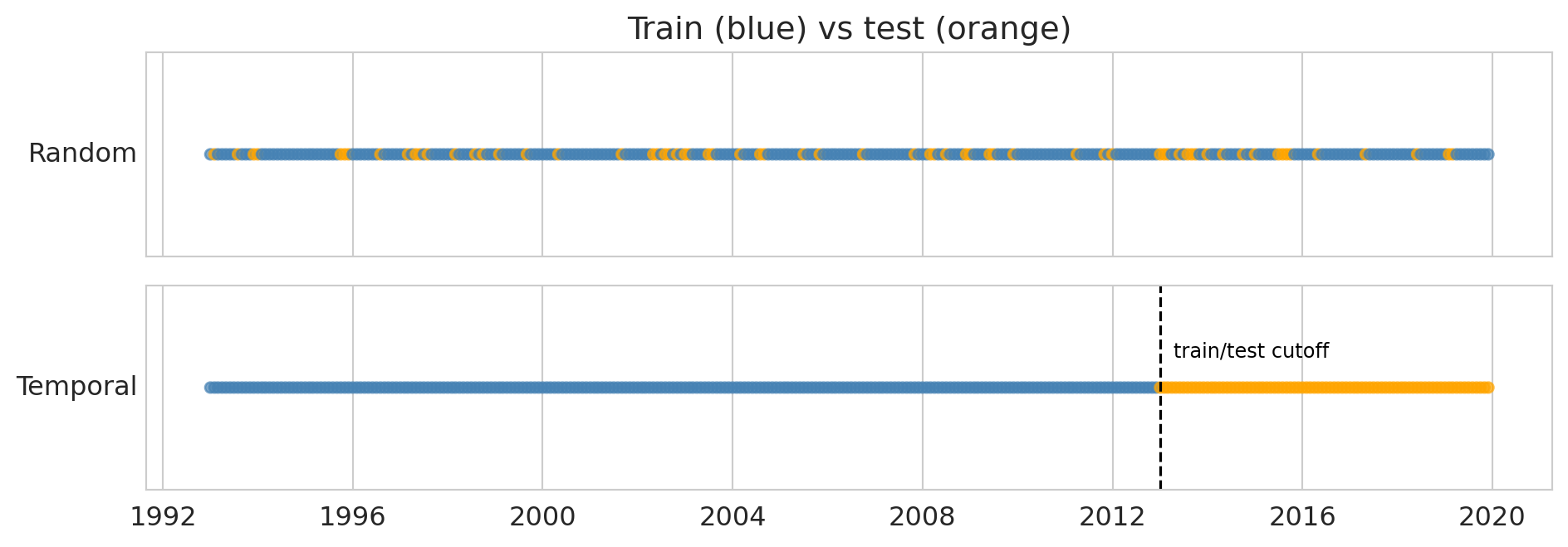
## Evaluating a forecast: random vs temporal split
Now fix the model and vary the *evaluation*. There are two ways to split the same data:
- a **random split** shuffles all months and holds out 20% at random;
- a **temporal split** trains on the early years and tests on the later ones — train on the past, predict the future, exactly as the model would be deployed.
```{python}
fig, axes = plt.subplots(2, 1, figsize=(10, 3.6), sharex=True)
np.random.seed(42)
rmask = np.random.rand(len(r)) < 0.8
cutoff = pd.Timestamp('2013-01-01')

axes[0].scatter(r['date'], np.ones(len(r)),
                c=np.where(rmask, 'steelblue', 'orange'), s=22, alpha=0.7)
axes[0].set_yticks([]); axes[0].set_ylabel('Random', rotation=0, ha='right', va='center')
axes[0].set_title('Train (blue) vs test (orange)')
axes[1].scatter(r['date'], np.ones(len(r)),
                c=np.where(r['date'] < cutoff, 'steelblue', 'orange'), s=22, alpha=0.7)
axes[1].axvline(cutoff, color='black', linewidth=1.2, linestyle='--')
axes[1].annotate('train/test cutoff', xy=(cutoff, 1.0), xytext=(6, 14),
                 textcoords='offset points', fontsize=9, color='black')
axes[1].set_yticks([]); axes[1].set_ylabel('Temporal', rotation=0, ha='right', va='center')
plt.tight_layout(); plt.show()
```
:::{.callout-important}
## Definition: Data leakage (temporal)
**Data leakage** occurs when information unavailable at prediction time contaminates training, producing optimistically biased scores. A random split on a time series leaks: a test month from 2010 has its immediate neighbors — the months just before and after — sitting in the training set.
:::
Evaluate all three models under both splits. Compare two columns: the random-split R² — what a careless evaluation would report — against the temporal-split R², what deployment will actually deliver. (The naive baseline has no random-split entry, shown as —, since it fits nothing to shuffle.)
```{python}
tr_t, te_t = r[r['date'] < cutoff], r[r['date'] >= cutoff]

print(f"{'Model':<15}{'random R²':>11}{'temporal R²':>13}{'temporal MAE':>14}")
print('-' * 53)
for name, feats in models.items():
    m_rand = LinearRegression().fit(r[rmask][feats], r[rmask]['sales'])
    r2_rand = r2_score(r[~rmask]['sales'], m_rand.predict(r[~rmask][feats]))
    m_time = LinearRegression().fit(tr_t[feats], tr_t['sales'])
    pred_time = m_time.predict(te_t[feats])
    print(f"{name:<15}{r2_rand:>11.3f}{r2_score(te_t['sales'], pred_time):>13.3f}"
          f"{mean_absolute_error(te_t['sales'], pred_time):>14,.0f}")
# Naive baseline (same month last year) on the same temporal test window
print(f"{'Naive baseline':<15}{'—':>11}{r2_score(te_t['sales'], te_t['lag12']):>13.3f}"
      f"{mean_absolute_error(te_t['sales'], te_t['lag12']):>14,.0f}")
```
Read down the columns. Under a random split all three models score above 0.9. Under a temporal split, the **recent-lags and trend models collapse to around 0.4 — below the naive "same month last year" baseline** — while only the seasonal model, anchored to the value twelve months back, holds near 0.94. Same models, same data; the only thing that changed is how we split, and the verdict swings from "all excellent" to "two of them lose to a forecast that fits no parameters."
Why does the year-ago anchor survive when momentum and a straight line don't? A random test month from 2010 sits between training neighbors in the months just before and after, and its near-twins — the same month in adjacent years — almost certainly land in the training set too. The model only has to interpolate among months it has effectively already seen. A temporal test month in 2015 has all its training data ending in 2012: the trend model must extrapolate a straight line three years past the data, falling behind as growth compounds, and the recent-lags model has only short-range structure to lean on — enough to nudge one month forward from the last, not to anchor a forecast across years of drift. The seasonal model carries forward the same-month-last-year value plus a stable annual shape, and that extrapolates cleanly. **Leakage bites exactly the models whose accuracy depends on having neighbors nearby in time.**
The random split didn't make those two models bad — they were always going to struggle out of sample. The random split just hid it. A random-split number answers "how well does this model interpolate inside data it has seen?" The temporal split answers "how well will it forecast?" Only the second question is the one a forecaster is paid to answer.
## Walk-forward validation
A single temporal split gives one number, from one cut point. **Walk-forward validation** repeats the temporal split at many cut points: train on an expanding window, test on the next period, step forward, repeat. (In finance the same procedure is called **backtesting**.)
```
Fold 1: [===== TRAIN =====][TEST]
Fold 2: [======= TRAIN =======][TEST]
Fold 3: [========= TRAIN =========][TEST]
Fold 4: [=========== TRAIN ===========][TEST]
```
An **expanding window** keeps all past data; a **sliding window** uses a fixed width, which helps when old data comes from a different regime. Beyond a single average, walk-forward shows *when* a model breaks. Run it across the full history — now restoring the years we held back — refitting the surviving seasonal model and testing one year at a time:
```{python}
rf = retail.copy()
rf['lag12'] = rf['sales'].shift(12)
rf['sin']   = np.sin(2 * np.pi * rf['date'].dt.month / 12)
rf['cos']   = np.cos(2 * np.pi * rf['date'].dt.month / 12)
rf = rf.dropna().reset_index(drop=True)
feats = ['sin', 'cos', 'lag12']

wf = []
for yr in range(2005, 2026):
    tr_wf = rf[rf['date'] < f'{yr}-01-01']
    te_wf = rf[(rf['date'] >= f'{yr}-01-01') & (rf['date'] < f'{yr + 1}-01-01')]
    if len(te_wf) < 6 or len(tr_wf) < 24:
        continue
    m = LinearRegression().fit(tr_wf[feats], tr_wf['sales'])
    wf.append({'year': yr, 'mae': mean_absolute_error(te_wf['sales'], m.predict(te_wf[feats]))})
wf = pd.DataFrame(wf)

fig, ax = plt.subplots(figsize=(10, 4))
ax.bar(wf['year'], wf['mae'] / 1000, color='steelblue', alpha=0.85)
ax.set_xlabel('Test year'); ax.set_ylabel('MAE ($B)')
ax.set_title('Walk-forward yearly MAE, US retail sales (seasonal model)')
plt.tight_layout(); plt.show()
```
Error sits low through the calm years, then jumps twice: the 2008–2009 financial crisis and, far larger, the 2020–2021 pandemic. A single average MAE would blend these regime changes into the quiet years and bury them; walk-forward surfaces *when* the model fails. Those spikes mark regime changes we return to as **distribution shift** in [Part 3](#part-3-distribution-shift). For the ordinary years, the seasonal model is serviceable — but it imposes one fixed annual shape across three decades; [Part 2](#part-2-forecasting-a-series-with-structure) builds a model whose trend and seasonal pattern adapt as the series evolves.
# Part 2: Forecasting a series with structure
The seasonal model wins because it matches retail's structure: a trend plus a repeating annual pattern. Decomposition makes that structure explicit, and Holt-Winters turns it into a forecasting model whose components adapt as the series drifts.
## Decomposing trend, seasonality, and residual
Classical decomposition splits a series into a **trend**, a repeating **seasonal** pattern, and a **residual**. The combination is either additive or multiplicative. Retail sales is multiplicative — the December spike is the same *percentage* above trend each year, not the same dollar amount.
```{python}
from statsmodels.tsa.seasonal import seasonal_decompose

retail_ts = retail.set_index('date').asfreq('MS')
decomp = seasonal_decompose(retail_ts['sales'], model='multiplicative', period=12)

fig, axes = plt.subplots(4, 1, figsize=(10, 8), sharex=True)
axes[0].plot(retail_ts.index, retail_ts['sales'] / 1000, linewidth=0.8, color='black'); axes[0].set_ylabel('Sales ($B)')
axes[0].set_title('Multiplicative decomposition: observed = trend × seasonal × residual')
axes[1].plot(decomp.trend.index, decomp.trend / 1000, linewidth=0.9, color='steelblue'); axes[1].set_ylabel('Trend ($B)')
axes[2].plot(decomp.seasonal.index, decomp.seasonal, linewidth=0.6, color='orange'); axes[2].set_ylabel('Seasonal')
axes[3].plot(decomp.resid.index, decomp.resid, linewidth=0.5, color='grey'); axes[3].set_ylabel('Residual')
axes[3].set_xlabel('Date')
plt.tight_layout(); plt.show()

# Annualized seasonal factors
months = ['Jan','Feb','Mar','Apr','May','Jun','Jul','Aug','Sep','Oct','Nov','Dec']
print("Seasonal multipliers (× trend):")
for m, s in zip(months, decomp.seasonal.iloc[:12].values):
    print(f"  {m}: {s:.3f}")
```
December runs well above trend; Jan/Feb sit below it. The residual panel shows COVID: a crater in early 2020, then a large overshoot. Outside crises, the residual is small — trend plus seasonality already captures most of the variation.
## Holt-Winters: adaptive smoothing of level, trend, and seasonal
The decomposition above forced a single trend curve and one fixed seasonal shape across the whole span. That is its limitation: if the growth rate shifts or the seasonal swing widens over the years, a frozen pattern can't keep up. **Holt-Winters** lets all three components adapt instead: each is re-estimated as new data arrives.^[Holt (1957), Winters (1960). Also called **triple exponential smoothing**. Update equations follow Hyndman & Athanasopoulos, *Forecasting: Principles and Practice*.] Two facts make it the right default for series like retail sales:
- **It is built for non-stationary series that drift smoothly.** A stationary model assumes a fixed mean; Holt-Winters instead tracks a *moving* level and slope, so it follows a series whose mean and seasonal amplitude drift gradually over time — exactly the non-stationarity defined above. (An abrupt break like COVID is a different problem, taken up in Part 2.)
- **Its state only ever looks backward.** The level, slope, and seasonal factors at any time depend only on observations up to that point, so the fitted model extends naturally into the future from wherever training ends. That one-directional construction is the modeling counterpart of walk-forward evaluation, which also moves strictly forward through time.
Three smoothing parameters in $[0, 1]$ control how fast each component adapts:
- $\alpha$ — weight on the latest observation when updating the level
- $\beta$ — weight on the latest level-change when updating the slope
- $\gamma$ — weight on the latest deviation when updating the seasonal pattern
Small values give smooth, slow-moving components; large values chase recent data. The three are fit by minimizing one-step-ahead squared error on the training set.
:::{.callout-tip}
## Think about it
Retail sales grows year after year, but the *growth rate* — the slope of the trend — barely changes from one year to the next. Which of $\alpha, \beta, \gamma$ would you expect the fit to drive near zero? Check your guess against the fitted values below.
:::
:::{.callout-note collapse="true"}
## Going deeper: the Holt-Winters update equations
Write $m$ for the number of periods in a season ($m = 12$ for monthly data), and let $\ell_t$, $b_t$, $s_t$ be the level, trend (slope), and seasonal factor estimated at time $t$. The whole method is one idea applied three times: **each component is updated as a weighted average of a fresh estimate and the value carried forward from before** — exponential smoothing, run on three quantities at once. With an additive trend and a *multiplicative* season (the combination fit below, matching retail's proportional December spike), each new observation $y_t$ updates all three:
$$
\begin{aligned}
\ell_t &= \alpha\,\frac{y_t}{s_{t-m}} + (1-\alpha)\,(\ell_{t-1} + b_{t-1}) &&\text{(level)}\\[2pt]
b_t &= \beta\,(\ell_t - \ell_{t-1}) + (1-\beta)\,b_{t-1} &&\text{(trend)}\\[2pt]
s_t &= \gamma\,\frac{y_t}{\ell_{t-1} + b_{t-1}} + (1-\gamma)\,s_{t-m} &&\text{(seasonal)}
\end{aligned}
$$
In each line the first term is the fresh estimate (a deseasonalized observation, the latest level-change, or the latest seasonal ratio) and the second carries the old value forward. The $h$-step-ahead forecast multiplies the projected level-plus-trend by the matching seasonal factor:
$$\hat{y}_{t+h} = (\ell_t + h\,b_t)\;\cdot\;s_{t + h - m(k+1)}, \qquad k = \big\lfloor (h-1)/m \big\rfloor,$$
where the seasonal index reuses the most recent estimate for that month. Two special cases sit inside the same recursion: dropping the seasonal component recovers **Holt's linear trend** method, and dropping the trend component as well recovers **simple exponential smoothing**, $\hat{y}_{t+1} = \alpha y_t + (1-\alpha)\hat{y}_t$. (Setting $\beta = 0$ is not the same: it freezes the slope at its initial value $b_0$ rather than removing the trend.) An additive season replaces the two ratios with differences. Statsmodels estimates $\alpha, \beta, \gamma$ together with the initial states $\ell_0, b_0, s_{-m+1}, \dots, s_0$ by minimizing in-sample one-step squared error.
:::
```{python}
from statsmodels.tsa.api import ExponentialSmoothing

train = retail_ts.loc[:'2017-12-01']
test = retail_ts.loc['2018-01-01':'2019-12-01']

hw = ExponentialSmoothing(
    train['sales'],
    seasonal_periods=12,
    trend='add',         # additive trend
    seasonal='mul',      # multiplicative seasonal
    initialization_method='estimated',
).fit()

print("Fitted smoothing parameters:")
print(f"  alpha (level)    = {hw.params['smoothing_level']:.3f}")
print(f"  beta  (trend)    = {hw.params['smoothing_trend']:.3f}")
print(f"  gamma (seasonal) = {hw.params['smoothing_seasonal']:.3f}")

hw_pred = hw.forecast(len(test))
```
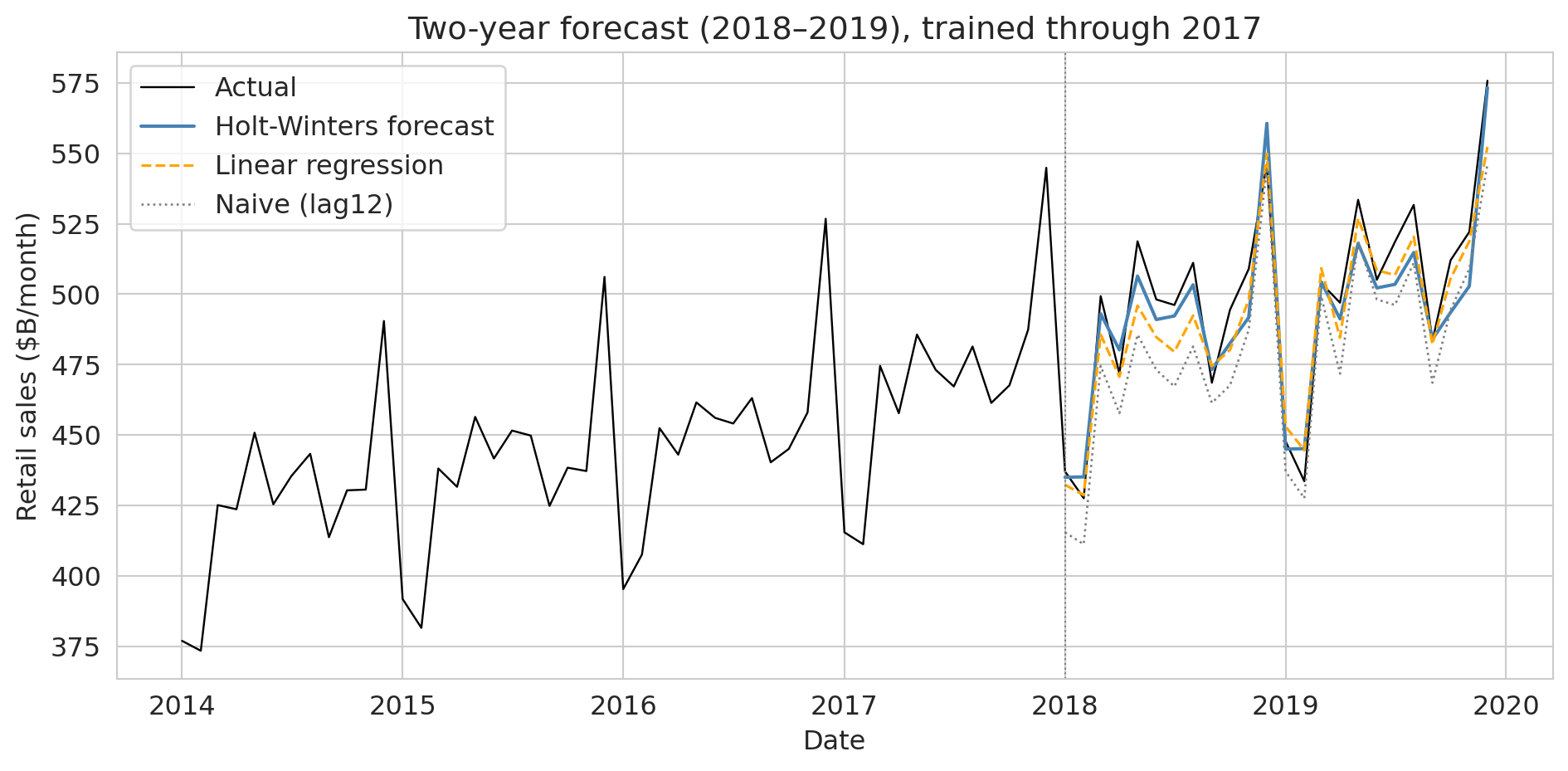
$\alpha$ and $\gamma$ are moderate; $\beta \approx 0$ (stable long-run slope). Compare against two benchmarks: the naive "same month last year," and a linear regression on lag12 plus a time trend.
```{python}
df = retail.copy()
df['lag12'] = df['sales'].shift(12)
df['year_frac'] = (df['date'] - df['date'].min()).dt.days / 365.25
df = df.dropna()
train_df = df[df['date'] <= '2017-12-01']
test_df = df[(df['date'] >= '2018-01-01') & (df['date'] <= '2019-12-01')]

# Naive: same month last year
naive_pred = test_df['lag12'].values
# Linear regression: lag12 + time trend
m_reg = LinearRegression().fit(train_df[['lag12', 'year_frac']], train_df['sales'])
reg_pred = m_reg.predict(test_df[['lag12', 'year_frac']])

results = {
    'Naive (lag12)':                  (naive_pred, test_df['sales'].values),
    'Linear regression (lag12+trend)': (reg_pred,  test_df['sales'].values),
    'Holt-Winters (add trend, mul seasonal)': (hw_pred.values, test['sales'].values),
}
print(f"\n2018–2019 forecast performance (24-month horizon):")
print(f"  {'Model':<42s} {'R²':>6s} {'MAE ($M)':>10s}")
for name, (pred, actual) in results.items():
    print(f"  {name:<42s} {r2_score(actual, pred):>6.3f} {mean_absolute_error(actual, pred):>10,.0f}")
```
```{python}
fig, ax = plt.subplots(figsize=(10, 5))
ax.plot(retail_ts.loc['2014':'2019'].index, retail_ts.loc['2014':'2019', 'sales'] / 1000,
        color='black', linewidth=0.9, label='Actual')
ax.plot(test.index, hw_pred / 1000, color='steelblue', linewidth=1.5, label='Holt-Winters forecast')
ax.plot(test_df['date'], reg_pred / 1000, color='orange', linewidth=1.2, linestyle='--', label='Linear regression')
ax.plot(test_df['date'], naive_pred / 1000, color='grey', linewidth=1.0, linestyle=':', label='Naive (lag12)')
ax.axvline(pd.Timestamp('2018-01-01'), color='grey', linewidth=0.8, linestyle=':')
ax.set_xlabel('Date'); ax.set_ylabel('Retail sales ($B/month)')
ax.set_title('Two-year forecast (2018–2019), trained through 2017')
ax.legend(loc='upper left')
plt.tight_layout(); plt.show()
```
Holt-Winters and the lag-feature regression both clear the naive bar; Holt-Winters wins because it tracks the December multiplier explicitly. Matching the model to the structure of the data — adaptive trend, multiplicative seasonality — is the right starting point for sales, energy, traffic, and electricity load.
Switching models doesn't fix validation. The forecast above still used a temporal split; the same COVID shock that spiked the walk-forward plot would break any Holt-Winters fit trained through 2019; and the distribution shift of [Part 3](#part-3-distribution-shift) and the feedback loops of [Part 4](#part-4-feedback-loops) still apply.
# Part 3: Distribution shift
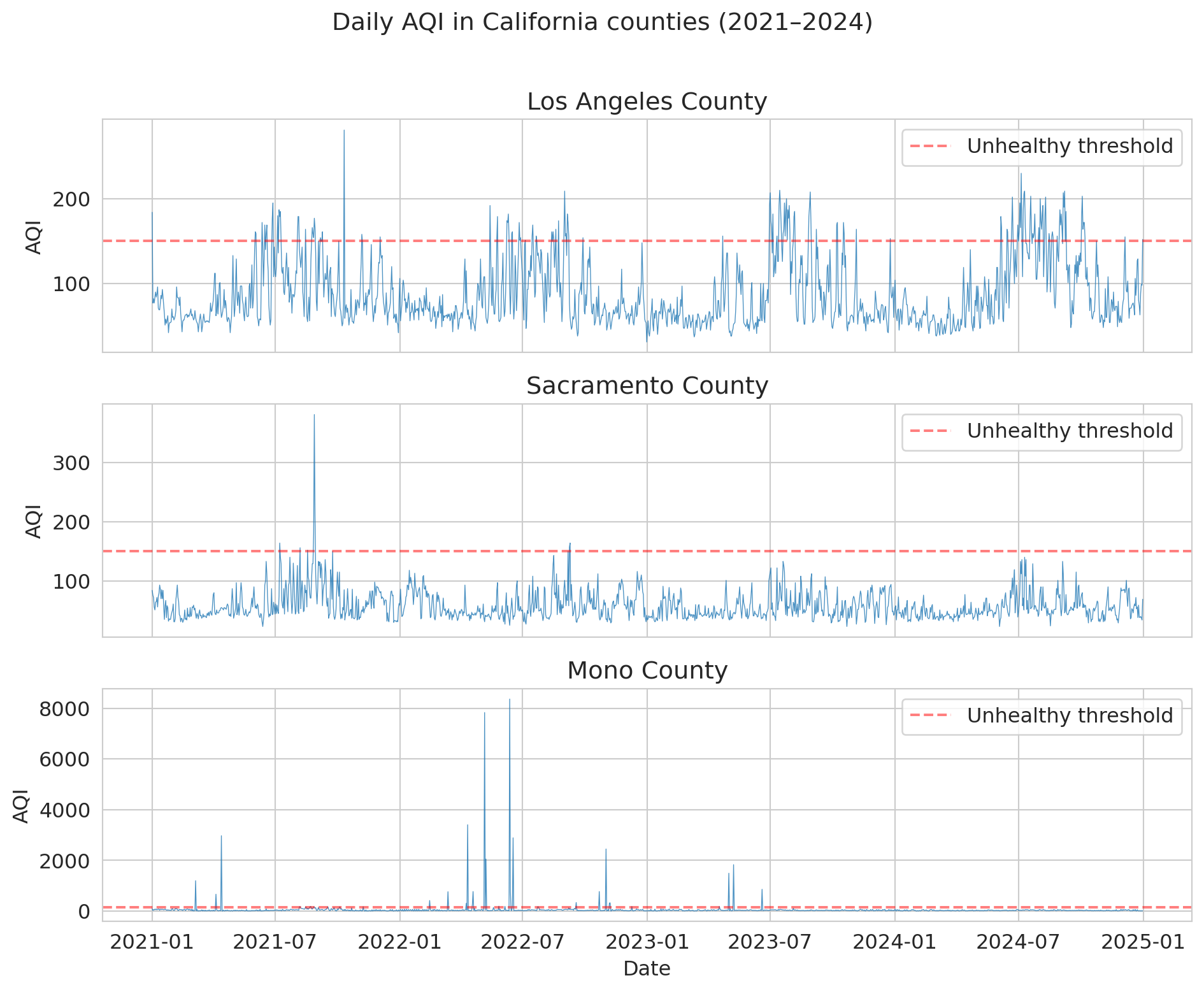
Retail sales has clean, repeating structure, so a model matched to it forecasts well — until the structure itself changes, as it did in 2020. Daily air quality makes that failure vivid: almost no long-run trend, just short-range noise punctuated by wildfire smoke that pushes the series into territory no training set contained. The same lag-feature toolkit applies; the lesson is what happens at the tails.
The EPA publishes a daily Air Quality Index (AQI) for every U.S. county. AQI runs from 0 (pristine) through "unhealthy" above 150; California wildfire smoke pushes it into the thousands.
```{python}
dfs = []
for year in range(2021, 2025):
    df_year = pd.read_csv(f'{DATA_DIR}/epa-air-quality/daily_aqi_by_county_{year}.csv')
    dfs.append(df_year[df_year['State Name'] == 'California'])
aqi = pd.concat(dfs, ignore_index=True)
aqi['Date'] = pd.to_datetime(aqi['Date'])
aqi = aqi.sort_values(['county Name', 'Date']).reset_index(drop=True)

counties = ['Los Angeles', 'Sacramento', 'Mono']
aqi_sub = aqi[aqi['county Name'].isin(counties)].copy()

fig, axes = plt.subplots(3, 1, figsize=(10, 8), sharex=True)
for ax, county in zip(axes, counties):
    cd = aqi_sub[aqi_sub['county Name'] == county]
    ax.plot(cd['Date'], cd['AQI'], linewidth=0.5, alpha=0.8)
    ax.set_ylabel('AQI'); ax.set_title(f'{county} County')
    ax.axhline(150, color='red', linestyle='--', alpha=0.5, label='Unhealthy threshold')
    ax.legend(loc='upper right')
axes[-1].set_xlabel('Date')
fig.suptitle('Daily AQI in California counties (2021–2024)', y=1.01)
plt.tight_layout(); plt.show()
```
Los Angeles and Sacramento show seasonal wildfire spikes on baseline pollution; Mono County reaches AQI above 8,000 during dust storms near Mono Lake.
## Los Angeles: recent lags on a noisy series
Build the same kind of lag-feature model on Los Angeles and evaluate it with a temporal split.
```{python}
la = aqi_sub[aqi_sub['county Name'] == 'Los Angeles'][['Date', 'AQI']].sort_values('Date').reset_index(drop=True)
la['aqi_lag1']     = la['AQI'].shift(1)
la['aqi_lag7_avg'] = la['AQI'].rolling(7).mean().shift(1)
la['aqi_lag3_avg'] = la['AQI'].rolling(3).mean().shift(1)
la['day_of_year']  = la['Date'].dt.dayofyear
la = la.dropna().reset_index(drop=True)

features = ['aqi_lag1', 'aqi_lag7_avg', 'aqi_lag3_avg', 'day_of_year']
train_temporal = la[la['Date'] < '2023-01-01']
test_temporal  = la[(la['Date'] >= '2023-01-01') & (la['Date'] < '2024-01-01')]

model_temporal = LinearRegression().fit(train_temporal[features], train_temporal['AQI'])
pred_temporal  = model_temporal.predict(test_temporal[features])
mae_temporal   = mean_absolute_error(test_temporal['AQI'], pred_temporal)
mae_naive      = mean_absolute_error(test_temporal['AQI'], test_temporal['aqi_lag1'])

print(f"Lag-feature model (temporal split, 2023): MAE = {mae_temporal:.1f}")
print(f"Naive baseline (yesterday's AQI):          MAE = {mae_naive:.1f}")
```
The model can't beat the naive baseline. On a noisy, non-trending series, yesterday's value is most of the signal, and confirming which lags help is an empirical question. Let `LassoCV` choose from thirteen candidate lags:
```{python}
from sklearn.linear_model import LassoCV

la_lf = la.copy()
for d in [1, 2, 3, 7, 14, 30, 60, 365]:
    la_lf[f'lag{d}'] = la_lf['AQI'].shift(d)
for w in [3, 7, 14, 30]:
    la_lf[f'lag{w}_avg'] = la_lf['AQI'].rolling(w).mean().shift(1)
la_lf['lag_yr_week'] = la_lf['AQI'].shift(358).rolling(7).mean()
la_lf = la_lf.dropna().reset_index(drop=True)
tr = la_lf[la_lf['Date'] < '2023-01-01']
te = la_lf[(la_lf['Date'] >= '2023-01-01') & (la_lf['Date'] < '2024-01-01')]
all_lags = [c for c in la_lf.columns if c.startswith('lag')]

for label, feats in [('Yesterday only', ['lag1']),
                     ('Same week last year only', ['lag_yr_week']),
                     ('All 13 lags (lasso)', all_lags)]:
    if label.startswith('All'):
        m = LassoCV(cv=5, max_iter=10000).fit(tr[feats], tr['AQI'])
    else:
        m = LinearRegression().fit(tr[feats], tr['AQI'])
    print(f"{label:<26s} MAE = {mean_absolute_error(te['AQI'], m.predict(te[feats])):.1f}")
```
Yesterday alone is essentially unbeatable here: same-week-last-year is too noisy to anchor anything, and lasso over all thirteen lags can't improve on lag1. Contrast retail sales, where the year-ago value carried real signal. The rule of thumb: noisy series → recent lags; cleanly seasonal series → year-ago anchors.
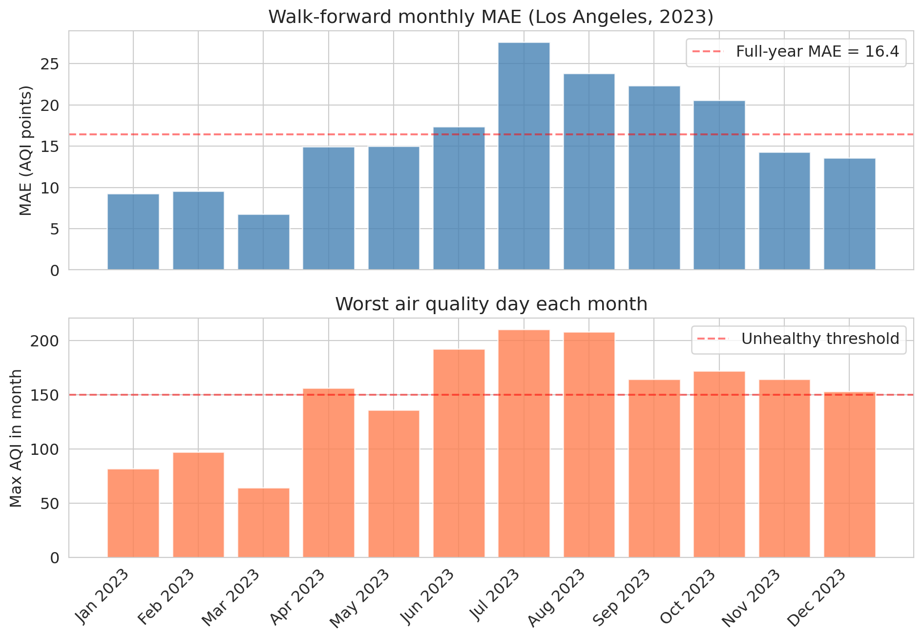
Walk-forward validation shows *when* this model breaks. Train on an expanding window, test one month at a time across 2023:
```{python}
results = []
test_months = pd.date_range('2023-01-01', '2024-01-01', freq='MS')
for i, test_start in enumerate(test_months[:-1]):
    train_wf = la[la['Date'] < test_start]
    test_wf = la[(la['Date'] >= test_start) & (la['Date'] < test_months[i + 1])]
    if len(test_wf) < 10 or len(train_wf) < 100:
        continue
    m = LinearRegression().fit(train_wf[features], train_wf['AQI'])
    results.append({'month': test_start,
                    'mae': mean_absolute_error(test_wf['AQI'], m.predict(test_wf[features])),
                    'max_aqi': test_wf['AQI'].max()})
wf_results = pd.DataFrame(results)
wf_results['month_label'] = wf_results['month'].dt.strftime('%b %Y')

fig, (ax1, ax2) = plt.subplots(2, 1, figsize=(10, 7), sharex=True)
ax1.bar(wf_results['month_label'], wf_results['mae'], color='steelblue', alpha=0.8)
ax1.axhline(mae_temporal, color='red', linestyle='--', alpha=0.5, label=f'Full-year MAE = {mae_temporal:.1f}')
ax1.set_ylabel('MAE (AQI points)'); ax1.set_title('Walk-forward monthly MAE (Los Angeles, 2023)'); ax1.legend()
ax2.bar(wf_results['month_label'], wf_results['max_aqi'], color='coral', alpha=0.8)
ax2.axhline(150, color='red', linestyle='--', alpha=0.5, label='Unhealthy threshold')
ax2.set_ylabel('Max AQI in month'); ax2.set_title('Worst air quality day each month'); ax2.legend()
plt.xticks(rotation=45, ha='right'); plt.tight_layout(); plt.show()
```
Error spikes in the summer months, exactly when wildfire smoke pushes AQI to extremes the training data rarely contained. A single annual MAE would hide this; walk-forward surfaces it.
Before stress-testing the model at those extremes, one more thing a forecast owes a decision-maker: a sense of how uncertain each prediction is.
## Prediction intervals: quantifying forecast uncertainty
A point forecast — "tomorrow's AQI will be 62" — hides what a decision-maker needs. Should the county issue a health advisory? That depends on whether 62 means "almost certainly 55 to 70" or "could easily be 200." **Prediction intervals** report the range.
Use the bootstrap from [Chapter 8](lec08-sampling.qmd): resample the model's training residuals, add each resample to every forecast, repeat. The spread of the resulting forecasts is the prediction interval.
```{python}
# Bootstrap prediction intervals for the temporal test set
np.random.seed(42)
train_resid = train_temporal['AQI'].values - model_temporal.predict(train_temporal[features])
n_boot = 1000

# Generate bootstrap forecasts by resampling residuals
boot_preds = np.zeros((n_boot, len(test_temporal)))
point_pred = model_temporal.predict(test_temporal[features])
for b in range(n_boot):
    resampled_resid = np.random.choice(train_resid, size=len(test_temporal), replace=True)
    boot_preds[b, :] = point_pred + resampled_resid

# 95% prediction interval: 2.5th and 97.5th percentiles
lower = np.percentile(boot_preds, 2.5, axis=0)
upper = np.percentile(boot_preds, 97.5, axis=0)

# How often does the actual value fall inside the interval?
coverage = np.mean((test_temporal['AQI'].values >= lower) & (test_temporal['AQI'].values <= upper))
avg_width = np.mean(upper - lower)

print(f"95% bootstrap prediction interval:")
print(f"  Coverage: {coverage:.1%} of test days (target: 95%)")
print(f"  Average width: {avg_width:.1f} AQI points")
```
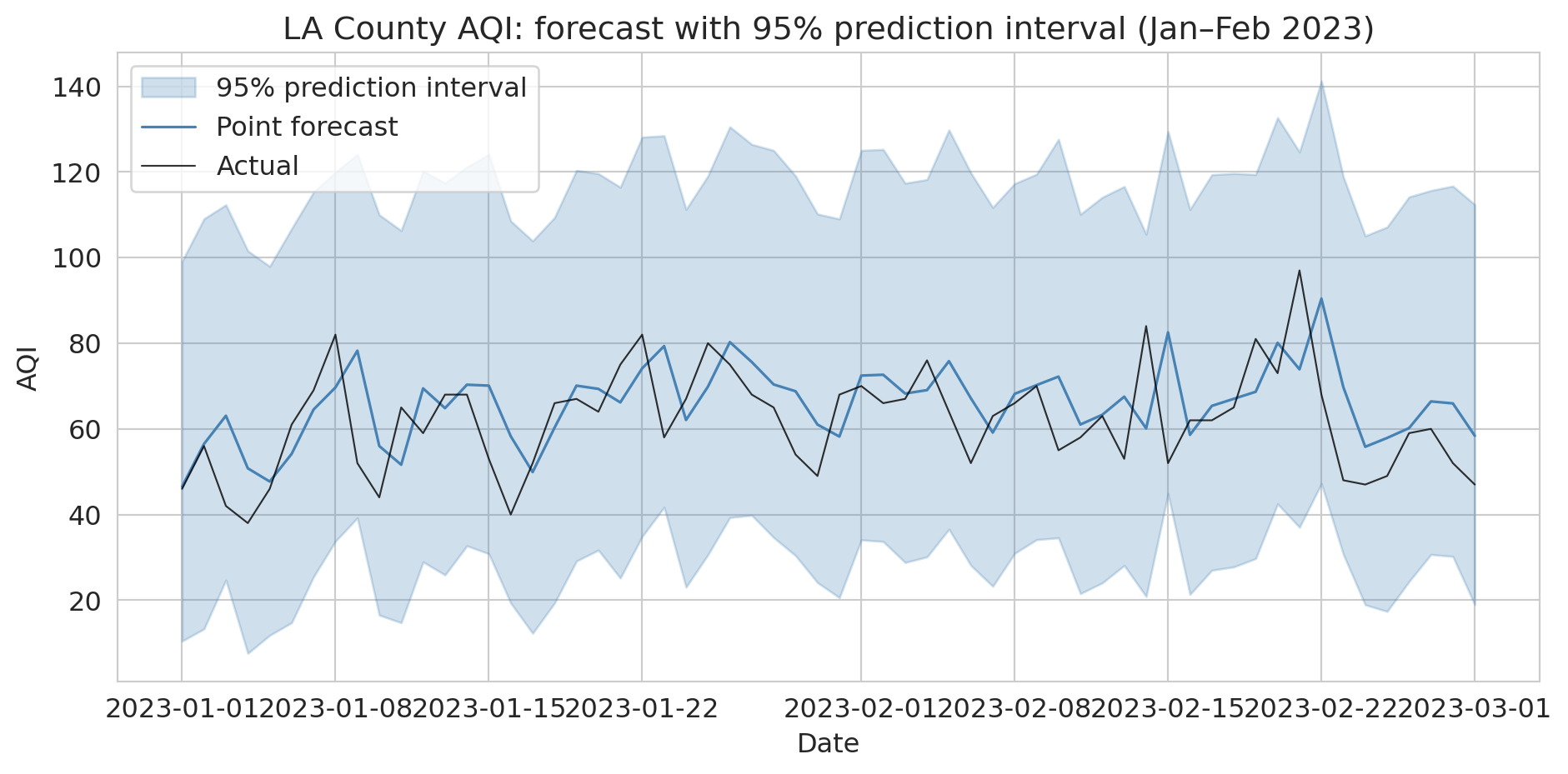
Visualize the intervals for the first two months of the test period — the shaded band is the 95% interval around each point forecast.
```{python}
# Visualize prediction intervals for a 60-day window
fig, ax = plt.subplots(figsize=(10, 5))
window = slice(0, 60)
dates_w = test_temporal['Date'].values[window]

ax.fill_between(dates_w, lower[window], upper[window],
                alpha=0.25, color='steelblue', label='95% prediction interval')
ax.plot(dates_w, point_pred[window], color='steelblue', linewidth=1.2, label='Point forecast')
ax.plot(dates_w, test_temporal['AQI'].values[window], color='black',
        linewidth=0.8, alpha=0.8, label='Actual')
ax.set_ylabel('AQI')
ax.set_xlabel('Date')
ax.set_title('LA County AQI: forecast with 95% prediction interval (Jan–Feb 2023)')
ax.legend()
plt.tight_layout()
plt.show()
```
Residual resampling works for any model, not just linear regression. A forecast without an uncertainty range isn't a complete forecast — and these intervals, built from past residuals, widen for ordinary noise but not for conditions the training data never held. That blind spot is starkest at the extremes.
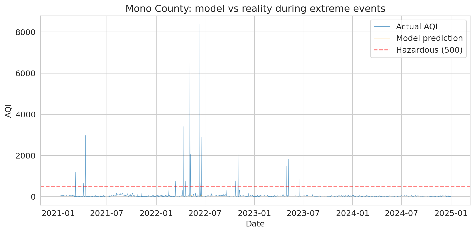
## Mono County: leaving the training range
The summer spike was the mild version of a deeper problem: what happens when the test data leaves the training range entirely. Mono County is the extreme — dust and wildfire events push AQI into the thousands, sometimes above 8,000, roughly 16× the "Hazardous" threshold of 500.
:::{.callout-tip}
## Think about it
If we train a model on "normal" days (AQI below 300), what would it predict for an AQI of 8,000? How far off would it be?
:::
```{python}
# Mono County extremes
mono = aqi_sub[aqi_sub['county Name'] == 'Mono'][['Date', 'AQI']].copy()
mono = mono.sort_values('Date').reset_index(drop=True)

# Create lag features
mono['aqi_lag1'] = mono['AQI'].shift(1)
mono['aqi_lag7_avg'] = mono['AQI'].rolling(7).mean().shift(1)
mono['aqi_lag3_avg'] = mono['AQI'].rolling(3).mean().shift(1)
mono['day_of_year'] = mono['Date'].dt.dayofyear
mono = mono.dropna().reset_index(drop=True)

print("Mono County AQI distribution:")
print(mono['AQI'].describe().to_string())
print(f"\nDays above 500: {(mono['AQI'] > 500).sum()}")
print(f"Max AQI: {mono['AQI'].max()}")
```
Train a linear model on "normal" days (AQI < 300); test it on the extremes.
```{python}
# Train a model on "normal" data (AQI < 300) and see what it predicts for extremes
normal_mono = mono[mono['AQI'] < 300]
extreme_mono = mono[mono['AQI'] >= 300]

model_mono = LinearRegression()
model_mono.fit(normal_mono[features], normal_mono['AQI'])

if len(extreme_mono) > 0:
    pred_extreme = model_mono.predict(extreme_mono[features])

    print("Model predictions vs reality during extreme events:")
    print(f"{'Actual AQI':>12} {'Predicted':>12} {'Error':>12}")
    print("-" * 40)
    for actual, pred in list(zip(extreme_mono['AQI'].values, pred_extreme))[:10]:
        print(f"{actual:>12.0f} {pred:>12.0f} {actual - pred:>12.0f}")

    coef_lag1 = model_mono.coef_[features.index('aqi_lag1')]
    print()
    print(f"Coefficient learned on aqi_lag1 (trained on AQI < 300): {coef_lag1:.4f}")
else:
    print("No extreme events found in Mono County subset.")
```
The plot makes the failure obvious:
```{python}
# Visualize the model's failure during extreme events
fig, ax = plt.subplots(figsize=(10, 5))

ax.plot(mono['Date'], mono['AQI'], linewidth=0.5, alpha=0.7, label='Actual AQI')

# Predict on all data
pred_all = model_mono.predict(mono[features])
ax.plot(mono['Date'], pred_all, linewidth=0.5, alpha=0.7, color='orange',
        label='Model prediction')

ax.axhline(y=500, color='red', linestyle='--', alpha=0.5, label='Hazardous (500)')
ax.set_ylabel('AQI')
ax.set_xlabel('Date')
ax.set_title('Mono County: model vs reality during extreme events')
ax.legend()
plt.tight_layout()
plt.show()
```
Why does the model fail even when yesterday's AQI was itself extreme? The learned coefficient on `aqi_lag1` is near zero. Inside the training regime (AQI < 300), day-to-day changes in Mono County are dominated by noise, so OLS learns that lag1 carries little signal and settles near the training mean. Plug in `aqi_lag1 = 8000` and the prediction barely moves. The model didn't refuse to extrapolate — the signal it needed wasn't there to be learned.
:::{.callout-important}
## Definition: Distribution shift
**Distribution shift** is when future data comes from a different regime than the training data. It's a severe form of non-stationarity: a qualitative change the training set never captured.
:::
Training data covers normal conditions. The events that matter most — wildfires, pandemics, crashes — are the ones your model has never seen. No cross-validation strategy fixes this; it holds out observations that *look like* the training ones, so it guards against in-distribution noise, not against a future that breaks the pattern. [Chapter 17](lec17-working-with-ai.qmd) returns to this: AutoML tools default to standard cross-validation and don't know your data is temporal.
> "Prediction is very difficult, especially about the future." — attr. Niels Bohr
# Part 4: Feedback loops
## When predictions change the world
Temporal leakage and distribution shift are failures of validation technique: with the right split or a stress test on the tails, you can see them coming. Feedback loops are deeper. Even a clean temporal split won't save you if the model is part of the world it predicts. What happens when a model doesn't just reflect the world but changes it?
**Predictive policing.** A model predicts high crime in neighborhood X. Police patrol X harder. More patrols produce more arrests in X. The model retrains and "confirms" that X is high-crime. The prediction is self-fulfilling — the model creates the data that justifies it. Feedback isn't confounding (where the association already exists and we misinterpret it); the model *causes* the association.
**Credit scoring.** Cathy O'Neil describes how credit scores trap people in cycles they can't escape.^[O'Neil, *Weapons of Math Destruction: How Big Data Increases Inequality and Threatens Democracy*, Crown, 2016.] A low score → denied loans → no credit history → score stays low. The score creates the reality it claims to measure.
**Recommendation algorithms.** YouTube recommends extreme content because users engage with it. Users watch what's recommended. The algorithm "learns" they prefer extreme content and recommends more. The model shapes the preferences it claims to predict.
**Clinical alerts.** A hospital deploys a sepsis-prediction model. Once alerts go live, clinicians treat flagged patients earlier; fewer progress to sepsis. Post-deployment the model looks *worse* than at validation — not because it degraded, but because the outcome it predicted stopped happening. Retraining on post-deployment data only makes this circular.
**Betting markets.** Your NBA model beats a naive baseline on historical data. You deploy it against the sportsbook. The line already encodes the same signals — recent scoring averages, rest days, matchup difficulty — because sharp bettors have moved it there. Your edge disappears the moment the market has processed those signals. The market *is* the feedback loop.
A causal arrow runs from the model's prediction back to the outcome:
```{python}
#| fig-cap: "Feedback loop: the model's prediction changes the outcome it measures, and the new data feeds back into training."
fig, ax = plt.subplots(figsize=(11, 3.2))
ax.set_xlim(0, 12); ax.set_ylim(0, 3); ax.axis('off')

nodes = [('Training\ndata', 1.0, 2.3), ('Model', 3.1, 2.3), ('Prediction', 5.2, 2.3),
         ('Action', 7.3, 2.3), ('Outcome', 9.4, 2.3), ('New training\ndata', 11.0, 2.3)]
hw = 0.7  # half-width of each box

for name, x, y in nodes:
    ax.add_patch(plt.Rectangle((x - hw, y - 0.3), 2 * hw, 0.6,
                               facecolor='lightblue', edgecolor='navy', lw=1.8, zorder=3))
    ax.text(x, y, name, ha='center', va='center', fontsize=9.5, fontweight='bold', zorder=4)

for (_, x1, y1), (_, x2, y2) in zip(nodes[:-1], nodes[1:]):
    ax.annotate('', xy=(x2 - hw, y2), xytext=(x1 + hw, y1),
                arrowprops=dict(arrowstyle='->', lw=2, color='navy'))

# Cycle return arrow: from "New training data" back to "Training data"
ax.annotate('', xy=(1.0, 2.0), xytext=(11.0, 1.6),
            arrowprops=dict(arrowstyle='->', lw=2, color='#d62728',
                            connectionstyle='arc3,rad=-0.3'))
ax.text(6.0, 0.55, 'cycle repeats', ha='center', va='center',
        fontsize=10, color='#d62728', fontstyle='italic')

plt.tight_layout(); plt.show()
```
"Correlation is not causation" isn't the whole story: sometimes the model *is* the cause. When predictions change the data-generating environment, validation breaks down because the test set no longer represents the deployed world.
Before deploying, ask: will the predictions change the data distribution? Weather forecasters don't change the weather; particle-physics models don't change the particles — both are safe. Credit scores change who gets loans; sepsis alerts change who gets treated — both are feedback loops, and no held-out set tells you how they'll behave.
:::{.callout-note collapse="true"}
## Going deeper: performative prediction
The formal framework for what we're calling feedback loops is **performative prediction** (Perdomo, Zrnic, Mendler-Dünner, Hardt 2020). A deployed model $f_\theta$ induces a data distribution $\mathcal{D}(\theta)$; the theory studies when iterative retraining converges to a fixed point — a "performatively stable" $\theta$ that's accurate against the distribution it induces. It subsumes *strategic classification*, where agents change their features to score better. The machinery matters for algorithm designers; for analysts, the phenomenon is what to recognize.
:::
## Weapons of Math Destruction
Cathy O'Neil calls the worst cases **Weapons of Math Destruction** (WMDs).^[O'Neil's original triad is opacity, scale, and damage; the triad below — inspired by her framework — emphasizes feedback dynamics.] Three properties together turn an ordinary model into a WMD:
1. The outcome is **not easily measurable** (you can't compute a clean test error)
2. The predictions can have **negative consequences** for individuals
3. The model creates **self-fulfilling feedback loops** that reinforce its own biases
For example:
* College rankings: high rankings attract students, faculty, donors — which raise quality, validating the rank.
* Parole-risk: keeping someone in prison longer can itself raise the odds of reoffense (lost job, deeper criminal networks), confirming the prediction.
:::{.callout-tip}
## Think about it
You build a model that predicts which students will fail a course, and the university uses it to assign tutoring resources. Is this a Weapon of Math Destruction? Check the three properties: is the outcome measurable? Could the prediction harm students (e.g., through stigma or self-fulfilling expectations)? Does it create a feedback loop? What design choices would make this a virtuous intervention rather than a vicious cycle?
:::
# Part 5: Goodhart's law
## "When a measure becomes a target..."
"When a measure becomes a target, it ceases to be a good measure" (attributed to Charles Goodhart, 1975; popularized by Marilyn Strathern). The law is **game-theoretic**: once a measurement carries consequences, the agents being measured respond. Those who game the metric well benefit disproportionately. Post-target, the data generated by $M$ isn't the data $M$ was calibrated on — it's the data produced by agents trying to score well on $M$.
Three ingredients:
1. A **proxy metric** $M$ approximating the goal $G$ we care about.
2. **Consequences** tied to $M$ (money, status, survival, promotion).
3. **Agents** who can adjust behavior to move $M$, and who differ in how well they can.
Before the metric $M$ is popularized, $M$ and $G$ may be tightly linked.
After, $M$ reflects a mix of $G$ and "skill at gaming $M$". Examples:
- **Hospital readmission penalties.** Medicare's Hospital Readmissions Reduction Program penalizes hospitals whose 30-day readmission rates run high. Hospitals can lower the *measured* rate without improving care: returning patients can be held in "observation status" or treated in the emergency department, neither of which counts as a readmission, and the sickest patients are the easiest to divert this way.^[The post-program rise in observation stays — excluded from the readmission count — is documented in the health-services literature; a widely cited analysis (Wadhera et al., *JAMA* 2018, ~8 million Medicare hospitalizations) further found the program associated with higher post-discharge mortality for heart failure and pneumonia, though that causal link remains debated.]
- **School accountability tests.** When teacher and school evaluations hinge on standardized scores, the score can rise without learning rising. Chicago investigators detected outright answer-altering by staff in at least 4–5% of classrooms once stakes were attached;^[Jacob & Levitt, "Rotten Apples: An Investigation of the Prevalence and Predictors of Teacher Cheating," *Quarterly Journal of Economics*, 2003.] in Florida, schools near the failing cutoff reclassified weak students into test-exempt special-education categories to keep them out of the tested pool.^[Figlio & Getzler, "Accountability, Ability and Disability: Gaming the System," NBER Working Paper 9307, 2002.]
- **Emissions testing.** Volkswagen's engine software detected the EPA lab cycle and ran full emissions controls only during the test; on the road the same cars emitted nitrogen oxides up to roughly 40 times the legal limit.^[EPA, Notice of Violation to Volkswagen, September 18, 2015; the defeat device surfaced through on-road testing by West Virginia University commissioned by the ICCT.] VW optimized the test distribution exactly, and real-world emissions moved the opposite way.
- **Citations and the h-index.** Citation counts were meant to track influence, but they can be inflated directly. A survey of 6,672 researchers found journal editors coercing authors into padding reference lists with the editor's own journal to lift its impact factor, with junior authors targeted most;^[Wilhite & Fong, "Coercive Citation in Academic Publishing," *Science*, 2012.] separately, groups of authors form "citation cartels" that cite one another disproportionately.^[Fister, Fister & Perc, "Toward the Discovery of Citation Cartels in Citation Networks," *Frontiers in Physics*, 2016.] Skill at the citation game and quality of research come apart.
- **p-hacking.** The $p < 0.05$ threshold was meant to gauge evidence strength. When publication and careers depend on clearing it, researchers exploit "researcher degrees of freedom," trying analyses until something crosses the line; simulations and live experiments show this can make almost any hypothesis look significant,^[Simmons, Nelson & Simonsohn, "False-Positive Psychology," *Psychological Science*, 2011.] and text-mining across published literatures finds a tell-tale excess of $p$-values landing just below 0.05.^[Head, Holman, Lanfear, Kahn & Jennions, "The Extent and Consequences of P-Hacking in Science," *PLOS Biology*, 2015.]
Every case has the same shape. Attaching stakes to a metric changes the behavior that produces it, so the numbers the metric collects afterward are no longer the numbers it was validated on. Overfitting on a fixed dataset is the tame version; the full phenomenon is that the data itself changes once the metric carries consequences, shifting most in favor of whoever games it best.
## Goodhart's law in machine learning
You have already met Goodhart's law, under a different name. The overfitting pattern from [Chapter 6](lec06-validation.qmd) — train loss falling while test loss rises — is the same mechanism as the hospitals and Volkswagen above: a proxy (training loss) optimized so hard it stops tracking the goal (generalization). What changes is the cast. Here a single agent, the learning algorithm, games a single proxy by memorizing noise; in the readmission and emissions cases the agents are people, adapting after the metric carries consequences.
Cross-validation helps ML resist Goodhart's law.
However, with enough hyperparameter tuning against the validation set,
validation loss stops measuring generalization. That's why serious practice separates **training / validation / test** and uses the test set once, after all decisions are locked.
But the ML scenario sees only one side of Goodhart's law.
In its full manifestation, Goodhart's law is dynamic: the data is generated by strategic agents who respond to the metric *after deployment*.
## Asking the Goodhart question
How can we avoid Goodhart's law? Whenever you use a prediction to make decisions, ask:
1. Can the measured agents move this metric without advancing the underlying goal?
2. Which agents are best positioned to do so — are they the ones the policy meant to reward?
If yes to (1), you have a Goodhart problem; if (2) names the wrong beneficiaries, an equity problem on top. Defensive designs: audit with a second metric the optimizer can't see; cap how often any one party can update against the metric; or, strongest, randomize a holdout to see what the unperturbed world looks like — the subject of [Chapter 19](lec19-causal-inference-2.qmd).
# Part 6: What to do
Three failure modes, one defensive recipe.
**Before deployment:**
1. **Split by the right axis.** Time matters → split by time. Same person recurs → split by person. Ask what generalization axis you care about.
2. **Simulate the deployed action.** Don't just score the prediction — score what it *causes*. Models whose predictions drive decisions can't be validated on passive historical data alone.
3. **Audit proxy vs. outcome.** Write down the goal each metric proxies for. Where they diverge is where Goodhart bites.
4. **Stress-test the tails.** Models fail on data they haven't seen. Construct adversarial and out-of-distribution cases before deployment, not after.
**After deployment:**
1. **Monitor drift.** Track performance against fresh ground truth. When it erodes, ask whether the world changed, the model changed the world, or the metric is being gamed.
2. **Hold out a control.** Reserve a random sample where the model doesn't decide — baseline, human, or coin flip. The control shows what would have happened.
3. **A/B test major changes.** Randomizing decisions to measure the model's impact causally is the single most effective defense against feedback-loop failures ([Chapter 19](lec19-causal-inference-2.qmd) develops the machinery).
[Chapter 17](lec17-working-with-ai.qmd) closes with a five-cluster checklist for evaluating an analysis; the "incentives and dynamics" cluster — Goodhart, feedback loops, and who paid for the analysis — points back here.
## Key takeaways
- **Random-split validation is one tool.** Match the validation procedure to the failure mode, and recognize when no procedure will help.
- **Temporal leakage.** Walk-forward validation — temporal splits with expanding training windows, called **backtesting** in finance — is the right tool for time-series data. The size of the random-split bias depends on what the model has to extrapolate: short-range autocorrelation hides it, long-run trends expose it.
- **Match the model to the structure.** Series with trend and seasonality call for decomposition or Holt-Winters, not lag-feature regression.
- **Distribution shift.** Models trained on normal conditions can't predict unprecedented events. Test on out-of-distribution data, stratify by subgroup, widen tail intervals.
- **Feedback loops.** When predictions change the world, no passive validation catches it — the test set no longer represents deployment. You need randomized holdouts, not better splits.
- **Weapons of Math Destruction** combine three traits: unmeasurable outcome, negative consequences, self-fulfilling loop. College rankings and parole-risk models qualify; weather and particle physics don't.
- **Goodhart's law is game-theoretic.** When a measurement carries consequences, the measured agents respond, and those best at responding dominate the metric. Overfitting is the special case where the only agent is the learning algorithm.
- **What to do.** Before deployment: split by the right axis, simulate the action, audit proxy vs. outcome, stress-test tails. After deployment: monitor drift, hold out a control, A/B test changes.
- **Report prediction intervals**, not point forecasts.
## Study guide
### Key ideas
- **Temporal split (walk-forward validation; "backtesting" in finance):** evaluating a model by training on past data and testing on future data, mimicking real deployment.
- **Data leakage:** when information from the future (or the test set) contaminates training, producing optimistically biased results. Random train/test splits create leakage in time series because neighboring observations are correlated across the split.
- **Lag features:** predictors constructed from past values (last period's value, a rolling average, the same period a year ago). Which lags help is empirical: cleanly seasonal series like retail sales benefit from year-ago anchors; noisy series like AQI lean on recent lags.
- **Walk-forward validation:** repeatedly training on an expanding (or sliding) window and testing on the next period. Reveals *when* a model fails, not just its average performance.
- **Classical decomposition:** splitting a series into trend, seasonal, and residual components (additive or multiplicative).
- **Holt-Winters (triple exponential smoothing):** tracks level, slope, and seasonal pattern with three smoothing parameters $\alpha, \beta, \gamma \in [0,1]$. The right starting point for series with both trend and seasonality.
- **Distribution shift:** when future data comes from a different regime than the training data. Models trained on normal conditions cannot predict unprecedented events.
- **Prediction intervals:** a range (e.g., 95%) around a point forecast capturing plausible future values. Bootstrap resampling of training residuals is a general-purpose method.
- **Feedback loop:** a causal arrow from the model's prediction back to the outcome — prediction → action → new data → new prediction. The test set no longer represents the deployment environment.
- **Weapon of Math Destruction (WMD):** a predictive model with (1) an unmeasurable outcome, (2) negative consequences for individuals, (3) a self-fulfilling feedback loop. Cathy O'Neil's framework.
- **Goodhart's law:** when a measure becomes a target, it ceases to be a good measure. Manifests in ML as overfitting (training loss as proxy for generalization), in policy as metric gaming, in science as p-hacking.
- **Proxy-vs-outcome auditing:** for every metric you optimize, write down the goal it's a proxy for. Where does the proxy diverge? That's where Goodhart will bite.
### Computational tools
- `pd.Series.shift(n)` — create lag features by shifting values forward or backward
- `pd.Series.rolling(k).mean()` — compute rolling window averages
- Temporal train/test split: filter by date (`df[df['Date'] < cutoff]`)
- Walk-forward loop: iterate over time periods with an expanding training window
- `statsmodels.tsa.seasonal.seasonal_decompose` — additive or multiplicative decomposition
- `statsmodels.tsa.api.ExponentialSmoothing` — Holt-Winters with `trend` and `seasonal` arguments
- `sklearn.linear_model.LassoCV` — lasso with cross-validated regularization, useful for selecting from many candidate lags
- Bootstrap residual resampling: construct prediction intervals for any model
### For the quiz
You should be able to: (1) explain why random splitting fails for time series data and implement a temporal split, (2) describe walk-forward validation (expanding and sliding window variants), (3) explain why short-range autocorrelation can hide leakage while long-run trends expose it, (4) decompose a series into trend, seasonal, and residual components and read off the seasonal multipliers, (5) describe what each Holt-Winters smoothing parameter ($\alpha, \beta, \gamma$) controls, (6) explain what distribution shift is and why no cross-validation method can fully address it, (7) identify the three properties of a WMD given a deployment scenario, (8) give two examples of feedback loops and diagram the prediction-action-outcome cycle, (9) state Goodhart's law and explain how overfitting is a special case, (10) list three pre-deployment and three post-deployment practices that defend against these failure modes, and (11) explain why prediction intervals matter and how bootstrap resampling produces them.