---
title: "Validation and the Bias-Variance Tradeoff"
execute:
enabled: true
jupyter: python3
---
A hospital is considering an AI system that predicts which patients will develop sepsis — a life-threatening condition where early intervention is critical. The vendor, Epic Systems, reports high accuracy on internal evaluations. The hospital buys the system and deploys it. What questions should they have asked?
When researchers at Michigan Medicine independently evaluated the model on 27,697 hospitalized patients, it missed 67% of sepsis cases while firing false alerts on 18% of all hospitalizations.^[Wong et al., "External Validation of a Widely Implemented Proprietary Sepsis Prediction Model in Hospitalized Patients," *JAMA Internal Medicine*, 2021. <https://pmc.ncbi.nlm.nih.gov/articles/PMC8218233/>]
The root cause: Epic evaluated the model on data similar to its training data, not on an independent external test set. The model had learned patterns specific to one hospital system's patient population and coding practices. Those patterns didn't generalize.
The Epic sepsis model is not an isolated failure. Dermatology AI systems have reported 90%+ accuracy on light skin tones but as low as 17% on dark skin, because the test sets didn't reflect the diversity of the deployment population.^[Daneshjou et al., "Disparities in Dermatology AI Performance on a Diverse, Curated Clinical Image Set," *Science Advances*, 2022.] Amazon built an AI recruiting tool that achieved high accuracy but systematically penalized resumes containing the word "women's" — the model had learned to replicate historical hiring bias embedded in its training data, and the company scrapped it.^[Dastin, "Amazon scraps secret AI recruiting tool that showed bias against women," *Reuters*, 2018.] In each case, the model looked good on data it had already seen but failed on the data that mattered.
Every one of these failures shares the same root cause: the evaluation didn't simulate the data the model would face in deployment. Before trusting any model's reported performance, ask: training data from *when*? From *where*? From *whom*?
In [Chapter 5](lec05-feature-engineering.qmd), we engineered features — dummies, polynomials, interactions — and saw that a linear model can capture surprisingly complex patterns. But we've been measuring performance on the *same data we trained on*. Evaluating a model on its training data is like grading a student on the questions they've already seen — of course they'll do well. The question the hospital *should* have asked is the question this chapter answers: **does this model generalize?** We'll develop the tools to answer it: train/test splits, cross-validation, and the bias-variance tradeoff that explains why more complex models don't always win.
:::{.callout-note}
## All models are wrong
"All models are wrong, but some are useful." — George Box (1976)
Every model simplifies reality. The question is never *whether* a model is exactly right — no model is. The question is whether the model's approximation is close enough to be useful for the decision at hand. The entire machinery of validation exists to answer that question.
:::
```{python}
import os
import numpy as np
import pandas as pd
import matplotlib.pyplot as plt
import matplotlib.patches as patches
import seaborn as sns
from sklearn.linear_model import LinearRegression, Lasso, LassoCV, Ridge, lasso_path
from sklearn.preprocessing import PolynomialFeatures, StandardScaler
from sklearn.model_selection import cross_val_score, train_test_split, KFold
from sklearn.metrics import r2_score
import warnings
warnings.filterwarnings('ignore')
sns.set_style('whitegrid')
plt.rcParams['figure.figsize'] = (7, 4.5)
plt.rcParams['font.size'] = 12

DATA_DIR = 'data'

# Also save key figures to the slide assets directory so slides can reuse them.
SLIDE_IMG_DIR = '../slides/images/lec06'
os.makedirs(SLIDE_IMG_DIR, exist_ok=True)

def save_for_slides(name):
    """Save the current figure as a PNG in the Lec 6 slide assets directory."""
    plt.savefig(f'{SLIDE_IMG_DIR}/{name}.png', dpi=150, bbox_inches='tight')
```
## Evaluating on new data
Training a model on data and then testing it on the *same* data is like letting a student write the exam with the answer key open. A perfect score tells you they can copy, not that they understand the material. A model that scores well on its training data might have memorized noise — patterns specific to those particular observations that won't appear again.
The fix: **split the data before fitting any model.** Set aside a random portion — say 30% — that the model never sees during training. After fitting the model on the remaining 70%, evaluate it on the held-out portion. These held-out observations simulate new data from the same population: same city, same time period, same measurement process, but observations the model has never encountered.
When does a random split give a reliable estimate of future performance? When future data comes from the *same distribution* as the training data. A random split shuffles observations so each set is a representative sample of the underlying population. If tomorrow's data looks statistically like today's, the held-out score is a trustworthy preview.
When does it break down? When deployment data differs systematically from training data — a mismatch called **distribution shift**. A random split shuffles observations *within* one population, so training and test sets come from the same distribution by construction. That is exactly what the Epic sepsis model's evaluation looked like: same hospital, same era, same coding practices. A random split would have pronounced it fine. Deploy the same model at a different hospital and the distribution has shifted — the test set the vendor used tells you nothing about the new population's performance. A random split tests *in-distribution* generalization; it cannot detect a mismatch between training and deployment. [Chapter 16](lec16-feedback-loops.qmd) returns to this problem when splits must respect time.
:::{.callout-note collapse="true"}
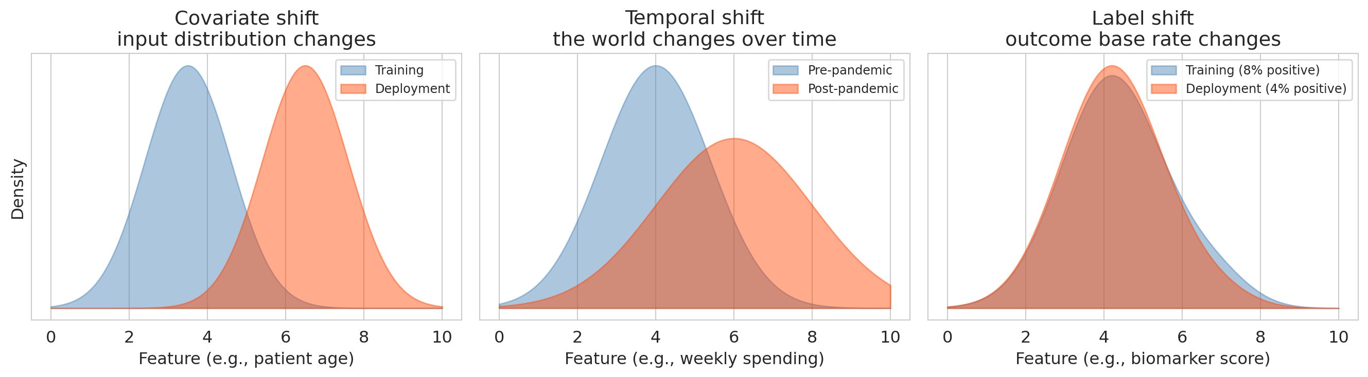
## Going deeper: three kinds of distribution shift
Distribution shift comes in several distinct forms, each one painted by a different picture:
- **Covariate shift**: the input distribution changes (e.g., training on one hospital's patients, deploying at another with different demographics).
- **Temporal shift**: the world changes over time (e.g., consumer preferences, market conditions, pandemic disruptions).
- **Label shift**: the outcome's base rate changes while features given the outcome stay the same (e.g., a sepsis model trained when prevalence is 8% and deployed a year later at 4% — individual patients who *do* have sepsis still look the same on paper, but the base rate has shifted, so a model whose decision threshold was tuned to the old prevalence fires far more false alarms per true case).
```{python}
#| label: fig-distribution-shift
#| fig-cap: "Three kinds of distribution shift, each with its own picture."
fig, axes = plt.subplots(1, 3, figsize=(14, 4))
x_grid_shift = np.linspace(0, 10, 400)

def gaussian(x, mu, sigma):
    return np.exp(-0.5 * ((x - mu) / sigma) ** 2) / (sigma * np.sqrt(2 * np.pi))

axes[0].fill_between(x_grid_shift, gaussian(x_grid_shift, 3.5, 1.1), alpha=0.45,
                     color='steelblue', label='Training')
axes[0].fill_between(x_grid_shift, gaussian(x_grid_shift, 6.5, 1.1), alpha=0.45,
                     color='orangered', label='Deployment')
axes[0].set_title('Covariate shift\ninput distribution changes')
axes[0].set_xlabel('Feature (e.g., patient age)')
axes[0].set_ylabel('Density')
axes[0].set_yticks([])
axes[0].legend(fontsize=9, loc='upper right')

axes[1].fill_between(x_grid_shift, gaussian(x_grid_shift, 4.0, 1.4), alpha=0.45,
                     color='steelblue', label='Pre-pandemic')
axes[1].fill_between(x_grid_shift, gaussian(x_grid_shift, 6.0, 2.0), alpha=0.45,
                     color='orangered', label='Post-pandemic')
axes[1].set_title('Temporal shift\nthe world changes over time')
axes[1].set_xlabel('Feature (e.g., weekly spending)')
axes[1].set_yticks([])
axes[1].legend(fontsize=9, loc='upper right')

pos_density = gaussian(x_grid_shift, 6.8, 0.9)
neg_density = gaussian(x_grid_shift, 4.2, 1.3)
train_prev, deploy_prev = 0.08, 0.04
train_marginal = train_prev * pos_density + (1 - train_prev) * neg_density
deploy_marginal = deploy_prev * pos_density + (1 - deploy_prev) * neg_density
axes[2].fill_between(x_grid_shift, train_marginal, alpha=0.45, color='steelblue',
                     label='Training (8% positive)')
axes[2].fill_between(x_grid_shift, deploy_marginal, alpha=0.45, color='orangered',
                     label='Deployment (4% positive)')
axes[2].set_title('Label shift\noutcome base rate changes')
axes[2].set_xlabel('Feature (e.g., biomarker score)')
axes[2].set_yticks([])
axes[2].legend(fontsize=9, loc='upper right')

plt.tight_layout()
save_for_slides('distribution-shift-panels')
plt.show()
```
Each example in the opening vignette lands in one of these panels: Epic sepsis (different hospital population) is covariate shift; Amazon hiring (historical bias encoded in training data) is a label-shift-style problem once deployed on an intentionally debiased pipeline; any model trained pre-pandemic and deployed post-pandemic hits temporal shift. A random train/test split sees none of them.
:::
**How much data for each part?** A common default is 70% train / 30% test, or 80/20. The tradeoff:
- **More training data** → the model sees more examples, so it learns more reliably. Especially important when the model is complex or the dataset is small.
- **More test data** → the performance estimate is more stable. A test set of 20 observations gives a noisy estimate; a test set of 2,000 gives a precise one.
With abundant data (tens of thousands of observations), the split ratio matters less — even 10% held out gives a large test set. With small data (a few hundred observations), every observation counts for training, and cross-validation (introduced below) is a better strategy than a single split.
:::{.callout-important}
## Definition: Train and test metrics
Any performance metric can be computed on either the training set or the test set:
- **Train $R^2$**: $R^2$ computed on the data used to fit the model. Measures how well the model explains what it has already seen. Always increases (or stays the same) as model complexity increases.
- **Test $R^2$**: $R^2$ computed on held-out data the model was not trained on. Measures how well the model predicts new observations. Can *decrease* if the model overfits.
More generally, the **train version** of a metric (accuracy, MSE, etc.) measures fit; the **test version** measures generalization. The gap between them reveals overfitting.
(One vocabulary trap if you read across literatures: clinical ML papers — including the Wong et al. sepsis paper above — often use *validation* to mean what we call *testing*, i.e., checking model performance on a held-out cohort. In this chapter we use *validation* specifically for the hyperparameter-selection split introduced later.)
:::
## Polynomials, when they help
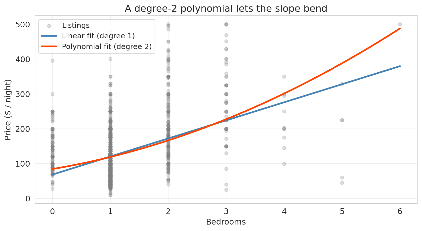
We already met one kind of polynomial feature in [Chapter 5](lec05-feature-engineering.qmd): the **interaction term** `bedrooms × borough`, a degree-2 polynomial built from two different base features. This chapter extends the same trick in two directions — to higher powers of a single feature ($x^2$, $x^3$, $\ldots$) and to all products of two, three, or more base features at once.
The motivation for bending a single feature: the jump in price from a 1-bedroom to a 2-bedroom listing isn't necessarily the same as the jump from a 4-bedroom to a 5-bedroom — at some point, extra bedrooms stop adding as much, and the straight-line fit starts to miss. A **polynomial feature** lets the slope bend by adding powers of $x$ ($x^2$, $x^3$, $\ldots$) as additional columns and letting the linear model pick its own coefficients on each.
Scikit-learn's `PolynomialFeatures` does the expansion. With `degree=2, include_bias=False`, it takes a single feature $x$ and returns two columns: $x$ and $x^2$. The resulting regression $\hat{y} = \beta_0 + \beta_1 x + \beta_2 x^2$ is still linear in the *coefficients* — so OLS fits it the same way — but the fitted curve is no longer a straight line. Applied to a pair of features $(x_1, x_2)$ at degree 2, the same call returns $x_1, x_2, x_1^2, x_1 x_2, x_2^2$ — so every interaction term from Chapter 5 shows up automatically as one of the degree-2 polynomial features.
```{python}
# Load Airbnb data (same setup as Chapter 5)
listings = pd.read_csv(f'{DATA_DIR}/airbnb/listings.csv', low_memory=False)

cols = ['price', 'bedrooms', 'bathrooms', 'room_type', 'neighbourhood_group_cleansed']
df = listings[cols].copy()
n_before = len(df)
df = df.dropna()
df = df.rename(columns={'neighbourhood_group_cleansed': 'borough'})
df = df[df['price'].between(10, 500)].reset_index(drop=True)
print(f"Dropped {n_before - len(df):,} rows with missing values or extreme prices")

# Subsample: enough to see overfitting at high-degree polynomials, but not so much
# that we leave the regime where a single train/test split is informative.
df_sub = df.sample(1500, random_state=42).reset_index(drop=True)
y_sub = df_sub['price']

print(f"Full dataset: {n_before:,} listings")
print(f"Subsample: {len(df_sub):,} listings")
```
Fit a straight line and a degree-2 polynomial to price as a function of bedrooms, then overlay both on a scatter of the raw data:
```{python}
# Linear fit: price ~ bedrooms
x_bed = df_sub[['bedrooms']].values
y_price = y_sub.values

linear_fit = LinearRegression().fit(x_bed, y_price)

# Degree-2 polynomial fit: price ~ bedrooms + bedrooms^2
poly2 = PolynomialFeatures(degree=2, include_bias=False)
x_bed_poly2 = poly2.fit_transform(x_bed)
poly2_fit = LinearRegression().fit(x_bed_poly2, y_price)

# Grid for smooth curves
x_grid_bed = np.linspace(x_bed.min(), x_bed.max(), 200).reshape(-1, 1)
y_linear_grid = linear_fit.predict(x_grid_bed)
y_poly2_grid = poly2_fit.predict(poly2.transform(x_grid_bed))

fig, ax = plt.subplots(figsize=(9, 5))
ax.scatter(x_bed, y_price, alpha=0.25, s=25, color='gray', label='Listings')
ax.plot(x_grid_bed, y_linear_grid, color='steelblue', linewidth=2.5,
        label='Linear fit (degree 1)')
ax.plot(x_grid_bed, y_poly2_grid, color='orangered', linewidth=2.5,
        label='Polynomial fit (degree 2)')
ax.set_xlabel('Bedrooms')
ax.set_ylabel('Price ($ / night)')
ax.set_title('A degree-2 polynomial lets the slope bend')
ax.legend(fontsize=11, loc='upper left')
ax.grid(True, alpha=0.3)
plt.tight_layout()
save_for_slides('polynomials-when-they-help')
plt.show()
```
At small bedroom counts the two fits agree, but the polynomial bends upward as bedrooms grow — picking up the fact that the price gap between a 4- and 5-bedroom listing is bigger than the gap between a 1- and 2-bedroom listing. That curvature is real, and the straight line can't see it.
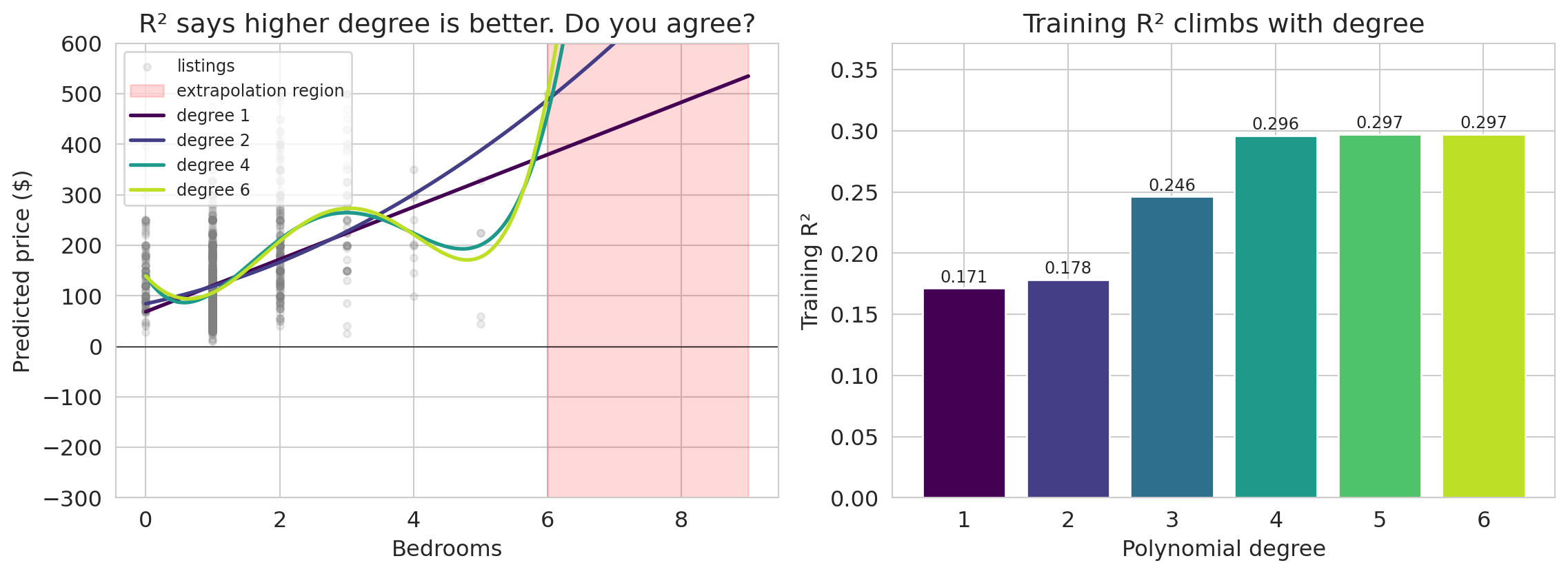
If a little bending helps, does more bending help more? Let's push the degree up on the same bedrooms-only feature and see what each fit predicts — both inside the observed range and a few bedrooms beyond it.
```{python}
#| label: fig-polynomial-parade
MAX_DEGREE = 6
fig, axes = plt.subplots(1, 2, figsize=(12, 4.5))
max_obs = float(df_sub['bedrooms'].max())

# Left panel: polynomial fits on bedrooms, extrapolated beyond the observed range
ax = axes[0]
ax.scatter(df_sub['bedrooms'], y_sub, alpha=0.15, s=15, color='gray', label='listings')
x_extrap = np.linspace(0, 9, 300).reshape(-1, 1)
ax.axvspan(max_obs, 9, alpha=0.15, color='red', label='extrapolation region')

colors_poly = plt.cm.viridis(np.linspace(0, 0.9, MAX_DEGREE))
parade_r2s = []
top_degree_pred = None

for degree in range(1, MAX_DEGREE + 1):
    poly = PolynomialFeatures(degree=degree, include_bias=False)
    X_p = poly.fit_transform(df_sub[['bedrooms']].values)
    m = LinearRegression().fit(X_p, y_sub.values)
    parade_r2s.append(m.score(X_p, y_sub.values))
    pred = m.predict(poly.transform(x_extrap))
    if degree == MAX_DEGREE:
        top_degree_pred = pred
    if degree in [1, 2, 4, MAX_DEGREE]:
        ax.plot(x_extrap, pred, color=colors_poly[degree-1], linewidth=2,
                label=f'degree {degree}')

ax.axhline(0, color='black', linewidth=0.5)
ax.set_xlabel('Bedrooms')
ax.set_ylabel('Predicted price ($)')
ax.set_title('R² says higher degree is better. Do you agree?')
ax.legend(fontsize=9, loc='upper left')
ax.set_ylim(-300, 600)

ax.annotate(f'degree {MAX_DEGREE} swings\nwildly here',
            xy=(8.5, top_degree_pred[-30]),
            xytext=(6.3, -220),
            fontsize=9, color='#b00020',
            arrowprops=dict(arrowstyle='->', color='#b00020', lw=1.2))

# Right panel: training R² by degree — the "higher is better" view
ax = axes[1]
ax.bar(range(1, MAX_DEGREE + 1), parade_r2s, color=colors_poly, edgecolor='white')
for i, r2_val in enumerate(parade_r2s):
    ax.text(i + 1, r2_val + 0.005, f'{r2_val:.3f}', ha='center', fontsize=9)
ax.set_xlabel('Polynomial degree')
ax.set_ylabel('Training R²')
ax.set_title('Training R² climbs with degree')
ax.set_ylim(0, max(parade_r2s) * 1.25)

plt.tight_layout()
save_for_slides('polynomial-parade')
plt.show()
```
It fits the data better and better! Training $R^2$ climbs from about 0.17 at degree 1 up to around 0.30 at degree 6 — every extra degree buys a little more "fit." What a great fit. Let's ship it.
…wait, is something wrong? Would you trust this model to predict the price of a 7- or 8-bedroom listing? Look at what the degree-6 curve does beyond the range we actually measured: it swings into territory no honest prediction should ever enter. And even inside the observed range, the higher-degree curves have started to wobble between points — each wiggle is the model chasing a pattern the data never really had.
Training $R^2$ says yes. Your eye says no. The rest of this chapter is about resolving that disagreement by grading the model on data it has never seen before.
## Adding features: from help to harm
In [Chapter 5](lec05-feature-engineering.qmd), adding features always improved $R^2$. But that was $R^2$ on the training data. Now that we can measure performance on held-out data, we can ask the real question: does adding features improve predictions on *new* data?
We'll build feature matrices at increasing complexity — from two raw numeric features up through high-order polynomial interactions — and track both train and test $R^2$. We deliberately use a subsample of 1,500 listings so that even our most elaborate feature expansion has fewer parameters than training observations — enough complexity to see overfitting without forcing us into the regime where OLS stops being well-defined. (With 20,000+ listings, you'd need far more features before overfitting bites — good news for practitioners with abundant data, but hard to see the pattern.)
Here's the plan: seven levels of model complexity. Levels 1–4 add meaningful features one group at a time. Levels 5–7 use `PolynomialFeatures` to generate all products of up to $d$ features (including a feature with itself — so degree-2 interactions include squared terms like bedrooms$^2$, degree-3 adds cubed terms, and so on). The number of features grows combinatorially with the degree.
| Level | What it adds | Intuition |
|-------|-------------|-----------|
| 1 | bedrooms + bathrooms | Raw numeric features only |
| 2 | + room type dummies | Different baseline by listing type |
| 3 | + borough dummies | Different baseline by location |
| 4 | + bedroom × borough interactions | Different bedroom effect by borough |
| 5 | all degree-2 terms | Pairwise interactions + squared terms |
| 6 | all degree-3 terms | Three-way interactions + cubic terms |
| 7 | all degree-4 terms | Four-way interactions + quartic terms |
```{python}
# Build base features: numeric + dummies (created once, then split)
base = pd.concat([
    df_sub[['bedrooms', 'bathrooms']],
    pd.get_dummies(df_sub['room_type'], drop_first=True, prefix='room'),
    pd.get_dummies(df_sub['borough'], drop_first=True, prefix='boro')
], axis=1)

print(f"Base features: {list(base.columns)}")
print(f"Number of base features: {base.shape[1]}")
```
Next, we define a function that builds feature matrices at each complexity level. Levels 1–4 select columns by hand; levels 5–7 generate all polynomial terms of increasing degree.
```{python}
def build_features(base_df, level):
    """Build feature matrices at increasing complexity.

    Levels 1-4: hand-picked features (each nested in the next).
    Levels 5-7: all polynomial terms of degree 2-4 on the base features.
    """
    num_cols = ['bedrooms', 'bathrooms']
    room_cols = [c for c in base_df.columns if c.startswith('room_')]
    boro_cols = [c for c in base_df.columns if c.startswith('boro_')]

    if level == 1:
        return base_df[num_cols].copy()
    if level == 2:
        return base_df[num_cols + room_cols].copy()
    if level == 3:
        return base_df[num_cols + room_cols + boro_cols].copy()
    if level == 4:
        out = base_df.copy()
        inter = base_df[boro_cols].multiply(base_df['bedrooms'], axis=0)
        inter.columns = [f'{c}_x_bed' for c in inter.columns]
        return pd.concat([out, inter], axis=1)

    # Levels 5-7: polynomial features of degree (level - 3) on all base features
    degree = level - 3
    poly = PolynomialFeatures(degree=degree, include_bias=False)
    return pd.DataFrame(
        poly.fit_transform(base_df),
        index=base_df.index,
        columns=poly.get_feature_names_out(base_df.columns),
    )
```
We split the data before fitting any models. We train on 60% and evaluate on the held-out 40%.
```{python}
# Split: 60% train, 40% test
indices = np.arange(len(df_sub))
idx_train, idx_test = train_test_split(indices, test_size=0.4, random_state=42)

base_train = base.iloc[idx_train].reset_index(drop=True)
base_test = base.iloc[idx_test].reset_index(drop=True)
y_train = y_sub.iloc[idx_train].reset_index(drop=True)
y_test = y_sub.iloc[idx_test].reset_index(drop=True)

print(f"Train: {len(y_train):,}  |  Test: {len(y_test):,}")
```
:::{.callout-tip}
## Think about it
Before we run the experiment: which level do you think will have the highest *test* $R^2$? Sketch what you expect the train and test $R^2$ curves to look like across the seven levels.
:::
Now we fit a `LinearRegression` at each complexity level and record both training and test $R^2$.
```{python}
level_names = [
    '1: bedrooms + bath',
    '2: + room type',
    '3: + borough',
    '4: + bed × boro',
    '5: degree-2 terms',
    '6: degree-3 terms',
    '7: degree-4 terms'
]

train_r2s = []
test_r2s = []
n_features_list = []

for level in range(1, 8):
    X_tr = build_features(base_train, level)
    X_te = build_features(base_test, level)

    model = LinearRegression().fit(X_tr, y_train)
    train_r2s.append(model.score(X_tr, y_train))
    test_r2s.append(r2_score(y_test, model.predict(X_te)))
    n_features_list.append(X_tr.shape[1])

print(f"Fit 7 models. Feature counts: {n_features_list}")
```
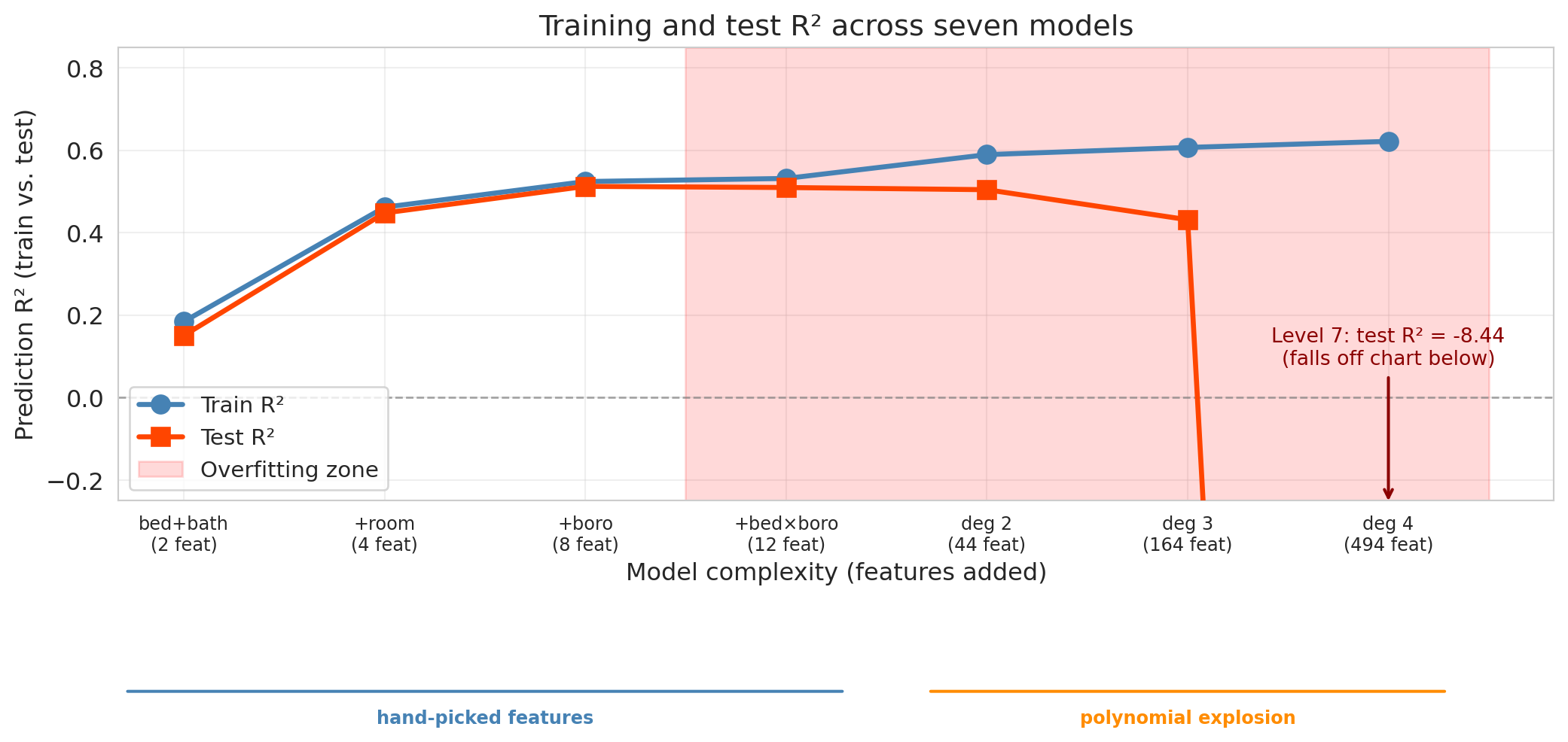
Before we plot, pause on the prediction you sketched a moment ago. Training $R^2$ increases monotonically across these levels: because each level's feature set contains the previous level's (the levels are *nested*), adding features can only help fit the training data — in the worst case, the new coefficients are set to zero. Test $R^2$ tells a different story.
Note that the seven levels represent two different kinds of complexity. Levels 1–4 add hand-picked feature *groups* — room type, borough, interactions — each motivated by a substantive hypothesis about pricing. Levels 5–7 use `PolynomialFeatures` to generate *all* products of the base features up to a given degree, a brute-force explosion with no hypothesis behind it. We plot them on one axis to make the comparison concrete, but when the curve collapses in Levels 5–7, that's driven both by "too many features" and by "features chosen mechanically," and separating those is a harder experiment.
```{python}
fig, ax = plt.subplots(figsize=(11, 6))

x_pos = np.arange(len(level_names))
ax.plot(x_pos, train_r2s, 'o-', color='steelblue', linewidth=2.5, markersize=9,
        label='Train R²', zorder=3)
ax.plot(x_pos, test_r2s, 's-', color='orangered', linewidth=2.5, markersize=9,
        label='Test R²', zorder=3)

# Shade the overfitting region (after test R² peaks)
best_test_idx = int(np.argmax(test_r2s))
if best_test_idx < len(level_names) - 1:
    ax.axvspan(best_test_idx + 0.5, len(level_names) - 0.5, alpha=0.15, color='red',
               label='Overfitting zone')

# Clip y-axis so Levels 1-6 stay readable; Level 7's test R² is dramatically
# negative and we annotate it as off-chart rather than let it drive the scale.
ax.set_ylim(-0.25, 0.85)
ax.axhline(y=0, color='gray', linestyle='--', linewidth=1, alpha=0.7)

if test_r2s[-1] < -0.25:
    ax.annotate(
        f'Level 7: test R² = {test_r2s[-1]:.2f}\n(falls off chart below)',
        xy=(len(level_names) - 1, -0.26),
        xytext=(len(level_names) - 1, 0.08),
        ha='center',
        fontsize=10, color='darkred',
        arrowprops=dict(arrowstyle='->', color='darkred', lw=1.5),
        annotation_clip=False,
    )

ax.set_xticks(x_pos)
ax.set_xticklabels([f'{n}\n({nf} feat)' for n, nf in zip(
    ['bed+bath', '+room', '+boro', '+bed×boro',
     'deg 2', 'deg 3', 'deg 4'],
    n_features_list)], fontsize=9)
ax.set_xlabel('Model complexity (features added)')
ax.set_ylabel('Prediction R² (train vs. test)')
ax.set_title('Training and test R² across seven models')
ax.legend(fontsize=11, loc='lower left')
ax.grid(True, alpha=0.3)

# Visual grouping under the axis: Levels 1-4 are hand-picked, 5-7 are polynomial.
ax.annotate('', xy=(3.3, -0.42), xytext=(-0.3, -0.42),
            xycoords=('data', 'axes fraction'),
            arrowprops=dict(arrowstyle='-', color='steelblue', lw=1.5),
            annotation_clip=False)
ax.annotate('', xy=(6.3, -0.42), xytext=(3.7, -0.42),
            xycoords=('data', 'axes fraction'),
            arrowprops=dict(arrowstyle='-', color='darkorange', lw=1.5),
            annotation_clip=False)
ax.text(1.5, -0.46, 'hand-picked features', ha='center', va='top',
        fontsize=9, color='steelblue', fontweight='bold',
        transform=ax.get_xaxis_transform())
ax.text(5.0, -0.46, 'polynomial explosion', ha='center', va='top',
        fontsize=9, color='darkorange', fontweight='bold',
        transform=ax.get_xaxis_transform())

plt.tight_layout()
save_for_slides('seven-level-traintest')
plt.show()
```
The experiment reveals three phases:
1. **Improvement** (Levels 1–3). Adding room type and borough captures real signal — both train and test $R^2$ jump. The gap between them is small: the model is learning genuine patterns.
2. **Diminishing returns** (Levels 4–5). The bedroom × borough interactions and degree-2 polynomial terms add modest value. Train $R^2$ keeps climbing, but test $R^2$ plateaus or dips slightly. The widening gap signals that some of the "improvement" is fitting noise.
3. **Overfitting** (Levels 6–7). The model now has hundreds of features — still fewer than the training set, but the extra flexibility is spent chasing noise instead of signal. Train $R^2$ keeps creeping up while test $R^2$ drops, and the widening gap between them is the signature of overfitting.
```{python}
#| echo: false
print(f"Level 7: test R² = {test_r2s[-1]:.2f}")
print(f" {n_features_list[-1]:,} features, {len(y_train):,} training observations "
f"({n_features_list[-1] / len(y_train):.0%} of the training set size)")
```
**The warning sign:** a large gap between train and test $R^2$, with test $R^2$ moving in the wrong direction as we add features. Push complexity far enough and test $R^2$ can even drop *below zero* — meaning the model's predictions on held-out listings are worse than simply predicting the test-set mean every time. Adding features has a limit; past it, more features make the model worse, not better.
:::{.callout-tip}
## Think about it
Why does training $R^2$ always go up as we add nested feature sets? And why can test $R^2$ go *negative* in principle? Take a minute before reading on — the answer is hiding in the definition of $R^2$.
:::
Adding a feature can only help fit the training data: in the worst case the model sets the new coefficient to zero and recovers the previous fit. But on test data, no such guarantee holds. Recall from [Chapter 4](lec04-regression.qmd) that $R^2 = 1 - \|\epsilon\|^2 / \|y - \bar{y}\|^2$, where $\epsilon = y - \hat{y}$ are the residuals and $\bar{y}$ is the mean of $y$. On the test set, sklearn computes the denominator from the *held-out* $y$ and the numerator from $y - \hat{y}$ on that same held-out set. When the model's predictions on new data are worse than predicting the test-set mean every time, $\|\epsilon\|^2$ exceeds $\|y - \bar{y}\|^2$ and $R^2$ drops below zero. Negative test $R^2$ is the extreme signature of catastrophic overfitting.
As von Neumann put it, "with four parameters I can fit an elephant, and with five I can make him wiggle his trunk." Level 7 packs in 494 features — enough to chase noise no honest pattern supports, and the test set exposes it.
## The bias-variance tradeoff
The feature experiment showed a striking pattern: test error first decreased and then increased as models got more complex. Why? The **bias-variance tradeoff** explains the pattern.
:::{.callout-important}
## Definition: Bias and Variance
Two sources of prediction error:
- **Bias** is the error from oversimplifying. The model can't capture the true pattern. High bias corresponds to **underfitting** — like fitting a straight line through a curved relationship.
- **Variance** is the error from over-complicating. The model is so flexible that it's too sensitive to the particular training data it happened to see. High variance corresponds to **overfitting** — the model learns noise as if it were signal.
:::
### The data-generating model
Before we can measure bias and variance, we have to say what we think the world looks like. Throughout this chapter we assume each observation is generated as
$$y = f(x) + \varepsilon, \qquad \varepsilon \sim \mathcal{N}(0, \sigma^2)$$
where $f(x)$ is the true relationship between features and outcome — the **signal** — and $\varepsilon$ is mean-zero Gaussian **noise** independent across observations. The noise is what keeps even a perfect model from ever scoring zero error: $\sigma^2$ is the **irreducible noise floor**.
We never see $f$ directly. A model fit to a training set $\mathcal{D}$ produces a prediction function $\hat{f}_{\mathcal{D}}(x)$ — its best guess at $f(x)$. Bias will measure how far the *average* of $\hat{f}_{\mathcal{D}}(x)$ (across random $\mathcal{D}$) falls from $f(x)$; variance will measure how much individual fits scatter around that average. Both are expectations *over the random draw of the training set*, which means they're properties you can only measure when you can generate many fresh datasets from a known $f$ — i.e., on simulated data. On a real dataset you have one draw from $\mathcal{D}$ and one fit $\hat{f}_{\mathcal{D}}$; you cannot read bias or variance off it.
:::{.callout-warning}
## You can only measure bias and variance on simulated data
On a real dataset you have one training set, one fit, and no access to $f$. There is no way to ask "what is the average prediction at $x$ across training sets?" or "how much does $\hat f(x)$ vary?" — both questions need access to the data-generating process. The decomposition is a *conceptual* tool on real data (it explains *why* test error is U-shaped) and a *measurable* tool only on synthetic data where we chose $f$ and $\sigma$ ourselves. Every real-data diagnostic in this chapter — train-test gaps, CV curves — reads the *symptoms* of high bias or high variance, not the quantities themselves.
:::
| | Too few features | Just right | Too many features |
|---|---|---|---|
| **Bias** | High (underfitting) | Low | Low |
| **Variance** | Low | Low | High (overfitting) |
| **Test error** | High | **Low** | High |
### Seeing bias and variance directly
The Airbnb experiment showed the pattern. But to *measure* bias and variance, we need something the Airbnb data can't give us: the true price function $f$. Without it, we can't tell whether the average of many fits is close to the truth (low bias) or systematically off (high bias). So for one section we leave Airbnb and work with a synthetic dataset where we *know* the truth.
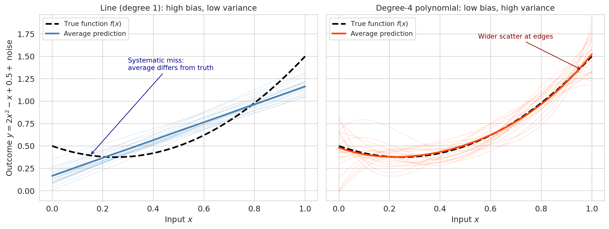
The true relationship is a quadratic:
$$f(x) = 2x^2 - x + 0.5$$
We add Gaussian noise with $\sigma = 0.3$, draw 200 different training sets of 50 points each, and fit two models to each: a **line** (degree 1 — high bias, low variance) and a **degree-4 polynomial** (low bias, high variance).
```{python}
np.random.seed(0)

def true_fn(x):
    """The true function we are trying to learn."""
    return 2 * x**2 - x + 0.5

sigma_noise = 0.3
n_train_pts = 50
n_repeats = 200
n_plot = 20  # how many to overlay

x_grid = np.linspace(0, 1, 200)
f_true = true_fn(x_grid)

# Store predictions from each training set
preds_linear = np.zeros((n_repeats, len(x_grid)))
preds_poly4 = np.zeros((n_repeats, len(x_grid)))

for i in range(n_repeats):
    x_tr = np.random.uniform(0, 1, n_train_pts)
    y_tr = true_fn(x_tr) + np.random.normal(0, sigma_noise, n_train_pts)

    # Fit line (degree 1)
    coef_lin = np.polyfit(x_tr, y_tr, 1)
    preds_linear[i] = np.polyval(coef_lin, x_grid)

    # Fit degree-4 polynomial
    coef_p4 = np.polyfit(x_tr, y_tr, 4)
    preds_poly4[i] = np.polyval(coef_p4, x_grid)
```
Overlaying the 20 fits reveals each source of error directly.
```{python}
fig, axes = plt.subplots(1, 2, figsize=(13, 5), sharey=True)

# Left: linear model (high bias, low variance)
for i in range(n_plot):
    axes[0].plot(x_grid, preds_linear[i], color='steelblue', alpha=0.15, linewidth=1)
axes[0].plot(x_grid, f_true, 'k--', linewidth=2.5, label='True function $f(x)$')
axes[0].plot(x_grid, preds_linear.mean(axis=0), color='steelblue', linewidth=2.5,
             label='Average prediction')
axes[0].annotate('Systematic miss:\naverage differs from truth',
                 xy=(0.15, true_fn(0.15)), xytext=(0.3, 1.35),
                 fontsize=10, color='darkblue',
                 arrowprops=dict(arrowstyle='->', color='darkblue', lw=1))
axes[0].set_title('Line (degree 1): high bias, low variance', fontsize=12)
axes[0].set_xlabel('Input $x$')
axes[0].set_ylabel('Outcome $y = 2x^2 - x + 0.5 + $ noise')
axes[0].legend(fontsize=10, loc='upper left')

# Right: degree-4 polynomial (low bias, high variance)
for i in range(n_plot):
    axes[1].plot(x_grid, preds_poly4[i], color='orangered', alpha=0.15, linewidth=1)
axes[1].plot(x_grid, f_true, 'k--', linewidth=2.5, label='True function $f(x)$')
axes[1].plot(x_grid, preds_poly4.mean(axis=0), color='orangered', linewidth=2.5,
             label='Average prediction')
axes[1].annotate('Wider scatter at edges',
                 xy=(0.96, 1.35), xytext=(0.55, 1.7),
                 fontsize=10, color='darkred',
                 arrowprops=dict(arrowstyle='->', color='darkred', lw=1))
axes[1].set_title('Degree-4 polynomial: low bias, high variance', fontsize=12)
axes[1].set_xlabel('Input $x$')
axes[1].legend(fontsize=10, loc='upper left')

plt.tight_layout()
plt.show()
```
The left panel shows 20 linear fits overlaid. They cluster tightly together (low variance) but *systematically miss the curvature* — they're all wrong in the same direction (high bias). The right panel shows 20 degree-4 polynomial fits. Their average (solid line) closely tracks the true function (low bias), but individual fits scatter widely (high variance), especially near the edges of the data.
:::{.callout-note}
## Parametric extrapolation in the real world
The synthetic experiment shows bias as a systematic miss when the model class can't capture the truth. Rigid parametric models make the same mistake in production. In early 2020, the influential IHME COVID-19 model forecast U.S. deaths by fitting a Gaussian-like curve — a symmetric bell shape — to the daily death counts. Because the parametric form assumed deaths would decline as fast as they rose, the model repeatedly projected the pandemic was about to end even as deaths were still climbing (Jewell et al., *JAMA*, 2020). The assumed shape, not the data, was driving the predictions. The broader lesson: parametric forms extrapolate by their assumed shape, not by the data. Held-out scores catch in-distribution overfitting — they cannot save you from a model whose shape is wrong at the edges.
:::
Now we can write the decomposition formally. Recall $y = f(x) + \varepsilon$ from the data-generating model above, and let $\hat{f}_{\mathcal{D}}(x)$ be the model fit to training set $\mathcal{D}$. Each of the 200 runs in the synthetic experiment above drew a new $\mathcal{D}$, fit a model, and produced one $\hat{f}_{\mathcal{D}}$. At a fixed test point $x$, the 200 predictions have an average and a spread — and those are exactly the cloud of blue lines in the left panel and the cloud of orange curves in the right.
$$\text{Bias}(x) = \mathbb{E}_{\mathcal{D}}[\hat{f}_{\mathcal{D}}(x)] - f(x)$$
$$\text{Variance}(x) = \mathbb{E}_{\mathcal{D}}\bigl[(\hat{f}_{\mathcal{D}}(x) - \mathbb{E}_{\mathcal{D}}[\hat{f}_{\mathcal{D}}(x)])^2\bigr]$$
For a fresh test observation $y = f(x) + \varepsilon$ with $\varepsilon$ independent of the training data, the expected squared prediction error decomposes into three pieces:^[The decomposition is usually traced to Geman, Bienenstock, and Doursat, "Neural Networks and the Bias/Variance Dilemma," *Neural Computation*, 1992.]
$$\mathbb{E}\bigl[(y - \hat{f}_{\mathcal{D}}(x))^2\bigr] = \text{Bias}^2(x) + \text{Variance}(x) + \sigma^2$$
:::{.callout-note}
## Where does the decomposition come from?
Add and subtract $\mathbb{E}_{\mathcal{D}}[\hat f_{\mathcal{D}}(x)]$ inside the squared error, expand, and note that all three cross-terms vanish (the test-point noise $\varepsilon$ is independent of the training data, and $\hat f_{\mathcal{D}}(x) - \mathbb{E}_{\mathcal{D}}[\hat f_{\mathcal{D}}(x)]$ has mean zero under $\mathbb{E}_{\mathcal{D}}$). Three independent sources of error add up.
:::
The first two terms depend on the model. The third, $\sigma^2$, is the **irreducible noise** — randomness no model can explain. Simple models have high bias and low variance; complex models have low bias and high variance. The best model minimizes the sum of the first two; $\sigma^2$ sets the floor.
Now we can make the decomposition numerical for the synthetic experiment, averaging across a uniform grid of test points:
```{python}
# Compute the bias-variance decomposition on the x_grid
bias_linear = preds_linear.mean(axis=0) - f_true
var_linear = preds_linear.var(axis=0)
bias_poly4 = preds_poly4.mean(axis=0) - f_true
var_poly4 = preds_poly4.var(axis=0)

print("Bias-variance decomposition (averaged uniformly over x in [0, 1])")
print("=" * 65)
print(f"{'':20s} {'Bias²':>8s} {'Variance':>10s} {'σ²':>8s} {'Total MSE':>10s}")
print(f"{'Line (degree 1)':20s} {(bias_linear**2).mean():8.4f} {var_linear.mean():10.4f} "
      f"{sigma_noise**2:8.4f} {(bias_linear**2).mean() + var_linear.mean() + sigma_noise**2:10.4f}")
print(f"{'Poly (degree 4)':20s} {(bias_poly4**2).mean():8.4f} {var_poly4.mean():10.4f} "
      f"{sigma_noise**2:8.4f} {(bias_poly4**2).mean() + var_poly4.mean() + sigma_noise**2:10.4f}")
```
The line has high bias (it can't capture the curvature) but low variance. The degree-4 polynomial has near-zero bias but higher variance. The polynomial wins on total expected error because its bias reduction outweighs the variance increase. The $\sigma^2 = 0.09$ noise floor is the same for both — no model can reduce it.
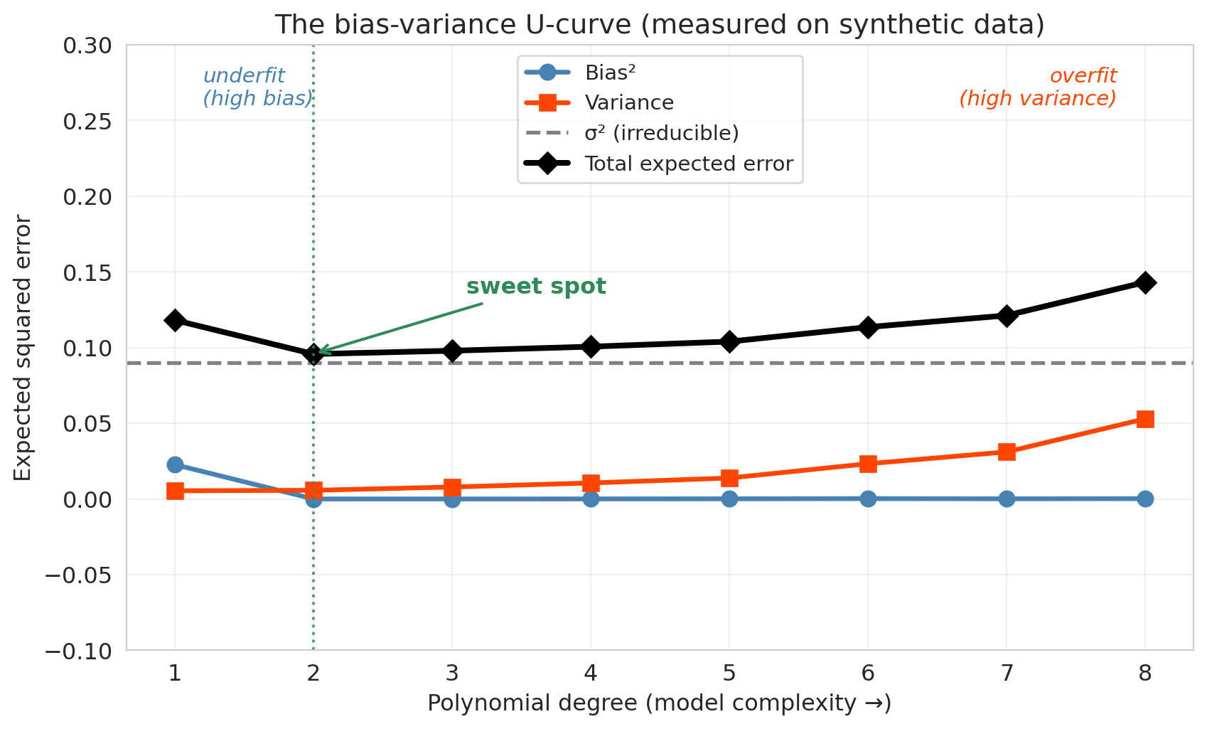
### The U-curve
Now turn the knob: run the synthetic experiment at every polynomial degree from 1 to 8 and plot bias$^2$, variance, and the total expected error against degree. Bias$^2$ drops as the model becomes flexible enough to capture the truth. Variance rises as the flexibility starts fitting noise. Their sum — the total expected error — is U-shaped, with the irreducible noise $\sigma^2$ as a floor no model can cross.
```{python}
#| label: fig-bias-variance-ucurve
# Monte Carlo sweep: for each polynomial degree, draw 200 fresh training sets,
# fit the model, and average bias² and variance across a uniform grid of test points.
np.random.seed(1)

degree_sweep = np.arange(1, 9)
bias_sq_per_degree = np.zeros(len(degree_sweep))
var_per_degree = np.zeros(len(degree_sweep))

for j, d in enumerate(degree_sweep):
    preds_d = np.zeros((n_repeats, len(x_grid)))
    for i in range(n_repeats):
        x_tr = np.random.uniform(0, 1, n_train_pts)
        y_tr = true_fn(x_tr) + np.random.normal(0, sigma_noise, n_train_pts)
        coefs = np.polyfit(x_tr, y_tr, d)
        preds_d[i] = np.polyval(coefs, x_grid)
    mean_pred = preds_d.mean(axis=0)
    bias_sq_per_degree[j] = ((mean_pred - f_true) ** 2).mean()
    var_per_degree[j] = preds_d.var(axis=0).mean()

sigma_sq = sigma_noise ** 2
total_per_degree = bias_sq_per_degree + var_per_degree + sigma_sq

fig, ax = plt.subplots(figsize=(9, 5.5))
ax.plot(degree_sweep, bias_sq_per_degree, 'o-', label='Bias²',
        color='steelblue', linewidth=2.5, markersize=8)
ax.plot(degree_sweep, var_per_degree, 's-', label='Variance',
        color='orangered', linewidth=2.5, markersize=8)
ax.axhline(sigma_sq, label='σ² (irreducible)', color='gray', linewidth=2, linestyle='--')
ax.plot(degree_sweep, total_per_degree, 'D-', label='Total expected error',
        color='black', linewidth=3, markersize=8)

sweet_idx = int(np.argmin(total_per_degree))
ax.axvline(degree_sweep[sweet_idx], color='seagreen', linestyle=':', alpha=0.8)
ax.annotate('sweet spot',
            xy=(degree_sweep[sweet_idx], total_per_degree[sweet_idx]),
            xytext=(degree_sweep[sweet_idx] + 1.1, total_per_degree[sweet_idx] + 0.04),
            fontsize=12, color='seagreen', fontweight='bold',
            arrowprops=dict(arrowstyle='->', color='seagreen', lw=1.5))

ax.text(1.2, 0.26, 'underfit\n(high bias)', fontsize=11, color='steelblue',
        style='italic', ha='left')
ax.text(7.8, 0.26, 'overfit\n(high variance)', fontsize=11, color='orangered',
        style='italic', ha='right')

ax.set_xlabel('Polynomial degree (model complexity →)')
ax.set_ylabel('Expected squared error')
ax.set_title('The bias-variance U-curve (measured on synthetic data)')
ax.set_xticks(degree_sweep)
ax.set_ylim(-0.1, 0.3)
ax.legend(fontsize=11, loc='upper center')
ax.grid(True, alpha=0.3)
plt.tight_layout()
save_for_slides('bias-variance-ucurve')
plt.show()
```
:::{.callout-tip}
## Think about it
Go back to the Airbnb 7-level plot. Which levels show high bias? Which show high variance? Where is the sweet spot? (Hint: look at both the absolute test $R^2$ *and* the gap between train and test.)
:::
The synthetic experiment visited two points on this curve — the line (far left, dominated by bias) and the degree-4 polynomial (mid-way, near the valley). The Airbnb experiment walked the same curve, just with a different x-axis: going from bedrooms+bathrooms (underfit) through polynomial interactions (overfit). Low test $R^2$ at Level 1 signals high bias — the model is too simple to capture the real patterns. The large gap between train and test $R^2$ at the highest levels signals high variance — the model is fitting noise.
### Fixing overfitting and underfitting
Once you've diagnosed which way the model is failing, the fix is mechanical.
| symptom | diagnosis | fix |
|:---|:---|:---|
| training $R^2$ is low, test $R^2$ is close to it | **high bias** (underfitting) | add features, use a more flexible model class |
| training $R^2$ is high, test $R^2$ is much lower | **high variance** (overfitting) | reduce features, regularize (Lasso / Ridge), or **add more training data** |
| both $R^2$ are high and close | sweet spot | nothing to fix |
| both are low, gap is small | high bias **and** high noise | check for data quality, mismeasured features, wrong outcome |
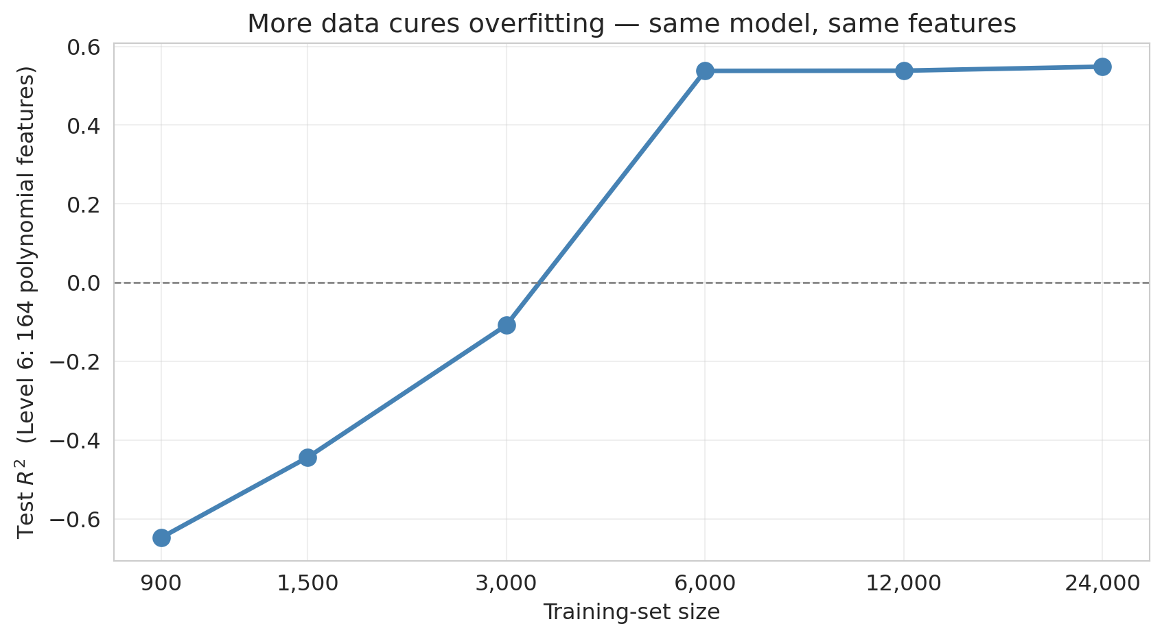
The add-features and reduce-features levers we've already seen (walking Levels 1-7). The lever we *haven't* demonstrated is **more training data**. The intuition: variance comes from the model being too sensitive to the particular training set it saw. Give it more training observations and the particular-set wiggle averages out — same model, same features, lower variance.
To see it, take the Level-6 model (164 polynomial features, catastrophically overfit on 900 training observations) and refit it with progressively more training data, all the way up to the full listings dataset.
```{python}
#| label: fig-more-data-cures-overfitting
# Level 6 is the catastrophic-overfit regime at 900 training observations.
# Sweep training-set size from 900 to ~30,000 and watch test R² recover.
from sklearn.model_selection import train_test_split
from sklearn.linear_model import LinearRegression

df_full = (
    listings[['price', 'bedrooms', 'bathrooms', 'room_type', 'neighbourhood_group_cleansed']]
    .dropna()
    .rename(columns={'neighbourhood_group_cleansed': 'borough'})
    .loc[lambda d: d['price'].between(10, 500)]
    .reset_index(drop=True)
)
base_full = pd.concat([
    df_full[['bedrooms', 'bathrooms']],
    pd.get_dummies(df_full['room_type'], drop_first=True, prefix='room'),
    pd.get_dummies(df_full['borough'],   drop_first=True, prefix='boro'),
], axis=1)
y_full = df_full['price']

X_full_level6 = build_features(base_full, 6)

train_sizes = [900, 1500, 3000, 6000, 12000, 24000]
test_r2_by_size = []
np.random.seed(0)
for n_train in train_sizes:
    test_r2s = []
    for trial in range(10):  # average across 10 random splits at each size
        idx = np.random.permutation(len(df_full))[:n_train + 2000]
        tr, te = idx[:n_train], idx[n_train:]
        X_tr, X_te = X_full_level6.iloc[tr], X_full_level6.iloc[te]
        y_tr, y_te = y_full.iloc[tr], y_full.iloc[te]
        model = LinearRegression().fit(X_tr, y_tr)
        test_r2s.append(r2_score(y_te, model.predict(X_te)))
    test_r2_by_size.append(np.mean(test_r2s))

fig, ax = plt.subplots(figsize=(9, 5))
ax.plot(train_sizes, test_r2_by_size, 'o-', color='steelblue', linewidth=2.5, markersize=9)
ax.axhline(0, color='gray', linestyle='--', linewidth=1)
ax.set_xlabel('Training-set size')
ax.set_ylabel('Test $R^2$  (Level 6: 164 polynomial features)')
ax.set_title('More data cures overfitting — same model, same features')
ax.set_xscale('log')
ax.set_xticks(train_sizes)
ax.set_xticklabels([f'{n:,}' for n in train_sizes])
ax.grid(True, alpha=0.3)
plt.tight_layout()
save_for_slides('more-data-cures-overfitting')
plt.show()

print("Level 6 test R² vs training-set size:")
for n, r2 in zip(train_sizes, test_r2_by_size):
    print(f"  n = {n:>6,}: test R² = {r2:.3f}")
```
With 900 training rows, the 164-feature model has test $R^2$ far below zero — worse than predicting the mean. Each doubling of the training set shrinks the "chase noise" failure mode, and by the time the training set reaches the tens of thousands, the same model that was catastrophic at 900 rows is now in a competitive range. The moral for practitioners is direct: **if your model is overfit and you can get more data, that is usually the strongest single lever you have.** More data does not fix bias — a linear model through curved signal stays biased no matter how many rows you throw at it — but for variance, more data is often the cleanest answer.
## Train, validation, and test sets
We read the 7-level plot and spotted the best test $R^2$ somewhere in the middle of the curve, around Level 4. But using the test set to choose a complexity level means we've already peeked at the data we were holding out for final evaluation — the test score for the "chosen" model is no longer an honest estimate of how it will generalize. The more models we compare on the same test set, the more likely we are to pick one that got lucky on that particular split, and the more optimistic our reported "test" $R^2$ becomes.
The solution: a **three-way split**.
:::{.callout-important}
## Definition: The three-way split
- **Training set** — the data the model learns from.
- **Validation set** — held-out data used to *choose* model complexity (number of features, regularization strength, tree depth). The modeler sees validation scores and adjusts accordingly.
- **Test set** — held-out data touched *only once*, at the very end, to report final performance. No modeling decisions depend on the test set.
:::
Think of the three roles the way you'd think about studying for an exam. The training data is the textbook you study from. The validation data is a practice exam you take while you still have time to change your approach — if you do badly, you try a different study strategy. The test data is the final exam: you walk in, you take it once, and whatever score you earn is the one that counts. If you were allowed to take the final three times and report the highest of the three, your final wouldn't be a fair estimate of what you know — and the same thing happens when you reuse a test set to pick a model.
### Worked example
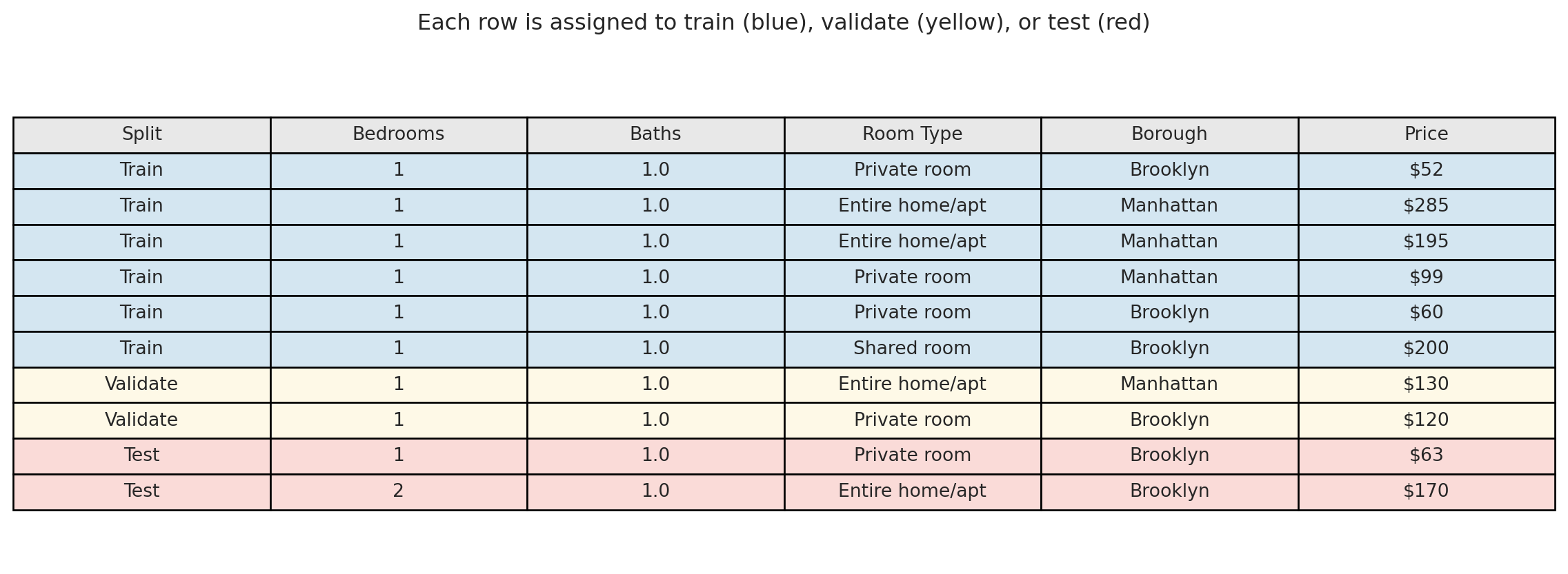
We split our 1,500 Airbnb listings into three groups: 60% for training (900 listings), 20% for validation (300 listings), and 20% for testing (300 listings).
```{python}
# Three-way split: 60% train, 20% validate, 20% test
idx_train_3, idx_temp = train_test_split(indices, test_size=0.4, random_state=42)
idx_val_3, idx_test_3 = train_test_split(idx_temp, test_size=0.5, random_state=42)

print(f"Train: {len(idx_train_3)}  |  Validate: {len(idx_val_3)}  |  Test: {len(idx_test_3)}")
```
Visualizing the split — each row of the dataset is assigned one role:
```{python}
# Pick a few example rows from each split — 6/2/2 to match the 60/20/20 proportions
example_rows = sorted(idx_train_3[:6]) + sorted(idx_val_3[:2]) + sorted(idx_test_3[:2])
roles = ['Train'] * 6 + ['Validate'] * 2 + ['Test'] * 2

example = df_sub.iloc[example_rows][['bedrooms', 'bathrooms', 'room_type', 'borough', 'price']].copy()

# Display as a colored table
fig, ax = plt.subplots(figsize=(12, 4.5))
ax.axis('off')

colors_map = {'Train': '#d4e6f1', 'Validate': '#fef9e7', 'Test': '#fadbd8'}
cell_colors = [[colors_map[r]] * 6 for r in roles]

display_vals = []
for role, row in zip(roles, example.itertuples(index=False)):
    display_vals.append([
        role, f"{row.bedrooms:.0f}", f"{row.bathrooms:.1f}",
        row.room_type, row.borough, f"${row.price:.0f}"
    ])

table = ax.table(
    cellText=display_vals,
    colLabels=['Split', 'Bedrooms', 'Baths', 'Room Type', 'Borough', 'Price'],
    cellColours=cell_colors,
    colColours=['#e8e8e8'] * 6,
    loc='center',
    cellLoc='center'
)
table.auto_set_font_size(False)
table.set_fontsize(10)
table.scale(1, 1.5)
plt.title('Each row is assigned to train (blue), validate (yellow), or test (red)',
          fontsize=12, pad=20)
plt.tight_layout()
plt.show()
```
The workflow: fit each candidate model on the **blue rows** (training set). Evaluate each on the **yellow rows** (validation set) and pick the best. Then report the winner's performance on the **red rows** (test set) — which no model has ever seen. The test score is our best estimate of how the chosen model will perform in practice.
```{python}
# Demonstrate the three-way workflow
base_train_3 = base.iloc[idx_train_3].reset_index(drop=True)
base_val_3 = base.iloc[idx_val_3].reset_index(drop=True)
base_test_3 = base.iloc[idx_test_3].reset_index(drop=True)
y_train_3 = y_sub.iloc[idx_train_3].reset_index(drop=True)
y_val_3 = y_sub.iloc[idx_val_3].reset_index(drop=True)
y_test_3 = y_sub.iloc[idx_test_3].reset_index(drop=True)

# Fit on train, evaluate on validation
val_r2s = []
for level in range(1, 8):
    X_tr = build_features(base_train_3, level)
    X_val = build_features(base_val_3, level)
    model = LinearRegression().fit(X_tr, y_train_3)
    val_r2s.append(r2_score(y_val_3, model.predict(X_val)))

best_level = int(np.argmax(val_r2s)) + 1
print("Validation R² by level:")
for level, (name, vr2) in enumerate(zip(level_names, val_r2s), start=1):
    marker = " ← best" if level == best_level else ""
    print(f"  {name}: {vr2:.4f}{marker}")

# Final evaluation: refit best model on train, score on test
X_tr_best = build_features(base_train_3, best_level)
X_te_best = build_features(base_test_3, best_level)
best_model = LinearRegression().fit(X_tr_best, y_train_3)
final_test_r2 = r2_score(y_test_3, best_model.predict(X_te_best))
print(f"\nBest model (Level {best_level}) — Test R²: {final_test_r2:.4f}")
```
A 300-listing validation set is still noisy, so don't be surprised that its verdict doesn't always match the earlier train/test reading. Cross-validation — averaging across multiple held-out subsets — is often more reliable, and we introduce it next.
In practice, a common split is 60% train / 20% validation / 20% test. With more data, you can afford a larger training set (say 80/10/10). With less data, cross-validation (below) is a more efficient alternative to a fixed validation set.
## Cross-validation
A single train/test split is noisy — we might get lucky or unlucky. Maybe our test set happened to contain easy-to-predict listings, or maybe the opposite. How do we get a more stable estimate of out-of-sample performance?
**Cross-validation** (CV) solves this problem by systematically rotating which data serves as the test set.
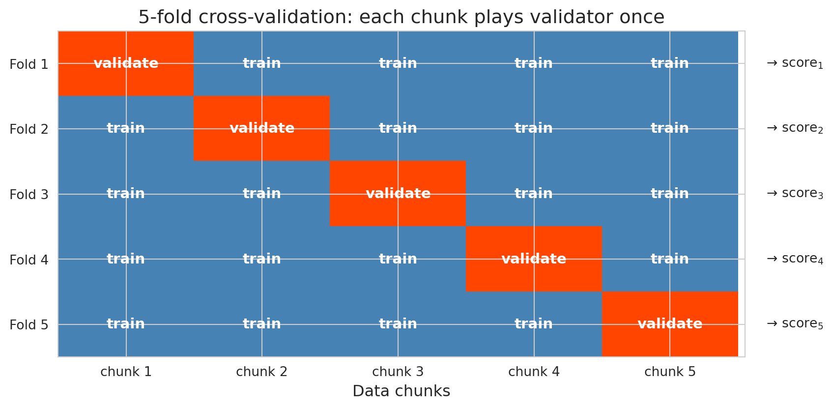
### How 5-fold CV works
1. Split the data randomly into 5 equal-sized **folds**. The folds are just the disjoint partitions of the training data — in 5-fold CV, we chop the training set into five equal-sized chunks.
2. For each fold $k = 1, \ldots, 5$:
- Train the model on the other 4 folds
- Test on fold $k$ and record the score
3. Report the average of the 5 test scores
```{python}
#| label: fig-cv-schematic
# 5-fold CV: rows are iterations, columns are data chunks.
# At iteration k, chunk k is the held-out validation fold; all others are training.
n_folds = 5
grid = np.zeros((n_folds, n_folds))
for k in range(n_folds):
    grid[k, k] = 1  # 1 = validation, 0 = training

fig, ax = plt.subplots(figsize=(9, 4.5))

# Color: 0 (train) = steelblue, 1 (validation) = orangered. Match chapter palette.
from matplotlib.colors import ListedColormap
cmap = ListedColormap(['steelblue', 'orangered'])
ax.imshow(grid, cmap=cmap, aspect='auto', vmin=0, vmax=1)

# Label each cell
for k in range(n_folds):
    for j in range(n_folds):
        label = 'validate' if grid[k, j] == 1 else 'train'
        ax.text(j, k, label, ha='center', va='center',
                color='white', fontsize=11, fontweight='bold')

ax.set_xticks(range(n_folds))
ax.set_xticklabels([f'chunk {j+1}' for j in range(n_folds)], fontsize=10)
ax.set_yticks(range(n_folds))
ax.set_yticklabels([f'Fold {k+1}' for k in range(n_folds)], fontsize=10)
ax.set_xlabel('Data chunks')
ax.set_title('5-fold cross-validation: each chunk plays validator once')

# Right-side "→ score_k" annotations
for k in range(n_folds):
    ax.text(n_folds - 0.35, k, f'  → score$_{k+1}$',
            ha='left', va='center', fontsize=10,
            transform=ax.transData, clip_on=False)

ax.set_xlim(-0.5, n_folds - 0.5 + 0.05)
plt.tight_layout()
save_for_slides('cv-schematic')
plt.show()
```
Every observation is in the test set exactly once. Averaging over 5 folds typically reduces the noise of any single split. (The 5 scores are not independent — the training sets overlap in 3/4 of their observations — so the reduction is weaker than averaging 5 truly independent estimates would give.) Five or ten folds is the usual default.
:::{.callout-tip}
## Think about it
With 5-fold CV, each observation sits in the held-out fold exactly once. How does this differ from running five independent 80/20 random splits? Which approach gives a more reliable performance estimate?
:::
### Leave-one-out CV: when every observation is its own fold
The extreme case of $k$-fold CV is **leave-one-out CV** (LOO-CV), where $k = n$: each training set uses $n - 1$ observations and the "fold" consists of the single held-out observation. Because each training set is nearly the full dataset, LOO-CV's estimate of test error is approximately unbiased — closer to what the final model deployed on all the data would actually achieve.
**When to use LOO-CV.** The regime where LOO-CV pays off is **small $n$**: when your dataset has 50 observations, throwing out 20% of them for validation wastes training data the model needs, and 5-fold CV leaves you comparing models trained on only 40 points. LOO lets each fit use 49 points. Once $n$ is in the low thousands, 5-fold or 10-fold CV gives essentially the same answer for a fraction of the compute, and LOO has two disadvantages worth knowing: (1) it is expensive — you refit the model $n$ times — and (2) its $n$ training sets differ from each other by only a single observation, so the fold-wise errors are highly correlated and the variance of the average shrinks less than a naive $1/n$ argument would predict.
:::{.callout-note collapse="true"}
## Going deeper: approximate leave-one-out CV
Refitting a model $n$ times is wasteful when the change from fitting on $n$ data points to fitting on $n - 1$ is usually tiny. **Approximate LOO-CV** exploits this: using a single fit and a one-step Newton correction, it estimates the held-out-one prediction for every observation without refitting at all, turning an $n$-refit procedure into essentially one fit plus $n$ cheap linear-algebra updates. For generalized linear models the approximation is very close to true LOO when no single observation dominates the fit; for models with influential points or weak regularization it can be diagnosed and improved.
Tamara Broderick's group has built out the theory and practical diagnostics for this approach — see Giordano, Stephenson, Liu, Jordan, and Broderick, "A Swiss Army Infinitesimal Jackknife," AISTATS 2019, and follow-up work. The point for this chapter is that "LOO is too slow" is an outdated excuse in most applied settings: approximate LOO gives you near-LOO accuracy at near-single-fit cost.
:::
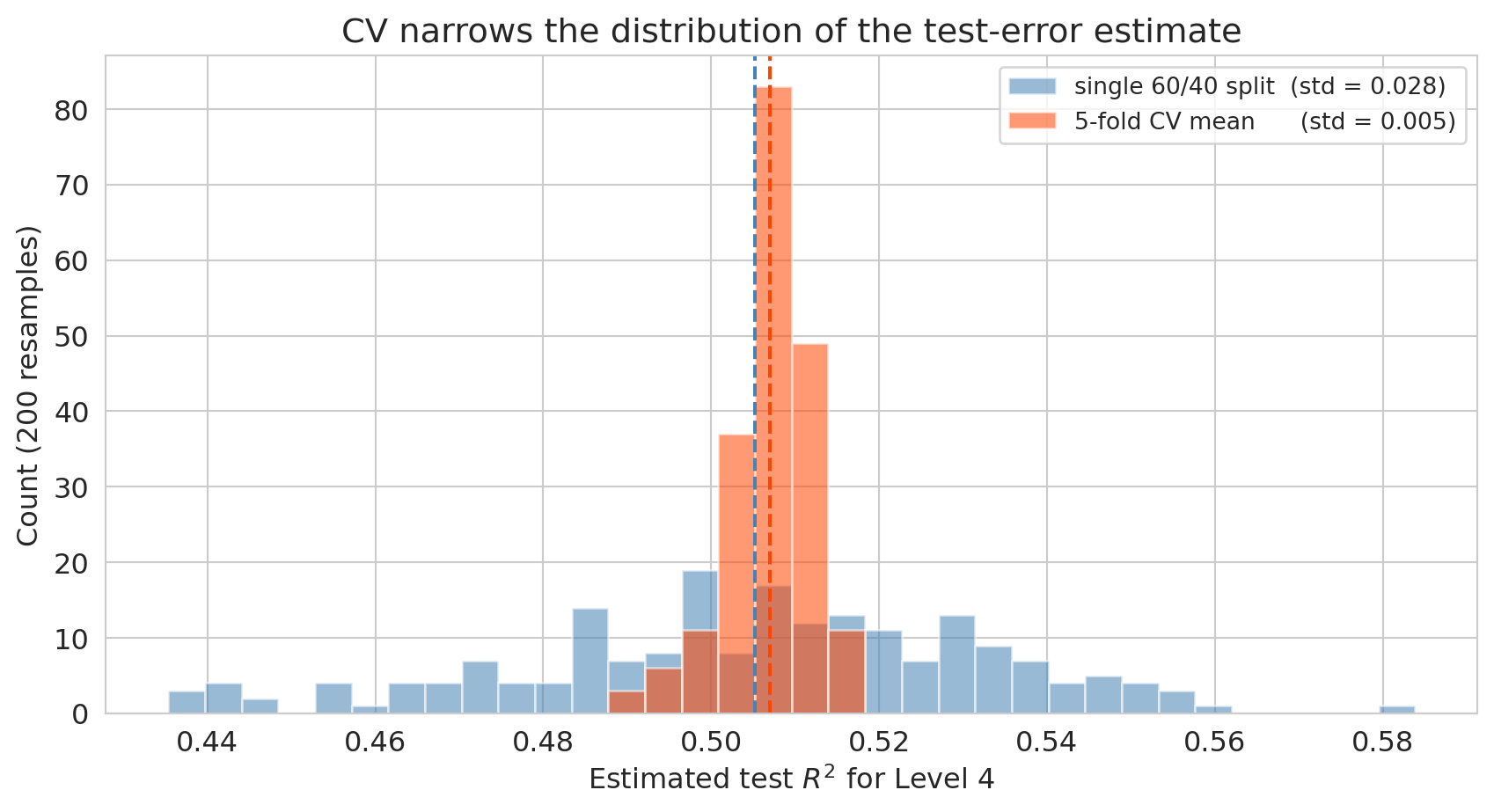
### Why CV beats a single split: a variance-reduction demo
The claim is that cross-validation gives a *more stable* estimate of test performance than any single train/test split. To see it, pick one model — say Level 4 of the Airbnb complexity ladder — and ask: if I resample the train/test split many times with different random seeds, how much does each method's estimate of test $R^2$ bounce around?
```{python}
#| label: fig-cv-variance-reduction
# Monte Carlo: fix Level 4 (the sweet spot region), resample the random split many
# times, and compare the spread of single-split R² vs. 5-fold CV R².
from sklearn.model_selection import cross_val_score, train_test_split, KFold

rng_seeds = np.arange(200)
X_level4 = build_features(base, 4)

single_split_r2 = np.empty(len(rng_seeds))
cv_mean_r2     = np.empty(len(rng_seeds))

for i, seed in enumerate(rng_seeds):
    # single 60/40 split, fit OLS, score on held-out 40%
    X_tr, X_te, y_tr, y_te = train_test_split(
        X_level4, y_sub, test_size=0.4, random_state=int(seed))
    model = LinearRegression().fit(X_tr, y_tr)
    single_split_r2[i] = r2_score(y_te, model.predict(X_te))

    # 5-fold CV on the same data, different random fold assignment
    scores = cross_val_score(
        LinearRegression(), X_level4, y_sub,
        cv=KFold(n_splits=5, shuffle=True, random_state=int(seed)),
        scoring='r2')
    cv_mean_r2[i] = scores.mean()

print(f"Single 60/40 split  — mean: {single_split_r2.mean():.3f}, std: {single_split_r2.std():.3f}")
print(f"5-fold CV mean      — mean: {cv_mean_r2.mean():.3f}, std: {cv_mean_r2.std():.3f}")

fig, ax = plt.subplots(figsize=(9, 5))
bins = np.linspace(min(single_split_r2.min(), cv_mean_r2.min()),
                   max(single_split_r2.max(), cv_mean_r2.max()), 35)
ax.hist(single_split_r2, bins=bins, alpha=0.55, color='steelblue',
        label=f'single 60/40 split  (std = {single_split_r2.std():.3f})')
ax.hist(cv_mean_r2, bins=bins, alpha=0.55, color='orangered',
        label=f'5-fold CV mean      (std = {cv_mean_r2.std():.3f})')
ax.axvline(single_split_r2.mean(), color='steelblue', linestyle='--', linewidth=1.5)
ax.axvline(cv_mean_r2.mean(), color='orangered', linestyle='--', linewidth=1.5)
ax.set_xlabel('Estimated test $R^2$ for Level 4')
ax.set_ylabel('Count (200 resamples)')
ax.set_title('CV narrows the distribution of the test-error estimate')
ax.legend(fontsize=10)
plt.tight_layout()
save_for_slides('cv-variance-reduction')
plt.show()
```
Both histograms are centered on roughly the same mean — neither method is systematically biased — but the 5-fold CV distribution is **much narrower**. That smaller standard deviation is the whole point of CV: whichever random seed you happen to draw, your CV estimate will be close to the truth, whereas a single split can land far from it. Now imagine you're comparing Level 3, Level 4, and Level 5 on this data: if each estimate has a standard deviation of 0.08, you can't reliably rank them; if the standard deviation drops to 0.02, the ranking is trustworthy. **Reducing the variance of the estimate directly improves your ability to choose the right model.** That is why CV is the standard tool, not a theoretical nicety.
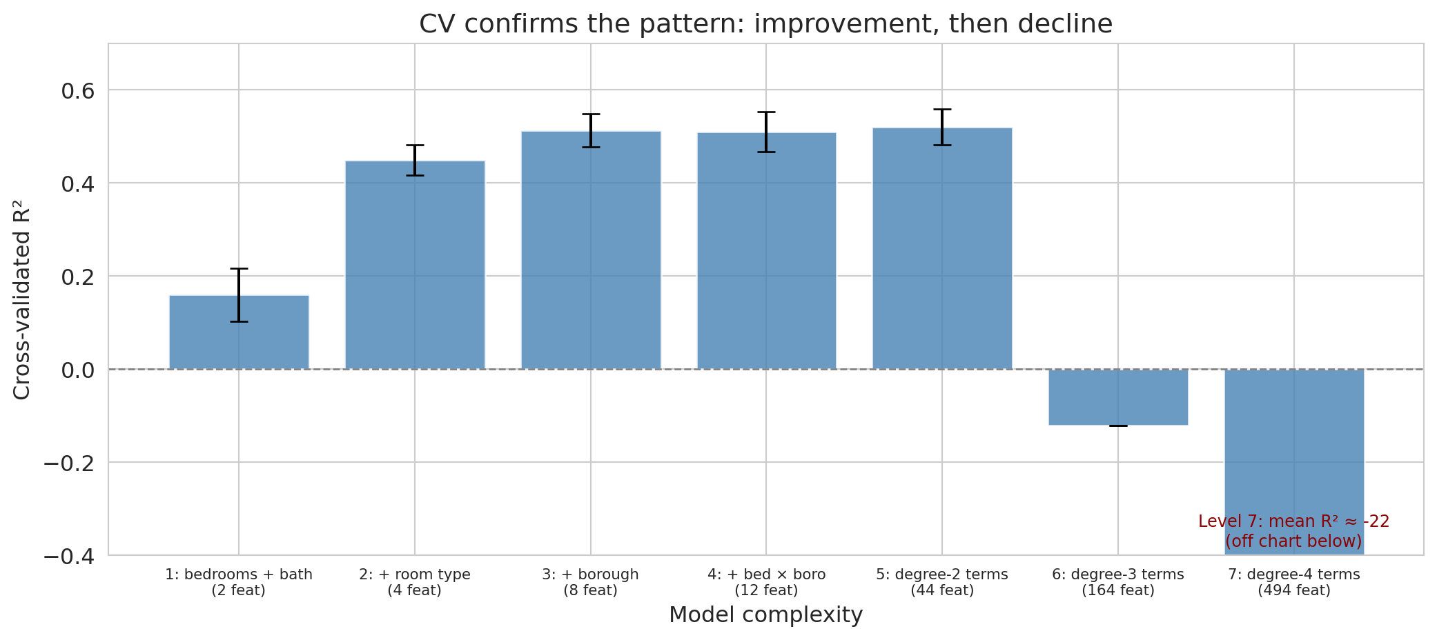
Let's apply 5-fold CV to our complexity levels.
```{python}
# Build base features on the full subsample for CV (levels 1-7)
cv_results = []
for level in range(1, 8):
    X_all = build_features(base, level)
    scores = cross_val_score(
        LinearRegression(), X_all, y_sub,
        cv=KFold(n_splits=5, shuffle=True, random_state=42),
        scoring='r2'
    )
    cv_results.append({
        'model': level_names[level-1],
        'features': X_all.shape[1],
        'cv_mean': scores.mean(),
        'cv_std': scores.std()
    })
    print(f"Level {level}: CV R² = {scores.mean():.4f} ± {scores.std():.4f}  ({X_all.shape[1]} features)")

cv_df = pd.DataFrame(cv_results)
```
The CV scores give a more stable comparison than the single train/test split. Let's visualize them with error bars showing the standard deviation across folds.
```{python}
fig, ax = plt.subplots(figsize=(11, 5))
# Hide error bars on the off-chart levels — their standard deviations are orders
# of magnitude larger than the visible y-range and would drown the plot in whiskers.
visible_err = np.where(cv_df['cv_std'] < 0.5, cv_df['cv_std'], 0)
ax.bar(range(len(cv_df)), cv_df['cv_mean'], yerr=visible_err,
       capsize=5, color='steelblue', alpha=0.8, edgecolor='white')
ax.axhline(y=0, color='gray', linestyle='--', linewidth=1)
ax.set_xticks(range(len(cv_df)))
ax.set_xticklabels([f'{r["model"]}\n({r["features"]} feat)' for _, r in cv_df.iterrows()],
                   fontsize=8)
ax.set_xlabel('Model complexity')
ax.set_ylabel('Cross-validated R²')
ax.set_title('CV confirms the pattern: improvement, then decline')

# Clip so Levels 1-5 stay readable; Levels 6-7 are catastrophic and would
# compress the rest of the chart into a sliver if they drove the scale.
ax.set_ylim(-0.4, 0.7)

if cv_df['cv_mean'].iloc[-1] < -0.4:
    ax.text(len(cv_df) - 1, -0.38,
            f"Level 7: mean R² ≈ {cv_df['cv_mean'].iloc[-1]:.0f}\n(off chart below)",
            ha='center', fontsize=9, color='darkred')

plt.tight_layout()
save_for_slides('cv-bars-7levels')
plt.show()

best = cv_df.loc[cv_df['cv_mean'].idxmax()]
print(f"\nBest model by CV: {best['model']} (CV R² = {best['cv_mean']:.4f})")
```
Cross-validation confirms the pattern from the single train/test split: performance improves through the first few levels, then declines as polynomial degree increases. The error bars (standard deviations across folds) quantify uncertainty — overlapping error bars suggest the difference between models is not reliable.
Notice, though, that our three procedures don't always agree on a single "best" level — and that's not a contradiction. Each procedure has its own noise source, and on a 1,500-listing dataset any one number can drift by a few percentage points of $R^2$ from the underlying truth.
There's also a concrete reason the rankings can differ even when the procedures are working correctly: the three procedures use *different amounts* of training data. A train/test split trains on 60% of the subsample (900 listings). The three-way split trains on the same 60% (900 listings) and reserves 20% for validation. Five-fold CV trains on 4/5 of the whole subsample — 1,200 listings per fold, 33% more than the single-split procedures see. A larger training set can support more features before noise swamps signal, so CV's ranking tends to lean toward more complex models than the single-split procedures. That's a feature, not a bug: CV is simulating the model you would actually deploy, which gets to use *all* the data at the end, not just 60% of it.
Cross-validation averages out the most noise and is usually the most trustworthy, so the practical takeaway is that a small cluster of "middle" levels is indistinguishable on this data and CV's ranking is the one to trust.
:::{.callout-warning}
## CV assumes the data can be shuffled
CV relies on the assumption that we can shuffle the data randomly — each fold is representative of the whole. The assumption breaks if the data have temporal structure. You can't train on 2024 data and "test" on 2023 data — the model would be peeking into the future. We'll see time-series validation in [Chapter 16](lec16-feedback-loops.qmd).
:::
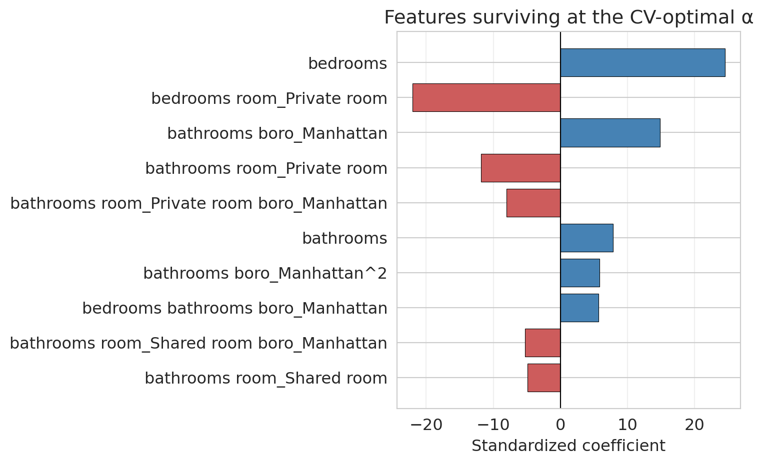
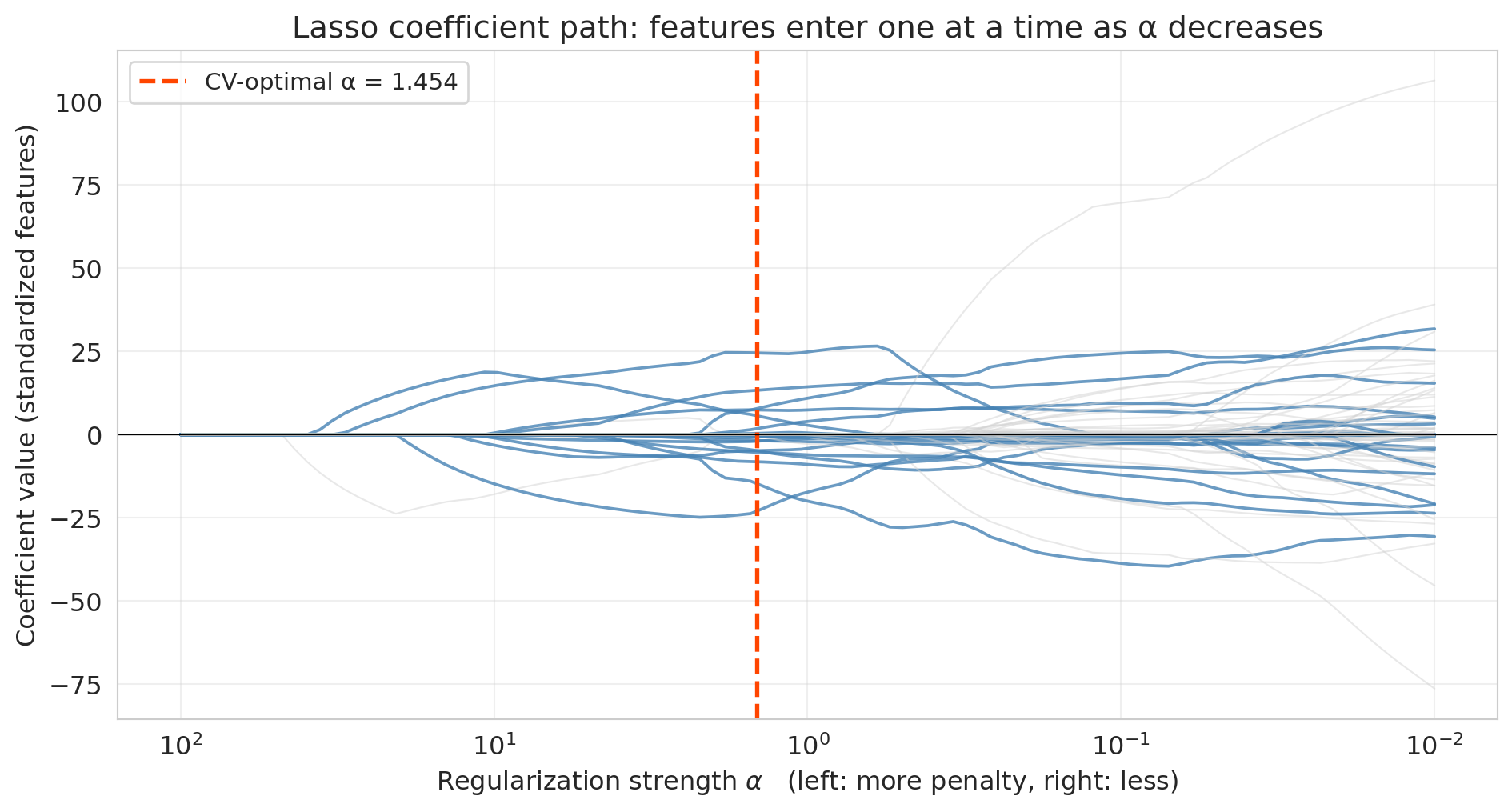
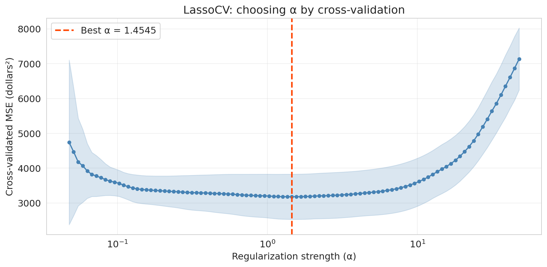
## Lasso (regularization)
Imagine you are building a cardiovascular risk score from 200 candidate blood markers. A model that uses all 200 is useless — no clinic will draw 200 vials to screen a patient. A deployable screen uses maybe 5 to 10 tests. How do you pick which ones?
Cross-validation is not a practical answer. With 200 features, just checking every subset of size 5 means $\binom{200}{5} \approx 2.5$ billion candidate models, and you still haven't considered sizes 6, 7, or 8. You need a method that picks features *automatically* — one that tells the model "use as many features as you need, but only the ones that actually help."
**Lasso** (Least Absolute Shrinkage and Selection Operator) does exactly this. Instead of enumerating subsets, it fits a single regression with a penalty that drives most coefficients to exactly zero. The features Lasso keeps are the ones it thinks matter; the rest are ignored.
Ordinary least squares (**OLS**) — the unregularized `LinearRegression` we've used so far — minimizes the sum of squared residuals with no penalty on the coefficients. Lasso adds an L1 penalty:
$$\min_{\beta} \; \sum_{i=1}^n \bigl(y_i - x_i^T \beta\bigr)^2 \;+\; \alpha \sum_{j=1}^p |\beta_j|$$
Here $x_i \in \mathbb{R}^{p+1}$ is the vector of features for listing $i$ with a leading $1$ prepended, so the intercept $\beta_0$ lives inside $\beta \in \mathbb{R}^{p+1}$ and the fitted value is $\hat{y}_i = x_i^T \beta$. The penalty sum runs from $j = 1$ to $p$, so the intercept is left unpenalized (penalizing it would just pull all predictions toward zero for no good reason). The penalty strength $\alpha$ is an example of a **hyperparameter** — a setting of the learning procedure itself (like the polynomial degree we swept earlier, the number of CV folds, or the L1 penalty weight) as opposed to a *parameter* (here, the $\beta$ coefficients) that the procedure fits from data. Hyperparameters are chosen before fitting — typically by the validation set or by cross-validation, which is exactly what we do with $\alpha$ below. A close relative of Lasso is **ridge regression** (L2 regularization), which replaces the L1 penalty with $\alpha \sum_{j=1}^p \beta_j^2$. Ridge shrinks all coefficients toward zero but generally does not set them exactly to zero — it keeps all features but dampens them. The choice between lasso and ridge depends on whether you believe many features each contribute a small amount (ridge) or only a handful of features carry real signal (lasso).
:::{.callout-note collapse="true"}
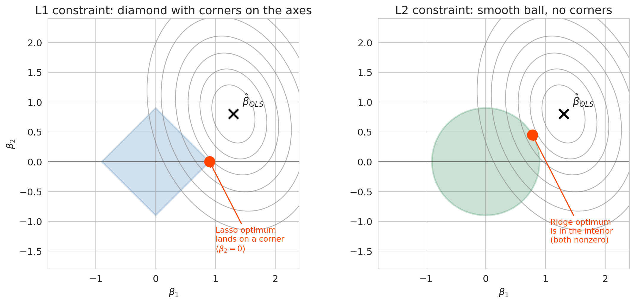
## Going deeper: the geometry of L1 vs L2
The one-sentence story: Lasso drives some coefficients to exactly zero because its penalty is a budget on the *sum of absolute values* $\sum_j |\beta_j|$, whose boundary has sharp corners on the coordinate axes. Ridge's budget is a smooth ball that almost never has its optimum land on an axis, so all coefficients stay nonzero.
Here is the geometry behind that intuition. Fitting Lasso is the same as minimizing squared error subject to $\sum_j |\beta_j| \leq t$. The L1 constraint region is a diamond with sharp corners along the coordinate axes, and the optimum often lands exactly on a corner — which is another way of saying some coefficients are exactly zero. The L2 constraint region $\sum_j \beta_j^2 \leq t$ is a smooth ball, and smooth balls have no corners, so the optimum almost never zeros out a coefficient. That geometric difference is the whole story.
```{python}
#| label: fig-l1-l2-geometry
# Two-feature cartoon of the L1 and L2 constraint regions
beta1_mesh, beta2_mesh = np.meshgrid(np.linspace(-2, 2.5, 400),
                                     np.linspace(-2, 2.5, 400))
ols_loss = (2.0 * (beta1_mesh - 1.3) ** 2
            + 1.1 * (beta2_mesh - 0.8) ** 2
            + 0.6 * (beta1_mesh - 1.3) * (beta2_mesh - 0.8))
contour_levels = [0.25, 0.6, 1.1, 1.8, 2.8, 4.0]

fig, axes = plt.subplots(1, 2, figsize=(12, 5.5))
t_budget = 0.9

# Left: L1 diamond (Lasso)
ax = axes[0]
ax.contour(beta1_mesh, beta2_mesh, ols_loss, levels=contour_levels,
           colors='gray', alpha=0.6, linewidths=1)
diamond = patches.Polygon(
    [(t_budget, 0), (0, t_budget), (-t_budget, 0), (0, -t_budget)],
    closed=True, facecolor='steelblue', alpha=0.25, edgecolor='steelblue', linewidth=2)
ax.add_patch(diamond)
ax.plot(1.3, 0.8, 'x', color='black', markersize=12, markeredgewidth=2.5)
ax.annotate(r'$\hat\beta_{OLS}$', xy=(1.3, 0.8), xytext=(1.45, 0.95), fontsize=13)
ax.plot(t_budget, 0, 'o', color='orangered', markersize=13, zorder=5)
ax.annotate('Lasso optimum\nlands on a corner\n($\\beta_2 = 0$)',
            xy=(t_budget, 0), xytext=(t_budget + 0.1, -1.5),
            fontsize=10, color='orangered',
            arrowprops=dict(arrowstyle='->', color='orangered', lw=1.3))
ax.axhline(0, color='black', linewidth=0.5)
ax.axvline(0, color='black', linewidth=0.5)
ax.set_xlim(-1.8, 2.4)
ax.set_ylim(-1.8, 2.4)
ax.set_xlabel(r'$\beta_1$')
ax.set_ylabel(r'$\beta_2$')
ax.set_title('L1 constraint: diamond with corners on the axes')
ax.set_aspect('equal')

# Right: L2 ball (Ridge)
ax = axes[1]
ax.contour(beta1_mesh, beta2_mesh, ols_loss, levels=contour_levels,
           colors='gray', alpha=0.6, linewidths=1)
theta = np.linspace(0, 2 * np.pi, 200)
ax.fill(t_budget * np.cos(theta), t_budget * np.sin(theta),
        color='seagreen', alpha=0.25, edgecolor='seagreen', linewidth=2)
ax.plot(1.3, 0.8, 'x', color='black', markersize=12, markeredgewidth=2.5)
ax.annotate(r'$\hat\beta_{OLS}$', xy=(1.3, 0.8), xytext=(1.45, 0.95), fontsize=13)
sol_angle = np.arctan2(0.55, 0.95)
sol_x = t_budget * np.cos(sol_angle)
sol_y = t_budget * np.sin(sol_angle)
ax.plot(sol_x, sol_y, 'o', color='orangered', markersize=13, zorder=5)
ax.annotate('Ridge optimum\nis in the interior\n(both nonzero)',
            xy=(sol_x, sol_y), xytext=(sol_x + 0.3, sol_y - 1.8),
            fontsize=10, color='orangered',
            arrowprops=dict(arrowstyle='->', color='orangered', lw=1.3))
ax.axhline(0, color='black', linewidth=0.5)
ax.axvline(0, color='black', linewidth=0.5)
ax.set_xlim(-1.8, 2.4)
ax.set_ylim(-1.8, 2.4)
ax.set_xlabel(r'$\beta_1$')
ax.set_title('L2 constraint: smooth ball, no corners')
ax.set_aspect('equal')

plt.tight_layout()
save_for_slides('l1-l2-geometry')
plt.show()
```
The gray contours show the unconstrained OLS squared-error loss, centered on $\hat\beta_{OLS}$. Fitting Lasso or Ridge means moving along the smallest loss contour that still touches the blue (L1) or green (L2) constraint region. On the L1 diamond, the first contact is almost always a corner on an axis, so one coefficient snaps to zero. On the L2 ball, the first contact is almost always in the interior of an edge, so both coefficients stay nonzero. This generalizes to $p$ dimensions — the L1 constraint has corners along every coordinate axis, and those corners are where Lasso's sparsity comes from.
:::
### Standardize before regularizing
> **Why this section is here.** The stem plots and coefficient path later in this section all assume the features have been standardized first. This subsection explains why that preprocessing step matters and what goes wrong if you skip it; if you've already used regularized regression in practice, feel free to skim.
The penalty $\alpha \sum |\beta_j|$ treats every coefficient on the same scale. But the *coefficients* depend on the feature's units. A numeric feature with a small range — bedrooms, whose standard deviation is about 0.7 — needs a *large* coefficient to move $\hat{y}$ by the same amount as a feature with a large range, like the listing's number of reviews (standard deviation ~35). Fitting OLS on the unregularized problem, the bedrooms coefficient lands near \$30 per bedroom and the reviews coefficient near a few cents per review. The L1 penalty $\alpha |\beta_j|$ treats those two numbers the same — so a coefficient of 30 on bedrooms takes a big penalty hit, while the coefficient of 0.03 on reviews is essentially free. The penalty falls disproportionately on the small-range feature, punishing it for its *units* rather than for being less useful. Put differently: OLS is scale-invariant (if you rescale a feature, the coefficient rescales to compensate and predictions are unchanged), but ridge and lasso are *not* — rescaling changes what the penalty "sees." Standardization restores the symmetry.
**Standardization** rescales each feature to have mean zero and standard deviation one:
$$\tilde{x}_j = \frac{x_j - \bar{x}_j}{s_j}$$
After standardization, every coefficient is in the same units (response per standard deviation of the feature), so the penalty shrinks them fairly. In practice, always standardize numeric features before applying lasso or ridge. (For 0/1 indicator variables, standardization is a little awkward — they already live in a bounded range — and a min/max rescaler is the more common choice. Our scaling demo here uses numeric features only.)
Scikit-learn's `StandardScaler` handles this. Fit the scaler on the training data (to learn the means and standard deviations), then transform both the training and test data using those same statistics. Applying the *training* statistics to the test data prevents information leakage — the test set plays no role in determining the scaling.
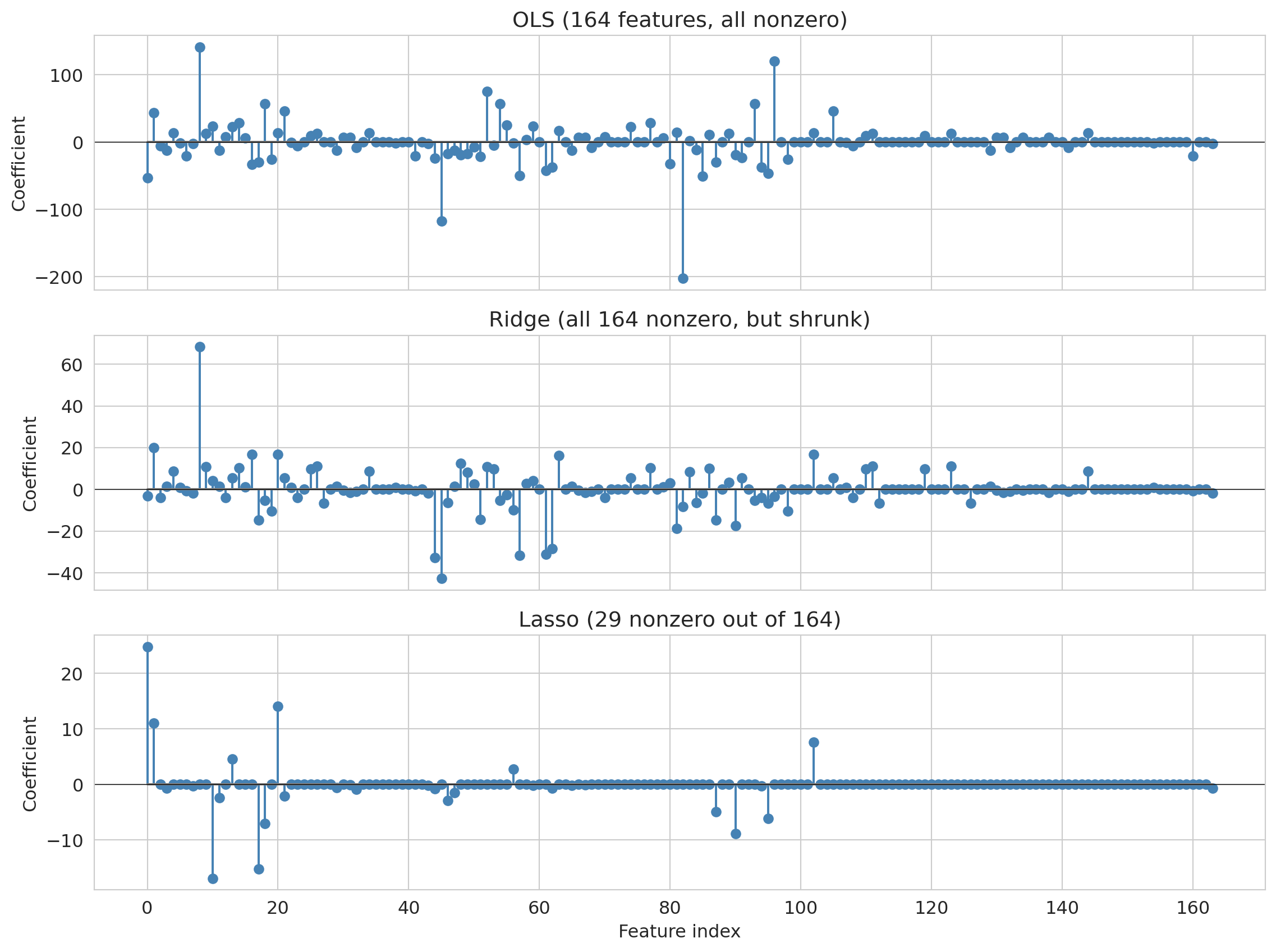
To see why standardization matters, it helps to look at what goes wrong when you skip it. The demo below fits Lasso on five numeric features whose raw scales differ dramatically — bedrooms (std $\approx 0.7$), bathrooms (std $\approx 0.4$), number of reviews (std $\approx 35$), minimum-nights requirement (std $\approx 9$), and availability in the next 365 days (std $\approx 134$). We fit lasso once on the raw features and once on standardized features, and compare the surviving coefficients and test $R^2$:
```{python}
# Self-contained scaling demo on five numeric features with dramatically
# different scales. We reload the listings with just these columns so the
# demo doesn't depend on the main experiment's subsample.
scale_cols = ['price', 'bedrooms', 'bathrooms',
              'number_of_reviews', 'minimum_nights', 'availability_365']
df_scale = (
    listings[scale_cols]
    .dropna()
    .loc[lambda d: d['price'].between(10, 500)]
    .sample(1500, random_state=42)
    .reset_index(drop=True)
)
feat_names = ['bedrooms', 'bathrooms', 'number_of_reviews',
              'minimum_nights', 'availability_365']
X_scale = df_scale[feat_names].values
y_scale = df_scale['price'].values

idx_s_train, idx_s_test = train_test_split(
    np.arange(len(df_scale)), test_size=0.4, random_state=42)
X_raw_train, X_raw_test = X_scale[idx_s_train], X_scale[idx_s_test]
y_s_train, y_s_test = y_scale[idx_s_train], y_scale[idx_s_test]

scaler_demo = StandardScaler()
X_std_train = scaler_demo.fit_transform(X_raw_train)
X_std_test = scaler_demo.transform(X_raw_test)

lasso_raw_fit = Lasso(alpha=1.0, max_iter=20000).fit(X_raw_train, y_s_train)
lasso_std_fit = Lasso(alpha=1.0, max_iter=20000).fit(X_std_train, y_s_train)

compare_scale = pd.DataFrame({
    'feature': feat_names,
    'std(x_j)': np.round(X_raw_train.std(axis=0), 2),
    'raw coef': np.round(lasso_raw_fit.coef_, 3),
    'standardized coef': np.round(lasso_std_fit.coef_, 3),
})
print(compare_scale.to_string(index=False))
print()
r2_raw = r2_score(y_s_test, lasso_raw_fit.predict(X_raw_test))
r2_std = r2_score(y_s_test, lasso_std_fit.predict(X_std_test))
nz_raw = int((lasso_raw_fit.coef_ != 0).sum())
nz_std = int((lasso_std_fit.coef_ != 0).sum())
print(f"raw          test R² = {r2_raw:.3f}  ({nz_raw}/5 nonzero)")
print(f"standardized test R² = {r2_std:.3f}  ({nz_std}/5 nonzero)")
```
The two columns are not the same. Without standardization, the raw lasso keeps all five features — `number_of_reviews` and `availability_365` survive with coefficients near zero (a penny or two per unit) because their large-scale raw values mean their OLS coefficients were already small, so the penalty $\alpha|\beta|$ barely touches them. They look "cheap to keep," even though they're essentially noise. Standardize everything first and the same lasso at the same $\alpha$ correctly zeros both of them out, leaving a leaner model built on bedrooms, bathrooms, and minimum-nights. The test $R^2$ is essentially identical in both runs — the two models predict equally well on held-out data — but they disagree on which features matter. That's the subtle cost of skipping standardization: you get a "feature importance" story that reflects units, not signal.
```{python}
# Use degree-3 polynomial features on our 1,500-listing subsample
# (enough features to overfit, but not so many that the comparison is trivial)
X_deg3 = build_features(base, 6)  # Level 6 = degree-3 polynomial features
X_deg3_train = X_deg3.iloc[idx_train].reset_index(drop=True)
X_deg3_test = X_deg3.iloc[idx_test].reset_index(drop=True)

# Standardize: fit on train, transform both
scaler = StandardScaler()
X_deg3_train_std = scaler.fit_transform(X_deg3_train)
X_deg3_test_std = scaler.transform(X_deg3_test)

# OLS on the same features (for comparison — unaffected by scaling)
ols_model = LinearRegression().fit(X_deg3_train_std, y_train)

# Ridge shrinks all coefficients but keeps them all
ridge_model = Ridge(alpha=1.0).fit(X_deg3_train_std, y_train)

# Lasso automatically shrinks/eliminates features
lasso_model = Lasso(alpha=1.0).fit(X_deg3_train_std, y_train)

n_total = X_deg3.shape[1]
n_nonzero_lasso = int((lasso_model.coef_ != 0).sum())

print(f"Degree-3 polynomial features: {n_total}")
print(f"Ridge: all {n_total} coefficients nonzero (shrunk, not eliminated)")
print(f"Lasso: {n_nonzero_lasso} nonzero (zeroed out {n_total - n_nonzero_lasso})")
print()
print(f"OLS   — Train R²: {ols_model.score(X_deg3_train_std, y_train):.3f}  Test R²: {r2_score(y_test, ols_model.predict(X_deg3_test_std)):.3f}")
print(f"Ridge — Train R²: {ridge_model.score(X_deg3_train_std, y_train):.3f}  Test R²: {r2_score(y_test, ridge_model.predict(X_deg3_test_std)):.3f}")
print(f"Lasso — Train R²: {lasso_model.score(X_deg3_train_std, y_train):.3f}  Test R²: {r2_score(y_test, lasso_model.predict(X_deg3_test_std)):.3f}")
```
On this split, both Ridge and Lasso beat OLS on the same features. The coefficient plots below reveal the mechanism. We stack the three panels so their shapes line up, and give each its own y-scale — because the OLS coefficients span several hundred while Lasso's sit well under twenty, forcing them onto the same axis would make Ridge and Lasso look flat.
:::{.callout-tip}
## Think about it
Before you look at the three panels: what should Ridge's coefficients look like compared to OLS's — shrunk toward zero, or a few set exactly to zero? What about Lasso's? If Lasso and Ridge end up with similar test $R^2$, do their coefficient vectors have to look the same?
:::
```{python}
fig, axes = plt.subplots(3, 1, figsize=(12, 9), sharex=True)

axes[0].stem(range(len(ols_model.coef_)), ols_model.coef_, linefmt='steelblue', markerfmt='o', basefmt='gray')
axes[0].set_title(f'OLS ({n_total} features, all nonzero)')
axes[0].set_ylabel('Coefficient')
axes[0].axhline(0, color='black', linewidth=0.5)

axes[1].stem(range(len(ridge_model.coef_)), ridge_model.coef_, linefmt='steelblue', markerfmt='o', basefmt='gray')
axes[1].set_title(f'Ridge (all {n_total} nonzero, but shrunk)')
axes[1].set_ylabel('Coefficient')
axes[1].axhline(0, color='black', linewidth=0.5)

axes[2].stem(range(len(lasso_model.coef_)), lasso_model.coef_, linefmt='steelblue', markerfmt='o', basefmt='gray')
axes[2].set_title(f'Lasso ({n_nonzero_lasso} nonzero out of {n_total})')
axes[2].set_xlabel('Feature index')
axes[2].set_ylabel('Coefficient')
axes[2].axhline(0, color='black', linewidth=0.5)

plt.tight_layout()
save_for_slides('ols-ridge-lasso-stems')
plt.show()
```
Reading the three panels top to bottom, the shrinkage story is immediate: OLS coefficients span hundreds (top panel), Ridge pulls them down by roughly an order of magnitude (middle), and Lasso zeros out most features entirely (bottom) — note each panel's y-axis range shrinks with it. Both regularizers resolve overfitting automatically — the penalty does the selection instead of the modeler. Ridge says "every feature contributes a little"; Lasso says "only a few features carry the signal."
The Lasso penalty strength $\alpha$ controls the bias-variance tradeoff directly. Large $\alpha$ means more regularization — more features zeroed out, a simpler model with higher bias and lower variance. Small $\alpha$ means less regularization — closer to OLS, with lower bias and higher variance. So how do we pick $\alpha$? Cross-validation, as we do next.
:::{.callout-tip}
## Think about it
Before we let cross-validation choose $\alpha$: where do you expect the CV-error curve to bottom out — closer to the OLS end (small $\alpha$) or closer to the all-zero end (large $\alpha$)? Sketch what you think the curve looks like.
:::
### Choosing $\alpha$ by cross-validation
How do we pick the right $\alpha$? Scikit-learn's `LassoCV` automates the search: it fits lasso at many $\alpha$ values, scores each by cross-validation, and selects the $\alpha$ with the best CV performance.
```{python}
# Raise max_iter so sklearn's coordinate-descent solver has room to converge on this problem.
lasso_cv = LassoCV(cv=5, random_state=42, max_iter=10000).fit(X_deg3_train_std, y_train)

print(f"Best alpha: {lasso_cv.alpha_:.4f}")
print(f"Nonzero coefficients: {(lasso_cv.coef_ != 0).sum()} out of {len(lasso_cv.coef_)}")
print(f"Train R²: {lasso_cv.score(X_deg3_train_std, y_train):.3f}")
print(f"Test R²:  {r2_score(y_test, lasso_cv.predict(X_deg3_test_std)):.3f}")
```
Which features did Lasso keep? Because we gave `PolynomialFeatures` human-readable column names, we can ask it directly:
```{python}
#| label: fig-lasso-survivors
# Rank the surviving features by |coefficient| and plot the top 10
feature_names = X_deg3.columns
nonzero_mask = lasso_cv.coef_ != 0
survivors = (
    pd.DataFrame({
        'feature': feature_names[nonzero_mask],
        'coefficient': lasso_cv.coef_[nonzero_mask],
    })
    .assign(abs_coef=lambda d: d['coefficient'].abs())
    .sort_values('abs_coef', ascending=False)
    .head(10)
    .iloc[::-1]  # reverse so the largest bar sits at the top of the barh chart
    .reset_index(drop=True)
)

fig, ax = plt.subplots(figsize=(8, 5))
bar_colors = ['steelblue' if c > 0 else 'indianred' for c in survivors['coefficient']]
ax.barh(survivors['feature'], survivors['coefficient'], color=bar_colors, edgecolor='black', linewidth=0.4)
ax.axvline(0, color='black', linewidth=0.8)
ax.set_xlabel('Standardized coefficient')
ax.set_title('Features surviving at the CV-optimal α')
ax.grid(True, axis='x', alpha=0.3)
plt.tight_layout()
save_for_slides('lasso-survivors')
plt.show()
```
The surviving features are a readable, targeted subset — `bedrooms`, room-type and borough dummies, a handful of interaction terms. Lasso decided these matter most and threw away the rest.
### The coefficient path
The stem plots showed a snapshot at one value of $\alpha$. But Lasso actually traces a whole *path*: as $\alpha$ decreases from a very large value (where every coefficient is zero) toward zero (where the solution is just OLS), features enter the model one at a time. Plotting the coefficients against $\log \alpha$ gives a direct view of that process.
```{python}
#| label: fig-lasso-path
# Pass alphas in descending order: sklearn's lasso_path always returns coefficients
# indexed by descending alpha, so we match the input ordering to the output.
alphas_path = np.logspace(2, -2, 100)
alphas_out, coefs_path, _ = lasso_path(X_deg3_train_std, y_train, alphas=alphas_path)

# Highlight features that are nonzero at the CV-optimal alpha
optimal_alpha = lasso_cv.alpha_
optimal_idx = int(np.argmin(np.abs(alphas_out - optimal_alpha)))
nonzero_at_optimum = np.abs(coefs_path[:, optimal_idx]) > 1e-8

fig, ax = plt.subplots(figsize=(10, 5.5))
for j in range(coefs_path.shape[0]):
    if nonzero_at_optimum[j]:
        ax.plot(alphas_out, coefs_path[j, :], color='steelblue', linewidth=1.4, alpha=0.8)
    else:
        ax.plot(alphas_out, coefs_path[j, :], color='lightgray', linewidth=0.8, alpha=0.5)

ax.axvline(optimal_alpha, color='orangered', linestyle='--', linewidth=2,
           label=f'CV-optimal α = {optimal_alpha:.3f}')
ax.axhline(0, color='black', linewidth=0.5)
ax.set_xscale('log')
ax.invert_xaxis()
ax.set_xlabel(r'Regularization strength $\alpha$   (left: more penalty, right: less)')
ax.set_ylabel('Coefficient value (standardized features)')
ax.set_title('Lasso coefficient path: features enter one at a time as α decreases')
ax.legend(fontsize=11, loc='upper left')
ax.grid(True, alpha=0.3)
plt.tight_layout()
save_for_slides('lasso-path')
plt.show()
```
Read the figure right to left: at very large $\alpha$ (left edge) every coefficient is exactly zero. As $\alpha$ decreases, the penalty eases and features "enter" the model one at a time. The blue lines are the features Lasso keeps at the CV-optimal $\alpha$ (marked by the dashed red line); the gray lines are features that were still on the path elsewhere but end up zeroed out at the optimum.
We can see the tradeoff directly by plotting cross-validated error against $\alpha$.
```{python}
fig, ax = plt.subplots(figsize=(10, 5))

alphas = lasso_cv.alphas_
mse_mean = lasso_cv.mse_path_.mean(axis=1)
mse_std = lasso_cv.mse_path_.std(axis=1)

ax.plot(alphas, mse_mean, 'o-', color='steelblue', markersize=4)
ax.fill_between(alphas, mse_mean - mse_std, mse_mean + mse_std, alpha=0.2, color='steelblue')
ax.axvline(lasso_cv.alpha_, color='orangered', linestyle='--', linewidth=2,
           label=f'Best α = {lasso_cv.alpha_:.4f}')
ax.set_xscale('log')
ax.set_xlabel('Regularization strength (α)')
ax.set_ylabel('Cross-validated MSE (dollars²)')
ax.set_title('LassoCV: choosing α by cross-validation')
ax.legend(fontsize=12)
ax.grid(True, alpha=0.3)
plt.tight_layout()
plt.show()
```
The U-shaped CV curve confirms the bias-variance tradeoff. Too small an $\alpha$ (left side of the plot) gives insufficient regularization — the model overfits. Too large an $\alpha$ (right side) penalizes too aggressively — the model underfits. `LassoCV` finds the valley automatically.
:::{.callout-note}
## Beyond the classical tradeoff
The U-shaped test error curve predicts that complex models eventually overfit. This is true for individual models — but not always for *averages* of models. If you train many different overfit models and average their predictions, the average inherits the low bias of a complex model while reducing variance, as long as the models' errors are sufficiently uncorrelated. [Chapter 13](lec13-trees.qmd) puts this into practice with **random forests**, which combine many overfit decision trees to achieve low bias *and* low variance — escaping the classical U-curve entirely. The punchline to hold on to: "regularize and cross-validate" is still the right default, but averaging uncorrelated overfit models is the one known way past it.
:::
## Recommended workflow
Pull the pieces together. Here is the procedure we recommend for choosing a model and reporting its test error, adapted to dataset size.
1. **Set aside a held-out test set at the very start.** 20% is the default. Don't touch it until step 5. If the data are temporal (will be re-run over time), take the *most recent* 20% as the test set, not a random 20% — see [Chapter 16](lec16-feedback-loops.qmd).
2. **Choose a candidate model family** (feature set, polynomial degree, lasso vs ridge vs OLS) and a grid of hyperparameters (e.g., $\alpha$ values for lasso).
3. **Pick the best hyperparameters using cross-validation on the training+validation data** (everything that isn't the test set). 5- or 10-fold CV is the standard choice; use LOO if $n < 200$.
4. **Refit the best model on all the training+validation data** — this is the model you would actually deploy.
5. **Score the refit model once on the held-out test set.** That score is your reported test error. Do not touch the test set again — if you re-optimize against it, the reported score is no longer honest.
6. **Report the test score with uncertainty** — either a bootstrap CI (Chapter 8) or the standard deviation across the CV folds as a minimum.
How this plays out on three datasets of different sizes:
**Case 1: small data (≈150 observations, ≈5 features).** A clinical pilot with 150 patients, a handful of lab markers, and an outcome you want to predict. A fixed 20% test set is only 30 rows — too few for a stable estimate. Use a 20% test set anyway for the final score (you need *something* untouched), but do hyperparameter selection via LOO-CV on the remaining 120 rows. The "best model" to refit and score is whatever LOO preferred. Report the test error alongside its bootstrap CI — with 30 test rows the CI will be wide, and that wide interval is honest information, not a weakness to hide.
**Case 2: medium data (≈1,500 observations, tens of features) — the Airbnb case we've been running.** 60/20/20 train/val/test or a fixed 20% test set with 5-fold CV on the remaining 80%. Either works. The 5-fold route uses training data more efficiently and is what we'd recommend in practice. Report test R² plus the CV-fold standard deviation.
**Case 3: large data (≈100,000+ observations, many features).** With abundant data the split matters less. A single 80/20 split gives a test set of 20,000+ rows — the test estimate is precise without averaging. 5-fold CV on the training 80% still helps for hyperparameter selection; you could also use a single train/validation split since each piece is still large. Report test R² and, if you're reporting inference-level claims, bootstrap the test set to get a CI. With this much data, regularization is less critical (overfitting is harder), so even OLS on a well-engineered feature set is a reasonable baseline.
The through-line across all three cases: **the test set is touched exactly once**, the chosen model is refit on all non-test data before scoring, and the reported error carries uncertainty. The procedure changes in its details (LOO vs 5-fold, test size choice) but not in its shape.
## What we still can't answer
Cross-validation tells us which model generalizes best to new observations drawn from the *same* distribution as our training data. That's a lot — but it's not everything. Several questions remain out of reach:
- **Distribution shift at deployment time.** CV holds out observations that look like the ones the model trained on. It cannot detect covariate, temporal, or label shift between now and the moment the model is deployed. [Chapter 16](lec16-feedback-loops.qmd) returns to this problem with temporal validation.
- **Whether any coefficient is statistically significant.** CV picks the model that generalizes best, but it does not quantify the uncertainty on any individual coefficient — we still don't know whether `boro_Manhattan`'s effect is real or noise. [Chapter 12](lec12-regression-inference.qmd) develops the inference tools that answer this.
- **Causation.** Everything in this chapter is still association. A borough effect measured by CV tells us where prices are higher, not *why* — and certainly not what would happen to prices if policy moved a listing across a borough boundary. [Chapter 18](lec18-causal-inference-1.qmd) separates association from causation.
- **Nonlinear structure that polynomials can't capture.** Polynomials let a line bend smoothly, but real relationships can have sharp thresholds and rich interactions that a linear model won't find no matter how many features you engineer. [Chapter 13](lec13-trees.qmd) introduces decision trees and random forests, which handle these patterns natively.
## Key takeaways
- **Hold out data before you touch the model.** Training $R^2$ measures memory, not generalization. Random train/test splits check whether a model generalizes *in distribution* — they cannot detect the covariate, temporal, or label shift that killed the Epic sepsis model.
- **More complexity eventually hurts — the bias-variance tradeoff explains why.** Expected test error = bias$^2$ + variance + $\sigma^2$. Simple models underfit (high bias); complex models overfit (high variance); the irreducible noise $\sigma^2$ sets the floor no model can cross.
- **Three-way splits and cross-validation keep the test set honest.** Train fits the model; validation (or CV) picks its complexity; the test set is touched exactly once at the end.
- **Regularization resolves overfitting automatically.** Lasso (L1) zeros out unimportant features; ridge (L2) shrinks all coefficients; standardize first so the penalty sees every feature on the same scale; pick $\alpha$ by cross-validation.
Where this leads: [Chapter 7](lec07-classification.qmd) (classification metrics), [Chapter 8](lec08-sampling.qmd) (bootstrap uncertainty), [Chapter 12](lec12-regression-inference.qmd) (regression inference), [Chapter 13](lec13-trees.qmd) (decision trees and random forests — averaging past the classical tradeoff), [Chapter 16](lec16-feedback-loops.qmd) (temporal validation).
## Study guide
### Key definitions
- **Distribution shift** — when deployment data differs systematically from training data. Three subtypes: **covariate shift** (input distribution changes), **temporal shift** (the world changes over time), **label shift** (the base rate of the outcome changes).
- **Train/test split** — holding out part of the data to evaluate model performance on unseen observations.
- **Train $R^2$ / test $R^2$** — $R^2$ computed on training data (measures fit) vs. held-out data (measures generalization). The gap reveals overfitting.
- **Validation set** — data used to choose model complexity (distinct from the final test set).
- **Three-way split** — train for fitting, validation for model selection, test for final performance.
- **Cross-validation (k-fold)** — rotating which of $k$ folds is held out, averaging test scores for a more stable performance estimate.
- **Overfitting** — the model memorizes training data (including noise) and performs poorly on new data. Signaled by training $R^2$ rising while test $R^2$ falls.
- **Underfitting** — the model is too simple to capture the real pattern in the data.
- **Bias** — expected prediction error from oversimplifying: $\text{Bias}(x) = \mathbb{E}_{\mathcal{D}}[\hat{f}_{\mathcal{D}}(x)] - f(x)$.
- **Variance** — expected prediction error from over-sensitivity to the training set: $\text{Var}(x) = \mathbb{E}_{\mathcal{D}}[(\hat{f}_{\mathcal{D}}(x) - \mathbb{E}_{\mathcal{D}}[\hat{f}_{\mathcal{D}}(x)])^2]$. The expectation is taken over random draws of the training set.
- **Bias-variance tradeoff** — expected test error = bias$^2$ + variance + $\sigma^2$. Simple models have high bias and low variance; complex models have low bias and high variance.
- **Irreducible noise ($\sigma^2$)** — randomness in the outcome that no model can explain.
- **OLS (ordinary least squares)** — unregularized linear regression; minimizes the sum of squared residuals with no penalty on coefficients.
- **Lasso (L1 regularization)** — adds a penalty $\alpha \sum |\beta_j|$ that shrinks some coefficients to exactly zero, performing automatic feature selection.
- **Ridge (L2 regularization)** — adds a penalty $\alpha \sum \beta_j^2$ that shrinks coefficients toward zero but does not set them exactly to zero.
- **Standardization** — rescaling each feature to mean zero and standard deviation one before regularization, so the penalty treats all coefficients on the same scale.
### Key ideas
- **Training error measures memory, not generalization.** A model that has seen the data will score well on it; only held-out data tells you whether it learned the pattern.
- **Adding features can only lower training error, but test error eventually rises.** The transition from "help" to "harm" is the signature of overfitting.
- **Expected test error decomposes into three parts.** Bias$^2$ + variance + $\sigma^2$; the first two shrink or grow with model complexity, and $\sigma^2$ is the floor no model can cross.
- **A three-way split (or CV + held-out test) keeps the test set honest.** Any decision made against the test set contaminates it — the test estimate is no longer the final word.
- **Regularization trades bias for variance, and cross-validation picks the tradeoff.** Lasso and ridge shrink coefficients automatically; the regularization strength $\alpha$ is itself a hyperparameter chosen by CV.
- **Random splits cannot detect distribution shift.** If deployment data comes from a different population, era, or base-rate regime, test-set performance can still look great right up to the moment the model fails in production.
- **Averaging uncorrelated overfit models is the one known escape from the classical U-curve.** Random forests (Chapter 13) exploit this; for single models, "regularize and cross-validate" remains the right default.
### Computational tools
- `train_test_split(X, y, test_size=0.3)` — splits data into training and test sets.
- `LinearRegression().fit(X, y)` — ordinary least squares (OLS).
- `Ridge(alpha=1.0).fit(X, y)` — L2-regularized linear regression.
- `Lasso(alpha=1.0).fit(X, y)` — L1-regularized linear regression.
- `LassoCV(cv=5).fit(X, y)` — fits Lasso at many $\alpha$ values and selects the best by cross-validation.
- `KFold(n_splits=5, shuffle=True, random_state=...)` — cross-validation splitter; use with `cross_val_score`.
- `cross_val_score(model, X, y, cv=5)` — returns $k$ fold-wise scores for averaging.
- `r2_score(y_true, y_pred)` — computes $R^2$ on any set of true/predicted values.
- `StandardScaler().fit_transform(X_train)` — standardizes features to mean 0, std 1; use `.transform(X_test)` on test data.
- `PolynomialFeatures(degree=d)` — generates all polynomial terms up to degree $d$.
### For the quiz
You are responsible for: train/test split (what it simulates and when it breaks down), cross-validation (how it works and why it's better than a single split), the three-way split (why validation is separate from test), overfitting and underfitting concepts, the bias-variance decomposition (bias$^2$ + variance + $\sigma^2$, what each term means), Lasso and Ridge concepts (what they do, not the optimization details), why standardization matters before regularization, and distribution shift.