---
title: "Bootstrap and the Normal Approximation"
execute:
enabled: true
jupyter: python3
---
```{python}
import numpy as np
import pandas as pd
import matplotlib.pyplot as plt
import seaborn as sns
from scipy.stats import norm
import warnings
warnings.filterwarnings('ignore')
sns.set_style('whitegrid')
plt.rcParams['figure.figsize'] = (8, 5)
plt.rcParams['font.size'] = 12

DATA_DIR = 'data'
np.random.seed(42)
```
In 1991, AIDS was the leading cause of death for Americans aged 25–44. Zidovudine (AZT), the first HIV drug, extended lives but often stopped working as the virus evolved resistance. The NIH's AIDS Clinical Trials Group launched **ACTG 175** to settle an urgent question: does combination therapy — two HIV drugs at once — work better than AZT alone? Between 1991 and 1995, the trial enrolled 2,139 adults with HIV and tracked the change in **CD4 cell count** (a measure of immune-system health) at 20 weeks. CD4 cells are the white blood cells HIV destroys, so a rising count means the immune system is recovering. The result would determine the standard of care for millions of patients worldwide (Hammer et al., *NEJM* 1996).
Any particular group of 2,139 patients is one random draw from a larger population: some would have improved on any drug, others would have worsened for unrelated reasons. Given such variation, how do we know whether a measured advantage for combination therapy reflects the drugs, or could have arisen from the particular mix of patients who enrolled? Act 2 of this book tackles that question — for this trial and for every model that follows: **can we trust the numbers our data produce?** The tools are the **bootstrap** and the **normal approximation**; together they turn a single sample into a statement about uncertainty.
:::{.callout-note}
## Bradley Efron's radical idea
For most of the 20th century, quantifying uncertainty required mathematical derivation — you needed a formula for the standard error of each statistic you cared about. In 1979, Bradley Efron at Stanford proposed a radical alternative: **just resample the data and see what happens.** His "bootstrap" was initially controversial — it felt like cheating, conjuring information from nothing. But it worked, and it liberated statisticians from having to derive a new formula for every new problem. The bootstrap is now one of the most widely used tools in applied statistics. (See Salsburg, *The Lady Tasting Tea*, Ch. 24, "The Bootstrap.")
:::
## The quantity we want to estimate
Before writing code, let's name what we want to measure. The medical question is whether combination therapy improves CD4 counts more than AZT alone. Both sides of the question refer to **population means**: the average CD4 change we would see if every eligible patient took combination therapy, and the average we would see if every eligible patient took AZT alone. Each is a fixed but unknown number; the chapter's job is to estimate them from the sample we have.
:::{.callout-important}
## Definition: Population mean
A **population mean** is the average of some quantity across every member of the population — here, the average CD4 change among all HIV-positive adults eligible for the trial, under a given treatment assignment. ACTG 175 gives us two population means to estimate: the mean CD4 change under combination therapy and the mean CD4 change under AZT alone. Each is a fixed but unknown number.
Each population mean is a parameter of an underlying **population distribution**, which we write $\mathcal{X}$: the full distribution of CD4 change across the population. ACTG 175 has two — $\mathcal{X}_T$ under combination therapy and $\mathcal{X}_C$ under AZT alone — with means $\mu_T, \mu_C$ and SDs $\sigma_T, \sigma_C$. Each patient's outcome is a single draw, $X_i \sim \mathcal{X}$.
The **difference** of the two population means is a derived quantity we'll often care about. Because ACTG 175 randomly assigned patients, this difference equals the drug's **causal effect** on CD4 change; [Chapter 18](lec18-causal-inference-1.qmd) returns to the causal interpretation. Here we treat the difference purely as a statistical quantity — a linear combination of two population means — and estimate it from the data.
:::
Let's load the trial data and compute the difference of sample means. We write $n_T$ for the treatment-group size and $n_C$ for the control-group size — the only "$n$'s" we care about in the clinical-trial analysis.
```{python}
df = pd.read_csv(f'{DATA_DIR}/clinical-trial/ACTG175.csv')
df['cd4_change'] = df['cd420'] - df['cd40']

# Two groups: ZDV monotherapy (control) vs combination therapy
control = df[df['treat'] == 0]
treatment = df[df['treat'] == 1]

n_T, n_C = len(treatment), len(control)
print(f"Treatment group (combination): n_T = {n_T} patients")
print(f"Control group   (ZDV mono):    n_C = {n_C} patients")
print(f"\nMean CD4 change — treatment: {treatment['cd4_change'].mean():.1f}")
print(f"Mean CD4 change — control:   {control['cd4_change'].mean():.1f}")

observed_diff = treatment['cd4_change'].mean() - control['cd4_change'].mean()
print(f"\nObserved difference of means:   {observed_diff:.1f} CD4 cells")
```
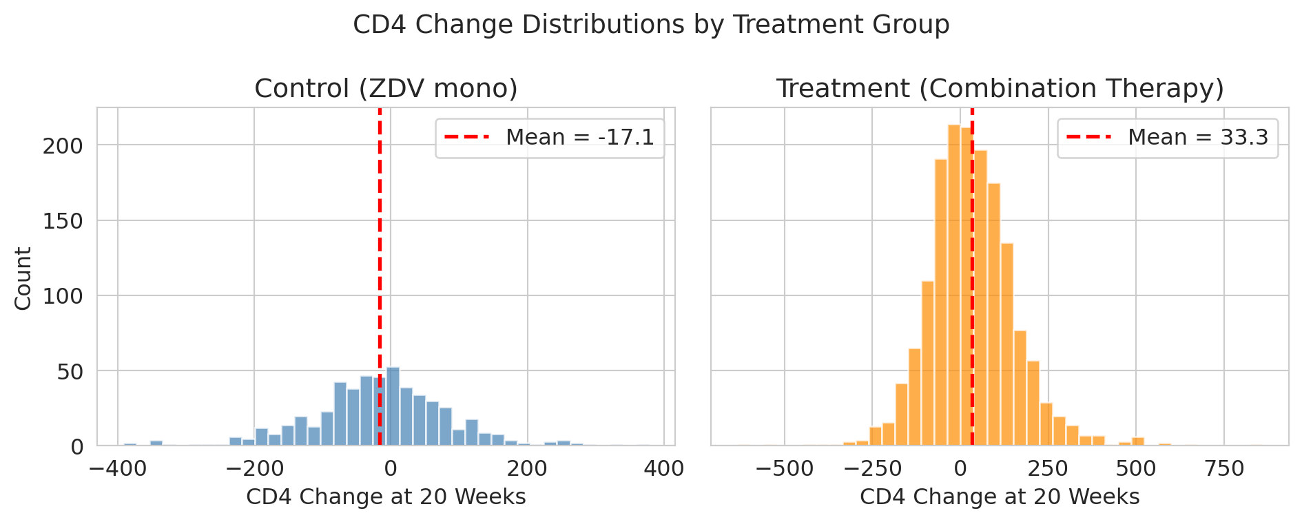
The treatment group improved more, on average. Let's visualize the full distributions to see how much overlap there is.
```{python}
fig, axes = plt.subplots(2, 1, figsize=(7, 7), sharex=True, sharey=True)

axes[0].hist(control['cd4_change'], bins=40, color='steelblue', alpha=0.7, edgecolor='white')
axes[0].axvline(0, color='black', lw=1, ls=':', alpha=0.6)
axes[0].axvline(control['cd4_change'].mean(), color='red', lw=2, ls='--',
                label=f"Mean = {control['cd4_change'].mean():.1f}")
axes[0].set_title('Control (ZDV mono)')
axes[0].set_ylabel('Count')
axes[0].legend()

axes[1].hist(treatment['cd4_change'], bins=40, color='darkorange', alpha=0.7, edgecolor='white')
axes[1].axvline(0, color='black', lw=1, ls=':', alpha=0.6, label='No change')
axes[1].axvline(treatment['cd4_change'].mean(), color='red', lw=2, ls='--',
                label=f"Mean = {treatment['cd4_change'].mean():.1f}")
axes[1].set_title('Treatment (combination arms)')
axes[1].set_xlabel('CD4 Change at 20 Weeks')
axes[1].set_ylabel('Count')
axes[1].legend()

plt.suptitle('CD4 change distributions by treatment group', fontsize=14)
plt.tight_layout()
plt.show()
```
The treatment group improved by about 50 more CD4 cells. But look at the spread — there's enormous patient-to-patient variation. If we enrolled a *different* set of patients, would we still see a ~50-cell advantage?
To get a feel for how much a new set of patients might matter, imagine the trial had only been able to enroll 50 people in the treatment arm instead of $n_T = 1607$. Different random draws of 50 from the patients we do have would give different sample means. Let's simulate three such hypothetical sub-trials.
```{python}
# .dropna() is a safety net — in this dataset, cd4_change has no missing values, so no rows are dropped.
treatment_cd4 = treatment['cd4_change'].dropna().values

# Three hypothetical sub-trials of 50 patients each, drawn from the treatment group
print("Three hypothetical sub-trials of 50 patients each:\n")
for i in range(3):
    sample = np.random.choice(treatment_cd4, size=50, replace=False)
    print(f"  Sub-trial {i+1}: mean CD4 change = {sample.mean():.1f}")

print(f"\n  Full treatment group mean:    {treatment_cd4.mean():.1f}")
```
Three different samples, three different estimates. Sample-to-sample variation is a fundamental feature of statistical estimation.
:::{.callout-tip}
## Think about it
The three sub-trials above all drew 50 patients each. If we instead drew sub-trials of 500 patients (ten times larger), would you expect the three estimates to vary more, less, or about the same? Why? (You'll see the answer quantified once we meet the CLT.)
:::
For ACTG 175, the story is clean: the 2,139 patients are a sample from the millions of HIV-positive adults who might take these drugs, so the two population means genuinely exist. The bootstrap will simulate what would happen if we could re-run the trial with different patients. Polling works the same way — 1,000 voters sampled from millions.
The distribution that all those hypothetical sub-trials trace out has a name:
:::{.callout-important}
## Definition: Sampling distribution
The **sampling distribution** of a statistic is the distribution of values the statistic would take if we could repeat the study many times, each time with a fresh sample from the population. The three sub-trials above are a tiny glimpse of it — three draws from the sampling distribution of the treatment-group mean at sample size 50.
We rarely see the sampling distribution directly: we have one sample, not many. The rest of this chapter is about two ways to approximate it — by resampling (**the bootstrap**) and by formula (**the normal approximation**).
:::
The question that motivates the rest of the chapter: **how much do these estimates vary, and what can we say about that variation?**
## The bootstrap idea
We can't rerun the clinical trial. We have one dataset. But here's a clever trick: **we can resample from the data we have.**
:::{.callout-important}
## Definition: Bootstrap
The **bootstrap** resamples the observed data **with replacement** to approximate the sampling distribution of a statistic. Our sample is the best picture we have of the population, so we treat the sample *as if* it were the population, and draw new "samples" from it — with replacement, meaning the same observation can appear more than once in a resample.
:::
To make "with replacement" concrete, imagine the trial had enrolled just five patients — Alex, Jordan, Sam, Taylor, and Casey. The bootstrap imagines a re-run of the trial by drawing five patients from this group *with replacement*: we draw a name, record their CD4 change, put them back, and draw again. Some patients may appear twice; some may not appear at all. Each resample is a plausible "alternative dataset" we might have seen.
```{python}
trial_patients = ['Alex', 'Jordan', 'Sam', 'Taylor', 'Casey']
resample = np.random.choice(trial_patients, size=5, replace=True)
print(f"Original five:  {trial_patients}")
print(f"One resample:   {list(resample)}")
```
Scaling up from five to 1,607 works the same way — we'll resample *rows* of the CD4 data, with replacement, and each resample has the same size as the original.
Expanded as a **reusable recipe**, the procedure is:
1. Treat the observed sample as if it were the population.
2. Draw a resample of the same size as the original, with replacement.
3. Compute the statistic of interest (mean, difference of means, median, regression slope, anything) on the resample.
4. Repeat steps 2–3 $B$ times (typically $B = 10{,}000$).
5. Summarize the distribution of those $B$ values — its standard deviation estimates the standard error, and its 2.5th and 97.5th percentiles give a 95% confidence interval.
We'll walk through steps 1–5 for the ACTG difference of means in a moment. The same recipe applies to any statistic you care about — regression coefficients ([Chapter 12](lec12-regression-inference.qmd)), classification AUCs, and beyond.
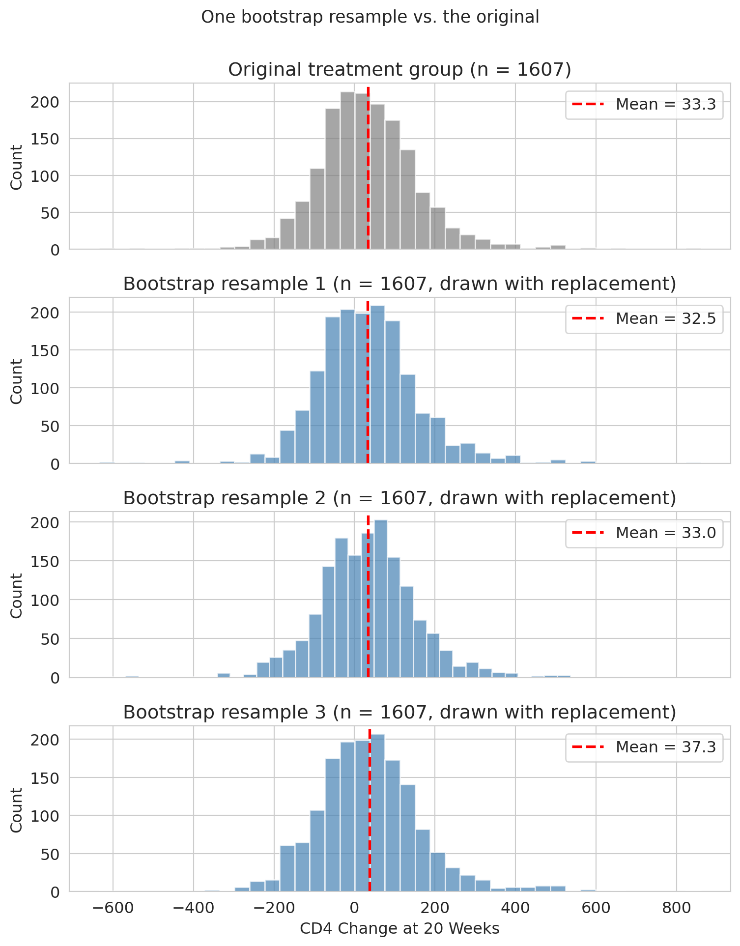
Before we loop this thousands of times, let's see what a single bootstrap resample of the full treatment group looks like. The plot below shows the original CD4-change distribution on top, and three bootstrap resamples below — each the same size as the original but drawn with replacement. The overall shape is similar across resamples, and each resample's mean (red dashed line) is close to but different from the original mean.
```{python}
rng_for_panels = np.random.default_rng(7)  # fixed seed so the demo is reproducible
panel_resamples = [
    rng_for_panels.choice(treatment_cd4, size=len(treatment_cd4), replace=True)
    for _ in range(3)
]

fig, axes = plt.subplots(4, 1, figsize=(8, 10), sharex=True)

axes[0].hist(treatment_cd4, bins=40, color='gray', alpha=0.7, edgecolor='white')
axes[0].axvline(treatment_cd4.mean(), color='red', lw=2, ls='--',
                label=f'Mean = {treatment_cd4.mean():.1f}')
axes[0].set_title('Original treatment group (n = 1607)')
axes[0].set_ylabel('Count')
axes[0].legend()

for i, resample in enumerate(panel_resamples):
    ax = axes[i + 1]
    ax.hist(resample, bins=40, color='steelblue', alpha=0.7, edgecolor='white')
    ax.axvline(resample.mean(), color='red', lw=2, ls='--',
               label=f'Mean = {resample.mean():.1f}')
    ax.set_title(f'Bootstrap resample {i + 1} (n = 1607, drawn with replacement)')
    ax.set_ylabel('Count')
    ax.legend()

axes[3].set_xlabel('CD4 Change at 20 Weeks')
plt.suptitle('One bootstrap resample vs. the original', fontsize=13, y=1.00)
plt.tight_layout()
plt.show()
```
Same size, slightly different composition, slightly different mean — that resample-to-resample variation is what the bootstrap captures. Repeating this thousands of times traces out the full distribution of plausible values.
Now let's do a few resamples and watch how the mean varies:
```{python}
print("Five bootstrap resamples of the treatment group:\n")
for i in range(5):
    resample = np.random.choice(treatment_cd4, size=n_T, replace=True)
    print(f"  Resample {i+1}: mean = {resample.mean():.1f}")
print(f"\n  Original mean:       {treatment_cd4.mean():.1f}")
```
Each resample gives a slightly different mean. The bootstrap idea is to do this *thousands* of times to map out the full distribution of plausible values. We'll call the number of bootstrap replications $B$ — a separate knob from the dataset size $n$.
## Bootstrap the difference of means
Now let's bootstrap the quantity we actually care about: the difference of sample means between the two groups. We resample *each group independently*, then compute the difference.
```{python}
control_cd4 = control['cd4_change'].dropna().values

def bootstrap_diff(treatment_data, control_data):
    """Resample both groups independently, return difference in means."""
    t_resample = np.random.choice(treatment_data, size=len(treatment_data), replace=True)
    c_resample = np.random.choice(control_data, size=len(control_data), replace=True)
    return t_resample.mean() - c_resample.mean()

B = 10_000   # number of bootstrap replications
boot_diffs = np.array([bootstrap_diff(treatment_cd4, control_cd4) for _ in range(B)])

print(f"Bootstrap mean of difference:            {boot_diffs.mean():.1f}")
print(f"Bootstrap SD of difference (≈ SE):       {boot_diffs.std():.1f}")
```
The `[bootstrap_diff(...) for _ in range(B)]` construction is a **list comprehension** — Python shorthand for a loop that collects results into a list. The `_` is the convention for a loop variable we don't need, and `10_000` is Python syntax for the integer $10{,}000$. The expression calls `bootstrap_diff` exactly $B$ times and stacks the results into an array.
Why $B = 10{,}000$? Large enough that the CI endpoints are stable to about a tenth of a CD4 cell across reruns; small enough to run in a few seconds. A different seed would shift the endpoints by a cell or two — that's **Monte Carlo error**, separate from the sampling uncertainty we're trying to estimate. Note that $B$ (how many resamples we take) is a completely separate quantity from $n_T, n_C$ (how big each resample is): we'd get the same kind of answer from a larger trial with a smaller $B$, or a smaller trial with a larger $B$, but the two quantities do different things.
The SD of the bootstrap distribution is our estimate of the standard error of the difference of sample means — that's the whole point of resampling. It approximates the spread of the **sampling distribution** of the difference of sample means (Definition above).
Preview: at the end of the chapter we'll see that a closed-form formula could have given the same standard error without any resampling. So why bother with the bootstrap? Because the formula works *only* for means of not-too-skewed data. The moment we ask about the median, the 95th percentile, or a mean when $n$ is small and tails are heavy, no formula exists — only the bootstrap does. The ACTG analysis is the easy warm-up; the harder cases come later.
Before we summarize the bootstrap distribution with a confidence interval, let's name the three vocabulary terms we've been using implicitly.
:::{.callout-important}
## Definition: Estimand, estimator, estimate
- **Estimand:** the quantity you want to know — here, the difference of population means defined above. We treat it as a fixed (but unknown) number.
- **Estimator:** the procedure we use to approximate the estimand — here, "compute the difference in sample means."
- **Estimate:** the specific number our estimator produces from this particular dataset — about 50 CD4 cells.
:::
The key insight: **the estimate changes every time you draw a new sample, but the estimand stays fixed.**
:::{.callout-important}
## Definition: Confidence interval
**Intuition.** A confidence interval is a range of plausible values for the estimand.
**Formal definition.** A 95% confidence interval is constructed by a procedure with the following property: if we repeated the study many times and built a new CI each time, about 95% of those intervals would contain the true estimand.
The **percentile method** builds a CI from the middle 95% of bootstrap values — the 2.5th and 97.5th percentiles. The method works well when the bootstrap distribution is roughly symmetric.
*Note:* the formal definition makes a probability statement about the *procedure*, not the *parameter*. The estimand is fixed; the interval varies from study to study. So "the estimand has a 95% chance of being in [45, 60]" misreads the procedure — the bootstrap percentile CI never treats the estimand as random. The Bayesian framework sketched below makes that phrasing coherent at the cost of choosing a prior.
:::
:::{.callout-note collapse="true"}
## Going deeper: two epistemologies of probability
Treating the truth as fixed and the data as random is a *modeling stance*, not a metaphysical claim. Two coherent epistemologies sit underneath statistical inference, and they support different readings of the same interval.
**Frequentist.** The estimand $\theta$ is fixed; the data $X$ is random. A 95% CI is a procedure $f(X) \mapsto [L, U]$ satisfying $P_\theta(L \leq \theta \leq U) \geq 0.95$, where the probability is over $X$ with $\theta$ held fixed. Once you observe data and compute $[1.2, 6.8]$, the randomness is gone — that one interval either covers $\theta$ or it doesn't. The "95%" lives in the procedure, not in any particular interval.
**Bayesian.** The parameter $\theta$ is treated as a random variable — not because nature flipped a coin to set its value, but because uncertainty about a fixed value can be modeled as a probability distribution. With a prior $p(\theta)$ and likelihood $p(X \mid \theta)$, Bayes' rule produces a posterior $p(\theta \mid X)$. A 95% *credible interval* $[L, U]$ satisfies $P(\theta \in [L, U] \mid X) = 0.95$ — a probability statement about the truth, conditional on the observed data.
The two frameworks attach the "95%" to different objects: the frequentist places it on the procedure (random over hypothetical repeats), the Bayesian on the parameter (random under the posterior).
Both frameworks are mathematically coherent. For weak priors and large samples they usually agree to within rounding; the gap between them is largest at small samples, strong priors, or in interpreting a single interval.
A lens for students who find frequentist coverage slippery: the **many-worlds interpretation** of quantum mechanics promotes "across many hypothetical repeats of the study" from a thought experiment to a literal ensemble — every probabilistic outcome happens in some branch, and 95% of branches running this study build intervals that cover the truth. You don't need MWI to do statistics; if the hypothetical-repetition language ever feels groundless, MWI gives it a referent.
:::
:::{.callout-note collapse="true"}
## Going deeper: does the bootstrap really cover 95%?
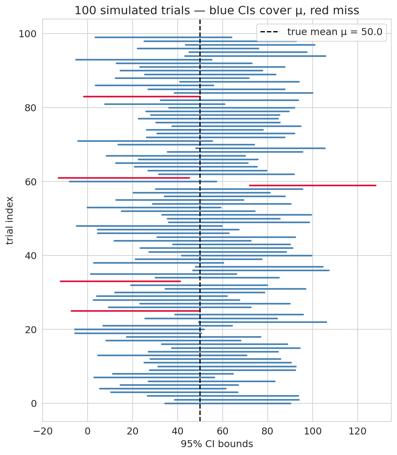
The formal statement promises that, across many hypothetical repeats of the study, 95% of the intervals we'd build should contain the true estimand. Let's verify by simulation.
We set up a synthetic population with a known mean, run many "trials," bootstrap a 95% CI from each, and count how many intervals cover the truth.
```{python}
rng_cov = np.random.default_rng(0)

mu_pop = 50.0                # the known "truth"
sigma_pop = 150.0            # population SD (roughly CD4-change scale)
n_trials = 1000              # number of simulated trials
n_per_trial = 100            # sample size in each trial
B_demo = 1000                # bootstrap replications per trial

covered = 0
intervals = []
for _ in range(n_trials):
    sample = rng_cov.normal(mu_pop, sigma_pop, size=n_per_trial)
    boot_means = np.array([
        rng_cov.choice(sample, size=n_per_trial, replace=True).mean()
        for _ in range(B_demo)
    ])
    lo, hi = np.percentile(boot_means, [2.5, 97.5])
    intervals.append((lo, hi))
    if lo <= mu_pop <= hi:
        covered += 1

print(f"{covered} of {n_trials} intervals covered μ = {mu_pop} — "
      f"simulated coverage = {covered / n_trials:.1%}")
```
The simulated coverage should land near the advertised 95%, with small Monte Carlo noise. A visualization of the first 100 intervals, color-coded by whether they caught the truth:
```{python}
fig, ax = plt.subplots(figsize=(7, 8))
for i, (lo, hi) in enumerate(intervals[:100]):
    hit = lo <= mu_pop <= hi
    ax.plot([lo, hi], [i, i], color='steelblue' if hit else 'crimson', lw=2)
ax.axvline(mu_pop, color='black', lw=1.5, ls='--',
           label=f'true mean μ = {mu_pop}')
ax.set_xlabel('95% CI bounds')
ax.set_ylabel('trial index')
ax.set_title('100 simulated trials — blue CIs cover μ, red miss')
ax.legend()
plt.tight_layout()
plt.show()
```
The misses are the point of "95%" rather than "100%." The procedure is *calibrated* to catch the truth 95 times out of 100 in the long run, not every single time. If the simulated coverage came out to, say, 0.82 or 1.00, that would indicate the procedure was miscalibrated — which is exactly the diagnostic that statisticians run on any new CI method before recommending it.
:::
:::{.callout-tip}
## Think about it
Before running the next cell: given the bootstrap mean ≈ 50 and bootstrap SD ≈ 5.5, do you expect the 95% CI to include zero? What would it mean for the drug if the CI *did* include zero?
:::
```{python}
# 95% bootstrap CI: percentile method (2.5th and 97.5th percentiles)
ci_low, ci_high = np.percentile(boot_diffs, [2.5, 97.5])

print(f"Observed difference of means: {observed_diff:.1f} CD4 cells")
print(f"95% Bootstrap CI:          [{ci_low:.1f}, {ci_high:.1f}]")
print(f"\nDoes the CI include zero?  {'Yes' if ci_low <= 0 <= ci_high else 'No'}")
```
Let's visualize the bootstrap distribution along with the confidence interval.
```{python}
fig, ax = plt.subplots(figsize=(8, 5))

ax.hist(boot_diffs, bins=60, density=True, color='steelblue', alpha=0.7, edgecolor='white',
        label='Bootstrap distribution')

# Shade the 95% CI
ax.axvspan(ci_low, ci_high, alpha=0.15, color='steelblue', label=f'95% CI: [{ci_low:.1f}, {ci_high:.1f}]')

# Vertical line at zero
ax.axvline(0, color='black', lw=2, ls=':', alpha=0.7, label='Zero (no effect)')
ax.axvline(observed_diff, color='red', lw=2, ls='--', label=f'Observed difference = {observed_diff:.1f}')

ax.set_xlabel('Difference of mean CD4 change')
ax.set_ylabel('Density')
ax.set_title('Bootstrap distribution of the difference of means')
ax.legend(fontsize=10)
plt.tight_layout()
plt.show()
```
The confidence interval is entirely above zero, suggesting combination therapy genuinely improves CD4 counts more than AZT alone. Because ACTG 175 randomly assigned patients, the positive difference reads as the drug's **causal effect** on CD4 change, not merely a correlation; [Chapter 18](lec18-causal-inference-1.qmd) formalizes what randomization buys us. We will formalize the "is the difference real or just noise?" question in [Chapter 9](lec09-permutation-tests.qmd) (permutation tests) and [Chapter 10](lec10-hypothesis-testing.qmd) (hypothesis testing). For now, focus on the *shape* of that histogram.
:::{.callout-warning}
## What a confidence interval does (and doesn't) cover
A confidence interval quantifies **sampling uncertainty** — the scatter we'd see from re-running the same study under the same conditions, with fresh patients drawn from the same population. It does *not* cover **systematic shifts** — a pandemic, a policy change, a recession — that move every unit at once. Before trusting a CI for a decision, ask whether the uncertainty that matters is the kind the bootstrap captures, or the kind where the whole system might change underneath you. [Chapter 16](lec16-feedback-loops.qmd) returns to this distinction when models trained on historical data meet changed conditions.
:::
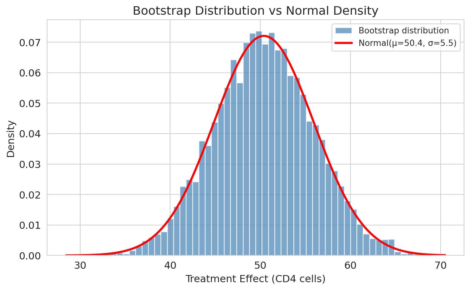
## "It looks normal!"
Look at the bootstrap distribution above. It's **bell-shaped** — symmetric, with tails that fall off smoothly. Is that a coincidence?
Let's overlay a normal density curve and see how well it fits.
```{python}
fig, ax = plt.subplots(figsize=(8, 5))

ax.hist(boot_diffs, bins=60, density=True, color='steelblue', alpha=0.7, edgecolor='white',
        label='Bootstrap distribution')

# Overlay normal density with matching mean and SD
x = np.linspace(boot_diffs.min(), boot_diffs.max(), 300)
ax.plot(x, norm.pdf(x, boot_diffs.mean(), boot_diffs.std()),
        'r-', lw=2.5, label=f'Normal(μ={boot_diffs.mean():.1f}, σ={boot_diffs.std():.1f})')

ax.set_xlabel('Difference of mean CD4 change')
ax.set_ylabel('Density')
ax.set_title('Bootstrap distribution vs normal density')
ax.legend(fontsize=10)
plt.tight_layout()
plt.show()
```
The normal curve fits almost perfectly. **The close fit isn't a coincidence.** A pair of theorems from your probability course explain why.
You've already met the **Law of Large Numbers** (LLN): as $n \to \infty$, the sample mean $\bar X_n$ converges to the population mean $\mu$, and the sample SD $s_n$ converges to $\sigma$. The LLN is why our plug-in estimators work at all — $\hat\mu = \bar X$ and $\hat\sigma = s$ get arbitrarily close to the true values as samples grow. But the LLN only promises *eventual* convergence; it says nothing about *how fast* or *in what shape*. That's what the **Central Limit Theorem** adds.
## The CLT explains why
The Central Limit Theorem (CLT) says: **if you average many independent things, the result is approximately normal — for large enough sample size.**
More precisely: if $X_1, X_2, \ldots, X_n$ are **iid** (independent and identically distributed) with finite mean $\mu$ and finite variance $\sigma^2$, then for large $n$,
$$\bar{X}_n \;\sim\; \text{Normal}\!\left(\mu,\; \frac{\sigma}{\sqrt{n}}\right) \quad \text{(approximately, for large $n$)},$$
where Normal$(\mu, \sigma/\sqrt{n})$ denotes the normal distribution with mean $\mu$ and standard deviation $\sigma/\sqrt{n}$. The `$\sim$` here reads *distributed as* — the standard textbook symbol for "has this distribution"; the parenthetical reminds us the match is asymptotic, not exact.
:::{.callout-note}
## Notation check
We use $\text{Normal}(\mu, \sigma)$ with the second slot a *standard deviation*, matching scipy's `norm` and many intro texts. Some references (Wasserman, Casella & Berger) write $\text{Normal}(\mu, \sigma^2)$ with the *variance* instead. Read carefully when you consult another source.
:::
Crucially, the $X_i$ themselves do **not** need to be normal. Any distribution works, as long as it has a finite mean and a finite variance — bounded first and second moments are the entire requirement. That is what makes the CLT so powerful: cell counts, dollar amounts, survey scores, wait times — real data is rarely normal, but averages of iid draws from such data are.
You saw iid random variables throughout MS&E 120. In ACTG 175, iid is reasonable: **independence** follows because patients are different people whose outcomes don't influence each other, and **identical distribution** is the sampling assumption — we treat the 2,139 enrolled patients as iid draws from the population of HIV-positive adults eligible for the trial.
Randomization does something different: it ensures the treatment and control groups are comparable draws from that same population, so any difference in outcomes isn't driven by group-selection bias. [Chapter 9](lec09-permutation-tests.qmd) returns to randomization as a source of exchangeability when we build permutation tests.
Our difference of sample means is a linear combination of two sample means, and each sample mean is approximately normal by the CLT. A useful fact from MS&E 120: a linear combination of independent normal random variables is itself normal — so $\bar{X}_T - \bar{X}_C$ is normal whenever each $\bar{X}$ is. That is why the bootstrap distribution looks bell-shaped.
### Convergence demo
Let's watch the CLT at work. We'll draw samples of varying size $m$ from the treatment CD4-change distribution and see how the sampling distribution of the sample mean sharpens. (We use $m$ to distinguish the demo's sample size from $n_T$, the actual dataset size: $m$ is how many patients we *pretend* to have for this demonstration, while $n_T = 1607$ is how many we actually have.)
A note on the distribution we're sampling from: CD4-change values aggregate many small sources of cross-patient variation — baseline health, virus genetics, adherence to the drug regime, concomitant infections — so a CLT-at-the-patient-level argument already applies, and the distribution is broadly mound-shaped (though still with heavier tails than a pure normal, as the histogram below shows). The demo is therefore a gentle test of the CLT's promise: even starting from something that already looks broadly normal, averaging tightens the picture further as $m$ grows.
:::{.callout-tip}
## Think about it
Before running the next cell, predict: if we draw many samples of size $m = 10$ from the CD4-change distribution and compute their means, will the spread of those means be wider, narrower, or the same as the original CD4-change distribution? What about at $m = 500$?
:::
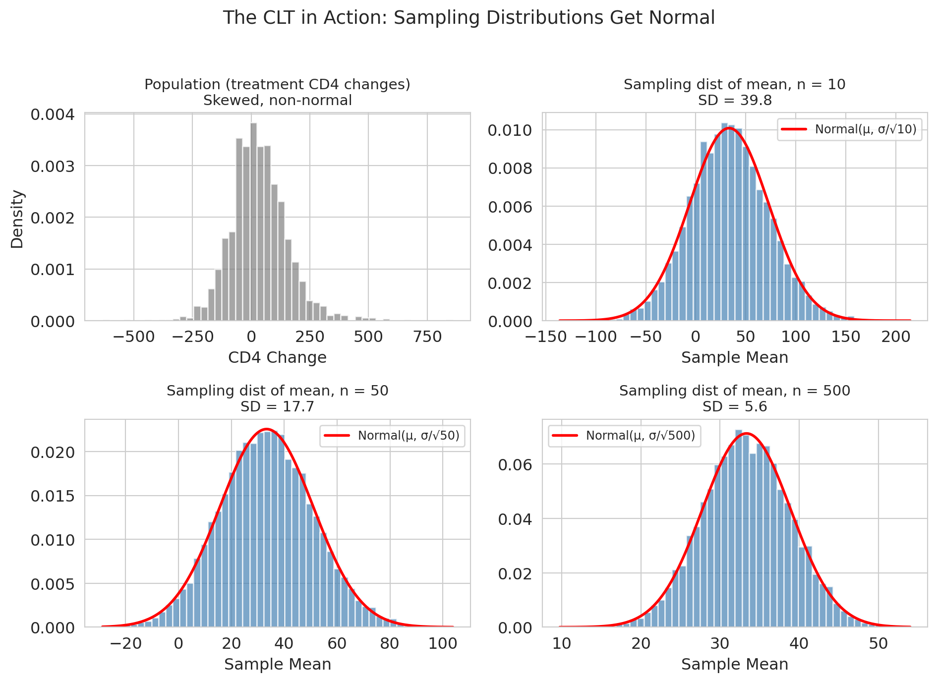
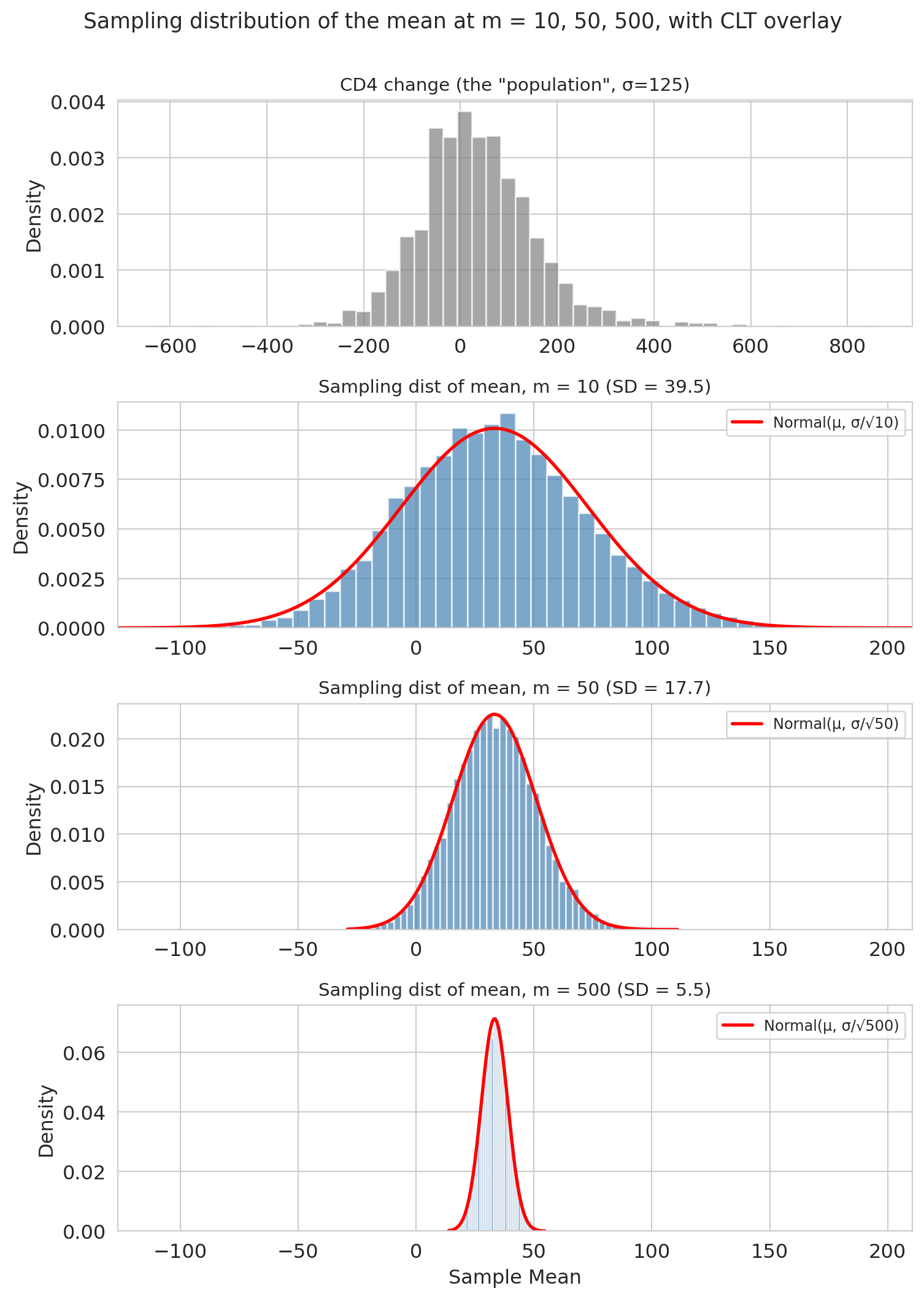
```{python}
sample_sizes_m = [10, 50, 500]   # values of m (sample size per draw)
clt_results = {}

sigma = treatment_cd4.std()
mu = treatment_cd4.mean()

fig, axes = plt.subplots(4, 1, figsize=(8, 11))

# Top panel: the CD4-change distribution we're sampling from
axes[0].hist(treatment_cd4, bins=50, density=True, color='gray', alpha=0.7, edgecolor='white')
axes[0].set_title(f'CD4 change (the "population", σ={sigma:.0f})', fontsize=11)
axes[0].set_ylabel('Density')

# Panels 1-3: sampling distributions at m = 10, 50, 500
for i, m in enumerate(sample_sizes_m):
    ax = axes[i + 1]
    means = np.array([
        np.random.choice(treatment_cd4, size=m, replace=True).mean()
        for _ in range(10_000)
    ])
    clt_results[m] = means

    ax.hist(means, bins=50, density=True, color='steelblue', alpha=0.7, edgecolor='white')

    # Overlay CLT normal prediction
    x = np.linspace(means.min(), means.max(), 200)
    se = sigma / np.sqrt(m)
    ax.plot(x, norm.pdf(x, mu, se), 'r-', lw=2, label=f'Normal(μ, σ/√{m})')

    ax.set_title(f'Sampling dist of mean, m = {m} (SD = {means.std():.1f})', fontsize=11)
    ax.set_ylabel('Density')
    ax.legend(fontsize=9)

# Share x-range across the three sampling-distribution panels so "gets narrower" is visible
sampling_xlim = (
    min(clt_results[m].min() for m in sample_sizes_m),
    max(clt_results[m].max() for m in sample_sizes_m),
)
for i in range(1, 4):
    axes[i].set_xlim(sampling_xlim)

axes[3].set_xlabel('Sample mean')  # bottom sampling-distribution panel owns the shared x-label

plt.suptitle('Sampling distribution of the mean at m = 10, 50, 500, with CLT overlay',
             fontsize=13, y=1.00)
plt.tight_layout()
plt.show()
```
Three things to notice:
1. **Centered at the population mean.** The sample mean is *unbiased*.
2. **Gets narrower as $m$ increases**, specifically at rate $1/\sqrt{m}$ — quadruple the data, halve the SE.
3. **Gets more normal as $m$ increases.** The CD4 distribution was already close to normal; by $m = 500$ the normal overlay of the sampling distribution is nearly perfect.
The width of the sampling distribution has a name: the **standard error (SE)**. Plugging the demo's sample size $m$ into the CLT's formula,
$$\text{SE}(\bar{X}) = \frac{\sigma}{\sqrt{m}},$$
we can check it against the simulation:
```{python}
print(f"Population SD (sigma): {sigma:.1f}\n")
print(f"{'m':>5s}  {'SE (formula)':>14s}  {'SE (simulated)':>16s}")
print("-" * 40)
for m in sample_sizes_m:
    se_formula = sigma / np.sqrt(m)
    se_simulated = clt_results[m].std()
    print(f"{m:>5d}  {se_formula:>14.2f}  {se_simulated:>16.2f}")
```
The formula matches simulation almost exactly.
A practical caveat: the formula uses the *population* standard deviation $\sigma$, which we never know in the real world. In this demo we pretended the full treatment arm was the population and computed its SD directly. In practice we *estimate* $\sigma$ with the sample standard deviation $s$ — giving the operational formula
$$\widehat{\text{SE}}(\bar X) \;=\; \frac{s}{\sqrt{n}}.$$
The law of large numbers says $s \to \sigma$ as $n$ grows, so the plug-in error vanishes for large samples and is small even for moderate $n$. Every CI in this chapter (and in the rest of the course) uses this plug-in silently — sample SD where theory calls for population SD.
## The normal approximation
Here's the payoff. If the bootstrap distribution is approximately normal, we don't *need* 10,000 resamples. A formula suffices.
The **normal approximation** uses the CLT to replace bootstrap resampling with a closed-form CI based on the normal distribution. A **95% normal confidence interval** is:
$$\hat{\theta} \pm 1.96 \cdot \text{SE}.$$
For a difference of two independent means (and independence is what a randomized trial buys us — that's where the variances *add*), the standard error is:
$$\text{SE} = \sqrt{\frac{s_T^2}{n_T} + \frac{s_C^2}{n_C}},$$
where $s_T, s_C$ are the sample standard deviations and $n_T, n_C$ the sample sizes — the same plug-in we saw for the single-mean SE above, now applied separately to each group. Let's compare the two approaches side by side.
```{python}
# ddof=1 tells numpy to divide by (n-1), the standard sample-variance convention
se_normal = np.sqrt(treatment_cd4.var(ddof=1) / len(treatment_cd4) +
                    control_cd4.var(ddof=1) / len(control_cd4))

normal_ci_low = observed_diff - 1.96 * se_normal
normal_ci_high = observed_diff + 1.96 * se_normal

print("Side-by-side comparison:")
print(f"  Bootstrap CI (10,000 resamples): [{ci_low:.1f}, {ci_high:.1f}]")
print(f"  Normal CI   (one formula):       [{normal_ci_low:.1f}, {normal_ci_high:.1f}]")
print(f"\n  SE (bootstrap):  {boot_diffs.std():.2f}")
print(f"  SE (formula):    {se_normal:.2f}")
```
They agree closely. The small remaining gap has two ingredients: Monte Carlo error from 10,000 resamples (a different seed would shift the bootstrap endpoints by a cell or two), and asymmetry — the bootstrap CI is allowed to be lopsided if the bootstrap distribution is, while the normal CI is symmetric around $\hat\theta$ by construction. On near-normal distributions like this one, both effects are small.
So why bother with the normal approximation if we have the bootstrap?
**Advantages of the normal approximation:**
1. **Analytical planning.** The formula lets you do calculations the bootstrap cannot. Before ACTG 175 was fielded, the researchers had to answer: "how many patients do we need to enroll to detect a 50-cell effect with 80% power?" That requires inverting the SE formula — no amount of resampling answers it, because you don't have data yet. [Chapter 10](lec10-hypothesis-testing.qmd) shows how.
2. **Composable.** You can combine standard errors across studies (meta-analysis) without re-bootstrapping, using the same addition-of-variances step we just saw.
3. **Speed.** One formula vs. 10,000 resamples. For simple problems on a laptop this gap is small; for large datasets or complex models it is not.
4. **Less code.** The one-line CI is easy to audit and hard to misconfigure.
:::{.callout-note collapse="true"}
## Going deeper: how big a trial do we need?
Before ACTG 175 enrolled a single patient, NIH had to answer: *how many patients do we need to detect a clinically meaningful effect with acceptable certainty?* Resampling cannot answer this — you don't have data yet. The normal approximation can.
**Setup.**
- **Target detectable effect**: $\Delta = 50$ CD4 cells (the smallest difference worth knowing about).
- **SD guess**: $\sigma \approx 150$ per arm, from pilot data and prior trials.
- **Power**: 80% — the probability of correctly rejecting "no effect" when the true effect is $\Delta$.
- **Significance**: $\alpha = 0.05$ — the probability of wrongly rejecting "no effect" when the truth is zero.
**Derivation.** For a two-sample test of means with equal group sizes $n$, the SE of the difference is $\sqrt{2\sigma^2/n}$. To achieve 80% power at $\alpha = 0.05$, the detectable effect must satisfy
$$(z_{\alpha/2} + z_\beta) \cdot \sqrt{\tfrac{2\sigma^2}{n}} \;=\; \Delta,$$
where $z_{\alpha/2} = 1.96$ is the two-sided 5% critical value and $z_\beta = 0.84$ is the 80th percentile of the standard normal. Solving for $n$:
$$n \;=\; \frac{2\sigma^2 \,(z_{\alpha/2} + z_\beta)^2}{\Delta^2}.$$
Plugging in:
```{python}
sigma_plan = 150      # SD guess per arm
delta = 50            # target detectable effect
z_alpha2 = 1.96       # two-sided α = 0.05
z_beta = 0.84         # 80% power

n_per_arm = 2 * sigma_plan**2 * (z_alpha2 + z_beta)**2 / delta**2
print(f"Needed sample size per arm: {n_per_arm:.0f}")
print(f"Total enrolment (two arms): {2 * n_per_arm:.0f}")
```
ACTG 175 actually enrolled 2,139 patients — roughly ten times the minimum this calculation suggests. The trial was designed to detect smaller effects, examine subgroup differences, and tolerate dropout, so the extra enrolment is not overkill but structured redundancy. The pedagogical point stands: only the normal approximation gives you a sample-size answer at all; there is nothing to bootstrap when no data exist yet. Chapter 10 returns to power calculations once we formalize hypothesis testing.
:::
:::{.callout-warning}
## When the normal approximation fails
So why bother with the bootstrap at all, if the formula agrees? Because the agreement is specific to *means* of not-too-skewed data. For the median, no closed-form SE exists; for right-skewed data at small $m$, the CLT hasn't kicked in yet. In both cases the bootstrap is the only honest answer. Let's see what each looks like.
**Caveat: the bootstrap isn't magic either.** When $n$ is very small, the observed sample is a poor picture of the population, so resampling from it just propagates that poor picture. And for extreme quantiles (the minimum, the 95th percentile, the maximum), even a large sample carries little information in the tails. No resampling method can conjure information the data doesn't have — when you see a heavily skewed or lumpy bootstrap distribution, treat the CI as a signal of uncertainty *in your uncertainty estimate*, not a final answer.
**A working rule of thumb.** For modestly skewed data, $m \geq 30$ is usually enough for the CLT to kick in; for heavy-tailed data like prices, incomes, or wait times, you may need $m$ in the hundreds. When in doubt, bootstrap — and if the bootstrap distribution is visibly skewed at the $m$ you have, the normal CI will be wrong in the same direction.
:::
### Demo 1: The median
The CLT applies to sample *means*. The median is different — let's see how.
:::{.callout-tip}
## Think about it
We have $\text{SE}(\bar{X}) = \sigma / \sqrt{n}$ for the mean. What's the analogous formula for the SE of the sample median? (Try to guess before reading on.)
:::
```{python}
fig, axes = plt.subplots(2, 3, figsize=(12, 6), sharex='col')

for col, m in enumerate(sample_sizes_m):
    # Bootstrap the mean at sample size m
    means = np.array([
        np.random.choice(treatment_cd4, size=m, replace=True).mean()
        for _ in range(10_000)
    ])
    axes[0, col].hist(means, bins=50, density=True, color='steelblue', alpha=0.7, edgecolor='white')
    axes[0, col].set_title(f'Mean, m = {m} (SD = {means.std():.1f})', fontsize=11)

    # Bootstrap the median at sample size m
    medians = np.array([
        np.median(np.random.choice(treatment_cd4, size=m, replace=True))
        for _ in range(10_000)
    ])
    axes[1, col].hist(medians, bins=50, density=True, color='darkorange', alpha=0.7, edgecolor='white')
    axes[1, col].set_title(f'Median, m = {m} (SD = {medians.std():.1f})', fontsize=11)
    axes[1, col].set_xlabel('Sample statistic')

axes[0, 0].set_ylabel('Density')
axes[1, 0].set_ylabel('Density')

plt.suptitle('Bootstrap distributions: mean vs median at matched m', fontsize=13, y=1.01)
plt.tight_layout()
plt.show()
```
The median's bootstrap distribution is **lumpier** (especially at small $m$), **wider**, and doesn't converge to normal as cleanly. The lumpiness is a real feature, not a plotting artifact: the sample median can only take values that appear in the resample (or averages of adjacent order statistics), so its distribution lives on a discrete grid. No *simple* formula like $\sigma / \sqrt{n}$ exists for the median's standard error — the asymptotic formula involves the population density at the median, a nonparametric object you would need its own bootstrap to estimate. For the median and most other statistics without a clean CLT, the bootstrap is the practical tool.
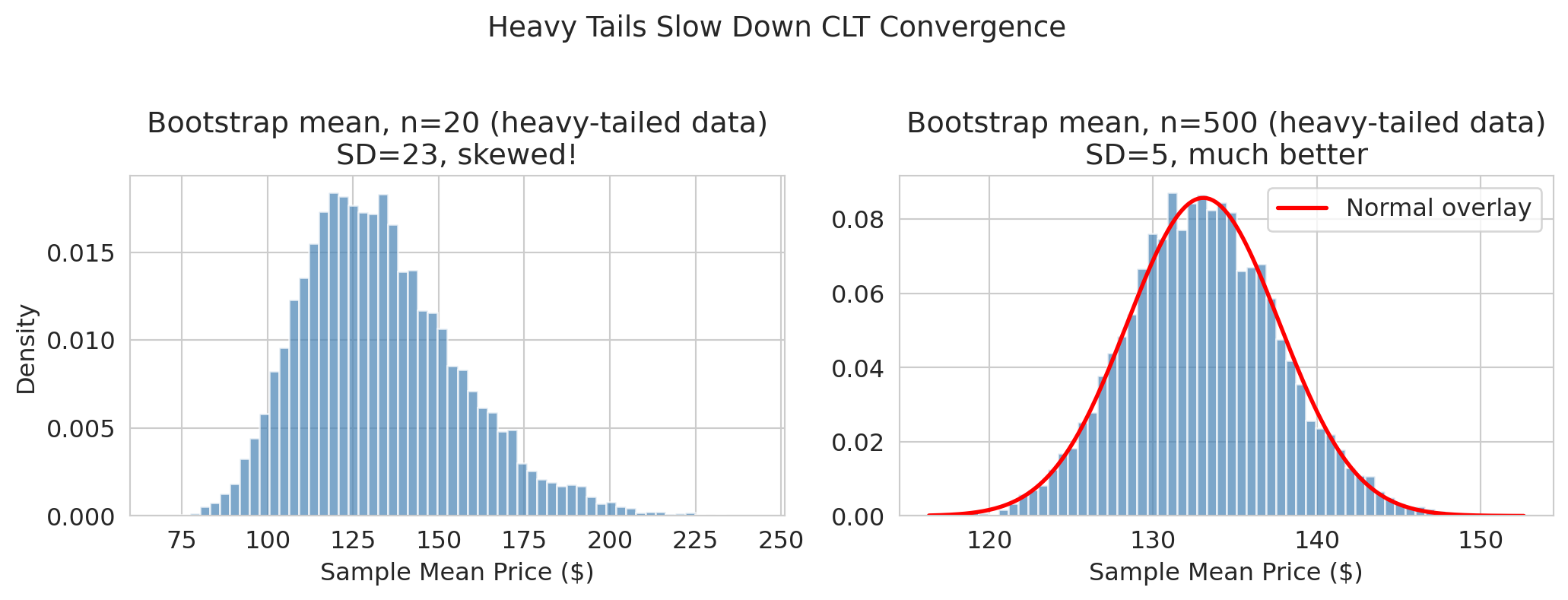
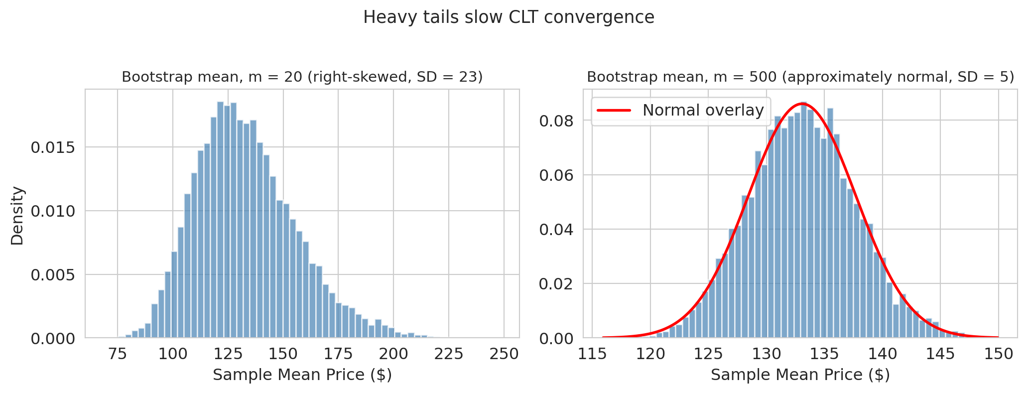
### Demo 2: Heavy tails at small m
Even for means, the CLT needs enough data to "kick in." With right-skewed data and small $m$, the sampling distribution can itself be skewed.
```{python}
listings = pd.read_csv(f'{DATA_DIR}/airbnb/listings.csv', low_memory=False)
airbnb_prices = listings['price'].dropna().values
airbnb_prices = airbnb_prices[airbnb_prices > 0]  # drop zero-price listings

print(f"Airbnb prices: {len(airbnb_prices):,} listings")
print(f"Mean: ${airbnb_prices.mean():.0f},  Median: ${np.median(airbnb_prices):.0f},  Max: ${airbnb_prices.max():,.0f}")
print(f"The distribution is right-skewed: the mean sits well above the median.")
```
Let's bootstrap the mean of Airbnb prices at two sample sizes to see how tail weight affects convergence.
```{python}
fig, axes = plt.subplots(1, 2, figsize=(11, 4))

# Bootstrap the mean at m = 20 (small sample, heavy tails)
boot_means_20 = np.array([
    np.random.choice(airbnb_prices, size=20, replace=True).mean()
    for _ in range(10_000)
])

axes[0].hist(boot_means_20, bins=60, density=True, color='steelblue', alpha=0.7, edgecolor='white')
axes[0].set_title(f'Bootstrap mean, m = 20 (right-skewed, SD = {boot_means_20.std():.0f})', fontsize=11)
axes[0].set_xlabel('Sample mean price ($)')
axes[0].set_ylabel('Density')

# Compare at m = 500
boot_means_500 = np.array([
    np.random.choice(airbnb_prices, size=500, replace=True).mean()
    for _ in range(10_000)
])

# Overlay normal
x = np.linspace(boot_means_500.min(), boot_means_500.max(), 200)
axes[1].hist(boot_means_500, bins=60, density=True, color='steelblue', alpha=0.7, edgecolor='white')
axes[1].plot(x, norm.pdf(x, boot_means_500.mean(), boot_means_500.std()),
             'r-', lw=2, label='Normal overlay')
axes[1].set_title(f'Bootstrap mean, m = 500 (approximately normal, SD = {boot_means_500.std():.0f})', fontsize=11)
axes[1].set_xlabel('Sample mean price ($)')
axes[1].legend()

plt.suptitle('Heavy tails slow CLT convergence', fontsize=13, y=1.02)
plt.tight_layout()
plt.show()
```
At $m = 20$ with heavy-tailed Airbnb prices, the bootstrap distribution is clearly **skewed right** — the normal approximation would give a misleading CI. By $m = 500$, the CLT has had enough data to produce a roughly normal shape.
> "When in doubt, bootstrap. It's slower but honest."
## Key takeaways
- **Bootstrap:** resample with replacement to estimate uncertainty. Works for *any* statistic — means, medians, regression coefficients, anything. The bootstrap generalizes to regression coefficients ([Chapter 12](lec12-regression-inference.qmd)) and beyond.
- **The CLT explains why** bootstrap distributions often look normal — at least for means and other "average-like" statistics.
- **Normal approximation:** a fast, analytical shortcut when the CLT applies (large $n$, well-behaved data, mean-like statistics). Replace 10,000 resamples with $\hat{\theta} \pm 1.96 \cdot \text{SE}$.
- **When the CLT fails** (median, heavy tails, small $n$), the bootstrap is usually the right fallback — but it isn't magic: it can't conjure information the sample doesn't have.
- **Where you'll meet this outside stats class:** A/B-test lift CIs from bootstrap or normal approximation; FiveThirtyEight-style poll aggregations; value-at-risk estimates from bootstrapped return distributions. Same pattern everywhere: one dataset, a statistic, quantified sampling uncertainty.
- **Next:** [Chapter 9](lec09-permutation-tests.qmd) asks "is the difference *real* or could it be zero?" — introducing permutation tests and hypothesis testing.
## Study guide
### Key definitions
- **Estimand** — the quantity you want to know (e.g., a difference of population means).
- **Estimator** — the procedure used to approximate the estimand (e.g., difference in sample means).
- **Estimate** — the specific number produced from one sample (e.g., ~50 CD4 cells).
- **Population mean** — the average of a quantity across every member of the population; fixed but unknown. Chapter 8 estimates population means (and differences of population means) from samples.
- **Bootstrap** — resample the observed data with replacement to approximate the sampling distribution.
- **Sampling distribution** — the distribution of values a statistic would take if we could repeat the study many times with a fresh sample each time. The bootstrap *approximates* it by resampling the observed data.
- **Confidence interval** — an interval built by a procedure with the property that, across many repetitions of the study, about 95% of intervals contain the estimand. The **percentile method** takes the 2.5th and 97.5th percentiles of the bootstrap distribution.
- **Central Limit Theorem (CLT)** — for large $n$ and iid observations, $\bar{X}_n \sim \text{Normal}(\mu,\; \sigma/\sqrt{n})$ (approximately, for large $n$).
- **Standard error (SE)** — the standard deviation of a statistic's sampling distribution; for the mean, $\text{SE} = \sigma/\sqrt{n}$.
- **Normal approximation** — using $\hat{\theta} \pm 1.96 \cdot \text{SE}$ instead of bootstrapping; relies on the CLT.
- **iid** (independent and identically distributed) — each observation drawn from the same distribution, independently of the others.
- **Monte Carlo error** — the variation in bootstrap output from using finite $B$ resamples; separate from sampling uncertainty.
### Notation used in this chapter
- $n_T, n_C$ — treatment- and control-group dataset sizes (here 1607 and 532).
- $n$ — generic sample size in the CLT statement and $\sigma/\sqrt{n}$ formula.
- $B$ — number of bootstrap replications (here 10,000).
- $m$ — the sample size we *vary* in the CLT-convergence, median, and Airbnb demos, to illustrate how the sampling distribution sharpens as sample size grows. In standard bootstrap, $m = n$.
### Key ideas
- The CLT explains why bootstrap distributions of means look normal: averaging many iid observations produces normality.
- **LLN vs CLT:** the Law of Large Numbers says the sample mean *converges* to the population mean; the CLT tells you *how fast* (at rate $1/\sqrt{n}$) and *in what shape* (normal).
- The normal approximation replaces 10,000 resamples with a single formula — when the CLT applies.
- **Reach for the bootstrap when:** the statistic isn't a mean (e.g., median), the data has heavy tails, or $n$ is small — any time the CLT's normal approximation is suspect.
- A confidence interval quantifies *sampling uncertainty* — the scatter that would arise from re-running the same study. It does not quantify model uncertainty, selection bias, or shifts in the underlying system.
### Computational tools
- `np.random.choice(data, size=n, replace=True)` — one bootstrap resample.
- `np.percentile(bootstrap_dist, [2.5, 97.5])` — 95% bootstrap CI via the percentile method.
- `data.var(ddof=1)` — sample variance (divides by $n-1$, the convention for an estimator from a sample); `np.sqrt(...)` for the SE formula.
- `np.median(...)` for the median; `boot_dist.mean()` and `boot_dist.std()` summarize a bootstrap distribution (the SD estimates the SE).
- `from scipy.stats import norm` for `norm.pdf(x, mu, sigma)` — a normal density evaluated at `x`, used for overlays.
- List comprehension `[f(resample) for _ in range(B)]` — Python shorthand for "do this $B$ times and collect the results into a list."
### For the quiz
You are responsible for: the bootstrap procedure (resample with replacement, compute statistic, repeat), the percentile CI and how to interpret it, the CLT statement, the SE formula for the mean and for the difference of two independent means, and when the normal approximation works vs. fails. You are NOT responsible for: proving the CLT, the Glivenko-Cantelli foundation of the bootstrap, the BCa interval, or deriving the SE formula for the median.