---
title: "Multiple Regression and Feature Engineering"
execute:
enabled: true
jupyter: python3
---
```{python}
import os
import numpy as np
import pandas as pd
import matplotlib.pyplot as plt
import matplotlib.colors as mcolors
import matplotlib.ticker as mticker
import seaborn as sns
from sklearn.linear_model import LinearRegression
import warnings
warnings.filterwarnings('ignore')
sns.set_style('whitegrid')
plt.rcParams['figure.figsize'] = (8, 5)
plt.rcParams['font.size'] = 12

# Load data
DATA_DIR = 'data'

# Also save key figures to the slide assets directory so slides can reuse them.
SLIDE_IMG_DIR = '../slides/images/lec05'
os.makedirs(SLIDE_IMG_DIR, exist_ok=True)

def save_for_slides(name):
    """Save the current figure as a PNG in the Lec 5 slide assets directory."""
    plt.savefig(f'{SLIDE_IMG_DIR}/{name}.png', dpi=150, bbox_inches='tight')
```
## How much is a bathroom worth?
An Airbnb host is considering adding a second bathroom to their listing. How much more should they charge per night? In [Chapter 4](lec04-regression.qmd) we built a regression from the mean up and stopped at a single feature — bedrooms. That model can't answer the host's question. It doesn't even know bathrooms exist. Every prediction rests on bedrooms alone, and the bedrooms coefficient absorbs every pricing signal correlated with room count, bathrooms included.
Today we add bathrooms, then room type, then neighborhood. Along the way we discover that naively adding features can mislead: the coefficient on bedrooms shifts once bathrooms enter the model. We finish with **feature engineering** — interactions, log transforms, and missingness indicators — which turns linear regression into a surprisingly expressive tool.
The roadmap: add numeric features (bathrooms), then categorical features (room type via one-hot encoding), then engineered features (interactions, log transforms). At each step the model stays linear; we just expand the set of features.
## The data
```{python}
listings = pd.read_csv(f'{DATA_DIR}/airbnb/listings.csv', low_memory=False)

cols = ['id', 'name', 'description', 'price', 'bedrooms', 'bathrooms', 'beds',
        'room_type', 'neighbourhood_group_cleansed', 'accommodates',
        'number_of_reviews', 'cleaning_fee']
n_raw = len(listings)
df = listings[cols].dropna(subset=['price', 'bedrooms', 'bathrooms']).copy()
df = df.rename(columns={'neighbourhood_group_cleansed': 'borough'})

# Price is already a clean integer column (no $ signs); filter to reasonable range
df['price'] = pd.to_numeric(df['price'], errors='coerce')
df = df[df['price'].between(10, 999)].reset_index(drop=True)
prices = df['price']

print(f"Raw listings:                 {n_raw:,}")
print(f"After dropping missing price/bedrooms/bathrooms and clipping price to $10–$999:")
print(f"  Working with {len(df):,} listings ({n_raw - len(df):,} dropped)")
df[['name', 'price', 'bedrooms', 'bathrooms', 'room_type', 'borough']].head()
```
# Multiple regression with numeric features
## Adding bathrooms
In Chapter 4, simple regression gave us price as a function of bedrooms alone. But a 2-bedroom apartment with 2 bathrooms is worth more than the same apartment with 1 bathroom. Let's add bathrooms as a second feature.
```{python}
# Simple regression (from Chapter 4)
model_simple = LinearRegression()
model_simple.fit(df[['bedrooms']], prices)
print(f"Simple regression:   price = {model_simple.intercept_:.0f} + {model_simple.coef_[0]:.0f} × bedrooms")
print(f"  R² = {model_simple.score(df[['bedrooms']], prices):.3f}")
print()

# Multiple regression: price ~ bedrooms + bathrooms
model_two = LinearRegression()
model_two.fit(df[['bedrooms', 'bathrooms']], prices)
print(f"Multiple regression: price = {model_two.intercept_:.0f} + {model_two.coef_[0]:.0f} × bedrooms + {model_two.coef_[1]:.0f} × bathrooms")
print(f"  R² = {model_two.score(df[['bedrooms', 'bathrooms']], prices):.3f}")
```
Adding bathrooms improves $R^2$. The intercept and the bedrooms coefficient both changed — we'll return to why shortly. First we need a compact way to talk about "the features" as a single object, and then a geometric reading of why $R^2$ went up at all.
## The feature matrix
Chapter 4 worked with one feature at a time — a single column vector $x$ of bedrooms, paired with the column of ones for the intercept. Multiple regression wants many features, and writing them out one at a time gets unwieldy. Stack them into a matrix instead.
You already know what a feature matrix looks like: it is the numeric part of a pandas DataFrame. Each row is one listing, each column is one feature, and each cell holds a number. Calling `df[['bedrooms', 'bathrooms']].values` converts that chunk of the DataFrame into a NumPy matrix — that matrix *is* $X$, just with a mathematical name.
:::{.callout-important}
## Definition: Feature matrix (design matrix)
With $p$ features measured on $n$ listings, stack the feature vectors as columns of an $n \times p$ **feature matrix** $X$ (statistics textbooks call the same object the **design matrix**; we use the terms interchangeably). Each *row* of $X$ is one listing's features; each *column* is one feature across all listings. A linear model with this matrix is
$$\hat{y} = X\beta,$$
where $\beta \in \mathbb{R}^p$ is a vector of coefficients, one per column of $X$. By convention we include a column of ones in $X$ so that $\beta_0$ (the intercept) sits alongside the other coefficients.
:::
For the two-feature model above, $X$ has three columns: the all-ones column, `bedrooms`, and `bathrooms`. The prediction for listing $i$ is
$$\hat{y}_i = \beta_0 \cdot 1 + \beta_1 \cdot \text{bedrooms}_i + \beta_2 \cdot \text{bathrooms}_i,$$
and stacking those $n$ predictions gives $\hat{y} = X\beta$.
Every prediction $\hat{y} = X\beta$ is a linear combination of the columns of $X$ — the span (also called the **column space**) from Chapter 4, now with more vectors. With one feature plus an intercept the span was a 2D plane inside $\mathbb{R}^n$; adding bathrooms as a third column expands it to a three-dimensional set of reachable predictions. More columns mean a larger span, so the projection of $y$ can only get closer. Training $R^2$ can only increase (or stay the same) when you add a feature.
## Normal equations
The key insight carries over from Chapter 4: $\hat{y}$ sits as close to $y$ as the feature columns allow, which happens exactly when the residual is perpendicular to every feature direction. With one feature we wrote that idea as two scalar conditions — $\mathbf{1}^T \epsilon = 0$ (residuals sum to zero) and $x^T \epsilon = 0$ (no linear pattern between the feature and the residuals). With many features we want to say the same thing all at once, and linear algebra gives us a clean way to do it: stack every perpendicularity condition into a single matrix equation.
Write $X$ for the $n \times p$ feature matrix (including the intercept column of ones). The orthogonality conditions become:
$$X^T \epsilon = 0 \quad \text{where } \epsilon = y - X\beta.$$
Substitute $\epsilon = y - X\beta$ and distribute:
$$X^T(y - X\beta) = 0 \;\Longrightarrow\; X^T y - X^T X \beta = 0 \;\Longrightarrow\; X^T X \beta = X^T y.$$
When $X$ has linearly independent columns, $X^T X$ is invertible and we can solve for $\beta$:
$$\beta = (X^T X)^{-1} X^T y.$$
:::{.callout-important}
## Definition: Normal equations
The **normal equations** $X^TX\beta = X^Ty$ give the least squares coefficients. Each row of $X^T \epsilon = 0$ says "the residual has zero inner product with one column of $X$" — orthogonality to every feature simultaneously.
:::
```{python}
# Build design matrix with intercept
X_manual = np.column_stack([
    np.ones(len(df)),
    df['bedrooms'].values,
    df['bathrooms'].values
])

# Normal equations: beta = (X^T X)^{-1} X^T y
beta_normal = np.linalg.solve(X_manual.T @ X_manual, X_manual.T @ prices.values)

print("Normal equations:  intercept = {:.2f}, bedrooms = {:.2f}, bathrooms = {:.2f}".format(*beta_normal))
print("sklearn:           intercept = {:.2f}, bedrooms = {:.2f}, bathrooms = {:.2f}".format(
    model_two.intercept_, model_two.coef_[0], model_two.coef_[1]))
```
The two approaches agree. We use `np.linalg.solve` rather than computing $(X^TX)^{-1}$ explicitly — matrix inversion is numerically unstable for large or ill-conditioned problems.
```{python}
# Verify orthogonality: residuals have zero dot product with every column
y_hat_two = model_two.predict(df[['bedrooms', 'bathrooms']])
residuals_two = prices.values - y_hat_two

dot_ones = np.dot(residuals_two, np.ones(len(df)))
dot_beds = np.dot(residuals_two, df['bedrooms'].values)
dot_baths = np.dot(residuals_two, df['bathrooms'].values)

print(f"Residuals dot (ones):      {dot_ones:.4f}  (≈ 0)")
print(f"Residuals dot (bedrooms):  {dot_beds:.4f}  (≈ 0)")
print(f"Residuals dot (bathrooms): {dot_baths:.4f}  (≈ 0)")
```
## Interpreting coefficients
The coefficient on bedrooms changed from the simple regression. Why?
```{python}
print(f"Simple regression:   bedrooms coefficient = ${model_simple.coef_[0]:.0f}")
print(f"Multiple regression: bedrooms coefficient = ${model_two.coef_[0]:.0f}")
print(f"                     bathrooms coefficient = ${model_two.coef_[1]:.0f}")
```
Bedrooms and bathrooms travel together: apartments with more bedrooms tend to have more bathrooms too. Simple regression on bedrooms alone has no way to split the gain — it hands all the price difference to bedrooms, since that is the only variable it can see, and the coefficient absorbs everything **correlated** with bedrooms, bathrooms included. Multiple regression asks a sharper question: *among listings with the same number of bathrooms, how does price change with bedrooms?* That comparison is what "holding bathrooms constant" means.
:::{.callout-tip}
## Think about it
When you compare two listings with the same number of bathrooms, the one with an extra bedroom costs about \$58 more (according to the two-feature model). When you compare two listings with the same number of bedrooms, the one with an extra bathroom costs about \$34 more. Notice that the simple regression said each bedroom was worth \$66 — the coefficient dropped when we controlled for bathrooms. These coefficients measure **association**, not causation — we'll revisit that distinction in [Chapter 18](lec18-causal-inference-1.qmd).
:::
# One-hot encoding and categorical features
## The problem
Room type is one of the strongest predictors of price — entire apartments cost more than private rooms. But room type is a string:
```{python}
print("Room types:", df['room_type'].unique())
print()
print("Average price by room type:")
print(df.groupby('room_type')['price'].mean().round(0).sort_values(ascending=False))
```
You cannot multiply "Entire home/apt" by a coefficient. Regression requires numbers.
:::{.callout-tip}
## Think about it
How would you convert room type to numbers so a regression model can use it? A first instinct is to assign each category a single integer — say, entire home = 2, private room = 1, shared room = 0. Think before reading on: what would a linear model actually do with those numbers, and why is that a problem?
:::
## One-hot encoding
The solution: create one binary (0/1) column per category, called an **indicator variable** (or dummy variable). A listing that is an "Entire home/apt" gets a 1 in that column and 0 in the others. The function `pd.get_dummies()` does the work.
```{python}
# One-hot encode room type
room_dummies = pd.get_dummies(df['room_type'], prefix='room_type')
room_dummies.head()
```
There is a subtlety. Add the three dummy columns together, and you get a column of all ones — exactly the intercept column $\mathbf{1}$ that is already in the model. That means one of the dummies can be written as the intercept minus the other two: they form a **linearly dependent** set.
:::{.callout-important}
## Definition: Linear dependence
A set of vectors $v_1, \ldots, v_k$ is **linearly dependent** if one of them can be written as a linear combination of the others. Equivalently, there exist scalars $c_1, \ldots, c_k$, not all zero, such that
$$c_1 v_1 + c_2 v_2 + \cdots + c_k v_k = 0.$$
A set that is not linearly dependent is **linearly independent**.
:::
The room-type dummies illustrate the definition concretely. Let $e, p, s$ be the Entire-home, Private-room, and Shared-room indicator columns. Every listing is in exactly one category, so for every row
$$e_i + p_i + s_i = 1 = \mathbf{1}_i,$$
and rearranging gives $\mathbf{1} - e - p - s = 0$ — a non-trivial linear combination of $\{\mathbf{1}, e, p, s\}$ that equals the zero vector. The four columns are linearly dependent.
Adding a linearly dependent column doesn't grow the span — it just creates a collinearity, and the normal equations no longer have a unique solution ($X^TX$ is singular, so $(X^TX)^{-1}$ does not exist). The fix: drop one category, called the **reference level**, so the remaining dummy columns are linearly independent of the intercept.
:::{.callout-important}
## Definition: Reference level
When one-hot encoding a categorical variable with $k$ categories, we create $k - 1$ binary columns and drop one. The dropped category is the **reference level**. Its baseline is absorbed into the intercept; every other coefficient measures the difference relative to this baseline. Using `drop_first=True` in `pd.get_dummies()` drops the first category alphabetically.
:::
```{python}
# One-hot encode with reference level dropped
room_dummies_ref = pd.get_dummies(df['room_type'], prefix='room_type', drop_first=True)
print("Columns after dropping reference level:")
print(room_dummies_ref.columns.tolist())
print(f"\nReference level (dropped): {sorted(df['room_type'].unique())[0]}")
room_dummies_ref.head()
```
## Interpreting coefficients relative to the reference
With "Entire home/apt" as the reference level, the intercept absorbs the baseline price for entire homes. The coefficient on `room_type_Private room` tells you how much less a private room costs relative to an entire home, holding all other features constant.
```{python}
# Regression with room type only
X_room = room_dummies_ref.astype(float)
model_room = LinearRegression().fit(X_room, prices)

print(f"Intercept (Entire home/apt baseline): ${model_room.intercept_:.0f}")
for name, coef in zip(X_room.columns, model_room.coef_):
    print(f"  {name}: ${coef:+.0f}")
```
The intercept is approximately the mean price of entire homes. The private room coefficient is negative — private rooms cost less than entire homes. The shared room coefficient is even more negative. Each coefficient is a price *difference* relative to the reference category.
## The full model
Now we combine everything: bedrooms, bathrooms, and room type. We prepare all features in one design matrix — bedrooms and bathrooms stay as numeric columns, and room type is one-hot encoded with `drop_first=True` so the "Entire home/apt" category becomes the reference level. The intercept will absorb that baseline; the other room-type coefficients measure price differences relative to it.
```{python}
# Numeric features stay as-is; room type becomes k-1 dummies
num_features = df[['bedrooms', 'bathrooms']]
cat_features = pd.get_dummies(df[['room_type']], drop_first=True)
X_full = pd.concat([num_features, cat_features], axis=1).astype(float)
```
```{python}
# Fit the full model and collect coefficients
model_full = LinearRegression().fit(X_full, prices)
r2_full = model_full.score(X_full, prices)

coef_table = pd.DataFrame({
    'feature': list(X_full.columns),
    'coefficient': model_full.coef_.round(2)
}).sort_values('coefficient', key=abs, ascending=False)

print(f"R² = {r2_full:.3f}")
print(f"Intercept: ${model_full.intercept_:.2f}\n")
print(coef_table.to_string(index=False))
```
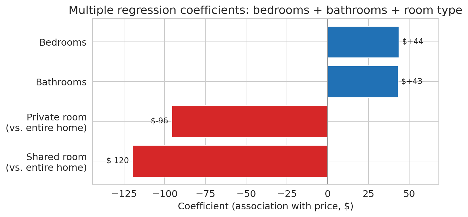
The model finally answers the opening question: a bathroom is associated with roughly \$43 more per night, holding bedrooms and room type constant. An extra bedroom, once bathrooms and room type are controlled for, is associated with about \$44 more. Private rooms cost substantially less than entire homes, even after adjusting for size, and shared rooms less still.
To see the coefficients at a glance, we plot them as a horizontal bar chart with dollar labels on each bar.
```{python}
# Visualize coefficients with dollar labels
fig, ax = plt.subplots(figsize=(8, 4))
coef_sorted = coef_table.sort_values('coefficient').copy()

# Rename the raw pandas dummy names to human-readable labels
label_map = {
    'bedrooms': 'Bedrooms',
    'bathrooms': 'Bathrooms',
    'room_type_Private room': 'Private room\n(vs. entire home)',
    'room_type_Shared room': 'Shared room\n(vs. entire home)',
}
coef_sorted['feature'] = coef_sorted['feature'].map(lambda s: label_map.get(s, s))

colors = ['#d62728' if c < 0 else '#2171b5' for c in coef_sorted['coefficient']]
bars = ax.barh(coef_sorted['feature'], coef_sorted['coefficient'],
               color=colors, edgecolor='white')
ax.axvline(0, color='gray', linewidth=1)
ax.set_xlabel('Coefficient (association with price, $)')
ax.set_title('Multiple regression coefficients: bedrooms + bathrooms + room type')

# Annotate each bar with its dollar value
for bar, val in zip(bars, coef_sorted['coefficient']):
    offset = 2 if val >= 0 else -2
    ha = 'left' if val >= 0 else 'right'
    ax.text(val + offset, bar.get_y() + bar.get_height() / 2,
            f'${val:+.0f}', va='center', ha=ha, fontsize=10)

ax.margins(x=0.15)
plt.tight_layout()
save_for_slides('coefficient-bars')
plt.show()
```
:::{.callout-note collapse="true"}
## Going deeper: the reviews puzzle
What happens when we add `number_of_reviews` to the model? Before looking at the coefficient, compare $R^2$ with and without the new feature.
```{python}
# Add number of reviews — drop rows with missing review counts first
df_reviews = df.dropna(subset=['number_of_reviews']).copy()
X_reviews = pd.concat([
    df_reviews[['bedrooms', 'bathrooms', 'number_of_reviews']],
    pd.get_dummies(df_reviews[['room_type']], drop_first=True)
], axis=1).astype(float)
y_reviews = df_reviews['price']

# Refit the baseline model on the same rows so R² values are comparable
X_base_reviews = pd.concat([
    df_reviews[['bedrooms', 'bathrooms']],
    pd.get_dummies(df_reviews[['room_type']], drop_first=True)
], axis=1).astype(float)
r2_base_reviews = LinearRegression().fit(X_base_reviews, y_reviews).score(X_base_reviews, y_reviews)

model_reviews = LinearRegression().fit(X_reviews, y_reviews)
r2_reviews = model_reviews.score(X_reviews, y_reviews)

print(f"Without reviews: R² = {r2_base_reviews:.4f}")
print(f"With reviews:    R² = {r2_reviews:.4f}")
print(f"Improvement:     {r2_reviews - r2_base_reviews:+.5f}")
```
The R² is essentially identical to four decimal places — adding reviews buys us nothing in predictive accuracy.
```{python}
print("Coefficients with reviews included:")
for name, coef in zip(X_reviews.columns, model_reviews.coef_):
    print(f"  {name:30s}  {coef:+.2f}")
```
The coefficient on `number_of_reviews` is *negative*. The association is real: listings with more reviews do tend to have lower prices in this data, holding other features constant. But reading it as a recommendation — "get more reviews to lower your price" — is wrong. Two mechanisms work together to produce the negative sign, and neither is a causal effect of reviews on price:
- **Reverse causation** — the response $y$ is influencing the feature $x$, not the other way around. Price influences how often a listing sells, bookings drive review counts, so reviews sit downstream of price. A \$60/night studio might host 200 guests a year; a \$350/night loft might host 30. More guests means more reviews.
- **Omitted variables** — listing age, host activity, and segment (budget vs. luxury) drive both review counts *and* prices for reasons that have nothing to do with a price-to-reviews link. Old, casual, lower-end listings accumulate more reviews and charge less; neither direction is a causal channel between the two.
The regression faithfully reports the downward association but has no window into which of these stories is generating it. An analyst who stops at the coefficient — or worse, recommends a host strategy based on it — has confused association with causation.
A good habit: when a coefficient surprises you, ask *could the response plausibly influence this feature?* Here, high price discourages bookings, and fewer bookings mean fewer reviews — so $y$ (price) causally affects $x$ (reviews), not the other way around. Multiple regression cannot untangle this from observational data alone; we develop tools that can in [Chapter 18](lec18-causal-inference-1.qmd).
:::
# Feature engineering: transforming X
## The big idea
Every model we've fit so far is $\hat{y} = X\beta$ — linear in the parameters $\beta$. The features $X$ can be anything: raw columns, squared columns, products of columns, or columns derived from text. The mantra captures the point: **"linear in parameters, not in features."** The creative work happens *before* the fit, in the choice of which columns to build.
This section works through two moves. **Interaction terms** let the slope depend on another variable. **Missing-value indicators** turn an awkward data-cleaning problem into a feature. The next section then reshapes the response with a log transform. (Features that are powers of other features — $x^2$, $x^3$, and so on — are one more move in the same family; we defer them to [Chapter 6](lec06-validation.qmd), where train-test splits let us see their tendency to overfit.)
## Interaction terms
Is an extra bedroom associated with the same price increase in Manhattan and the Bronx? So far, our model uses a single bedrooms coefficient everywhere. An **interaction term** lets the association between one feature and the response depend on another:
$$\hat{y} = \beta_0 + \beta_1 \cdot \text{bedrooms} + \beta_2 \cdot \mathbb{1}_{\text{Manhattan}} + \beta_3 \cdot (\text{bedrooms} \times \mathbb{1}_{\text{Manhattan}})$$
The coefficient $\beta_3$ captures how much *more* (or less) a bedroom is worth in Manhattan compared to the reference borough.
```{python}
# Pooled model: bedrooms + borough dummies (shared slope, borough-specific intercepts)
borough_dummies = pd.get_dummies(df['borough'], drop_first=True).astype(float)
X_pooled = pd.concat([df[['bedrooms']], borough_dummies], axis=1)
model_pooled = LinearRegression().fit(X_pooled, prices)

# Interaction model: add bedrooms × borough columns
interactions = borough_dummies.multiply(df['bedrooms'], axis=0)
interactions.columns = [f'bedrooms_x_{col}' for col in interactions.columns]
X_interact_only = pd.concat([df[['bedrooms']], borough_dummies, interactions], axis=1)
model_interact_only = LinearRegression().fit(X_interact_only, prices)

# The reference borough is the one that was dropped by drop_first=True
ref_borough = sorted(df['borough'].unique())[0]
shared_slope = model_pooled.coef_[0]
print(f"Pooled model: shared bedroom slope = ${shared_slope:.0f}/BR across all boroughs")
print(f"Reference borough (absorbed into intercept): {ref_borough}")
```
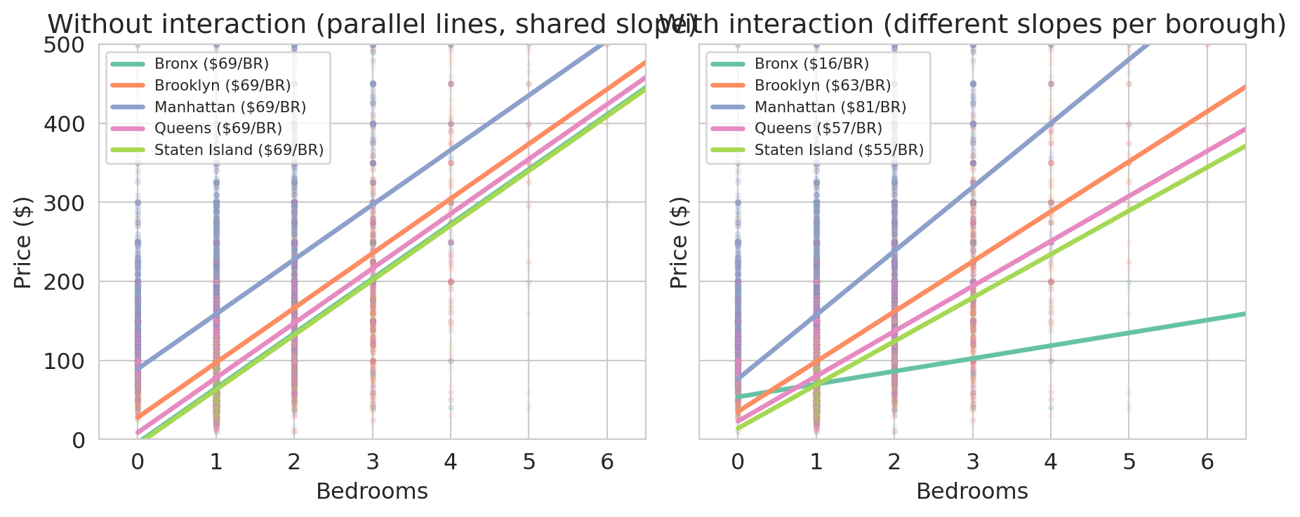
With both models in hand, we can draw one line per borough under each. Under the pooled model every borough uses the same slope; under the interaction model every borough uses its own.
```{python}
# Draw per-borough lines implied by each model
fig, axes = plt.subplots(1, 2, figsize=(9.5, 4), sharey=True)
palette = sns.color_palette('Set2', n_colors=df['borough'].nunique())
borough_order = [ref_borough] + list(borough_dummies.columns)
color_map = dict(zip(borough_order, palette))

def borough_intercept_pooled(borough):
    intercept = model_pooled.intercept_
    if borough != ref_borough:
        idx = list(borough_dummies.columns).index(borough) + 1
        intercept = intercept + model_pooled.coef_[idx]
    return intercept

def borough_line_interact(borough):
    intercept = model_interact_only.intercept_
    slope = model_interact_only.coef_[0]
    if borough != ref_borough:
        nb = len(borough_dummies.columns)
        idx_dummy = list(borough_dummies.columns).index(borough) + 1
        idx_inter = 1 + nb + list(borough_dummies.columns).index(borough)
        intercept = intercept + model_interact_only.coef_[idx_dummy]
        slope = slope + model_interact_only.coef_[idx_inter]
    return intercept, slope

for ax, title, kind in [
    (axes[0], 'Without interaction (parallel lines, shared slope)', 'pooled'),
    (axes[1], 'With interaction (different slopes per borough)', 'interact')
]:
    for borough, group in df.groupby('borough'):
        color = color_map[borough]
        ax.scatter(group['bedrooms'], group['price'], alpha=0.07, s=6, color=color)
        if len(group) > 50:
            x_range = np.array([0.0, group['bedrooms'].max()])
            if kind == 'pooled':
                intercept = borough_intercept_pooled(borough)
                slope = shared_slope
            else:
                intercept, slope = borough_line_interact(borough)
            ax.plot(x_range, intercept + slope * x_range, color=color, linewidth=2.5,
                    label=f'{borough} (${slope:.0f}/BR)')
    ax.set_xlabel('Bedrooms')
    ax.set_ylabel('Price ($)')
    ax.set_title(title)
    ax.legend(fontsize=8, loc='upper left')
    ax.set_xlim(-0.5, 6.5)
    ax.set_ylim(0, 500)

plt.tight_layout()
save_for_slides('borough-interactions')
plt.show()
```
In the left panel every borough shares the same slope — the pooled model forces one bedroom coefficient for the whole city, and the only room for variation across boroughs is the intercept. In the right panel the interaction model lets each borough set its own slope, and the slopes differ substantially. An extra bedroom in Manhattan or Brooklyn adds much more to the predicted price than the same bedroom in the Bronx.
```{python}
# Compare R² across the two models
r2_pooled = model_pooled.score(X_pooled, prices)
r2_interact = model_interact_only.score(X_interact_only, prices)
print(f"Pooled (borough intercepts only): R² = {r2_pooled:.4f}")
print(f"With bedrooms × borough:          R² = {r2_interact:.4f}")
```
The interaction model also nests the room-type and bathrooms features from earlier. Refitting with the full feature set plus interactions gives our richest model so far.
```{python}
# Full model + bedrooms × borough interactions for the recap R² table
X_interact_full = pd.concat([X_full, borough_dummies, interactions], axis=1).astype(float)
model_interact = LinearRegression().fit(X_interact_full, prices)
r2_interact_full = model_interact.score(X_interact_full, prices)
print(f"Full features + borough + interactions: R² = {r2_interact_full:.4f}  ({X_interact_full.shape[1]} features)")
```
A model without interaction terms hides borough-level heterogeneity inside a single pooled slope. Interactions let the model say what every real-estate agent already knows: a bedroom is not worth the same dollars everywhere.
## Missing values as features
Interactions built new columns out of products of existing features. The next move builds a column out of the *absence* of a feature.
A missing `cleaning_fee` carries information. Hosts who leave it blank might bundle cleaning into the nightly rate, might be casual operators who skipped optional fields, or might expect guests to tidy up. Whatever the mechanism, listings with no listed fee are systematically cheaper, and we want the model to see it.
```{python}
# cleaning_fee is stored as a numeric dollar amount (already parsed);
# a substantial fraction of listings leave it blank.
n_missing_fee = df['cleaning_fee'].isna().sum()
pct_missing_fee = 100 * n_missing_fee / len(df)
print(f"Listings with missing cleaning fee: {n_missing_fee:,} ({pct_missing_fee:.1f}%)")
print()

# Median price split by whether the fee is present
median_missing = df[df['cleaning_fee'].isna()]['price'].median()
median_present = df[df['cleaning_fee'].notna()]['price'].median()
print(f"Median price when cleaning fee is missing: ${median_missing:.0f}")
print(f"Median price when cleaning fee is present: ${median_present:.0f}")
```
Listings with a missing cleaning fee are noticeably cheaper on average — the missingness isn't random noise, it's tracking something real about the listing. The approach: impute the missing numeric value with *any* constant, then add a binary `fee_missing` column. The model can then learn whether "missing" predicts a different price from any observed fee.
The choice of imputation constant does not affect predictions. Imputing with $c$ instead of zero shifts $\hat{\beta}_{\text{missing}}$ by exactly $-c \cdot \hat{\beta}_{\text{fee}}$, leaving $\hat{y}$ unchanged for every row. To see why: the imputed-with-$c$ column equals the imputed-with-zero column plus $c$ times the indicator, so the two designs span the same column space and produce the same projection. We pick **zero** because it gives the indicator coefficient a clean interpretation — $\hat{\beta}_{\text{missing}}$ directly measures the total contribution from a missing-fee listing, with no $\hat{\beta}_{\text{fee}} \cdot c$ offset to unwind.
```{python}
# Impute the cleaning fee with zero and record which rows were filled in.
df['cleaning_fee_imputed'] = df['cleaning_fee'].fillna(0)
df['fee_missing'] = df['cleaning_fee'].isna().astype(int)

print("Sample rows:")
print(df[['cleaning_fee', 'cleaning_fee_imputed', 'fee_missing']].head(10))
```
```{python}
# Verify: imputing with c=0 vs c=50 gives identical predictions
fee_0  = df['cleaning_fee'].fillna(0)
fee_50 = df['cleaning_fee'].fillna(50)
indicator = df['fee_missing']

X_c0  = pd.concat([X_full, fee_0.rename('fee'), indicator], axis=1).astype(float)
X_c50 = pd.concat([X_full, fee_50.rename('fee'), indicator], axis=1).astype(float)

m0  = LinearRegression().fit(X_c0, prices)
m50 = LinearRegression().fit(X_c50, prices)

print("Max prediction difference:", np.abs(m0.predict(X_c0) - m50.predict(X_c50)).max())
print(f"c=0:  β_fee={m0.coef_[-2]:+.4f},  β_missing={m0.coef_[-1]:+.2f}")
print(f"c=50: β_fee={m50.coef_[-2]:+.4f},  β_missing={m50.coef_[-1]:+.2f}")
print(f"Shift: β_missing changed by {m50.coef_[-1] - m0.coef_[-1]:+.2f}  "
      f"= -50 × β_fee = {-50 * m0.coef_[-2]:+.2f}")
```
The coefficients shift but the predictions are identical — the column space is the same. With zero imputation, $\hat{\beta}_{\text{missing}}$ reads directly as the price premium for a missing-fee listing.
Does the indicator carry its own weight, beyond the imputed value?
```{python}
# Baseline: the full model without any cleaning-fee information
X_base = X_full
m_base = LinearRegression().fit(X_base, prices)
r2_base = m_base.score(X_base, prices)

# Add the imputed fee by itself
X_fee = pd.concat([X_full, df[['cleaning_fee_imputed']]], axis=1).astype(float)
m_fee = LinearRegression().fit(X_fee, prices)
r2_fee = m_fee.score(X_fee, prices)

# Add the imputed fee and the missingness indicator
X_fee_ind = pd.concat([X_full, df[['cleaning_fee_imputed', 'fee_missing']]], axis=1).astype(float)
m_fee_ind = LinearRegression().fit(X_fee_ind, prices)
r2_fee_ind = m_fee_ind.score(X_fee_ind, prices)

print(f"Baseline (no fee):            R² = {r2_base:.4f}")
print(f"+ imputed cleaning fee:       R² = {r2_fee:.4f}")
print(f"+ imputed fee + fee_missing:  R² = {r2_fee_ind:.4f}")
print()
beta_fee = m_fee_ind.coef_[-2]
beta_missing = m_fee_ind.coef_[-1]
median_fee = df['cleaning_fee'].median()
print(f"cleaning_fee_imputed coefficient: ${beta_fee:+.2f} per $1 of fee")
print(f"fee_missing coefficient:          ${beta_missing:+.2f}")
print()
print(f"Median observed cleaning fee: ${median_fee:.0f}")
print(f"Fee contribution for a median-fee listing: ${beta_fee * median_fee:+.2f}")
print(f"Fee contribution for a missing-fee listing: ${beta_missing:+.2f}")
```
The imputed fee pushes $R^2$ up sharply — the fee itself is a strong price signal. Adding the `fee_missing` indicator contributes a smaller additional bump. Now the key move: read the **total contribution** each row gets from the two new columns.
- A listing with a missing fee has `cleaning_fee_imputed = 0` and `fee_missing = 1`, so its combined contribution is $\hat{\beta}_{\text{fee}} \cdot 0 + \hat{\beta}_{\text{missing}} \cdot 1 = \hat{\beta}_{\text{missing}} \approx \$35.71$.
- A listing with the median observed fee ($50) has `cleaning_fee_imputed = 50` and `fee_missing = 0`, so its combined contribution is $\hat{\beta}_{\text{fee}} \cdot 50 \approx \$40.04$.
The missing-fee listings are predicted about \$4 cheaper than a typical-fee listing, holding bedrooms, bathrooms, and room type fixed. That gap is the "missing carries information" signal: the model has learned something from the *pattern* of missingness that raw imputation alone can't capture.
:::{.callout-warning}
## Don't impute blindly
Imputation replaces missing values with plausible substitutes. Without a missingness indicator, the model cannot distinguish real values from imputed ones. Always pair imputation with an indicator column when missingness might carry information — that is, when the data is MAR or MNAR (see [Chapter 3](lec03-munging.qmd)).
:::
# Log transforms: transforming y
## A hint hiding in the interaction coefficients
Before we fit anything new, look more carefully at what the bedrooms × borough interaction model already told us. Each borough has its own bedroom slope — but those slopes are only *dollar* changes per bedroom. Translating them into *percentages* reveals something we haven't yet noticed.
```{python}
# Per-borough bedroom premium, now showing dollars AND percentages side-by-side.
# Uses model_interact_only and the borough_line_interact helper from §Interaction terms.
hint_rows = []
for b in [ref_borough] + list(borough_dummies.columns):
    intercept, slope = borough_line_interact(b)
    p1 = intercept + slope          # fitted 1-BR price
    p2 = intercept + slope * 2      # fitted 2-BR price
    pct_per_bedroom = (p2 / p1 - 1) * 100
    hint_rows.append((b, p1, p2, slope, pct_per_bedroom))

hint_table = pd.DataFrame(
    hint_rows,
    columns=['borough', '1-BR fit', '2-BR fit', '$ per bedroom', '% per bedroom']
).sort_values('$ per bedroom', ascending=False)

print(hint_table.round(0).to_string(index=False))
```
Dollar premiums span a 5× range, from \$16 in the Bronx to \$81 in Manhattan — the interaction model needs a separate slope for each borough. Percentages tell a different story: four of the five boroughs cluster between 51% and 80% per bedroom. That's meaningfully closer to "one shared number" than the dollar column is. Only the Bronx fits neither picture (23% per bedroom, \$16 per bedroom), and it will be the outlier we accept as the price of simplification. If we can find a model that speaks in percentages, one coefficient can do what five interaction terms were doing. The log transform is that model.
## A second clue: the fat right tail
The interaction-coefficient hint is one reason the log transform was the right move. There is a second, independent reason, and it's visible in the price distribution itself.
```{python}
fig, ax = plt.subplots(figsize=(7, 4))
ax.hist(prices, bins=60, edgecolor='white', alpha=0.85, color='#4c72b0')
ax.axvline(prices.median(), color='#d62728', lw=2, ls='--',
           label=f'median ${prices.median():.0f}')
ax.axvline(np.percentile(prices, 90), color='#ff7f0e', lw=2, ls='--',
           label=f'90th percentile ${np.percentile(prices, 90):.0f}')
ax.set_xlabel('Price per night ($)')
ax.set_ylabel('Number of listings')
ax.set_title('Airbnb prices are heavily right-skewed')
ax.legend(loc='upper right', fontsize=9)
plt.tight_layout()
save_for_slides('price-histogram')
plt.show()
```
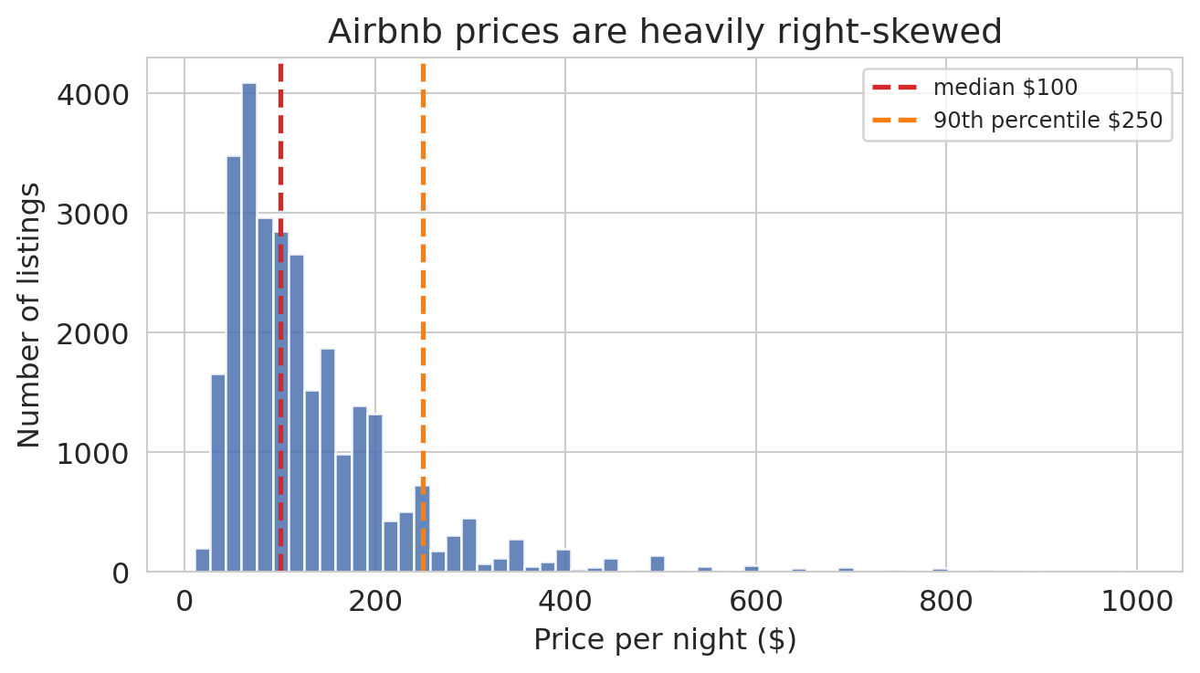
The median listing costs \$100 per night, but the distribution runs all the way to \$999 — a fat right tail of expensive listings an order of magnitude above the center. When any level model fits by minimizing squared error in dollars, that tail is where the error budget ends up. We can measure how much, using the pooled model `model_pooled` we fit back in the interaction-terms section.
```{python}
# How much of the pooled level-model's squared error comes from the most expensive listings?
resid_pooled = prices.values - model_pooled.predict(X_pooled)
sse_pooled = resid_pooled ** 2

order = np.argsort(-prices.values)  # listings sorted from most to least expensive
sse_sorted = sse_pooled[order]

for pct in [5, 10, 20]:
    n = int(len(prices) * pct / 100)
    share = sse_sorted[:n].sum() / sse_pooled.sum() * 100
    print(f"Top {pct:2d}% most expensive listings: {share:.1f}% of total squared error")
```
If every listing contributed equally, the top 5% would account for 5% of the squared error. Instead they account for nearly half — almost ten times their fair share. The reason is the squared-dollar objective: a \$50 miss on a \$100 listing (50% off — a disaster) and a \$50 miss on a \$500 listing (10% off — mild) contribute exactly the same amount to the SSE. The level model can't distinguish them, so it distributes attention by absolute dollars, and the tail dominates.
We want an error metric that treats proportional mistakes on equal footing, so that a 50% miss is a 50% miss regardless of the listing's base price. That is what a log transform does — and it happens to be the same move the interaction-coefficient hint suggested.
## From additive to multiplicative
Both clues point the same direction. The interaction coefficients said the model should think in percentages; the fat right tail said the least-squares objective should too. A **log transform** gives us both at once, by reshaping $y$ before we fit.
The additive structure of ordinary least squares has a basic limitation when the data is multiplicative: each coefficient adds a correction, and nothing in the math keeps predictions positive or prevents them from swinging below zero.
A **log transform** attacks the same curvature from a different angle. Instead of letting $X$ grow into more columns, it reshapes $y$. The motivation is a simple observation about the bedroom premium: adding a bedroom to a luxury apartment is worth more in absolute dollars than adding a bedroom to a rundown studio. Large Airbnbs are scarce; the handful that can host a family reunion or a bachelor party command a disproportionate premium over the many cramped studios. The dollar response to "one more bedroom" *grows* with the base size, which is exactly the super-linear pattern a straight-line fit cannot match.
A log transform captures that pattern cleanly. On the log scale, a one-unit increase in bedrooms multiplies the price by a *constant factor*. Apply the same multiplier to a big Manhattan base and you get a big dollar jump; apply it to a small Bronx base and you get a small dollar jump — same proportional increase, very different dollar amounts.
```{python}
# Fit two models we can compare: a level model and a log model, each with borough
log_prices = np.log(prices)

X_level_b = pd.concat([df[['bedrooms']], borough_dummies], axis=1).astype(float)
model_level_b = LinearRegression().fit(X_level_b, prices)
r2_level_b = model_level_b.score(X_level_b, prices)

model_loglevel = LinearRegression().fit(X_level_b, log_prices)
r2_loglevel = model_loglevel.score(X_level_b, log_prices)

print(f"price      ~ bedrooms + borough: R² = {r2_level_b:.4f}")
print(f"log(price) ~ bedrooms + borough: R² = {r2_loglevel:.4f}  (comparing log-y to log-y)")
print(f"\nShared multiplier per bedroom (log model): e^{model_loglevel.coef_[0]:.3f}"
      f" = {np.exp(model_loglevel.coef_[0]):.3f}")
```
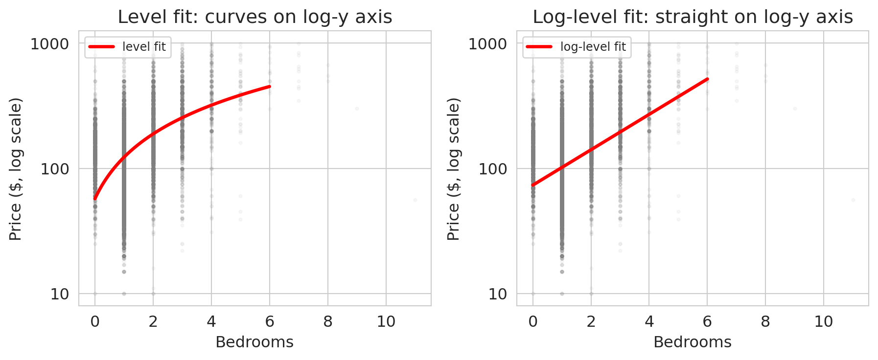
The two $R^2$ values measure different things (one fits price, one fits log price) so the bare comparison is not decisive. The visual is: on a log-scaled y-axis, the curvy cloud straightens out.
```{python}
# Visualize the log transform's effect using a semilogy y-axis
fig, axes = plt.subplots(1, 2, figsize=(9.5, 4), sharex=True)
bedroom_grid = np.linspace(0, 6, 200)

# Left: level model overlaid on a semilogy plot.
# The fit is a straight line in dollars but curves on a log-y axis.
ax = axes[0]
ax.scatter(df['bedrooms'], prices, alpha=0.05, s=5, color='gray')
level_pred = model_simple.predict(bedroom_grid.reshape(-1, 1))
ax.plot(bedroom_grid, level_pred, 'r-', lw=2.5, label='level fit')
ax.set_yscale('log')
ax.set_xlabel('Bedrooms')
ax.set_ylabel('Price ($, log scale)')
ax.set_title('Level fit: curves on log-y axis')
ax.yaxis.set_major_formatter(mticker.ScalarFormatter())
ax.legend(fontsize=9, loc='upper left')

# Right: log fit on a semilogy plot - straight line in log space
ax = axes[1]
ax.scatter(df['bedrooms'], prices, alpha=0.05, s=5, color='gray')
# Fit log(price) ~ bedrooms (single feature), then exponentiate to plot on price axis
model_log_simple = LinearRegression().fit(df[['bedrooms']], log_prices)
log_fit_price = np.exp(model_log_simple.predict(bedroom_grid.reshape(-1, 1)))
ax.plot(bedroom_grid, log_fit_price, 'r-', lw=2.5, label='log-level fit')
ax.set_yscale('log')
ax.set_xlabel('Bedrooms')
ax.set_ylabel('Price ($, log scale)')
ax.set_title('Log-level fit: straight on log-y axis')
ax.yaxis.set_major_formatter(mticker.ScalarFormatter())
ax.legend(fontsize=9, loc='upper left')

plt.tight_layout()
save_for_slides('log-transform')
plt.show()
```
On a log-scaled y-axis, the log-level fit is a straight line and the level fit visibly curves. The log model has matched the super-linear bedroom premium that the level model had to fake with a tilted straight line.
## Dollar increases differ by borough, percentage increases don't
This is the confirmation of the clue we spotted in the interaction coefficients. With one shared multiplier, the log-with-borough model produces a different dollar increase per bedroom in each borough — small in the Bronx, large in Manhattan — but the *percentage* increase is the same everywhere. The interaction coefficients were hinting at this structure all along; the log transform is what made it expressible in a single number.
```{python}
# Translate the log-level coefficients back into dollar increases per bedroom
# by borough. Each borough's base (0-bedroom) price differs; the multiplier
# per bedroom is shared across boroughs.
beta_bed_log = model_loglevel.coef_[0]
multiplier = np.exp(beta_bed_log)

rows = []
for i, borough in enumerate([ref_borough] + list(borough_dummies.columns)):
    if i == 0:
        log_base = model_loglevel.intercept_
    else:
        log_base = model_loglevel.intercept_ + model_loglevel.coef_[i]
    base_price = np.exp(log_base)
    next_price = np.exp(log_base + beta_bed_log)
    rows.append((borough, base_price, next_price, next_price - base_price))

dollar_table = pd.DataFrame(
    rows, columns=['borough', '0-BR base', '1-BR price', '$ per bedroom (0→1)']
).sort_values('$ per bedroom (0→1)', ascending=False)
print(f"Shared multiplier per bedroom: {multiplier:.3f}  (≈ {(multiplier-1)*100:.0f}% per bedroom)")
print()
print(dollar_table.round(0).to_string(index=False))
```
A bedroom in Manhattan adds many more dollars than a bedroom in the Bronx, even though both boroughs share the same *proportional* increase in the log model. The single multiplier reproduces the pattern we spotted in the interaction coefficients — Manhattan, Brooklyn, Queens, and Staten Island all come in around the shared percentage — and pays for that compression by under-fitting the Bronx, which we already knew was the outlier. The log transform has traded five interaction coefficients for one.
:::{.callout-note collapse="true"}
## Going deeper: does the log model actually predict better?
The multiplicative story says the log model captures borough heterogeneity more elegantly. But does it make *better predictions* in dollars? We can answer by breaking the data into price deciles and computing the mean absolute error within each decile for both models.
One subtlety: the log model predicts $\log(y)$, so we exponentiate to get a dollar prediction — and naive `np.exp()` of a log-regression's fitted values systematically *underpredicts* the mean on the dollar scale (the arithmetic mean of $\exp(\log y)$ is larger than $\exp$ of the mean of $\log y$). A standard fix multiplies by the average of $\exp(\text{log residuals})$, rescaling the predictions to match the mean.
```{python}
# Precompute predictions once.
yhat_level_b = model_level_b.predict(X_level_b)

# Back-transform log predictions to dollars, with a correction factor so
# the arithmetic mean of the predictions matches the mean of y.
log_pred_b = model_loglevel.predict(X_level_b)
log_resid_b = log_prices - log_pred_b
correction = np.mean(np.exp(log_resid_b))
yhat_log_dollars = np.exp(log_pred_b) * correction

# Per-decile MAE for both models.
deciles = pd.qcut(prices, 10, labels=False, duplicates='drop')
decile_rows = []
for d in range(10):
    mask = deciles == d
    lo, hi = int(prices[mask].min()), int(prices[mask].max())
    level_mae = np.mean(np.abs(prices.values[mask] - yhat_level_b[mask]))
    log_mae = np.mean(np.abs(prices.values[mask] - yhat_log_dollars[mask]))
    decile_rows.append((d + 1, f'${lo}-${hi}', level_mae, log_mae))

decile_df = pd.DataFrame(decile_rows, columns=['decile', 'price range', 'level MAE', 'log MAE'])
```
```{python}
fig, ax = plt.subplots(figsize=(8.5, 5.5))
y_pos = np.arange(len(decile_df))
bar_height = 0.38
max_mae = decile_df[['level MAE', 'log MAE']].values.max()
label_offset = max_mae * 0.012

bars_level = ax.barh(y_pos - bar_height/2, decile_df['level MAE'], bar_height,
                     color='#d62728', label='level model', edgecolor='white')
bars_log = ax.barh(y_pos + bar_height/2, decile_df['log MAE'], bar_height,
                   color='#2171b5', label='log model', edgecolor='white')

for bar, val in zip(bars_level, decile_df['level MAE']):
    ax.text(val + label_offset, bar.get_y() + bar.get_height()/2, f'${val:.0f}',
            va='center', ha='left', fontsize=9, color='#d62728')
for bar, val in zip(bars_log, decile_df['log MAE']):
    ax.text(val + label_offset, bar.get_y() + bar.get_height()/2, f'${val:.0f}',
            va='center', ha='left', fontsize=9, color='#2171b5')

ax.set_yticks(y_pos)
ax.set_yticklabels([f"D{r['decile']} ({r['price range']})" for _, r in decile_df.iterrows()],
                   fontsize=9)
ax.invert_yaxis()
ax.set_xlabel('Mean absolute error ($)')
ax.set_title('Per-decile prediction error: where each model wins')
ax.legend(loc='lower right', fontsize=10)
ax.set_xlim(0, max_mae * 1.24)
plt.tight_layout()
plt.show()
```
Two patterns stand out. First, the top decile (\$251-\$999) has roughly \$170 MAE for the level model and \$180 for the log — expensive listings are hard to fit either way. Our features describe bedroom count and borough, not amenities, sub-neighborhood, property type, or seasonality; neither model has what it would take to predict those well. Second, in deciles 4-7 (\$76-\$150 per night, where most listings live) the log model's MAE is 74-89% of the level model's, a real improvement of \$5-\$10 per listing.
There's a puzzle hiding in this table. The level model minimizes squared error in dollars — it is by definition the best fit among linear functions $\beta_0 + \beta_1 \cdot \text{bedrooms} + \cdots$. And yet the log model just beat it on MAE across most of the distribution. How? The log model's backtransformed prediction, $\exp(\beta_0 + \beta_1 \cdot \text{bedrooms} + \cdots)$, is *not* a linear function of bedrooms and borough — it lives in a different (non-linear) class of predictors. "Least squares minimizes MSE" is a promise within the linear class only; a richer class can beat it with a different objective. The log transform isn't cheating; it's changing the shape of the hypothesis space to match the multiplicative structure of prices.
:::
## The four transform combinations
Depending on whether you log-transform $y$, $x$, or both, the coefficient takes on a different interpretation.
:::{.callout-important}
## Interpreting coefficients with log transforms
| Model | Coefficient $\beta_1$ means |
|-------|---------------------------|
| $y \sim x$ | a 1-unit increase in $x$ adds $\beta_1$ to $y$ |
| $\log(y) \sim x$ | a 1-unit increase in $x$ multiplies $y$ by $e^{\beta_1}$ |
| $y \sim \log(x)$ | a 1% increase in $x$ adds about $\beta_1/100$ to $y$ |
| $\log(y) \sim \log(x)$ | a 1% increase in $x$ gives about a $\beta_1$% change in $y$ |
: {.striped .hover}
:::
```{python}
beta1_log = model_log_simple.coef_[0]
multiplier_simple = np.exp(beta1_log)
pct_change = (multiplier_simple - 1) * 100

print(f"log(price) ~ bedrooms:  β₁ = {beta1_log:.4f}")
print(f"Each bedroom multiplies price by e^{beta1_log:.4f} = {multiplier_simple:.3f}")
print(f"That corresponds to a {pct_change:.1f}% increase per bedroom.")
```
On the log scale, a one-unit increase in bedrooms multiplies the predicted price by $e^{\beta_1}$ — a fixed proportional jump, which becomes a larger dollar jump off a larger base.
The first row is the standard linear model we've been using. The second row is the log-level model we just fit: each extra bedroom multiplies price by about $e^{0.33} \approx 1.38$. The bottom two rows — where $x$ itself appears on the log scale — are meant for features that span many orders of magnitude, so a *percentage* change is the natural unit (square footage, income, population, or in our data `accommodates`, which ranges over an order of magnitude).
:::{.callout-important}
## Definition: Elasticity
The coefficient on a log-log model is an **elasticity**: the percentage change in $y$ associated with a one-percent change in $x$. Elasticities are dimensionless, which makes them comparable across features on wildly different scales. Economists use them constantly — price elasticity of demand, income elasticity, wage elasticity — because "how much does revenue shift when price rises 1%" is a question that matters whether the price is \$5 or \$500.
:::
```{python}
# Log-log model: log(price) ~ log(accommodates)
log_accom = np.log(df['accommodates'])
model_loglog = LinearRegression().fit(log_accom.values.reshape(-1, 1), log_prices)
beta_loglog = model_loglog.coef_[0]

print(f"log(price) ~ log(accommodates):  β₁ = {beta_loglog:.3f}")
print(f"Elasticity: a 1% increase in accommodates → about {beta_loglog:.2f}% increase in price")
print(f"            a 10% larger listing → about {10 * beta_loglog:.1f}% higher price")
```
The elasticity lets us compare the "bedroom premium" to the "capacity premium" without worrying about whether one is measured in integers and the other in people — they live on the same percentage scale.
# Diagnostics and dangers
With this many modeling choices at our disposal, we need tools to tell us when we've gone too far. Three diagnostics help: adjusted $R^2$ checks whether added features earn their place, multicollinearity warns when features duplicate each other, and residual plots reveal patterns the model missed.
## Adjusted $R^2$
Training $R^2$ never decreases when you add a feature — even a column of random noise. **Adjusted $R^2$** penalizes for the number of features:
$$R^2_{\text{adj}} = 1 - \frac{(1 - R^2)(n - 1)}{n - p - 1}$$
where $n$ is the number of observations and $p$ is the number of predictors. A useless feature increases $p$ without sufficiently reducing residual variance, so adjusted $R^2$ drops.
```{python}
def adjusted_r2(r2, n, p):
    return 1 - (1 - r2) * (n - 1) / (n - p - 1)

n = len(prices)
models_summary = {
    'bedrooms only': (model_simple.score(df[['bedrooms']], prices), 1),
    '+ bathrooms': (model_two.score(df[['bedrooms', 'bathrooms']], prices), 2),
    '+ room type': (r2_full, X_full.shape[1]),
    '+ borough + interactions': (r2_interact_full, X_interact_full.shape[1]),
}

print(f"{'Model':<30s}  {'R²':>6s}  {'Adj R²':>7s}  {'p':>3s}")
print("-" * 52)
for name, (r2, p) in models_summary.items():
    print(f"{name:<30s}  {r2:>.4f}  {adjusted_r2(r2, n, p):>.4f}  {p:>3d}")
```
For a more reliable assessment of model quality, we'll use held-out test data in [Chapter 6](lec06-validation.qmd).
## Multicollinearity
What happens when two features carry nearly the same information? The `beds` column (number of beds) is highly correlated with `bedrooms` — most listings have roughly one bed per bedroom.
```{python}
df_mc = df.dropna(subset=['beds']).copy()
corr_beds = df_mc['bedrooms'].corr(df_mc['beds'])
corr_bath = df_mc['bedrooms'].corr(df_mc['bathrooms'])

print(f"Correlation between bedrooms and beds:      {corr_beds:.3f}")
print(f"Correlation between bedrooms and bathrooms:  {corr_bath:.3f}")
```
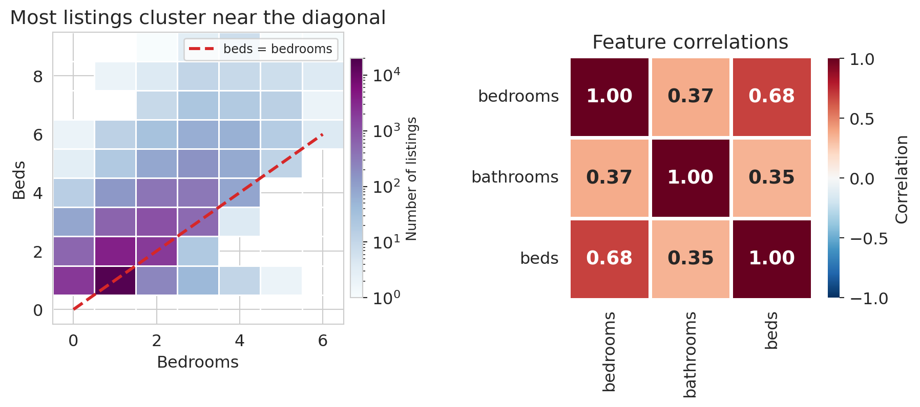
A correlation of about 0.68 between `bedrooms` and `beds` is high — much higher than the correlation between `bedrooms` and `bathrooms` (around 0.37) — and it says these two columns are carrying overlapping information. Plotting the `bedrooms`/`beds` cloud and the three-way correlation matrix makes the near-duplication visible.
```{python}
fig, axes = plt.subplots(1, 2, figsize=(9.5, 4.2),
                         gridspec_kw={'width_ratios': [1.15, 1]})

# Left: 2D histogram
h = axes[0].hist2d(
    df_mc['bedrooms'], df_mc['beds'],
    bins=[np.arange(-0.5, 7), np.arange(-0.5, 10)],
    cmap='BuPu', cmin=1,
    norm=mcolors.LogNorm(vmin=1, vmax=20000),
    edgecolors='white', linewidths=0.5)
cb = plt.colorbar(h[3], ax=axes[0], shrink=0.82, pad=0.02)
cb.set_label('Number of listings', fontsize=10)
axes[0].plot([0, 6], [0, 6], color='#d62728', ls='--', lw=2.2,
             label='beds = bedrooms', zorder=5)
axes[0].set_xlabel('Bedrooms')
axes[0].set_ylabel('Beds')
axes[0].set_title('Most listings cluster near the diagonal')
axes[0].legend(fontsize=9)

# Right: correlation heatmap
corr = df_mc[['bedrooms', 'bathrooms', 'beds']].corr()
sns.heatmap(corr, annot=True, fmt='.2f', cmap='RdBu_r',
            vmin=-1, vmax=1, ax=axes[1], square=True,
            linewidths=2, linecolor='white',
            annot_kws={'fontsize': 14, 'fontweight': 'bold'},
            cbar_kws={'shrink': 0.82, 'label': 'Correlation'})
axes[1].set_title('Feature correlations')

plt.tight_layout(w_pad=3)
save_for_slides('multicollinearity')
plt.show()
```
When two feature vectors point in nearly the same direction, adding the second one barely expands the span — a phenomenon with a name.
:::{.callout-important}
## Definition: Multicollinearity
**Multicollinearity** occurs when two or more feature columns are highly correlated — their vectors point in nearly the same direction. The span barely grows from the additional feature, and the normal equations become ill-conditioned: $(X^TX)^{-1}$ amplifies small perturbations in the data.
:::
```{python}
# Compare models with and without beds
X_no_beds = df_mc[['bedrooms', 'bathrooms']].astype(float)
X_with_beds = df_mc[['bedrooms', 'bathrooms', 'beds']].astype(float)
y_mc = df_mc['price']

m_no = LinearRegression().fit(X_no_beds, y_mc)
m_with = LinearRegression().fit(X_with_beds, y_mc)

print("Without beds:")
for name, coef in zip(X_no_beds.columns, m_no.coef_):
    print(f"  {name:12s}  {coef:+.2f}")
print(f"  R² = {m_no.score(X_no_beds, y_mc):.4f}")

print("\nWith beds:")
for name, coef in zip(X_with_beds.columns, m_with.coef_):
    print(f"  {name:12s}  {coef:+.2f}")
print(f"  R² = {m_with.score(X_with_beds, y_mc):.4f}")
```
Watch what happens to the coefficients. Without beds, bedrooms gets about \$58 and bathrooms about \$34. Once beds enters, bedrooms drops to roughly \$28, bathrooms drops to about \$26, and beds picks up around \$31. $R^2$ improves, but the bedrooms coefficient has been cut in half — the model is redistributing credit among correlated features, and the individual numbers have lost their stable meaning. Predictions remain serviceable; interpretations do not.
## Residual diagnostics
Multicollinearity is a warning about the *coefficients* — that their individual meanings can blur when features overlap. Residuals give us the complementary check on the *fit*: places where the model's structure is wrong rather than just its interpretation.
The normal equations guarantee $X^T \epsilon = 0$ — no *linear* pattern remains between features and residuals. Nonlinear patterns can still lurk, and when they do they are diagnosing something specific: the model's structure is missing a feature, a transformation, or a category. Before looking at our own residuals, here is a vocabulary for the patterns worth recognizing.
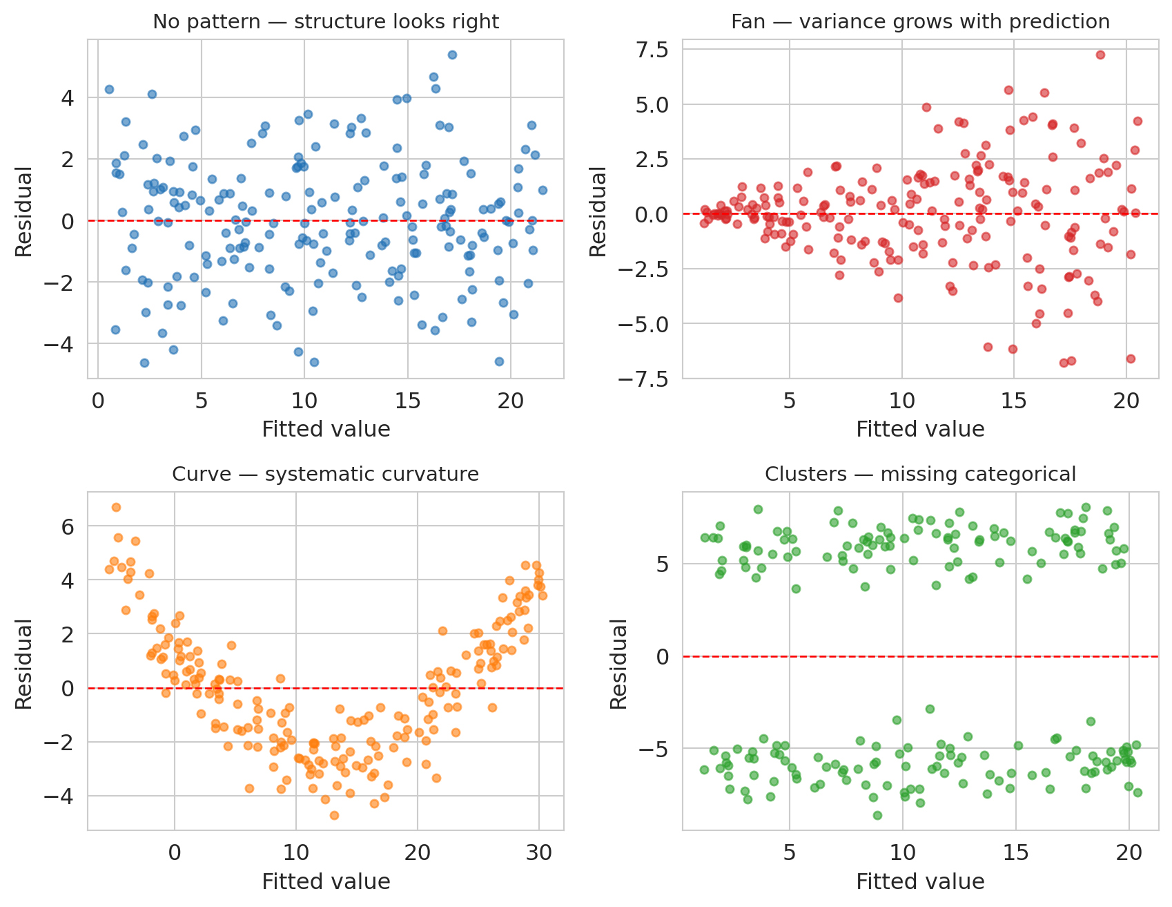
```{python}
# Four synthetic residual-vs-fitted plots: one well-specified model (reference)
# and three classic failure modes. Fixed seed for reproducibility.
syn_rng = np.random.default_rng(42)
n_syn = 200

fig, axes = plt.subplots(2, 2, figsize=(9, 7))

# Top-left: NO STRUCTURE (well-specified linear model)
x_flat = syn_rng.uniform(0, 10, n_syn)
y_flat = 1 + 2 * x_flat + syn_rng.normal(0, 2, n_syn)
fit_flat = LinearRegression().fit(x_flat.reshape(-1, 1), y_flat)
resid_flat = y_flat - fit_flat.predict(x_flat.reshape(-1, 1))
axes[0, 0].scatter(fit_flat.predict(x_flat.reshape(-1, 1)), resid_flat,
                   alpha=0.6, s=18, color='#2171b5')
axes[0, 0].axhline(0, color='red', lw=1, ls='--')
axes[0, 0].set_title('No pattern — structure looks right', fontsize=11)
axes[0, 0].set_xlabel('Fitted value')
axes[0, 0].set_ylabel('Residual')

# Top-right: FAN (variance grows with fitted value)
x_fan = syn_rng.uniform(0, 10, n_syn)
y_fan = 1 + 2 * x_fan + syn_rng.normal(0, 0.35 * (x_fan + 0.5), n_syn)
fit_fan = LinearRegression().fit(x_fan.reshape(-1, 1), y_fan)
resid_fan = y_fan - fit_fan.predict(x_fan.reshape(-1, 1))
axes[0, 1].scatter(fit_fan.predict(x_fan.reshape(-1, 1)), resid_fan,
                   alpha=0.6, s=18, color='#d62728')
axes[0, 1].axhline(0, color='red', lw=1, ls='--')
axes[0, 1].set_title('Fan — variance grows with prediction', fontsize=11)
axes[0, 1].set_xlabel('Fitted value')
axes[0, 1].set_ylabel('Residual')

# Bottom-left: CURVE (quadratic truth with positive linear trend, fit with a line)
# Mixing a linear trend with curvature gives fitted values that span the x range,
# so the panel is scaled similarly to the others.
x_curve = syn_rng.uniform(0, 10, n_syn)
y_curve = 0.5 * x_curve + 0.3 * x_curve**2 + syn_rng.normal(0, 1.0, n_syn)
fit_curve = LinearRegression().fit(x_curve.reshape(-1, 1), y_curve)
resid_curve = y_curve - fit_curve.predict(x_curve.reshape(-1, 1))
axes[1, 0].scatter(fit_curve.predict(x_curve.reshape(-1, 1)), resid_curve,
                   alpha=0.6, s=18, color='#ff7f0e')
axes[1, 0].axhline(0, color='red', lw=1, ls='--')
axes[1, 0].set_title('Curve — systematic curvature', fontsize=11)
axes[1, 0].set_xlabel('Fitted value')
axes[1, 0].set_ylabel('Residual')

# Bottom-right: CLUSTERS (two-component mixture)
x_clust = syn_rng.uniform(0, 10, n_syn)
group = syn_rng.choice([0, 1], size=n_syn)
y_clust = 1 + 2 * x_clust + np.where(group == 1, 6, -6) + syn_rng.normal(0, 1.0, n_syn)
fit_clust = LinearRegression().fit(x_clust.reshape(-1, 1), y_clust)
resid_clust = y_clust - fit_clust.predict(x_clust.reshape(-1, 1))
axes[1, 1].scatter(fit_clust.predict(x_clust.reshape(-1, 1)), resid_clust,
                   alpha=0.6, s=18, color='#2ca02c')
axes[1, 1].axhline(0, color='red', lw=1, ls='--')
axes[1, 1].set_title('Clusters — missing categorical', fontsize=11)
axes[1, 1].set_xlabel('Fitted value')
axes[1, 1].set_ylabel('Residual')

plt.tight_layout()
save_for_slides('residual-patterns')
plt.show()
```
Top-left is the reference: a well-specified linear model gives residuals that scatter evenly around zero with constant variance and no pattern. The other three panels each indicate a specific kind of model misspecification.
- **Fan** (variance grows with the prediction): the model's functional form is missing a variance-stabilizing transformation — often a log applied to $y$.
- **Curve** (systematic U or arch shape): the true relationship has curvature the linear model cannot express. Adding a polynomial term or a log(x) feature usually fixes it.
- **Clusters** (two or more vertically separated clouds): a categorical variable has been omitted, and listings in different categories are being lumped together.
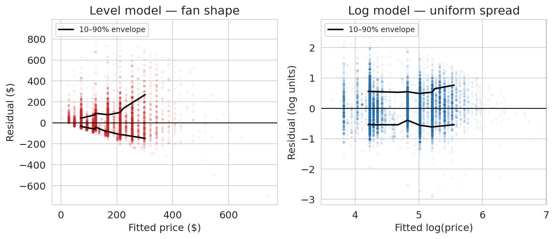
Now look at the residuals from our own full model. We'll fit both the level model and a log version on the same features and plot each one's residuals against its own fitted values — exactly the diagnostic the 2×2 figure just taught.
```{python}
# Level and log versions of the full model, with residuals and fitted values for each.
y_hat_full = model_full.predict(X_full)
residuals_full = prices.values - y_hat_full

model_log_full = LinearRegression().fit(X_full, np.log(prices))
log_fitted_full = model_log_full.predict(X_full)
log_residuals_full = np.log(prices.values) - log_fitted_full

def quantile_envelope(fitted, resid, n_bins=20, low_q=0.10, high_q=0.90):
    """10-90% residual envelope, computed in bins of fitted value."""
    order = np.argsort(fitted)
    fs, rs = fitted[order], resid[order]
    edges = np.quantile(fs, np.linspace(0, 1, n_bins + 1))
    centers, lows, highs = [], [], []
    for lo, hi in zip(edges[:-1], edges[1:]):
        mask = (fs >= lo) & (fs <= hi)
        if mask.sum() >= 30:
            centers.append(fs[mask].mean())
            lows.append(np.quantile(rs[mask], low_q))
            highs.append(np.quantile(rs[mask], high_q))
    return np.array(centers), np.array(lows), np.array(highs)
```
```{python}
fig, axes = plt.subplots(1, 2, figsize=(9.5, 4.2))

# Level model residuals vs fitted (dollars)
axes[0].scatter(y_hat_full, residuals_full, alpha=0.04, s=5, color='#d62728')
axes[0].axhline(0, color='black', lw=1)
c, lo, hi = quantile_envelope(y_hat_full, residuals_full)
axes[0].plot(c, hi, color='black', lw=1.8, label='10–90% envelope')
axes[0].plot(c, lo, color='black', lw=1.8)
axes[0].set_xlabel('Fitted price ($)')
axes[0].set_ylabel('Residual ($)')
axes[0].set_title('Level model — fan shape')
axes[0].legend(loc='upper left', fontsize=9)

# Log model residuals vs fitted (log units)
axes[1].scatter(log_fitted_full, log_residuals_full, alpha=0.04, s=5, color='#2171b5')
axes[1].axhline(0, color='black', lw=1)
c_l, lo_l, hi_l = quantile_envelope(log_fitted_full, log_residuals_full)
axes[1].plot(c_l, hi_l, color='black', lw=1.8, label='10–90% envelope')
axes[1].plot(c_l, lo_l, color='black', lw=1.8)
axes[1].set_xlabel('Fitted log(price)')
axes[1].set_ylabel('Residual (log units)')
axes[1].set_title('Log model — uniform spread')
axes[1].legend(loc='upper left', fontsize=9)

plt.tight_layout()
save_for_slides('log-vs-level-residuals')
plt.show()
```
The left panel is the **fan** from our synthetic vocabulary, staring back at us from real data. The 10–90% residual envelope widens from about ±\$50 for cheap listings to ±\$150 for expensive ones: the level model's spread grows with its prediction. The upper edge grows faster than the lower edge, which says the fan is one-sided — the level model under-predicts expensive listings more often than it over-predicts them, consistent with the fat right tail we saw in the price distribution.
The right panel shows what happens once we transform $y$. The log-model envelope is nearly a horizontal band: the spread of residuals is the same whether we're predicting a \$50 listing or a \$500 one. The fan is gone. The residuals told us which transformation we needed, if we had known what to look for.
# Recap: the regression toolkit
This chapter extended the regression framework from Chapter 4 in three directions: multiple regression with numeric features, one-hot encoding for categorical variables, and feature engineering — interactions, missingness indicators, and log transforms. Each move expands what "linear in parameters" can express. The $R^2$ progression from bedrooms alone through borough interactions shows how much pricing signal each move unlocks.
## What we still can't answer
Three questions remain open:
1. **Is the coefficient real or noise?** The bathrooms coefficient is about \$43, but with a different sample it might be \$39 or \$47. Quantifying that uncertainty requires confidence intervals, and interpreting residual patterns formally (including the fan-shape case from the diagnostics section) requires additional assumptions about the noise process. Both live in [Chapter 12](lec12-regression-inference.qmd).
2. **Does the model generalize to new data?** Training $R^2$ always increases with more features, even noise features. We'll develop train-test splits and cross-validation in [Chapter 6](lec06-validation.qmd).
3. **Does adding a bathroom *cause* higher prices?** Regression coefficients measure association. Causation requires a different framework — [Chapter 18](lec18-causal-inference-1.qmd).
## Study guide
### Key ideas
- **Normal equations** — $X^TX\beta = X^Ty$. The algebraic form of "the residual is orthogonal to every feature." Derived by stacking the orthogonality conditions. More independent feature columns means a larger span and a closer projection of $y$.
- **Coefficient interpretation** — in multiple regression, each coefficient measures the association between a feature and the response **holding all other features constant**. Coefficients change between simple and multiple regression when the features are correlated.
- **One-hot encoding** — converts a categorical variable with $k$ categories into $k-1$ binary columns. The dropped category is the **reference level**, absorbed into the intercept.
- **Feature engineering** — creating new input columns (interactions, indicators, transformations) so a linear model can capture nonlinear patterns. The model stays linear in $\beta$.
- **Interaction terms** — products of two features ($x_1 \times x_2$) that let the association between one feature and the response depend on another.
- **Log transform** — regressing $\log(y)$ on $x$ gives multiplicative coefficients (percentage changes per unit increase in $x$). Appropriate for positive, right-skewed responses.
- **Adjusted $R^2$** — penalizes for the number of features, preventing $R^2$ from rewarding useless predictors.
- **Multicollinearity** — when feature columns are highly correlated, the span barely grows. Coefficients become unstable and hard to interpret.
- **Missing values as features** — pair imputed values with a binary missingness indicator to let the model learn from informative missingness.
### Key formulas
- **Normal equations**: $X^T X \beta = X^T y$, with closed-form solution $\beta = (X^T X)^{-1} X^T y$ when $X^T X$ is invertible.
- **Orthogonality of residuals**: $X^T \epsilon = 0$ where $\epsilon = y - X\beta$.
- **Adjusted $R^2$**: $R^2_{\text{adj}} = 1 - \dfrac{(1 - R^2)(n - 1)}{n - p - 1}$, where $n$ is the sample size and $p$ is the number of predictors.
- **Log-level coefficient**: if $\log y = \beta_0 + \beta_1 x$, then a one-unit change in $x$ multiplies predicted $y$ by $e^{\beta_1}$.
### Computational tools
- `np.linalg.solve(A, b)` — solve $Ax = b$ without forming $A^{-1}$ (for the normal equations)
- `pd.get_dummies(df, drop_first=True)` — one-hot encode categorical variables, dropping the reference level
- `LinearRegression().fit(X, y)` — fit a linear model; `.coef_` for slopes, `.intercept_` for intercept
- `.score(X, y)` — compute $R^2$ on data
- `.dropna(subset=[...])` — drop rows with missing values in specified columns
- `.fillna(value)` — fill missing values (e.g., with the median for imputation)
- `.groupby(col)` — split a DataFrame by a categorical column for per-group computation
### For the quiz
- Be able to write and interpret the normal equations ($X^T \epsilon = 0$).
- Given a regression output with dummy variables, interpret coefficients relative to the reference level.
- Explain why the bedrooms coefficient changes between simple and multiple regression.
- Interpret a coefficient from a log-transformed model (percentage change vs. dollar change).
- Read a residual-vs-fitted plot for signs of missing structure (fan shapes, curves, clusters).