---
title: "Data Munging: When Data Fights Back"
execute:
enabled: true
jupyter: python3
---
## When clean-looking code gives wrong answers
In 2010, Harvard economists Carmen Reinhart and Kenneth Rogoff published a landmark paper arguing that GDP growth drops sharply when government debt exceeds 90% of GDP. The paper directly influenced austerity budgets across Europe and the United States. Three years later, Thomas Herndon, a graduate student at UMass Amherst, tried to replicate their results for a class assignment and discovered that an Excel formula selected only 15 of 20 countries — five nations were excluded because someone dragged a cell range one row too short. The corrected result flipped the headline finding: the claimed -0.1% growth rate became +2.2%.^[See ["The Reinhart-Rogoff error — or how not to Excel at economics,"](https://theconversation.com/the-reinhart-rogoff-error-or-how-not-to-excel-at-economics-13646) *The Conversation*, April 2013.]
A cell range error. Fiscal policy for millions of people.
In Chapter 2, we explored the Airbnb data — relatively tidy, with missing values encoded as `NaN`. Real-world datasets are rarely so cooperative. Values go missing in a dozen different ways. Tables need to be joined. Columns that look numeric hide strings. And every cleaning decision changes the answer.
Before you clean a dataset, ask where it came from. The US College Scorecard we'll use today is published by the Department of Education, with a data dictionary defining every column, technical documentation describing the methodology, and public updates each year. Contrast that with a random CSV on Kaggle: no documentation, no methodology, no way to know whether the data was collected, curated, or generated by an AI. **Data provenance** — the chain of custody from collection to your notebook — determines how much you should trust any result. In the AI era, provenance is breaking down: synthetic datasets, undocumented web scrapes, and training data contamination make "where did this come from?" the first question, not the last.
> *"The combination of some data and an aching desire for an answer does not ensure that a reasonable one can be extracted from a given body of data."*
> — John Tukey
Before you clean, ask: *what question am I trying to answer, and what data would I need to answer it well?* The question shapes every downstream decision:
- **"Which colleges give the best return on investment?"** requires earnings adjusted for selectivity — schools with high SAT scores admit students who would earn well regardless.
- **"Should I take on more debt for a prestigious school?"** requires program-level debt data joined to institution characteristics — so you need two separate tables linked by a common identifier.
- **"Which programs should a university expand?"** requires program-level enrollment and earnings — so you need field-of-study data, not just institution-level summaries.
Framing the question first prevents the most common failure mode: producing a precise answer to the wrong question.
In this chapter we get our hands dirty with the unglamorous work of **data munging**: cleaning, transforming, and joining raw data before analysis. Along the way, we'll build a catalog of traps that catch both beginners and AI assistants — and develop the habits to catch them.
```{python}
import numpy as np
import pandas as pd
import matplotlib.pyplot as plt
import seaborn as sns
import warnings
warnings.filterwarnings('ignore')
sns.set_style('whitegrid')
plt.rcParams['figure.figsize'] = (8, 5)
plt.rcParams['font.size'] = 12

# Load data
DATA_DIR = 'data'
```
## Part 1: The many faces of missing data
In Chapter 2, every missing value appeared as `NaN`. Pandas recognized it automatically, and functions like `.isna()` and `.describe()` handled it transparently. That's the easy case.
Real datasets encode absence in many other ways — and pandas won't recognize most of them without your help.
```{python}
# Load the College Scorecard institution-level data
scorecard = pd.read_csv(f'{DATA_DIR}/college-scorecard/scorecard.csv', encoding='latin-1')
print(f"Shape: {scorecard.shape}")
print(f"\nColumn types:")
print(scorecard.dtypes.value_counts())
```
The file has 122 columns. Most are `float64` or `int64`, but several are `str` — pandas' type for string columns. In a column that should hold numeric data, a `str` dtype is the first sign of trouble.
```{python}
# Median earnings of students working and not enrolled, 10 years after entry
print("MD_EARN_WNE_P10 dtype:", scorecard['MD_EARN_WNE_P10'].dtype)
print()

# What values are hiding in this column?
non_numeric = scorecard[pd.to_numeric(scorecard['MD_EARN_WNE_P10'], errors='coerce').isna()
                        & scorecard['MD_EARN_WNE_P10'].notna()]
print("Non-numeric values in 'MD_EARN_WNE_P10':")
print(non_numeric['MD_EARN_WNE_P10'].value_counts())
```
The culprit: **"PrivacySuppressed"** — a string sitting in a numeric column. The Department of Education suppresses earnings data when the cohort is too small to protect individual privacy. The missing data isn't coded as `NaN`; it's coded as a human-readable phrase that pandas treats as a string.
```{python}
# How many columns contain PrivacySuppressed?
ps_cols = []
for col in scorecard.columns:
    if not pd.api.types.is_numeric_dtype(scorecard[col]):
        n_ps = (scorecard[col].astype(str) == 'PrivacySuppressed').sum()
        if n_ps > 0:
            ps_cols.append((col, n_ps))

print(f"Columns containing 'PrivacySuppressed': {len(ps_cols)}")
for col, n in sorted(ps_cols, key=lambda x: -x[1]):
    print(f"  {col}: {n:,} values")
```
Seven columns are affected. Each one looks numeric in a data dictionary but carries string contamination that blocks arithmetic, plotting, and modeling.
### The missingness zoo
"PrivacySuppressed" is just one species in a zoo of missing-data encodings. Here's what you'll encounter across real datasets:
| Encoding | Where you'll find it | Pandas recognizes it? |
|----------|---------------------|----------------------|
| `NaN`, `None` | Standard pandas | Yes |
| Empty string `""` | CSV exports | No — reads as empty string |
| `"N/A"`, `"NA"`, `"n/a"` | Manual data entry | Sometimes (depends on `na_values`) |
| `"Not Available"`, `"Not Applicable"` | Government data (CMS, Census) | No |
| `"PrivacySuppressed"`, `"PS"`, `"***"` | Privacy-suppressed data | No |
| `-999`, `99`, `0` | Sensor data, surveys, legacy systems | No — looks numeric |
| `"."`, `"-"`, `" "` (space) | SAS exports, spreadsheets | No |
| Absent rows (implicit missingness) | Any panel/time-series data | No rows to detect |
: {.striped .hover}
The first category — `NaN` and `None` — is what Chapter 2 covered. Everything else requires active detection.
### A gradient of suppression
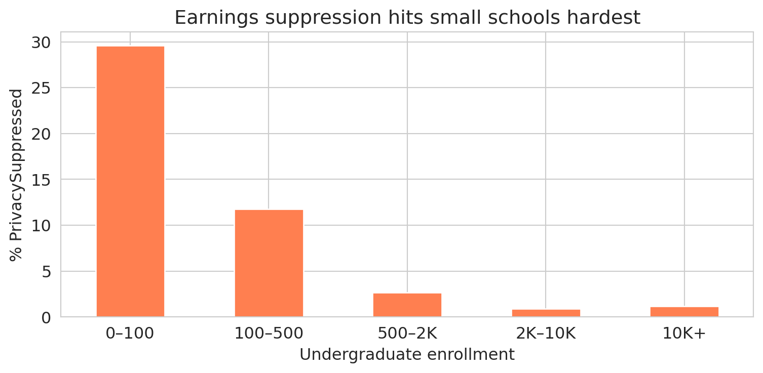
How is the PrivacySuppressed label distributed? If it were sprinkled randomly, we could drop those rows with little consequence. Let's check.
```{python}
# Bin schools by undergraduate enrollment (UGDS)
ugds = pd.to_numeric(scorecard['UGDS'], errors='coerce')
bins = [0, 100, 500, 2000, 10000, float('inf')]
labels = ['0–100', '100–500', '500–2K', '2K–10K', '10K+']
scorecard['size_bin'] = pd.cut(ugds, bins=bins, labels=labels, right=False)

# PrivacySuppressed rate by school size
ps_by_size = scorecard.groupby('size_bin', observed=False).agg(
    total=('size_bin', 'size'),
    suppressed=('MD_EARN_WNE_P10', lambda x: (x.astype(str) == 'PrivacySuppressed').sum())
)
ps_by_size['pct_suppressed'] = (ps_by_size['suppressed'] / ps_by_size['total'] * 100).round(1)
ps_by_size
```
The suppression rate plummets as school size grows. Let's see the pattern visually.
```{python}
fig, ax = plt.subplots(figsize=(8, 4))
ps_by_size['pct_suppressed'].plot.bar(ax=ax, color='coral', edgecolor='white')
ax.set_ylabel('% PrivacySuppressed')
ax.set_xlabel('Undergraduate enrollment')
ax.set_title('Earnings suppression hits small schools hardest')
ax.set_xticklabels(labels, rotation=0)
plt.tight_layout()
plt.show()
```
Nearly a third of the smallest schools have suppressed earnings data. Among schools with 2,000+ students, the rate drops to about 1%. The suppression isn't random — it targets small cohorts, and small cohorts come from small schools.
### Why missingness patterns matter
Statisticians distinguish three patterns of missingness, depending on *why* the data is absent:
:::{.callout-important}
## Definition: Patterns of Missingness
- **Missing Completely At Random (MCAR)**: no pattern at all. Mold damages a random subset of paper medical records in a basement archive — the destroyed records have nothing in common with each other.
- **Missing At Random (MAR)**: missingness depends on other *observed* data, but not on the missing value itself. Older patients are less likely to complete a follow-up survey, and we have each patient's age on file — so we can account for the gap.
- **Missing Not At Random (MNAR)**: missingness depends on the *unobserved value itself*. Patients with the worst health outcomes skip the follow-up survey, and we never observe their outcomes.
:::
The College Scorecard earnings data falls into the MNAR category. Earnings are suppressed for small programs precisely *because* the cohort is too small — and cohort size is directly related to what we're trying to measure. Schools with tiny graduating classes are systematically different from large ones: they tend to be specialized, rural, or resource-constrained. MNAR is the hardest pattern to handle — no set of observed variables can fully correct for it.
A vivid example from another domain: in ambulance data, a missing heart rate often means the EMTs were too busy saving the patient's life to record vitals. The missing value *is* the signal — the opposite of random missingness.
:::{.callout-important}
## Definition: Bias
A statistical estimate is **biased** when it systematically deviates from the true value. Bias is not random error — it doesn't shrink with more data. Dropping MNAR data introduces **selection bias**: the remaining sample no longer represents the population.
:::
:::{.callout-tip}
## Think about it
If you drop all the PrivacySuppressed rows, what kind of schools remain in your dataset? What conclusions about "average college earnings" might change?
:::
:::{.callout-note}
## Survivorship bias: the WWII bomber problem
During World War II, the US military examined returning bombers to decide where to add armor. The planes had bullet holes concentrated on the fuselage and wings. The natural conclusion: reinforce those areas. The statistician Abraham Wald saw the flaw. The holes showed where a plane could take damage *and survive the flight home*. The planes hit in the engines never came back — they were the missing data. Wald recommended armoring the engines instead (Mangel and Samaniego, "Abraham Wald's Work on Aircraft Survivability," *Journal of the American Statistical Association*, 1984).
Survivorship bias is MNAR in disguise: the observations you *don't* see are systematically different from the ones you do. Mutual fund performance reports include only funds that still exist — the ones that performed so poorly they were shut down have vanished from the dataset. Startup advice comes disproportionately from founders who succeeded — the thousands who did the same things and failed aren't writing blog posts. Whenever your dataset contains only the survivors, ask what happened to the rest.
:::
:::{.callout-tip}
## Think about it
What other datasets might suffer from survivorship bias? Consider: (1) a study of building longevity that only examines structures still standing, (2) a dataset of songs on a "greatest hits of the 1960s" playlist, or (3) career advice from Fortune 500 CEOs. In each case, what is missing, and how does the missing data distort your conclusions?
:::
## Part 2: Joining datasets
The College Scorecard comes in two files:
- `scorecard.csv` — institution-level data (one row per school: SAT scores, enrollment, earnings, debt)
- `field_of_study.csv` — program-level data (one row per school-program pair: earnings by major, debt by credential type)
To ask richer questions — like "do engineering programs pay more than humanities programs at the same school?" — we need to **join** them: combine the two tables by matching rows on a shared column.
### Inner join vs. left join
A **join key** is the column (or columns) used to match rows between two tables. Two common join strategies handle mismatched keys differently:
- An **inner join** keeps only rows whose key appears in *both* tables, discarding the rest.
- A **left join** keeps every row from the left table and attaches matching data from the right table. Where no match exists, the right-side columns become `NaN`.
Here's a small example. Suppose we have a table of students and a table of majors:
| student | major_id |
|---------|----------|
| Alice | 101 |
| Bob | 102 |
| Carol | 103 |
: **Students** {.striped}
| major_id | major_name |
|----------|------------|
| 101 | Physics |
| 102 | English |
| 104 | History |
: **Majors** {.striped}
An **inner join** on `major_id` keeps only Alice and Bob (IDs 101 and 102 appear in both tables). Carol (103) and History (104) are dropped:
| student | major_id | major_name |
|---------|----------|------------|
| Alice | 101 | Physics |
| Bob | 102 | English |
: **Inner join result** {.striped}
A **left join** keeps all three students. Carol's major name becomes `NaN` because ID 103 has no match in the Majors table:
| student | major_id | major_name |
|---------|----------|------------|
| Alice | 101 | Physics |
| Bob | 102 | English |
| Carol | 103 | NaN |
: **Left join result** {.striped}
In pandas, `pd.merge(left, right, on='key', how='inner')` performs an inner join, and `how='left'` performs a left join.
### One-to-many joins
The examples above were **one-to-one**: each key appeared at most once in each table. But when a key in the left table matches *multiple* rows in the right table, the join replicates the left row for each match — a **one-to-many join**. If a key appears multiple times in *both* tables, the join produces every combination. For example, if key "A" appears twice on the left and three times on the right, the result has 2 × 3 = 6 rows for key "A":
| left_id | key |
|---------|-----|
| L1 | A |
| L2 | A |
: **Left table** {.striped}
| key | right_val |
|-----|-----------|
| A | X |
| A | Y |
| A | Z |
: **Right table** {.striped}
| left_id | key | right_val |
|---------|-----|-----------|
| L1 | A | X |
| L1 | A | Y |
| L1 | A | Z |
| L2 | A | X |
| L2 | A | Y |
| L2 | A | Z |
: **Inner join result: 2 × 3 = 6 rows** {.striped}
This row multiplication is expected when you intentionally join institutions to their many programs. It becomes a problem when you *think* the key is unique but it isn't — the join quietly produces more rows than you expected, and every downstream calculation (means, totals, counts) is wrong. The defense: check that your key is unique *before* joining.
### Joining the College Scorecard
```{python}
# Load both datasets
programs = pd.read_csv(f'{DATA_DIR}/college-scorecard/field_of_study.csv', encoding='latin-1')

print(f"Scorecard (institutions): {scorecard.shape[0]:,} rows, {scorecard.shape[1]} columns")
print(f"Programs (field of study): {programs.shape[0]:,} rows, {programs.shape[1]} columns")
print()
print(f"Scorecard unique institutions: {scorecard['UNITID'].nunique():,}")
print(f"Programs unique institutions:  {programs['UNITID'].nunique():,}")
```
The join key is `UNITID` — a unique identifier assigned by the Department of Education to each campus. But the two datasets have different numbers of unique institutions, so not every ID appears in both.
:::{.callout-tip}
## Think about it
Before we run the join — predict: will the inner join have more rows, fewer rows, or the same number as the scorecard table? What about compared to the programs table?
:::
```{python}
# How much overlap?
sc_ids = set(scorecard['UNITID'].unique())
fs_ids = set(programs['UNITID'].unique())

print(f"Institutions in both files:    {len(sc_ids & fs_ids):,}")
print(f"Only in scorecard (no programs): {len(sc_ids - fs_ids):,}")
print(f"Only in programs (no scorecard): {len(fs_ids - sc_ids):,}")
```
### A one-to-many join in action
Each institution here matches to *many* programs. Stanford alone has over 180 programs across bachelor's, master's, and doctoral credentials. Before joining, let's verify that `UNITID` is truly unique in the scorecard table — otherwise we'd get unexpected row multiplication.
```{python}
# Defensive check: is UNITID a unique identifier in the scorecard?
assert scorecard['UNITID'].is_unique, "UNITID is not unique in scorecard — join will multiply rows!"
```
```{python}
# How many programs per institution?
programs_per = programs.groupby('UNITID').size()
print(f"Programs per institution:")
print(f"  Mean:   {programs_per.mean():.1f}")
print(f"  Median: {programs_per.median():.0f}")
print(f"  Max:    {programs_per.max()}")
```
Watch what happens when we join.
```{python}
# Inner join: only institutions in BOTH datasets
inner = pd.merge(
    scorecard[['UNITID', 'INSTNM', 'STABBR', 'CONTROL', 'UGDS', 'SAT_AVG', 'MD_EARN_WNE_P10']],
    programs[['UNITID', 'CIPCODE', 'CIPDESC', 'CREDDESC', 'EARN_MDN_1YR']],
    on='UNITID', how='inner'
)
print(f"Scorecard rows:       {scorecard.shape[0]:,}")
print(f"Inner join rows:      {inner.shape[0]:,}")
print(f"  Unique institutions: {inner['UNITID'].nunique():,}")

# Left join: keep ALL scorecard rows, add programs where available
left = pd.merge(
    scorecard[['UNITID', 'INSTNM', 'STABBR', 'CONTROL', 'UGDS', 'SAT_AVG', 'MD_EARN_WNE_P10']],
    programs[['UNITID', 'CIPCODE', 'CIPDESC', 'CREDDESC', 'EARN_MDN_1YR']],
    on='UNITID', how='left'
)
print()
print(f"Left join rows:       {left.shape[0]:,}")
print(f"  Unique institutions: {left['UNITID'].nunique():,}")
print(f"  Rows with no program data: {left['CIPDESC'].isna().sum():,}")
```
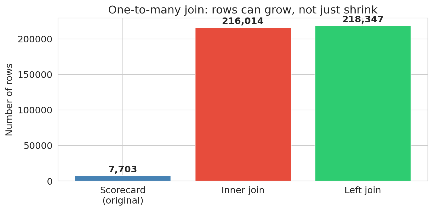
The inner join *exploded* rows from roughly 7,700 to over 216,000. Each institution was replicated once per matching program — a **one-to-many join**. Meanwhile, over 2,000 institutions disappeared entirely (present in the scorecard but absent from the field-of-study file). The left join kept all scorecard institutions but created NaN program data for the unmatched schools.
**The join type is a decision, not a default.** Each choice gives a different answer. An inner join used without checking may lose data; a one-to-many join may multiply it — and neither will warn you.
:::{.callout-important}
## Key principle
After every join, check your row counts. Did you gain rows (one-to-many matches or duplicates in the join key)? Lose rows (unmatched keys)? Either one is a signal worth investigating.
:::
```{python}
# Visualize: how do row counts compare?
join_types = ['Scorecard\n(original)', 'Inner join', 'Left join']
join_counts = [scorecard.shape[0], inner.shape[0], left.shape[0]]

fig, ax = plt.subplots(figsize=(8, 4))
bars = ax.bar(join_types, join_counts, color=['steelblue', '#e74c3c', '#2ecc71'], edgecolor='white')
ax.set_ylabel('Number of rows')
ax.set_title('One-to-many join: rows can grow, not just shrink')
for bar, count in zip(bars, join_counts):
    ax.text(bar.get_x() + bar.get_width()/2, bar.get_height() + 2000,
            f'{count:,}', ha='center', va='bottom', fontweight='bold')
plt.tight_layout()
plt.show()
```
After every join, add an assertion to verify your expectations:
```{python}
# Defensive check: inner join should have fewer unique institutions than scorecard
assert inner['UNITID'].nunique() <= scorecard['UNITID'].nunique(), "Inner join gained institutions?"
# Left join should preserve all scorecard institutions
assert left['UNITID'].nunique() == scorecard['UNITID'].nunique(), "Left join lost institutions!"
print(f"✓ Inner join: {inner['UNITID'].nunique():,} institutions (of {scorecard['UNITID'].nunique():,})")
print(f"✓ Left join: {left['UNITID'].nunique():,} institutions preserved")
```
An assert that passes is documentation of your assumption. An assert that fails is an alarm before the error propagates.
## Part 3: Deduplication and string standardization
### When is a duplicate not a duplicate?
Joins can create duplicate rows (the Cartesian product trap). But duplicates also arise from the data itself — the same entity recorded multiple times with slightly different names, addresses, or identifiers.
Consider voter registration files. Every U.S. state maintains a list of registered voters, and political campaigns merge these files across states to build a national voter database. The problem: people move, change names, and register in new states without canceling old registrations.
When I worked on the 2012 Obama campaign, several staff members looked ourselves up in the merged voter file and discovered we had active registrations in multiple states. Not because anyone voted twice — we had simply moved and registered in a new state without canceling the old one. But the states can't automatically deduplicate these records, because a registration in California and a registration in Illinois for "John A. Smith, DOB 04/04/1985" really might be two different people. The records might differ in:
- **Name spelling**: "José Rodriguez" vs. "Jose Rodriguez" vs. "J. Rodriguez"
- **Address**: a new ZIP code after a move
- **Date of birth**: transposed digits, different date formats
- **Middle name**: present in one record, absent in another
No single field is reliable. A 2020 study quantified the problem at national scale: matching 104 million voter records from the 2012 election on first name, last name, and date of birth produced 761,875 apparent duplicates — seeming evidence of massive double voting.^[Goel, Meredith, Morse, Rothschild & Shirani-Mehr, ["One Person, One Vote: Estimating the Prevalence of Double Voting in U.S. Presidential Elections,"](https://doi.org/10.1017/S0003055420000039) *American Political Science Review*, 2020.] But the birthday paradox explains almost all of them. To see why, consider a stylized example: if 141 voters named "John Smith" were born in 1970, the expected number of pairs sharing a birthday by chance is $\binom{141}{2} \times \frac{1}{365} \approx 27$. That's 27 "double voters" from one common name in one birth year — and no fraud at all.
The paper's actual method is more sophisticated: they model the birthday distribution for each name (accounting for day-of-week patterns, seasonal effects, and name-specific correlations like "June" clustering in June), compute expected coincidental matches across all name groups, and subtract. The result: **97% of the 762K matches were two distinct people who happened to share a name and birthday.** The estimated number of actual double votes was roughly 21,000 before accounting for measurement error — and a clerical error rate of just 1.3% in poll books would explain all of them.
The policy implications are stark. In states that participated in the Interstate Crosscheck Program, SSN verification revealed that fewer than 10 out of 26,000 confirmed duplicate registrations involved both records being used to vote. Canceling registrations based on name-and-birthday matches alone would disenfranchise over 300 legitimate voters for every double vote prevented.
The decision to merge or not merge two records is a **value judgment** — and a consequential one. Merge too aggressively and you remove legitimate distinct voters from the rolls. Merge too conservatively and you count the same person twice, inflating registration numbers and misdirecting campaign outreach.
### Branch campuses: one school or many?
The College Scorecard assigns each campus its own `UNITID`. But many campuses belong to the same parent institution, identified by a shared `OPEID6` code.
```{python}
# University of Phoenix: one institution or dozens?
uphx = scorecard[scorecard['INSTNM'].str.contains('University of Phoenix', na=False)]
print(f"University of Phoenix entries: {len(uphx)}")
print(f"  Unique UNITIDs: {uphx['UNITID'].nunique()}")
print(f"  Unique OPEID6:  {uphx['OPEID6'].nunique()}")
print(f"\nSample campuses:")
print(uphx[['INSTNM', 'STABBR', 'UGDS']].head(8).to_string(index=False))
```
All campuses share a single `OPEID6` but have separate UNITIDs. Depending on your question, you might treat them as one institution (for regulatory analysis) or as separate campuses (for location-level comparisons). Neither choice is wrong — but each gives a different answer.
### String standardization: the first step
Before you can compare records, you need to **standardize** them. The same value can appear in many forms:
```{python}
# Simulated messy names — the kind you'd find in merged administrative data
messy_names = pd.Series([
    'Stanford University',
    'STANFORD UNIVERSITY',
    'Stanford  University',     # extra space
    'stanford university ',     # trailing space, lowercase
    'St. Mary\'s College',
    'St Mary\'s College',
    'Saint Mary\'s College',
])

# Step 1: lowercase and strip whitespace
cleaned = messy_names.str.lower().str.strip()
# Step 2: collapse multiple spaces
cleaned = cleaned.str.replace(r'\s+', ' ', regex=True)

print("Before standardization:")
print(f"  Unique values: {messy_names.nunique()}")
print("\nAfter standardization:")
print(f"  Unique values: {cleaned.nunique()}")
print(cleaned.value_counts().to_string())
```
Three lines of code — `.str.lower()`, `.str.strip()`, and `.str.replace()` — reduced seven apparent values to four. But notice that "St. Mary's", "St Mary's", and "Saint Mary's" are still separate. Resolving *that* requires **fuzzy matching**: comparing strings by similarity rather than exact equality. Even small, inexpensive LLMs are remarkably good at this — given two name variants, they can judge whether the records likely refer to the same entity. Fuzzy matching is beyond the scope of this chapter, but the principle is clear: standardization is a series of judgment calls, and each one changes which records count as the same.
### Checking for duplicates
After standardization, use `.duplicated()` to find exact duplicates:
```{python}
# Check for duplicate institutions in the scorecard (same UNITID)
dupes = scorecard.duplicated(subset=['UNITID'], keep=False)
print(f"Duplicate UNITIDs: {dupes.sum()}")

# Check if any institution name appears with multiple UNITIDs
name_counts = scorecard.groupby('INSTNM')['UNITID'].nunique()
multi_id = name_counts[name_counts > 1].sort_values(ascending=False)
print(f"\nInstitution names with multiple UNITIDs: {len(multi_id)}")
if len(multi_id) > 0:
    print(multi_id.head(5))
```
The `subset` parameter controls which columns define a "duplicate." Changing it changes what counts as the same record — another judgment call.
:::{.callout-tip}
## Think about it
Suppose two university campuses merge into one. Going forward, the merged school reports under a single UNITID — but what happens to the old UNITID? It may be purged from future data releases, creating a gap in the time series. Worse, the historical records under the old UNITID aren't retroactively relabeled, so pre-merger and post-merger data live under different identifiers with no automatic link.
This problem is especially common in financial data: companies merge, are acquired, spin off divisions, go through IPOs, or go bankrupt. If you want to analyze the long-run performance of an investment strategy, you can't ignore these events — a company that was acquired in 2015 has no stock price after 2015, and its pre-acquisition data lives under a ticker symbol that no longer exists. Handling these transitions correctly is one of the hardest parts of working with longitudinal data.
:::
## Part 4: Handling missing data
We've diagnosed the missingness — PrivacySuppressed is concentrated among small schools and is likely MNAR. Now let's see how different handling strategies change the answer.
```{python}
# Convert earnings to numeric, replacing PrivacySuppressed with NaN
scorecard['earnings'] = pd.to_numeric(scorecard['MD_EARN_WNE_P10'], errors='coerce')

print(f"Total institutions: {len(scorecard):,}")
print(f"Earnings available:  {scorecard['earnings'].notna().sum():,}")
print(f"PrivacySuppressed:   {(scorecard['MD_EARN_WNE_P10'].astype(str) == 'PrivacySuppressed').sum():,}")
print(f"NaN (no data at all): {scorecard['MD_EARN_WNE_P10'].isna().sum():,}")
```
### Three approaches to average earnings
Let's compute the average median earnings three different ways and see how the answers differ.
```{python}
# Approach 1: Drop entire rows with missing earnings, then compute stats
approach1 = scorecard.dropna(subset=['earnings'])
mean1 = approach1['earnings'].mean()
std1 = approach1['earnings'].std()
n1 = len(approach1)

# Approach 2: Fill missing earnings with the column mean
mean_val = scorecard['earnings'].mean()  # mean of non-missing
approach2 = scorecard.copy()
approach2['earnings'] = approach2['earnings'].fillna(mean_val)
mean2 = approach2['earnings'].mean()
std2 = approach2['earnings'].std()
n2 = len(approach2)

# Approach 3: Leave as NaN (pandas ignores NaN in .mean() and .std() by default)
mean3 = scorecard['earnings'].mean()
std3 = scorecard['earnings'].std()
n3 = scorecard['earnings'].notna().sum()

print("Average median earnings 10 years after entry:")
print(f"  Approach 1 (drop rows):       ${mean1:,.0f}  (std = ${std1:,.0f}, n = {n1:,})")
print(f"  Approach 2 (fill with mean):  ${mean2:,.0f}  (std = ${std2:,.0f}, n = {n2:,})")
print(f"  Approach 3 (ignore NaN):      ${mean3:,.0f}  (std = ${std3:,.0f}, n = {n3:,})")
```
Approaches 1 and 3 produce identical results. What's the difference? **Approach 1** removes entire rows from the DataFrame — those schools are gone from *every* column, not just earnings. If you later compute average enrollment or SAT scores on `approach1`, you're computing them on a smaller, filtered set of schools. **Approach 3** leaves the full DataFrame intact and lets pandas skip `NaN` values column by column — a school with missing earnings but valid SAT data still contributes to the SAT average. The distinction matters whenever you compute statistics on multiple columns.
Approach 2 (**mean imputation**) gives the same overall mean — by construction, replacing missing values with the mean does not shift the average. But look at the standard deviation: it shrinks, because every imputed value sits exactly at the center of the distribution rather than reflecting the true spread. Mean imputation also distorts correlations between variables, pulling genuine relationships toward zero.
You might be thinking: if they all give the same overall mean, who cares? Here's where the damage shows — when we compare groups.
:::{.callout-tip}
## Think about it
If we drop all rows with missing earnings data, which types of schools do you think we lose the most of? Why?
:::
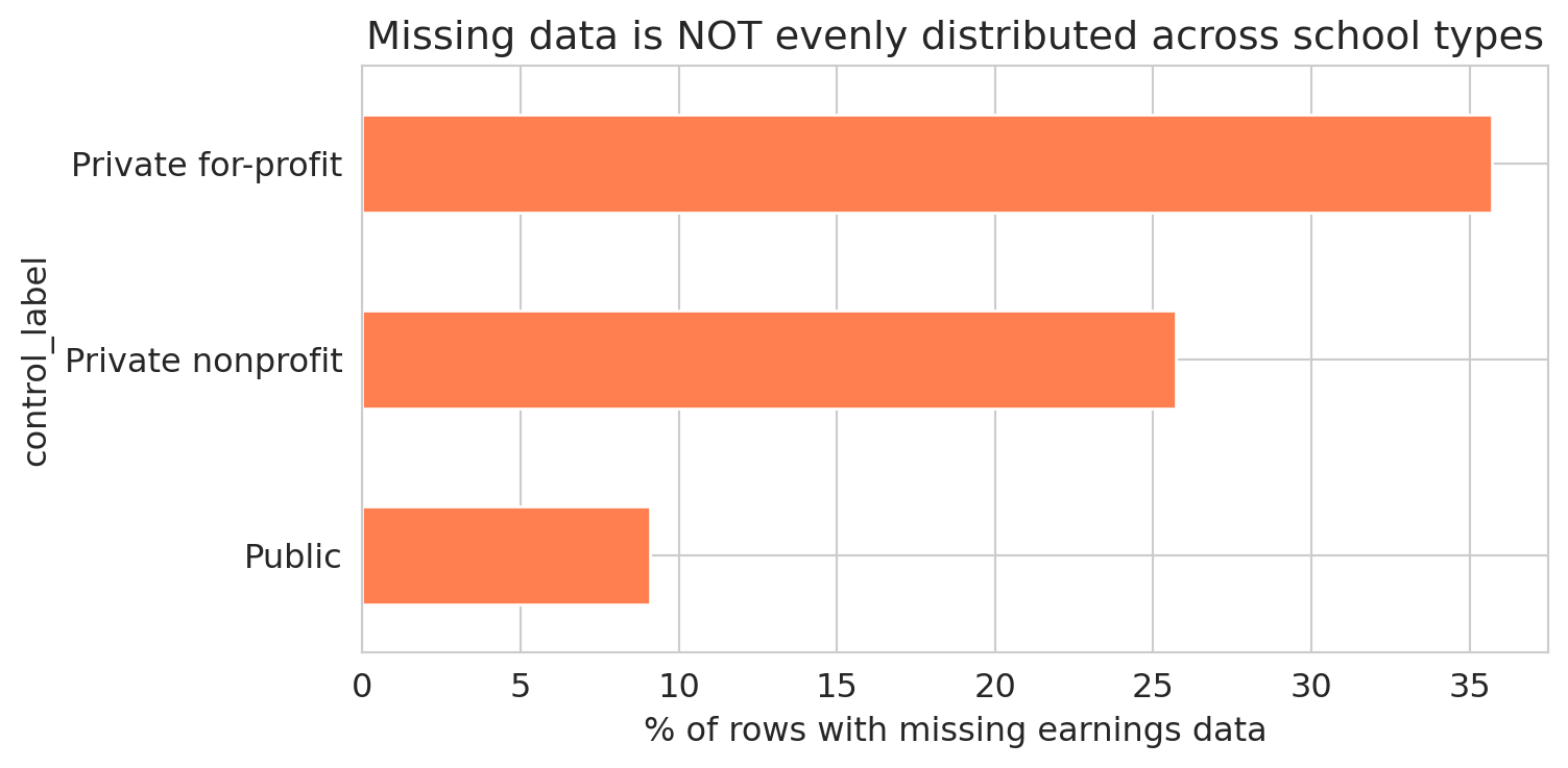
```{python}
# Are the missing values evenly distributed across school types?
# CONTROL: 1 = Public, 2 = Private nonprofit, 3 = Private for-profit
control_labels = {1: 'Public', 2: 'Private nonprofit', 3: 'Private for-profit'}
scorecard['control_label'] = scorecard['CONTROL'].map(control_labels)

ownership_missing = scorecard.groupby('control_label')['earnings'].agg(['size', 'count'])
ownership_missing.columns = ['total', 'non_missing']
ownership_missing['missing'] = ownership_missing['total'] - ownership_missing['non_missing']
ownership_missing['% missing'] = (ownership_missing['missing'] / ownership_missing['total'] * 100).round(1)
ownership_missing = ownership_missing.sort_values('% missing', ascending=False)
ownership_missing
```
The table reveals large differences in missing earnings data across school types. A bar chart makes the disparity vivid.
```{python}
fig, ax = plt.subplots(figsize=(8, 4))
ownership_missing['% missing'].plot.barh(ax=ax, color='coral', edgecolor='white')
ax.set_xlabel('% of rows with missing earnings data')
ax.set_title('Missing data is NOT evenly distributed across school types')
ax.invert_yaxis()
plt.tight_layout()
plt.show()
```
The missing earnings data is unevenly distributed across school types. Dropping rows with missing earnings changes the mix of schools in the analysis. The pattern is MNAR: for-profit schools are more likely to have small cohorts, which triggers privacy suppression, which makes their earnings data disappear. In [Chapter 5](lec05-feature-engineering.qmd), we'll see how to turn missingness patterns like these into features that a model can use.
:::{.callout-warning}
## `groupby` drops NaN groups by default
By default, `df.groupby('col')` excludes all rows where the grouping column is NaN. If schools with missing ownership type have systematically different earnings, the grouped summary is biased — and pandas won't warn you. Use `groupby('col', dropna=False)` to include the NaN group.
:::
## Part 5: Data types gone wrong
Chapter 2 introduced six semantic data types — continuous, discrete, nominal, ordinal, text, and identifier. Here we see what goes wrong when the stored type doesn't match the semantic type.
Missing data is one kind of data quality problem. Even present data can deceive when the *type* is wrong. Numbers stored as strings, categories encoded as integers — each creates a silent trap.
### Strings masquerading as numbers
We already saw that "PrivacySuppressed" forced `MD_EARN_WNE_P10` into a string column. The fix — `pd.to_numeric()` with `errors='coerce'`, which we first used in Chapter 2 — turns unparseable entries into `NaN`.
```{python}
# "MD_EARN_WNE_P10" is stored as a string because of "PrivacySuppressed"
print("Type of 'MD_EARN_WNE_P10':", scorecard['MD_EARN_WNE_P10'].dtype)
print()

# Convert to numeric, coercing non-numeric values to NaN
earnings_clean = pd.to_numeric(scorecard['MD_EARN_WNE_P10'], errors='coerce')
n_coerced = earnings_clean.isna().sum() - scorecard['MD_EARN_WNE_P10'].isna().sum()
print(f"Successfully converted. Mean earnings: ${earnings_clean.mean():,.0f}")
print(f"Rows coerced to NaN: {n_coerced:,}")
```
Look at how many rows were converted to `NaN` without any warning. Each one was a school where "PrivacySuppressed" became a missing value. If you're not paying attention, `errors='coerce'` sweeps the problem under the rug — it trades a visible error for invisible data loss.
```{python}
# Defensive check: how much did we lose?
assert n_coerced < 0.25 * len(scorecard), f"Coercion lost {n_coerced:,} rows — more than 25%!"
print(f"✓ Coercion lost {n_coerced:,} rows ({n_coerced/len(scorecard)*100:.1f}%) — within expected range")
```
:::{.callout-warning}
## `errors='coerce'` is a decision, not a default
Every time you coerce non-numeric values to NaN, you should know *what* you're losing and *how much*. Check with `value_counts()` before coercing.
:::
### Structural missingness: SAT scores
Here's a subtler type problem. SAT scores are missing for most schools — but the missingness has a structural explanation.
```{python}
# PREDDEG: predominant degree type
# 1 = Certificate, 2 = Associate, 3 = Bachelor's, 4 = Graduate
preddeg_labels = {0: 'Not classified', 1: 'Certificate', 2: 'Associate',
                  3: "Bachelor's", 4: 'Graduate'}
scorecard['degree_type'] = scorecard['PREDDEG'].map(preddeg_labels)

# SAT availability by degree type
sat_by_deg = scorecard.groupby('degree_type').agg(
    total=('SAT_AVG', 'size'),
    has_sat=('SAT_AVG', lambda x: x.notna().sum())
)
sat_by_deg['pct_with_sat'] = (sat_by_deg['has_sat'] / sat_by_deg['total'] * 100).round(1)
sat_by_deg
```
Certificate programs — cosmetology schools, truck driving academies, culinary institutes — don't require SAT scores for admission. The SAT data isn't "missing" in the sense of being lost or suppressed; it was *never applicable*. Including these rows when computing average SAT scores would be meaningless; excluding them is the correct choice. Structural missingness differs from privacy suppression: one is a data quality problem, the other is a feature of the population.
This also explains why filtering on `SAT_AVG` changes your sample so dramatically — it keeps almost exclusively bachelor's-granting institutions and drops nearly every certificate and associate program.
### The identifier trap: OPEID and leading zeros
```{python}
# OPEID in the scorecard is stored as integer — leading zeros are lost
print(f"OPEID dtype: {scorecard['OPEID'].dtype}")
print(f"Sample values: {scorecard['OPEID'].head(5).tolist()}")
```
The OPEID (Office of Postsecondary Education Identifier) is a code, not a number — like a ZIP code or phone number. Arithmetic on it is meaningless. When pandas reads it as `int64`, leading zeros vanish: OPEID `00102100` becomes `102100`. If you later try to match against a table where OPEID is stored as a zero-padded string, the join fails — the keys don't match, and you get zero matches with no error message.
### When type coercion corrupts an entire field
Type coercion gone wrong isn't just a pandas problem. Microsoft Excel automatically converts gene symbols like SEPT1 (Septin 1, a cytoskeletal protein) to the date "1-Sep" and MARCH1 to "1-Mar." A 2016 study found that roughly 20% of published genomics papers with supplementary Excel files contained these errors; by 2021, the rate had risen to 30%.^[Ziemann, Eren & El-Osta, ["Gene name errors are widespread in the scientific literature,"](https://doi.org/10.1186/s13059-016-1044-7) *Genome Biology*, 2016.] The problem was so intractable that the Human Gene Nomenclature Committee officially renamed 27 human genes — SEPTIN1, MARCHF1 — rather than wait for the software to be fixed.
The lesson generalizes beyond Excel: any tool that converts types without warning — including `pd.to_numeric(errors='coerce')` — can corrupt your data without raising an error.
### Sentinel values: the hidden missing data
Some datasets use special numbers to represent missing data instead of leaving the field blank. A temperature sensor might record `-999` when it malfunctions. A survey might code "prefer not to answer" as `99`. These **sentinel values** look like real data to pandas — they enter your mean, your regression, and your plots without triggering any warning.
```{python}
# Simulated sensor data with sentinel values
sensor_data = pd.Series([72.1, 73.5, -999, 71.8, 74.2, -999, 72.9])
print(f"Mean WITH sentinels:    {sensor_data.mean():.1f}°F")
print(f"Mean WITHOUT sentinels: {sensor_data[sensor_data != -999].mean():.1f}°F")
```
The sentinel-contaminated mean is wildly wrong. Unlike `NaN`, sentinel values don't trigger any warnings — they participate in every computation as if they were real data.
:::{.callout-tip}
## Think about it
The College Scorecard reports some schools with \$0 median debt. Are those real values — perhaps schools where all students receive full scholarships — or sentinel values for "no data"? How would you decide?
:::
## Part 6: Why we write code
In October 2020, Public Health England discovered that 15,841 positive COVID test results had been lost — and then suddenly found. The lab results had been aggregated in the legacy `.xls` Excel format, which has a maximum of 65,536 rows. When the data exceeded that limit, the extra rows were truncated with no error message. The problem was spotted on October 2 during a routine check of the automated pipeline feeding results to the national dashboard; once the missing cases were added back, the daily new case count nearly doubled overnight — from 12,872 to 22,961. The infected individuals had been notified of their own results, but their close contacts were never entered into the contact-tracing system during the delay.^[["Excel spreadsheet blunder blamed after England under-reports 16,000 COVID-19 cases,"](https://www.theregister.com/2020/10/05/excel_england_coronavirus_contact_error/) *The Register*, October 2020.]
Spreadsheets hide their logic: a formula buried in cell G47 can exclude rows, cap values, or reference the wrong range — and no one reviewing the file will notice unless they click into every cell. The Reinhart-Rogoff error that opened this chapter was exactly that: a dragged range that stopped one row too short.
Code makes every decision visible. A Python script that drops rows, coerces types, or joins tables does so in lines you can read, review, and test. When an analysis is wrong, the bug is findable. When an analysis is right, the logic is reproducible.
This course uses Python and pandas not because spreadsheets are always wrong, but because the data cleaning decisions in this chapter — joins, type conversions, missing data strategies — are too consequential to hide inside cells.
## Part 7: AI analysis vs. AI-assisted code
Writing code solves the spreadsheet problem. But a new trap has emerged: asking an AI assistant to analyze data directly — uploading a CSV and requesting a summary — rather than using AI to help you write and review code.
The difference is fundamental. When you ask an AI to *analyze* data directly, it makes cleaning decisions behind the scenes: which rows to drop, which metric to use, how to handle missing values. When you ask an AI to *write code*, those decisions appear as lines you can inspect.
### One question, four answers
Consider a simple question: **"What is the average median earnings 10 years after entry?"** Let's compute the answer four different ways — each reflecting a different, defensible cleaning path.
```{python}
# Reload clean copy
sc = pd.read_csv(f'{DATA_DIR}/college-scorecard/scorecard.csv', encoding='latin-1')

# Path 1: Use all available numeric data (pandas skips NaN by default)
earn1 = pd.to_numeric(sc['MD_EARN_WNE_P10'], errors='coerce')
answer1 = earn1.mean()
n1 = earn1.notna().sum()

# Path 2: Only bachelor's-granting institutions (PREDDEG == 3)
bachelors = sc[sc['PREDDEG'] == 3].copy()
earn2 = pd.to_numeric(bachelors['MD_EARN_WNE_P10'], errors='coerce')
answer2 = earn2.mean()
n2 = earn2.notna().sum()

# Path 3: Weight by undergraduate enrollment (large schools count more)
sc_complete = sc.dropna(subset=['UGDS']).copy()
sc_complete['earn_num'] = pd.to_numeric(sc_complete['MD_EARN_WNE_P10'], errors='coerce')
sc_complete = sc_complete.dropna(subset=['earn_num'])
answer3 = np.average(sc_complete['earn_num'], weights=sc_complete['UGDS'])
n3 = len(sc_complete)

# Path 4: Drop all rows with ANY missing value first
sc_nonan = sc.dropna()
earn4 = pd.to_numeric(sc_nonan['MD_EARN_WNE_P10'], errors='coerce') if len(sc_nonan) > 0 else pd.Series(dtype=float)
answer4 = earn4.mean() if len(earn4) > 0 else float('nan')
n4 = earn4.notna().sum() if len(earn4) > 0 else 0

print("'What is the average median earnings 10 years after entry?'")
print()
print(f"  Path 1 — all available data:       ${answer1:,.0f}  (n = {n1:,})")
print(f"  Path 2 — bachelor's schools only:  ${answer2:,.0f}  (n = {n2:,})")
print(f"  Path 3 — weighted by enrollment:   ${answer3:,.0f}  (n = {n3:,})")
print(f"  Path 4 — after dropna():           n = {n4:,} — no rows survive!")
```
Four paths, and the last one is the most dramatic: calling `dropna()` on all 122 columns leaves *zero rows*. Every school is missing at least one value.
The first three paths give different answers, each reflecting a different decision about which schools to include and how to weight them. In code, every fork is a line you can question: *Why bachelor's only? Why weight by enrollment?*
When you ask an AI to summarize the data directly, it picks one of these paths — and doesn't tell you which.
:::{.callout-tip}
## Think about it
Which of the first three paths above would you choose, and why? Under what circumstances would the enrollment-weighted average (Path 3) give a meaningfully different answer from the unweighted average (Path 1)?
:::
### AI gotcha: silent row dropping
A common first step in AI-generated code is to call `.dropna()` to "clean" the data. We just saw the extreme case — all rows lost. But even partial `dropna()` on a few columns shifts the sample.
```{python}
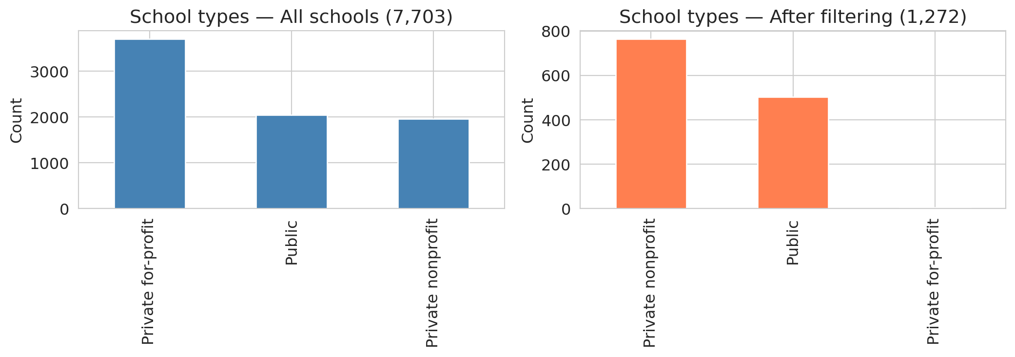
# Dropping rows with missing SAT + enrollment + earnings eliminates most non-bachelor's schools
# UGDS = undergraduate enrollment (number of degree-seeking undergraduates)
sc_partial = sc.dropna(subset=['SAT_AVG', 'UGDS'])
sc_partial['earn_num'] = pd.to_numeric(sc_partial['MD_EARN_WNE_P10'], errors='coerce')
sc_partial = sc_partial.dropna(subset=['earn_num'])

print(f"Before: {len(sc):,} rows")
print(f"After requiring SAT + UGDS + earnings: {len(sc_partial):,} rows ({len(sc_partial)/len(sc)*100:.1f}%)")
print()

# How does the school type distribution shift?
control_labels = {1: 'Public', 2: 'Private nonprofit', 3: 'Private for-profit'}
sc['control_label'] = sc['CONTROL'].map(control_labels)
sc_partial['control_label'] = sc_partial['CONTROL'].map(control_labels)

fig, axes = plt.subplots(1, 2, figsize=(11, 4))

sc['control_label'].value_counts().plot.bar(ax=axes[0], color='steelblue', edgecolor='white')
axes[0].set_title(f'School types — All schools ({len(sc):,})')
axes[0].set_ylabel('Count')
axes[0].set_xlabel('')

sc_partial['control_label'].value_counts().plot.bar(ax=axes[1], color='coral', edgecolor='white')
axes[1].set_title(f'School types — After filtering ({len(sc_partial):,})')
axes[1].set_ylabel('Count')
axes[1].set_xlabel('')

plt.tight_layout()
plt.show()
```
The distribution shifts dramatically. For-profit schools and certificate programs — which rarely report SAT scores — nearly vanish. The result is **selection bias**: dropping rows with missing data changes *which* schools remain in the sample, and the AI proceeds with the "cleaned" data as if nothing happened.
ChatGPT's data analysis tool introduces a further problem: it samples or truncates datasets over roughly 50,000 rows without warning. Uploading a large dataset may yield a confident answer computed from a hidden subset. The code runs, the plots look professional, and nothing warns you that part of your data was ignored.
### AI gotcha: wrong metric, no domain knowledge
:::{.callout-tip}
## Think about it
If you were ranking schools by earnings performance, would you use a single institution-level number or program-level data? Why might the aggregate be misleading?
:::
An analyst unfamiliar with higher education might rank schools by a single earnings column — the most intuitive approach. But a single number per school obscures enormous variation across programs. And raw earnings reflect both school quality *and* student selectivity: schools with high SAT averages admit students who would earn well regardless of where they went to college.
```{python}
# Stanford: website headline vs. program-level detail
stanford_inst = scorecard[scorecard['UNITID'] == 243744]
stanford_prog = programs[programs['UNITID'] == 243744].copy()
stanford_prog['earn_4yr'] = pd.to_numeric(stanford_prog['EARN_MDN_4YR'], errors='coerce')
stanford_valid = stanford_prog.dropna(subset=['earn_4yr'])

print("Stanford University:")
print(f"  Scorecard website headline:  $136,000  (median earnings, 4 years after completing)")
print(f"  Program-level median:        ${stanford_valid['earn_4yr'].median():,.0f}  (across {len(stanford_valid)} programs)")
print(f"  Program-level mean:          ${stanford_valid['earn_4yr'].mean():,.0f}")
print(f"  Range:                       ${stanford_valid['earn_4yr'].min():,.0f} – ${stanford_valid['earn_4yr'].max():,.0f}")
print(f"  SAT average:                 {stanford_inst['SAT_AVG'].iloc[0]:.0f}")
print(f"  Total programs:              {len(stanford_prog)}")
```
The College Scorecard website reports Stanford median earnings as \$136,000 four years after completing.^[[College Scorecard: Stanford University,](https://collegescorecard.ed.gov/school/?243744-Stanford-University) U.S. Department of Education.] Notice that this uses a different variable than `MD_EARN_WNE_P10`: the `_4YR` suffix means "4 years after *completing*" and counts only graduates, while `_P10` means "10 years after *entry*" and includes everyone who enrolled — including students who never finished. The two measure different populations on different timelines. (In 2017, the DOE discovered that the cohort mapping for its 6- and 8-year earnings variables was off by a year — the data documented as "6 years after entry" was actually measuring 7 years after entry. The correction appears in the data dictionary changelog. If even the agency that produces the data gets the documentation wrong, checking variable definitions is not optional.)
That headline figure pools all programs into a single number — likely weighted by enrollment. The program-level data tells a richer story: Stanford's 27 programs with reported four-year earnings range from roughly \$46K (Ethnic Studies, BA) to \$262K (MBA). CS bachelor's graduates earn a median of \$215K at four years, while English literature graduates earn \$82K. The institution-level number sits between the program-level median and mean, hiding a threefold spread.
And if you're an MS&E student wondering about your own department? Only 10 of Stanford's 51 bachelor's programs report four-year earnings at all — the other 41 simply have no data, likely because too few graduates in each program received Title IV aid to meet the reporting threshold. The closest CIP code for MS&E is 5213, "Management Sciences and Quantitative Methods," but no bachelor's degree is listed there. MS&E undergrads are most likely classified under "Engineering, Other" (CIP 1499, which reports \$115K at four years) or "Engineering-Related Fields" (CIP 1515, which has no four-year data for bachelor's degrees). There's no way to be sure without access to the underlying classification decisions. The opaque mapping from department names to CIP codes is itself a data quality problem — and one that no amount of cleaning can fix.
One more caveat: the Scorecard tracks only students who received federal financial aid (Title IV recipients). At Stanford, many students pay full tuition without federal loans, and their earnings aren't counted. The gap between the Scorecard number and your expectations is a data-cleaning lesson: an aggregate statistic can obscure enormous variation within the population it summarizes.
Even setting the aggregation aside, Stanford admits students with roughly 1,465 average SAT scores. The high earnings may partly reflect student ability, not school quality. Ranking by raw earnings without adjusting for selectivity confuses the treatment (attending the school) with the confounder (student ability). We'll revisit the confounding concept formally in later chapters.
Ranking by whichever column name sounds most relevant, without asking whether the metric is confounded or aggregated, is a common mistake — and one that's easy to make when you skip the data dictionary.
:::{.callout-warning}
## Don't rank before you adjust
The "best" schools by raw earnings might just be the ones admitting the strongest students. We'll revisit these questions in later chapters when we discuss confounding and causal reasoning.
:::
### AI gotcha: data leakage
:::{.callout-tip}
## Think about it
Look at these Scorecard columns: `SAT_AVG` (average SAT score), `UGDS` (undergraduate enrollment), `PCTPELL` (fraction of students receiving Pell grants, a measure of low-income enrollment), `MD_EARN_WNE_P10` (median earnings 10 years after entry), and `GT_25K_P6` (fraction of students earning above \$25K six years after entry). If you wanted to predict earnings, which columns would be dangerous to include as inputs?
:::
Suppose the AI builds a model to predict earnings. It naturally includes all numeric columns as features — including `GT_25K_P6`, the fraction of graduates earning above \$25K at six years. But `GT_25K_P6` is *derived from earnings data*. Including it as a feature to predict earnings is circular.
:::{.callout-important}
## Definition: Data leakage
**Data leakage** occurs when your model's input features contain information that wouldn't be available at prediction time, or that is mathematically derived from the target. Here, using `GT_25K_P6` (share earning above \$25K) to predict `MD_EARN_WNE_P10` (median earnings) is leakage — the feature encodes the answer by construction, like using tomorrow's stock price to "predict" today's return.
:::
The leakage is visible in the correlations. Recall that **correlation** measures the strength of the linear relationship between two variables, ranging from -1 (perfect negative) to +1 (perfect positive), with 0 indicating no linear relationship. We will formalize correlation in Chapter 4.
```{python}
sc_model = scorecard[['UGDS', 'SAT_AVG', 'PCTPELL', 'earnings']].copy()
sc_model['GT_25K'] = pd.to_numeric(scorecard['GT_25K_P6'], errors='coerce')
sc_model = sc_model.dropna()

print("Correlation with median earnings (10yr):")
for col in ['GT_25K', 'SAT_AVG', 'PCTPELL', 'UGDS']:
    r = sc_model[col].corr(sc_model['earnings'])
    print(f"  {col:15s}: {r:.3f}")
```
The `GT_25K_P6` variable is strongly correlated with earnings — unsurprising, given that both measure the same underlying outcome. Any model that includes `GT_25K_P6` as a feature would appear to perform brilliantly while simply encoding a tautology. SAT scores and Pell grant percentages, by contrast, show the kind of moderate correlations you would expect from genuinely informative variables. We will study regression in Chapter 5, but the leakage problem is conceptual: the feature contains the answer by construction.
### AI gotcha: not reproducible
There's a deeper problem with direct AI analysis: it is not always reproducible. A 2025 study tested ChatGPT on the same dataset with the same prompt in separate sessions and found inconsistent results — different factor structures, different conclusions — even for straightforward statistical tasks.^[Koçak, ["Examination of ChatGPT's Performance as a Data Analysis Tool,"](https://doi.org/10.1177/00131644241302721) *Educational and Psychological Measurement*, 2025.] If you can run an analysis until you get the result you want, the analysis is no longer trustworthy.
Good code, by contrast, is deterministic. Run the same script on the same data and you get the same answer every time. When the answer is wrong, the bug is findable. When the answer changes, the diff is reviewable.
## Part 8: A data munging checklist
Every data analysis starts with data munging. Here's the checklist:
:::{.callout-note}
## Data munging checklist
1. **Check provenance.** Where did the data come from? Is there a data dictionary? A methodology document? If not, proceed with caution.
2. **Check types.** Run `df.dtypes`. Any `object` columns that should be numeric? Any numeric columns that are really categories?
3. **Find the missing data.** Check `df.isna().sum()`, but also look for sentinel values (`-999`, `0`, `99`), string placeholders (`"PrivacySuppressed"`, `"PS"`, `"Not Available"`), and empty strings.
4. **Understand *why* data is missing.** Is the missingness random (MCAR), related to observed variables (MAR), or related to the missing value itself (MNAR)?
5. **Check joins.** After every merge, compare row counts. Did you gain or lose rows? Which records were dropped or duplicated? Add an `assert`.
6. **Standardize strings.** Lowercase, strip whitespace, collapse variants. Document each grouping decision.
7. **Deduplicate deliberately.** Check `df.duplicated()`. Decide what columns define "the same record" — and document that choice.
8. **Verify type conversions.** After `pd.to_numeric(errors='coerce')`, check how many values became NaN. Know what you lost.
9. **Compare groups.** Is the missingness evenly distributed across the groups you care about? If not, group comparisons are biased.
:::
## Key takeaways
- **Know where your data came from.** Data provenance — who collected it, how, and why — determines how much you should trust any result.
- **Missing data hides in many forms.** `NaN` is just one encoding. Strings like "PrivacySuppressed," sentinel values like `-999`, and absent rows are all missing data that pandas won't detect automatically.
- **Every cleaning choice is a decision.** Dropping rows, imputing values, converting types, standardizing strings, and deduplicating records all change which observations enter your analysis — and can change your conclusions.
- **One-to-many joins multiply rows.** Always check row counts after a join. The same question can produce very different sample sizes depending on join type and key cardinality.
- **Code makes decisions visible.** The same question can produce different answers depending on which rows you keep, which metric you choose, and how you handle missing data. Code makes each fork explicit; spreadsheets and direct AI analysis bury them.
- **Domain knowledge has no substitute.** Choosing the right metric, spotting leakage, and interpreting missingness all require understanding the data-generating process — not just the data itself.
- **Verify, then trust.** After every cleaning step, add an assert. Did you gain or lose rows? Did any group lose more than others? Do column types match their intended use?
## Study guide
### Key ideas
- **Data provenance** — the chain of custody from data collection to your notebook. Documented datasets (with methodology, data dictionaries, and known collection procedures) are more trustworthy than undocumented ones.
- **Data munging / wrangling** — the process of cleaning, transforming, and preparing raw data for analysis. Every cleaning choice is a decision that changes your conclusions — there is no "neutral" default.
- **Missingness encodings** — `NaN` is only one way data goes missing. Sentinel values (-999, 0, 99), string placeholders ("PrivacySuppressed", "PS"), and absent rows all encode missingness that pandas won't detect automatically.
- **Patterns of missingness** — **MCAR** (unrelated to any variable), **MAR** (depends on observed variables only), **MNAR** (depends on the unobserved value itself). MNAR is the hardest to handle because no observed variable can fully correct for it.
- **Informative missingness** — when the fact that data is missing tells you something about the value (e.g., small schools have earnings suppressed because their cohorts are too small).
- **Inner join** — combines two tables, keeping only rows with matching keys in *both* tables. **Left join** — keeps all rows from the left table and adds matched data from the right (NaN where no match). The **join key** is the column(s) used to match rows.
- **One-to-many join** — when one key in the left table matches multiple rows in the right table, the output has more rows than either input. Always check row counts after joining.
- **String standardization** — lowercasing, stripping whitespace, collapsing variants. A prerequisite for deduplication and grouping. Each standardization choice (e.g., grouping branch campuses by OPEID6) is a judgment call.
- **Deduplication** — identifying records that represent the same entity. Requires standardization first, and the definition of "same" is a value judgment with consequences.
- **Mean imputation** — filling missing values with the column mean; preserves the mean but shrinks variance and distorts relationships.
- **Selection bias** — systematic difference between the sample you analyze and the population you care about, caused here by dropping rows.
- **Data leakage** — including information in your model that wouldn't be available at prediction time, or that is mathematically derived from the target.
- **Assert statements** — defensive checks after each cleaning step. An assert that passes documents your assumption; an assert that fails catches errors before they propagate.
- Any uncritical analysis — human or AI — can produce plausible-looking output without questioning its own data-cleaning decisions. The defense is code you can audit, not trust in the tool.
### Computational tools
- `pd.merge(left, right, on=..., how=...)` — join two DataFrames; `how` controls inner/left/right/outer
- `pd.to_numeric(series, errors='coerce')` — convert strings to numbers, turning failures into NaN
- `pd.cut(series, bins, labels)` — bin continuous values into discrete intervals
- `.is_unique` — True if all values in a Series are distinct (useful for checking join keys)
- `.dropna(subset=[...])` — drop rows with NaN in specified columns
- `.fillna(value)` — fill NaN with a specified value
- `.isna()` / `.notna()` — boolean mask for missing / non-missing values
- `.value_counts()` — count unique values (useful for spotting unexpected entries like "PrivacySuppressed")
- `.str.lower()`, `.str.strip()`, `.str.replace(pat, repl, regex=True)` — string standardization
- `.duplicated(subset=[...])` / `.drop_duplicates()` — find and remove duplicate rows
- `.groupby(col).agg(...)` — split data by groups and compute summary statistics
- `.astype(dtype)` — cast a Series to a specified type (e.g., `float`, `int`, `str`, `'category'`)
- `assert condition, message` — defensive check; raises an error if the condition is false
### For the quiz
You should be able to: (1) predict the row count after an inner vs. left join given the key overlap and cardinality, (2) identify non-standard missingness encodings (sentinel values, string placeholders) that pandas won't detect, (3) explain why dropping missing data can introduce selection bias, (4) describe why string standardization and deduplication involve value judgments, and (5) identify data leakage when a feature is mathematically related to the target.