---
title: "Causal Inference I — DAGs and Confounding"
execute:
enabled: true
jupyter: python3
---
```{python}
import numpy as np
import pandas as pd
import matplotlib.pyplot as plt
import seaborn as sns
from scipy import stats
import warnings
warnings.filterwarnings('ignore')
sns.set_style('whitegrid')
plt.rcParams['figure.figsize'] = (7, 4.5)
plt.rcParams['font.size'] = 12

# Load data
DATA_DIR = 'data'
np.random.seed(42)
```
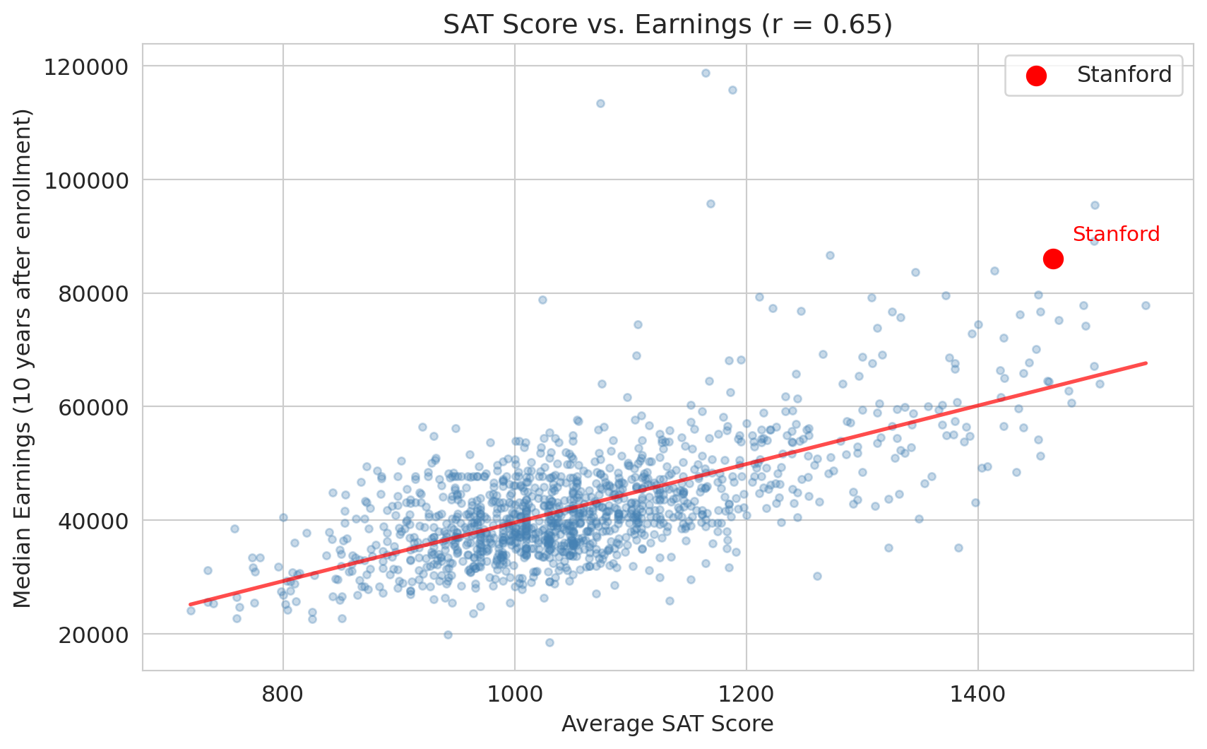
You're a high school senior choosing between Stanford and your state school. Stanford costs \$200K more over four years. Stanford graduates earn a median of \$86K ten years after enrollment — but is that *caused* by Stanford, or would those students earn a lot anyway? That's a \$200K question.
The central question of **causal inference** is: when can we interpret a statistical association as a cause-and-effect relationship?
:::{.callout-important}
## Definition: Causal effect
X **causes** Y if intervening to change X — while holding everything else fixed — would change Y. The causal effect of X on Y is the difference in Y that results from this intervention.
:::
If we could magically send every student to Stanford without changing anything else about them, would their earnings go up? The interventionist definition makes the question precise: a cause is something whose manipulation changes the outcome.
> "Correlation is not causation." — a foundational principle of statistics
Today we formalize *why* — and develop the tools to tell the difference.
## The Stanford premium
Let's start with the data. The College Scorecard tracks outcomes for students at every US college.
```{python}
scorecard = pd.read_csv(f'{DATA_DIR}/college-scorecard/scorecard.csv')

# Clean: keep schools with SAT and earnings data
scorecard['SAT_AVG'] = pd.to_numeric(scorecard['SAT_AVG'], errors='coerce')
scorecard['MD_EARN_WNE_P10'] = pd.to_numeric(scorecard['MD_EARN_WNE_P10'], errors='coerce')
colleges = scorecard.dropna(subset=['SAT_AVG', 'MD_EARN_WNE_P10']).copy()

# Find Stanford
stanford = colleges[colleges['INSTNM'].str.contains('Stanford University', na=False)]
print(f"Stanford SAT average: {stanford['SAT_AVG'].values[0]:.0f}")
print(f"Stanford median earnings (10 yrs): ${stanford['MD_EARN_WNE_P10'].values[0]:,.0f}")
print(f"\nSchools with both SAT and earnings data: {len(colleges):,}")
```
We use `pd.to_numeric()` with `errors='coerce'` to convert non-numeric entries to NaN, then `dropna()` to keep only complete rows. Now let's plot SAT scores against earnings with `stats.linregress()` to fit a regression line.
```{python}
fig, ax = plt.subplots(figsize=(10, 6))
ax.scatter(colleges['SAT_AVG'], colleges['MD_EARN_WNE_P10'], alpha=0.3, s=15, color='steelblue')

# Highlight Stanford
ax.scatter(stanford['SAT_AVG'], stanford['MD_EARN_WNE_P10'],
           color='red', s=100, zorder=5, label='Stanford')
ax.annotate('Stanford', xy=(stanford['SAT_AVG'].values[0], stanford['MD_EARN_WNE_P10'].values[0]),
            xytext=(10, 10), textcoords='offset points', fontsize=11, color='red')

# Regression line
slope, intercept, r, p, se = stats.linregress(colleges['SAT_AVG'], colleges['MD_EARN_WNE_P10'])
x_line = np.linspace(colleges['SAT_AVG'].min(), colleges['SAT_AVG'].max(), 100)
ax.plot(x_line, intercept + slope * x_line, 'r-', lw=2, alpha=0.7)

ax.set_xlabel('Average SAT score')
ax.set_ylabel('Median earnings (10 years after enrollment)')
ax.set_title(f'SAT score vs. earnings (r = {r:.2f})')
ax.legend()
plt.show()

print(f"Correlation: r = {r:.2f}")
print(f"Each 100-point SAT increase is associated with ${slope*100:,.0f} higher median earnings")
```
## Does attending a selective college *cause* higher earnings?
The correlation is striking: $r \approx 0.65$. Schools with higher average SATs have higher-earning graduates. This is the Stanford-vs-state-school question with a summary statistic attached — a naive interpretation would be: "attending a more selective school raises your earnings."
Each row in this dataset is a *school*, not a student. `SAT_AVG` is the average SAT of the school's admits, not any individual student's score — so treat it as a stand-in for the bundle that makes a selective school selective: peer group, resources, alumni network, brand. The causal question is: does attending a school with that bundle cause a student to earn more?
But wait. What if something else drives *both* who attends a selective school and who earns more?
:::{.callout-tip}
## Think about it
What factors might affect both a student's ability to attend a selective school and their future earnings?
:::
## Confounders: the hidden third variable
:::{.callout-important}
## Definition: Confounder
A **confounder** is a common *cause* of both the treatment and the outcome — it must cause both, not just be correlated with both.
:::
Here, **family wealth** is a classic confounder:
- Wealthy families invest in test prep, top-tier high schools, application coaches $\rightarrow$ **more likely to attend a selective college**
- Wealthy families provide professional networks, connections, inheritance $\rightarrow$ **higher earnings**
If family wealth drives both, then the selective-school-to-earnings correlation could be entirely **spurious** — a **spurious association** that exists only from a shared cause. Attending Stanford might not *cause* anything; the SAT_AVG column might just be a proxy for which schools admit wealthy students. (Recall from Chapter 11: "correlation is not causation." Now let's formalize *why*.)
## Causal diagrams (DAGs)
:::{.callout-important}
## Definition: DAG (directed acyclic graph)
A **Directed Acyclic Graph (DAG)** is a visual tool for representing causal relationships. "Directed" means the arrows have direction (A causes B, not the reverse). "Acyclic" means there are no loops — you can never follow the arrows in a circle back to where you started. Each arrow means "causes" or "directly influences." Another formal framework, the **potential outcomes model** (also called the Rubin causal model), defines causal effects algebraically rather than graphically.
:::
:::{.callout-note}
## Preview: the potential outcomes framework
DAGs represent causal structure visually. The potential outcomes model defines causal effects algebraically. For each unit, imagine two potential outcomes: $Y(1)$ under treatment and $Y(0)$ under control. The **causal effect** is $Y(1) - Y(0)$, but we only observe one of these for any individual (the **fundamental problem of causal inference**). Randomization ensures that the *average* causal effect can be estimated, even though individual effects cannot.
:::
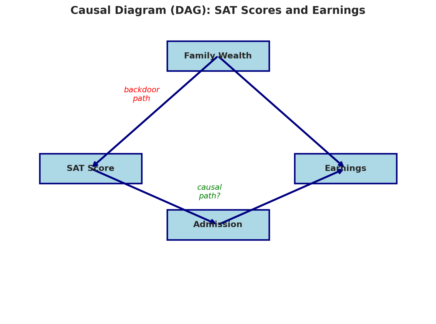
Write the treatment as "attend selective college" (proxied in the data by a school's SAT_AVG). There are **two paths** from the treatment to earnings:
1. **Causal path (directed path):** Attend selective college $\to$ Earnings (maybe real — arrows point forward from treatment to outcome)
2. **Backdoor path:** Attend selective college $\leftarrow$ Wealth $\to$ Earnings (spurious — goes "behind" the treatment through a common cause)
The standard causal inference term for path 2 is a **backdoor path**: it connects treatment to outcome by going through a common cause rather than through a direct causal chain. A naive regression mixes both paths together. We can't tell which is which without more information. Let's draw it.
```{python}
def draw_dag(nodes, edges, annotations=None, title='', figsize=(8, 6)):
    """Draw a simple DAG. nodes: dict {name: (x,y)}, edges: list [(from, to)],
    annotations: list [(text, x, y, color)]."""
    fig, ax = plt.subplots(figsize=figsize)
    ax.set_xlim(0, 10); ax.set_ylim(0, 8); ax.axis('off')
    for name, (x, y) in nodes.items():
        fc = 'lightyellow' if '(unobserved)' in name else 'lightblue'
        ls = '--' if '(unobserved)' in name else '-'
        ax.add_patch(plt.Rectangle((x-1.2, y-0.4), 2.4, 0.8,
            facecolor=fc, edgecolor='navy', lw=2, ls=ls, zorder=3))
        ax.text(x, y, name, ha='center', va='center', fontsize=11, fontweight='bold', zorder=4)
    for (sn, dn) in edges:
        sx, sy = nodes[sn]; dx, dy = nodes[dn]
        ax.annotate('', xy=(dx, dy), xytext=(sx, sy),
            arrowprops=dict(arrowstyle='->', lw=2.5, color='navy'))
    for text, x, y, color in (annotations or []):
        ax.annotate(text, xy=(x, y), fontsize=10, color=color, fontstyle='italic', ha='center')
    if title:
        ax.set_title(title, fontsize=14, fontweight='bold')
    plt.tight_layout(); plt.show()
```
The `draw_dag()` helper above draws nodes as rectangles and connects them with arrows. Let's use it to visualize the selectivity–earnings DAG.
```{python}
draw_dag(
    nodes={'Family Wealth\n(unobserved)': (5, 7), 'Attend selective\ncollege': (2, 4),
           'Earnings': (8, 4)},
    edges=[('Family Wealth\n(unobserved)', 'Attend selective\ncollege'),
           ('Family Wealth\n(unobserved)', 'Earnings'),
           ('Attend selective\ncollege', 'Earnings')],
    annotations=[('backdoor\npath', 3.2, 5.8, 'red'), ('causal\npath?', 5.0, 3.6, 'green')],
    title='Causal diagram (DAG): selective-college attendance and earnings'
)
```
The dashed yellow node marks a variable we cannot cleanly observe — family wealth is not in the Scorecard dataset. The chapter's central difficulty: we can see the correlation along the red path, but we can't separate the two paths without either measuring wealth or intervening.
## When does regression estimate a causal effect?
In Chapter 12, we interpreted regression coefficients as "holding everything else constant." Now we can see when that interpretation is *causal* and when it's just descriptive.
Regression estimates a causal effect **only** when you **block all backdoor paths** between treatment and outcome — by controlling for at least one non-collider variable on each backdoor path — without blocking any causal paths.
In practice, this is nearly impossible with **observational data** (data collected without an experiment):
- We can't measure "family wealth" perfectly
- There may be confounders we haven't even thought of (motivation, neighborhood, genetics...)
- Controlling for the wrong variable can actually **create** bias (we'll see this with colliders soon)
The gap between correlation and causation motivates the distinction between **observational data** (collected without intervention) and **experimental data** (from a randomized experiment). In a randomized experiment, the treatment is assigned randomly, so there are no backdoor paths to worry about.
:::{.callout-warning}
## The fundamental problem
With observational data, you can never be sure you've blocked every backdoor path.
:::
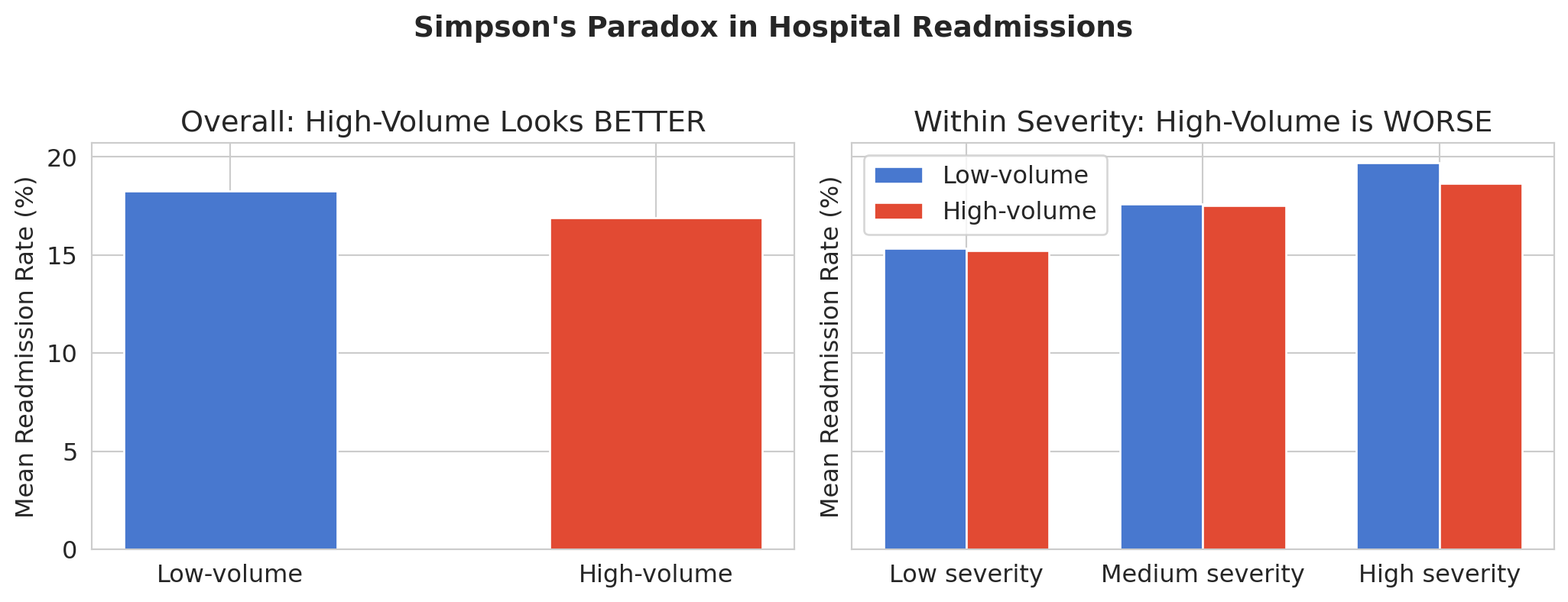
## Simpson's paradox: a confounding problem
In Chapter 11, you saw Simpson's Paradox in NBA rest data: extended-rest players scored fewer points overall, but *more* points within each position group. The aggregate lied. We first saw hospital readmission data in Chapter 2, where the "worst" hospitals turned out to be small rural ones with noisy estimates. Now let's see another way this data can mislead — and explain *why* using DAGs.
The question: are **high-volume hospitals** better or worse at preventing readmissions?
```{python}
hospitals = pd.read_csv(f'{DATA_DIR}/hospital-readmissions/hospital_level_summary.csv')
hospitals['star_rating_num'] = pd.to_numeric(hospitals['star_rating_num'], errors='coerce')

hospitals['is_high_volume'] = hospitals['total_discharges'] > hospitals['total_discharges'].median()

# Overall comparison
print("Overall readmission rates:")
print("-" * 50)
for group_name, group in hospitals.groupby('is_high_volume'):
    label = 'High-volume' if group_name else 'Low-volume'
    rate = group['overall_readmission_rate'].mean()
    n = len(group)
    print(f"  {label}: {rate:.2f}%  (n={n})")

print("\nHigh-volume hospitals appear BETTER overall.")
```
We use `pd.qcut()` to split hospitals into three severity groups of roughly equal size, then compare readmission rates within each group.
```{python}
# Create severity categories for within-group comparison
hospitals['severity_cat'] = pd.qcut(hospitals['severity_proxy'], q=3,
                                     labels=['Low severity', 'Medium severity', 'High severity'])
```
But when we break the data down by patient severity, the story reverses:
```{python}
fig, axes = plt.subplots(1, 2, figsize=(11, 4), sharey=True)

# Left: overall
overall = hospitals.groupby('is_high_volume')['overall_readmission_rate'].mean()
colors_bar = ['#4878CF', '#E24A33']
axes[0].bar(['Low-volume', 'High-volume'],
            overall.values, color=colors_bar, edgecolor='white', width=0.5)
axes[0].set_ylabel('Mean readmission rate (%)')
axes[0].set_title('Overall: high-volume looks BETTER')

# Right: within severity categories
severity_cats = ['Low severity', 'Medium severity', 'High severity']
x = np.arange(len(severity_cats))
width = 0.35

rates_low = []
rates_high = []
for sev in severity_cats:
    subset = hospitals[hospitals['severity_cat'] == sev]
    rates_low.append(subset[~subset['is_high_volume']]['overall_readmission_rate'].mean())
    rates_high.append(subset[subset['is_high_volume']]['overall_readmission_rate'].mean())

axes[1].bar(x - width/2, rates_low, width, label='Low-volume', color='#4878CF', edgecolor='white')
axes[1].bar(x + width/2, rates_high, width, label='High-volume', color='#E24A33', edgecolor='white')
axes[1].set_xticks(x)
axes[1].set_xticklabels(severity_cats)
axes[1].set_ylabel('Mean readmission rate (%)')
axes[1].set_title('Within severity: high-volume is WORSE')
axes[1].legend()

plt.suptitle("Simpson's paradox in hospital readmissions", fontsize=14, fontweight='bold', y=1.02)
plt.tight_layout()
plt.show()
```
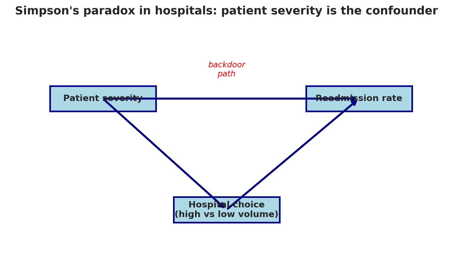
## Why does this happen?
The DAG tells the story:
```{python}
draw_dag(
    nodes={'Patient severity': (2.2, 5.5), 'Hospital choice\n(high vs low volume)': (5, 2),
           'Readmission rate': (8, 5.5)},
    edges=[('Patient severity', 'Hospital choice\n(high vs low volume)'),
           ('Patient severity', 'Readmission rate'),
           ('Hospital choice\n(high vs low volume)', 'Readmission rate')],
    annotations=[('backdoor\npath', 5, 6.2, 'red')],
    title="Simpson's paradox in hospitals: patient severity is the confounder",
    figsize=(8, 5)
)
```
**Patient severity** is a confounder: it causes both Hospital Choice (sicker patients tend to go to smaller, specialized hospitals) and Readmission Rate (sicker patients get readmitted more). High-volume hospitals see a less severe case mix, so their aggregate readmission rate looks lower. But *within* each severity level — blocking the backdoor path — high-volume hospitals actually perform worse.
Simpson's Paradox is a confounding problem. The aggregate data tells the opposite story from the disaggregated data: high-volume hospitals look *better* overall but *worse* within each severity group. Which one is "right"? The one that blocks the backdoor path by controlling for the confounder.
### Simpson's paradox in policing: NYPD stop-and-frisk
Simpson's Paradox doesn't just show up in hospitals. It appears whenever a confounding variable has different distributions across groups — and the policy consequences can be enormous.
From 2008 to 2012, the NYPD conducted roughly 760,000 stops under its Concealed Weapons Possession (CPW) program. For each stop, officers recorded whether a weapon was found — the **hit rate**. A higher hit rate means officers are stopping people on stronger evidence; a lower hit rate suggests weaker justification for the stop.
```{python}
# NYPD stop-and-frisk hit rates (Goel, Rao, Shroff 2016; Grossman 2023 MSE 125 Lecture 1)
print("NYPD stop-and-frisk hit rates (2008-2012)")
print("=" * 55)
print(f"  City-wide hit rate, Black individuals:  2.5%")
print(f"  City-wide hit rate, White individuals:  13%")
print(f"  City-wide ratio: 13 / 2.5 = {13/2.5:.1f}x")
print(f"\n  Within-precinct ratio (controlling for location): 2.2x")
print(f"\n  The ratio drops from {13/2.5:.1f}x to 2.2x after controlling for precinct.")
```
```{python}
# Visualize the city-wide vs within-precinct ratio — same Simpson's reversal as hospitals
fig, ax = plt.subplots(figsize=(6, 4.5))
comparisons = ['City-wide\n(confounded by precinct)', 'Within-precinct\n(confounder blocked)']
ratios = [13 / 2.5, 2.2]
colors_hr = ['#d62728', '#4878CF']
bars = ax.bar(comparisons, ratios, color=colors_hr, edgecolor='white', width=0.55)
ax.axhline(y=1.0, color='black', linewidth=0.8, linestyle='--', alpha=0.6)
ax.text(1.45, 1.08, 'equal hit rates', color='black', fontsize=9, alpha=0.7, ha='right')
ax.set_ylabel('Hit-rate ratio (white ÷ Black)')
ax.set_title('NYPD stop-and-frisk: disparity shrinks after blocking the backdoor')
for bar, r in zip(bars, ratios):
    ax.text(bar.get_x() + bar.get_width()/2, bar.get_height() + 0.1,
            f'{r:.1f}x', ha='center', va='bottom', fontsize=13, fontweight='bold')
ax.set_ylim(0, 6)
plt.tight_layout()
plt.show()
```
The city-wide numbers paint a stark picture: the hit rate for white individuals is `{python} f'{13/2.5:.1f}'`x higher than for Black individuals, suggesting officers stop Black individuals on far weaker evidence. But the city-wide comparison is **confounded by precinct**. Different precincts have different stop rates *and* different racial compositions.
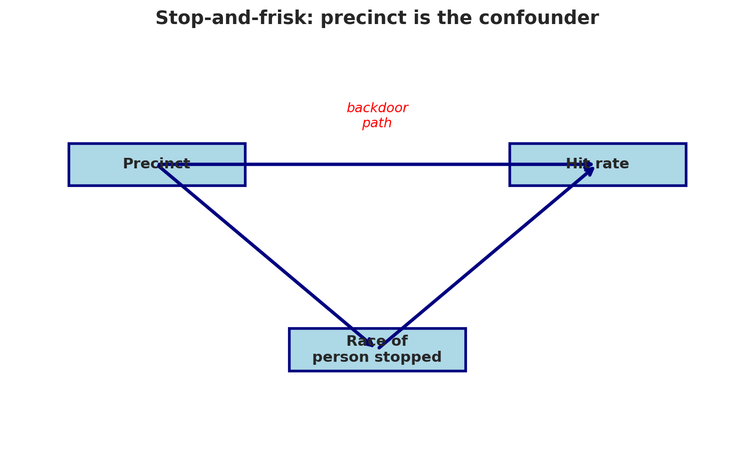
The DAG:
```{python}
draw_dag(
    nodes={'Precinct': (2, 5.5), 'Race of\nperson stopped': (5, 2), 'Hit rate': (8, 5.5)},
    edges=[('Precinct', 'Race of\nperson stopped'),
           ('Precinct', 'Hit rate'),
           ('Race of\nperson stopped', 'Hit rate')],
    annotations=[('backdoor\npath', 5, 6.2, 'red')],
    title="Stop-and-frisk: precinct is the confounder",
    figsize=(8, 5)
)
```
**Precinct** is a confounder: it influences both who gets stopped (racial composition varies by neighborhood) and the hit rate (policing intensity and weapon prevalence vary by location). When we compare hit rates *within* precincts — blocking the backdoor path — the ratio drops from 5.2x to 2.2x. (The within-precinct number isn't computed from our summary data; it's the result of Sharad Goel, Justin Rao, and Ravi Shroff's stop-level analysis in the *Annals of Applied Statistics*, 2016.)
The within-precinct ratio is still evidence of disparate treatment: officers appear to stop Black individuals on weaker evidence even within the same precinct. But the *magnitude* of the disparity changes dramatically once we control for location. Getting the confounding structure right is essential for accurate policy analysis.
After the Stanford Open Policing Project published similar within-group analyses for the LAPD, the department changed its Metro Division operations (*Los Angeles Times*, October 2019). The statistical question — aggregate or disaggregated? — had real consequences for how a major city policed its residents.
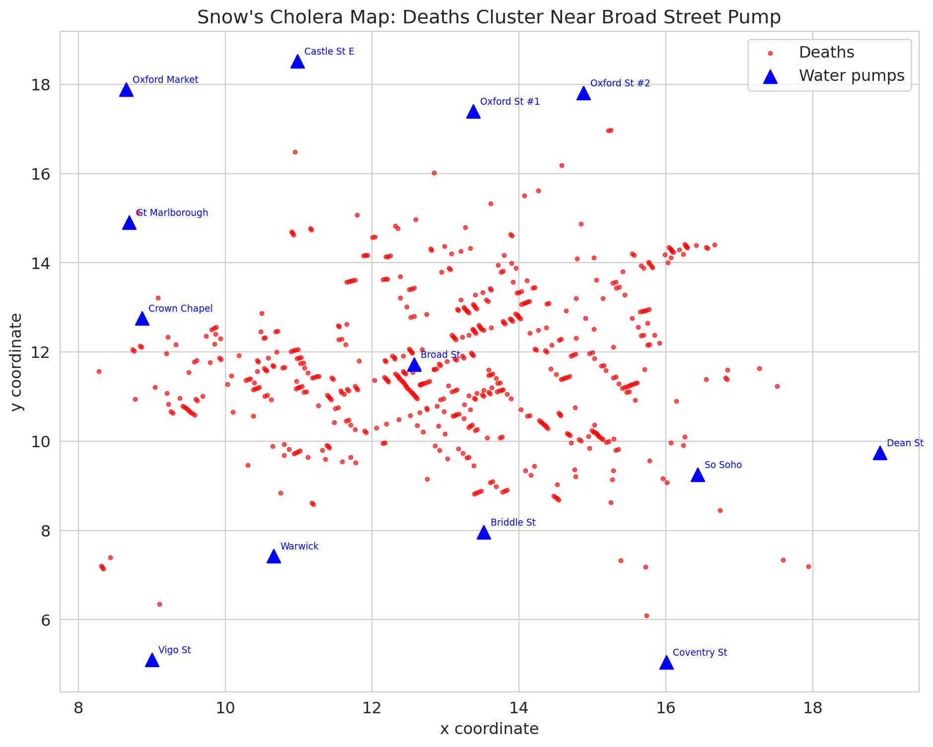
## John Snow and the birth of epidemiology
:::{.callout-note}
## Historical context: John Snow's cholera investigation
London, 1854. Cholera is killing thousands. The prevailing theory: "bad air" (miasma) causes disease. A physician named John Snow had a different idea: contaminated *water*.
:::
Let's look at his data.
```{python}
deaths = pd.read_csv(f'{DATA_DIR}/john-snow/snow_deaths.csv')
pumps = pd.read_csv(f'{DATA_DIR}/john-snow/snow_pumps.csv')
water = pd.read_csv(f'{DATA_DIR}/john-snow/snow_water_companies.csv')

print("Each row is a cholera death with x,y coordinates on Snow's map")
print("\nDeath locations (first 5):")
print(deaths.head())
print(f"\nTotal deaths recorded: {len(deaths)}")
print(f"\nWater pumps:")
print(pumps[['pump', 'label']].to_string(index=False))
```
Snow's famous map plots each death as a point and each pump as a triangle. Let's recreate it.
```{python}
fig, ax = plt.subplots(figsize=(10, 8))

# Plot deaths
ax.scatter(deaths['x'], deaths['y'], c='red', s=8, alpha=0.6, label='Deaths')

# Plot pumps
ax.scatter(pumps['x'], pumps['y'], c='blue', s=100, marker='^', zorder=5, label='Water pumps')
for _, pump in pumps.iterrows():
    ax.annotate(pump['label'], xy=(pump['x'], pump['y']),
                xytext=(5, 5), textcoords='offset points', fontsize=7, color='blue')

ax.set_xlabel('x coordinate')
ax.set_ylabel('y coordinate')
ax.set_title("Snow's cholera map: deaths cluster near Broad Street pump")
ax.legend()
plt.tight_layout()
plt.show()

print("Deaths cluster around the Broad Street pump -- the famous map.")
print("But is this CAUSAL evidence? Or just a spatial correlation?")
```
## Snow's real evidence: the natural experiment
The famous cholera map is compelling, but it's just a **correlation** — deaths cluster near a pump. Maybe those neighborhoods were just poorer or more crowded.
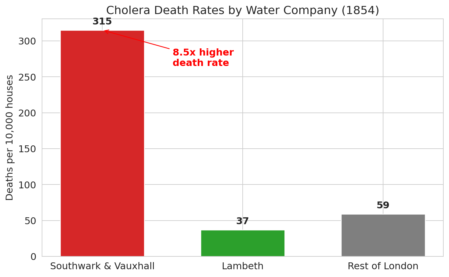
Snow's true breakthrough was something different. Two water companies served overlapping neighborhoods in South London:
- **Southwark & Vauxhall**: drew water from the Thames *downstream* of sewage outflows
- **Lambeth**: had recently moved its intake *upstream* of the sewage
Crucially, houses served by different companies were **intermingled on the same streets**. Same neighborhoods, same air, same poverty — but different water.
```{python}
print("Deaths by water company (1854 cholera outbreak):")
print("=" * 55)
print(water.to_string(index=False))

sv_rate = water[water['company'] == 'Southwark & Vauxhall']['death_rate_per_10000'].values[0]
l_rate = water[water['company'] == 'Lambeth']['death_rate_per_10000'].values[0]

print(f"\nSouthwark & Vauxhall death rate: {sv_rate} per 10,000")
print(f"Lambeth death rate: {l_rate} per 10,000")
print(f"Ratio: {sv_rate / l_rate:.1f}x higher death rate for contaminated water")
```
```{python}
fig, ax = plt.subplots(figsize=(8, 5))

companies = water['company'].values
rates = water['death_rate_per_10000'].values
colors_wc = ['#d62728', '#2ca02c', '#7f7f7f']

bars = ax.bar(companies, rates, color=colors_wc, edgecolor='white', width=0.6)
ax.set_ylabel('Deaths per 10,000 houses')
ax.set_title('Cholera death rates by water company (1854)')

# Annotate bars
for bar, rate in zip(bars, rates):
    ax.text(bar.get_x() + bar.get_width()/2, bar.get_height() + 5,
            f'{rate}', ha='center', va='bottom', fontsize=12, fontweight='bold')

# Ratio annotation
ax.annotate(f'{sv_rate/l_rate:.1f}x higher\ndeath rate',
            xy=(0, sv_rate), xytext=(0.5, sv_rate - 50),
            fontsize=12, color='red', fontweight='bold',
            arrowprops=dict(arrowstyle='->', color='red'))

plt.tight_layout()
plt.show()
```
## Why this is a natural experiment
:::{.callout-important}
## Definition: Natural experiment
A **natural experiment** occurs when some external circumstance assigns treatment in a way that is **as-if random** — creating comparable groups without deliberate randomization.
:::
Here, the "treatment" is contaminated water. The key features:
| Feature | Status |
|---------|--------|
| Treatment assigned randomly? | No — but **as-if random** within neighborhoods |
| Groups comparable? | Yes — same streets, same poverty, same "bad air" |
| Confounders controlled? | Yes — the only difference was the water source |
| Temporal precedent? | Yes — Lambeth moved its intake before the outbreak |
The intermingling of houses is what makes Snow's evidence *causal*, not just correlational. He couldn't run an experiment (you can't randomly give people contaminated water!), but nature effectively ran one for him.
```{python}
draw_dag(
    nodes={'Water company\n(as-if random)': (2, 4.5), 'Water quality': (5, 4.5),
           'Cholera death': (8, 4.5)},
    edges=[('Water company\n(as-if random)', 'Water quality'),
           ('Water quality', 'Cholera death')],
    annotations=[('no backdoor path — neighborhoods are comparable', 5, 2.5, '#2ca02c')],
    title="Snow's natural experiment: no unblocked backdoor path",
    figsize=(9, 4)
)
```
## The map is not the experiment
Here's what most people get wrong about John Snow. The famous cholera map — deaths clustered around the Broad Street pump — is the image everyone remembers. It's in every textbook, every documentary, every data science course.
But **the map is not the causal evidence.**
The map shows a *spatial correlation*: deaths near the pump. But maybe people near that pump were also poorer, more crowded, less healthy. The map can't rule that out.
Snow's actual causal argument came from the **water company comparison** — the natural experiment. Same neighborhoods, different water, 8.5x difference in death rates. That's the evidence that contaminated water causes cholera.
The map is memorable. The natural experiment is convincing. They're not the same thing.
```{python}
# Let's quantify the map's limitation
from scipy.spatial.distance import cdist  # computes distances between sets of points

death_coords = deaths[['x', 'y']].values
pump_coords = pumps[['x', 'y']].values

distances = cdist(death_coords, pump_coords)
nearest_pump_idx = distances.argmin(axis=1)

deaths_with_pumps = deaths.copy()
deaths_with_pumps['nearest_pump'] = pumps.iloc[nearest_pump_idx]['label'].values
deaths_with_pumps['distance'] = distances.min(axis=1)

# Deaths by nearest pump
pump_deaths = deaths_with_pumps.groupby('nearest_pump').size().sort_values(ascending=False)
print("Deaths by nearest pump:")
print(pump_deaths.head(8).to_string())
print(f"\nBroad Street pump accounts for {pump_deaths.get('Broad St', 0)} of {len(deaths)} deaths")
print("\nBut proximity is not causation. Snow knew he needed stronger evidence.")
```
## A framework: levels of causal evidence
Snow's investigation illustrates a hierarchy of evidence that we'll use throughout causal inference. Not all evidence is created equal:
| Level | Method | Example | Strength |
|-------|--------|---------|----------|
| 1 | **Randomized experiment** | Clinical trial (ACTG 175 from Chapter 10) | Gold standard |
| 2 | **Natural experiment** | Snow's water companies | Very strong |
| 3 | **Regression with confounders** | School selectivity $\to$ earnings, controlling for wealth | Depends on what you control for |
| 4 | **Simple correlation** | School SAT_AVG and earnings ($r = 0.65$) | Weakest — could be confounded |
We'll see more of levels 1 and 2 in Chapter 19.
## Can we fix regression? Controlling for confounders
If we can't run an experiment, can we at least control for confounders in a regression?
Let's try. In the college data, `CONTROL` indicates public (1), private nonprofit (2), or private for-profit (3). This variable is a rough proxy for resources and wealth. What happens when we add it?
```{python}
from sklearn.linear_model import LinearRegression

# Simple regression: SAT -> earnings
X_simple = colleges[['SAT_AVG']].values
y = colleges['MD_EARN_WNE_P10'].values

model_simple = LinearRegression().fit(X_simple, y)
print("Simple regression: SAT -> Earnings")
print(f"  Coefficient on SAT: ${model_simple.coef_[0]:.0f} per point")
print(f"  R-squared = {model_simple.score(X_simple, y):.3f}")

# Multiple regression: SAT + school type -> earnings
colleges['is_private_nonprofit'] = (colleges['CONTROL'] == 2).astype(int)
colleges['is_for_profit'] = (colleges['CONTROL'] == 3).astype(int)
X_multi = colleges[['SAT_AVG', 'is_private_nonprofit', 'is_for_profit']].values

model_multi = LinearRegression().fit(X_multi, y)
print(f"\nMultiple regression: SAT + school type -> Earnings")
print(f"  Coefficient on SAT: ${model_multi.coef_[0]:.0f} per point")
print(f"  Coefficient on private nonprofit: ${model_multi.coef_[1]:,.0f}")
print(f"  R-squared = {model_multi.score(X_multi, y):.3f}")

print(f"\nThe SAT coefficient barely changed (${model_simple.coef_[0]:.0f} → ${model_multi.coef_[0]:.0f}) when we controlled for school type.")
print("School type captures only a coarse difference in resources -- within each type,")
print("family wealth still varies enormously, so it can still confound the relationship")
print("even when public/private flags don't. Not every suspected confounder actually")
print("confounds at the level you measure it -- but the unmeasured confounders remain.")
```
## Feedback loops as causal structure
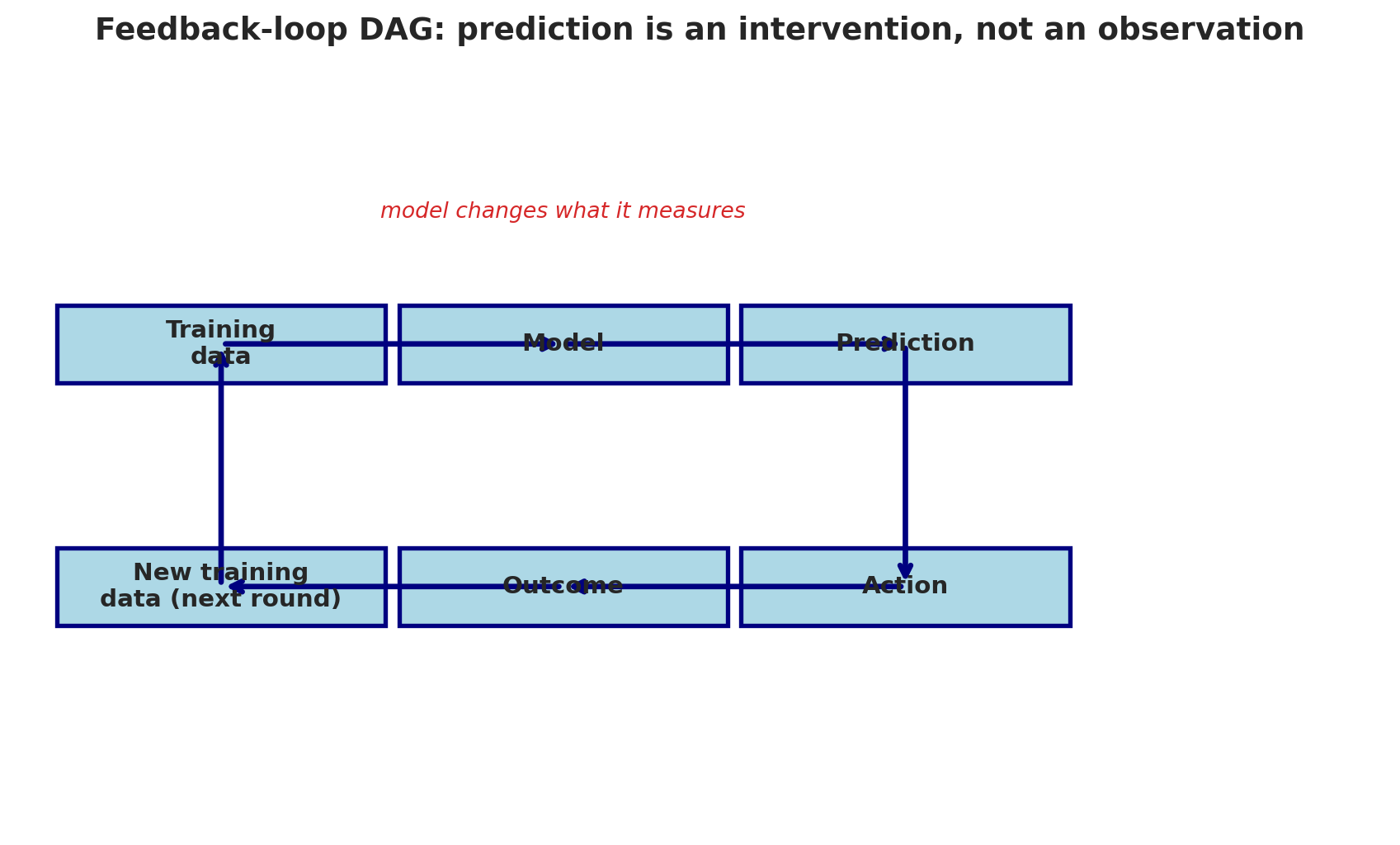
Before leaving confounding, there's a subtler cousin worth naming. [Chapter 16](lec16-feedback-loops.qmd) introduced **feedback loops**: cases where the model's *predictions* change the outcome it's trying to measure (predictive policing, credit scoring, sepsis alerts). The DAG view makes precise why those loops break standard analysis.
In a feedback-loop DAG, the model's prediction is an **intervention** on the outcome, not just an observation of it. The arrow from prediction to outcome is a causal edge — not a passive correlation — and any path that goes *through* the model's output cannot be blocked by conditioning on the model's inputs.
```{python}
draw_dag(
    nodes={'Training\ndata': (1.5, 5), 'Model': (4, 5), 'Prediction': (6.5, 5),
           'Action': (6.5, 2.5), 'Outcome': (4, 2.5), 'New training\ndata (next round)': (1.5, 2.5)},
    edges=[('Training\ndata', 'Model'), ('Model', 'Prediction'),
           ('Prediction', 'Action'), ('Action', 'Outcome'),
           ('Outcome', 'New training\ndata (next round)'),
           ('New training\ndata (next round)', 'Training\ndata')],
    annotations=[('model changes what it measures', 4, 6.3, '#d62728')],
    title='Feedback-loop DAG: prediction is an intervention, not an observation',
    figsize=(9, 5.5)
)
```
The fix isn't better covariates. Conditioning on model inputs cannot block a path that runs *through* the model's output. The fix is structural: either sever the loop (for example, randomize some decisions as a holdout so that outcomes for those cases are generated without the model's input) or analyze the deployed system as a causal system with its own treatment-and-outcome structure. Chapter 19 develops both approaches.
## The limits of "controlling for"
Adding control variables to a regression can help — but only if:
1. **You include all confounders.** Miss one, and the estimate is biased.
2. **You measure them well.** A rough proxy for "family wealth" isn't the same as actual wealth.
3. **You don't control for the wrong things.** Controlling for a **mediator** (something on the causal path) or a **collider** (something caused by both treatment and outcome) can make bias *worse*.
4. **The arrow structure must be passive.** If the "treatment" is a deployed model's prediction, no amount of covariate adjustment recovers a causal effect — see the feedback-loop DAG above.
The difficulty of controlling for all confounders is the core challenge of observational studies. You're always one unmeasured confounder away from a wrong answer.
:::{.callout-tip}
## Think about it
What would you need to measure to estimate the *causal* effect of attending a selective college on earnings?
:::
## A trap: collider bias
:::{.callout-tip}
## Think about it
We said you should control for confounders. Should you *always* add more control variables to a regression? What could go wrong?
:::
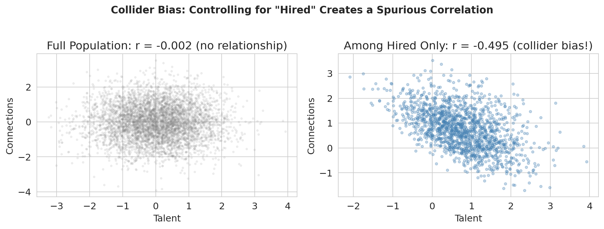
Here's a puzzle. Imagine you're at a prestigious consulting firm. You notice that the most talented analysts seem to have the weakest professional networks, and the best-connected people tend to be mediocre analysts. Does getting hired destroy your social skills? No — this is a statistical illusion called **collider bias**.
:::{.callout-important}
## Definition: Collider
A variable is a **collider** on a particular path if both arrows on that path point *into* it. (Note: being a collider is a property of a variable *on a specific path*, not a property of the variable itself — the same variable might be a collider on one path but not another.)
:::
```
Talent ──→ Hired at Top Firm ←── Connections
```
In the simulation below, talent and connections are independent by construction. But among people hired at top firms (conditioning on the collider), they're **negatively** correlated — you got in either through talent OR connections.
The resulting artifact is called **collider bias** or **selection bias**, and it's a common trap in regression analysis.
```{python}
# Simulate collider bias
n = 5000
talent = np.random.normal(0, 1, n)
connections = np.random.normal(0, 1, n)

# Hiring depends on both (collider)
hire_score = talent + connections + np.random.normal(0, 0.5, n)
hired = hire_score > np.percentile(hire_score, 70)
print(f"Hired {hired.sum()} of {n} people (top 30% of hire score)")
```
```{python}
fig, axes = plt.subplots(1, 2, figsize=(11, 4))

# Left: full population
axes[0].scatter(talent, connections, alpha=0.1, s=5, color='gray')
r_all = np.corrcoef(talent, connections)[0, 1]
axes[0].set_xlabel('Talent'); axes[0].set_ylabel('Connections')
axes[0].set_title(f'Full population: r = {r_all:.3f} (no relationship)')

# Right: among hired only — negative correlation!
axes[1].scatter(talent[hired], connections[hired], alpha=0.3, s=10, color='steelblue')
r_hired = np.corrcoef(talent[hired], connections[hired])[0, 1]
axes[1].set_xlabel('Talent'); axes[1].set_ylabel('Connections')
axes[1].set_title(f'Among hired only: r = {r_hired:.3f} (collider bias!)')

plt.suptitle('Collider bias: controlling for "Hired" creates a spurious correlation',
             fontsize=13, fontweight='bold', y=1.02)
plt.tight_layout()
plt.show()

print(f"In the full population, talent and connections are unrelated (r = {r_all:.3f}).")
print(f"Among hired people, they're negatively correlated (r = {r_hired:.3f}).")
print("Controlling for a collider creates bias that wasn't there before!")
print("(The negative correlation holds regardless of the hiring threshold — try changing 70 to 50 or 90.)")
```
:::{.callout-warning}
## Collider bias
Conditioning on a common *effect* of two variables creates a fake relationship between them. That's collider bias. Always check your DAG before adding control variables to a regression.
:::
:::{.callout-important}
## Confounder vs. collider
A **confounder** is a common *cause* of treatment and outcome — controlling for it **removes** bias. A **collider** is a common *effect* of treatment and outcome — controlling for it **creates** bias. The two require opposite strategies: always control for confounders, never control for colliders.
:::
## DAG rules: what to control for
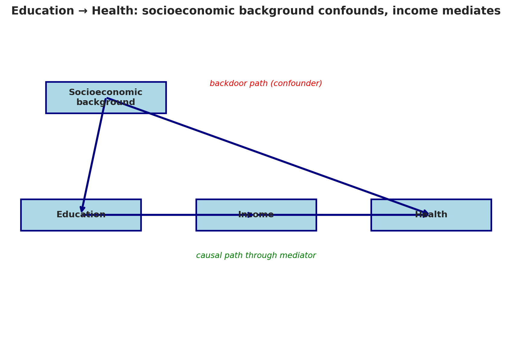
Before we summarize the rules, let's work through one more example. Consider this DAG for the effect of Education on Health:
```{python}
draw_dag(
    nodes={'Socioeconomic\nbackground': (2, 6), 'Education': (1.5, 3),
           'Income': (5, 3), 'Health': (8.5, 3)},
    edges=[('Socioeconomic\nbackground', 'Education'),
           ('Socioeconomic\nbackground', 'Health'),
           ('Education', 'Income'), ('Income', 'Health')],
    annotations=[('backdoor path (confounder)', 5.2, 6.3, 'red'),
                 ('causal path through mediator', 5, 1.9, 'green')],
    title="Education → Health: socioeconomic background confounds, income mediates",
    figsize=(9, 6)
)
```
What's the confounder? Socioeconomic Background — it's a common cause of Education and Health. Should we control for it? **Yes** — it's on a backdoor path. What's the mediator? Income — it's on the causal path from Education to Health. Should we control for Income? **No** — it would block the very effect we're trying to measure.
:::{.callout-important}
## Definition: Mediator
A **mediator** is a variable on the causal path between treatment and outcome (X $\rightarrow$ Z $\rightarrow$ Y). Controlling for a mediator removes part of the causal effect you are trying to measure.
:::
Here are the key rules for reading causal diagrams:
| Structure | Name | Example | Control for it? |
|-----------|------|---------|----------------|
| X $\leftarrow$ Z $\rightarrow$ Y | **Confounder** | Wealth $\to$ Selective college, Wealth $\to$ Earnings | **Yes!** Blocks the backdoor path |
| X $\rightarrow$ Z $\rightarrow$ Y | **Mediator** | Selective college $\to$ Alumni network $\to$ Earnings | **No!** Blocks the causal path |
| X $\rightarrow$ Z $\leftarrow$ Y | **Collider** | Talent $\to$ Hired $\leftarrow$ Connections | **No!** Opens a spurious path |
:::{.callout-important}
## Definition: Back-door criterion
The **back-door criterion** says: to estimate the causal effect of X on Y, you must block all backdoor paths (paths into X through common causes) without blocking any causal paths (paths from X to Y) or opening any collider paths. An additional requirement: you cannot control for any **descendant of the treatment** (a variable caused by X), since doing so partly blocks the causal effect or introduces bias through collider structures downstream of X.
:::
These rules follow from whether "controlling for" a variable opens or closes the path between treatment and outcome. Getting this wrong — controlling for the wrong variable — is one of the most common mistakes in applied statistics.
:::{.callout-tip}
## Think about it
In the DAG below, identify the confounder, mediator, and collider. Which should you control for?
X $\to$ M $\to$ Y,   X $\leftarrow$ C $\to$ Y,   X $\to$ Z $\leftarrow$ Y
:::
## Key takeaways
> "Correlation is not causation." Now you know *why* — and you have the tools (DAGs) to tell the difference.
- **Confounders** create spurious associations. A confounder is a common cause of treatment and outcome, creating a backdoor path that makes correlation look like causation.
- **Causal diagrams (DAGs)** make the reasoning visual. Draw the arrows, trace the paths, and you'll see whether regression can identify a causal effect.
- **Simpson's Paradox** is a confounding problem: aggregate data can show the opposite of disaggregated data. The DAG tells you which is right.
- **Natural experiments** (like Snow's water companies — not his famous map!) provide causal evidence without randomization, by exploiting situations where treatment is as-if random.
- **Block all backdoor paths, but don't block causal paths.** Control for confounders (good), but never control for colliders (opens spurious paths) or mediators (removes the effect you're trying to measure).
Back to the opening question: with observational data alone, can we estimate Stanford's causal effect on earnings? Honestly — no. We can't measure family wealth perfectly, can't enumerate every confounder, and the only "treatment" we observe is the bundle of selection + admission + culture that makes Stanford Stanford. Next time: difference-in-differences, A/B tests, and counterfactual reasoning — the tools for designing studies that *can* answer questions like this.
## Study guide
### Key ideas
- **Causal inference:** determining when a statistical association reflects a cause-and-effect relationship
- **Confounder:** a common cause of treatment and outcome that creates a spurious association (a backdoor path)
- **DAG (Directed Acyclic Graph):** a diagram of causal relationships; "directed" = arrows have direction, "acyclic" = no loops
- **Backdoor path:** a non-causal path connecting treatment and outcome through a common cause
- **Causal path (directed path):** a path where all arrows point forward from treatment to outcome
- **Back-door criterion:** to estimate a causal effect, block all backdoor paths without blocking causal paths or opening collider paths
- **Collider:** a variable on a path where both arrows point *into* it; conditioning on a collider opens a spurious path
- **Mediator:** a variable on the causal path between treatment and outcome
- **Spurious association:** a correlation arising entirely from a common cause, not from a causal relationship
- **Natural experiment:** a situation where an external circumstance assigns treatment as-if randomly
- **Observational data vs. experimental data:** data collected without intervention vs. data from a randomized experiment
- **Simpson's Paradox:** when a trend reverses after disaggregating by a confounding variable
- Confounders create backdoor paths that make correlation look like causation; DAGs let you see and block them.
- Regression estimates a causal effect only when all backdoor paths are blocked without blocking causal paths.
- Controlling for a collider *creates* bias; controlling for a mediator *removes* the effect you want to measure.
- Natural experiments exploit as-if-random assignment to provide causal evidence without a randomized trial.
- Simpson's Paradox is a confounding problem that DAGs explain: the aggregate hides a backdoor path.
### Computational tools
- No new computational tools are critical for this lecture — the key skills are conceptual (drawing and reading DAGs, identifying confounders/colliders/mediators)
- `pd.qcut()` for creating severity categories
- `scipy.spatial.distance.cdist()` for computing distances between points
- The `draw_dag()` helper function pattern for visualizing causal diagrams
### For the quiz
You should be able to:
- Given a scenario, identify confounders, mediators, and colliders
- Given a DAG, determine which variables to control for and which to leave alone
- Explain why controlling for a collider creates bias (with an example)
- Distinguish observational evidence (correlation) from experimental evidence (causation)
- Explain Simpson's Paradox using a DAG