---
title: "Multiple Testing"
execute:
enabled: true
jupyter: python3
---
## Which NBA players really shoot better than league average?
The 2023--24 NBA season averaged 47.7% shooting from the field across rotation players. Some players were far above: Jarrett Allen at 63%, Rudy Gobert at 66%. Some were far below: Jevon Carter at 38%. Are those gaps real, or could a season's worth of shots produce that much variation by chance? And if Aaron Gordon comes in at 55.7%, is he genuinely a better shooter than Klay Thompson at 43.3%?
We answer these questions twice. First we run a hypothesis test for every player and run into the **multiple testing** problem: when you do hundreds of tests, some come back significant by chance alone. Second, we revisit Gordon vs Thompson and find that even when an aggregate difference is statistically real, it can still mislead — that's **confounding**, which we formalize through correlation and Simpson's paradox.
> *"If you torture the data long enough, it will confess to anything."*
> — Ronald Coase
```{python}
import numpy as np
import pandas as pd
import matplotlib.pyplot as plt
import seaborn as sns
from scipy import stats
import warnings
warnings.filterwarnings('ignore')
sns.set_style('whitegrid')
plt.rcParams['figure.figsize'] = (8, 5)
plt.rcParams['font.size'] = 12

DATA_DIR = 'data'
```
## The data: shots by zone
`shot_zones_2023-24.csv` records every NBA player's makes (`FGM`) and attempts (`FGA`) in each of six shot zones during the 2023--24 regular season, from NBA.com Stats. Throughout the chapter, "FGA" and "FG%" mean the totals across these six zones; back-court heaves and a small handful of unclassified shots are excluded, so the numbers here run a few percentage points off Basketball-Reference totals (which include every attempt). The six zones, ordered from the rim outward:
- `RA` — restricted area (the small arc under the basket; mostly dunks and layups)
- `PAINT` — the rest of the painted lane (close shots not under the basket)
- `MID` — mid-range jumpers (inside the three-point line)
- `LC3`, `RC3` — left and right corner three-pointers
- `ATB3` — above-the-break three-pointers
```{python}
shots = pd.read_csv(f'{DATA_DIR}/nba/shot_zones_2023-24.csv')
print(f"Players: {len(shots)}")
shots.head()
```
We filter to rotation players with at least 200 shots — the minimum for individual hypothesis tests to have meaningful power.
```{python}
qual = shots[shots['FGA'] >= 200].copy()
qual['FG_PCT'] = qual['FGM'] / qual['FGA']
print(f"Qualified players (FGA >= 200): {len(qual)}")
```
## First analysis: one z-test per player
[Lecture 10](lec10-hypothesis-testing.qmd) used a two-sample t-test, with $\sigma$ estimated from the data. Here we have one player, a binary outcome, and no control group. For a Bernoulli outcome the mean $p$ determines the variance $p(1-p)$, so under $H_0: p = p_0$ the standard error $\sqrt{p_0(1-p_0)/n}$ is known exactly.
For each player, we ask: *is this player's true shooting percentage different from the league baseline?* The natural test is a one-sample two-sided z-test for a proportion.
::: {.callout-note}
## How is this different from the t-test?
The t-test from [Chapter 10](lec10-hypothesis-testing.qmd) and the z-test for a proportion are the **same recipe**: take the standardized distance from the null,
$$\frac{\text{statistic} - \text{null value}}{\text{SE under null}},$$
and look up its tail probability in a reference distribution. They differ in two places.
**The standard error.** For a sample mean of a continuous variable, you have to *estimate* the standard error from the data: $\hat\sigma / \sqrt{n}$, where $\hat\sigma$ is the sample standard deviation. That extra estimation step is the reason the reference distribution is $t_{n-1}$ rather than the standard normal — the $t$ distribution accounts for the noise in $\hat\sigma$ itself, and approaches the standard normal as $n$ grows.
For a proportion, the null hypothesis $p = p_0$ pins the standard error for free: $\sqrt{p_0(1-p_0)/n}$. There is nothing to estimate from the data, so the standardized statistic is asymptotically standard normal — no $t$ correction needed. (Equivalently, you can run an *exact* binomial test that doesn't depend on the normal approximation at all; for $n$ as large as our 200+ shots per player, the two agree to several decimals.)
**The reference distribution.** $t_{n-1}$ for the t-test, $\mathcal{N}(0, 1)$ for the z-test for a proportion.
**Both are CLT-driven shortcuts to the bootstrap.** The bootstrap from [Chapter 8](lec08-sampling.qmd) resamples the data and looks at the empirical distribution of the test statistic. As $n \to \infty$, both the bootstrap distribution of a sample mean and that of a sample proportion become normal. The t and z formulas are the closed-form versions of that limit — z for proportions (where $H_0$ specifies the variance) and t for means (where you have to estimate it).
**When to use which.** A continuous outcome compared to a fixed value: t-test. A binary outcome compared to a fixed proportion: z-test (or its exact binomial sibling). A continuous outcome with huge $n$ and known $\sigma$: technically a z-test works, but in practice you'd reach for the t-test anyway.
:::
Let $p_0$ be the league baseline FG% across all qualified shots, and $\hat p_i = \text{FGM}_i / \text{FGA}_i$ be player $i$'s observed FG%. Under $H_0: p_i = p_0$,
$$z_i = \frac{\hat p_i - p_0}{\sqrt{p_0(1-p_0) / \text{FGA}_i}} \sim \mathcal{N}(0, 1).$$
We run this test for every qualified player.
```{python}
p0 = qual['FGM'].sum() / qual['FGA'].sum()
print(f"League baseline FG%: {p0:.4f}")

qual['z'] = (qual['FG_PCT'] - p0) / np.sqrt(p0 * (1 - p0) / qual['FGA'])
qual['p_value'] = 2 * (1 - stats.norm.cdf(np.abs(qual['z'])))

m = len(qual)
n_unc = (qual['p_value'] < 0.05).sum()
print(f"Tests run:                     {m}")
print(f"Significant at p < 0.05:       {n_unc}")
```
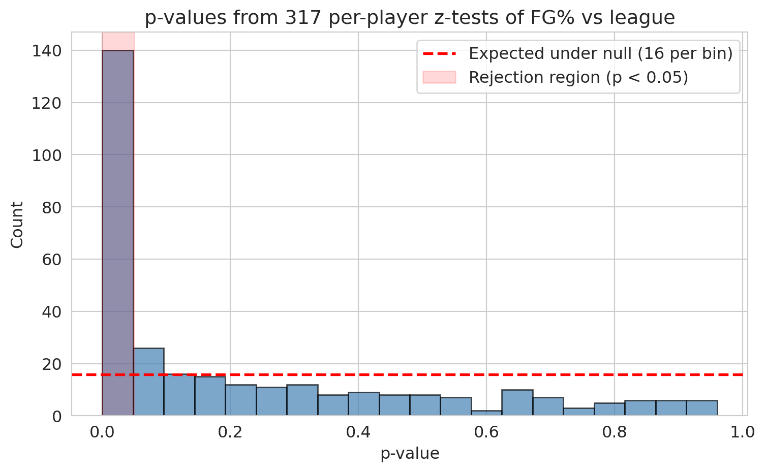
About 141 of the 317 players come back significant. That can't be right — we haven't just discovered that 45% of NBA players are statistically distinguishable from average. Many of these rejections are real, but we don't yet know which ones.
## Wait — how many should we expect by chance?
::: {.callout-tip}
## Think about it
If every player's true FG% equaled the league baseline, how many of our 317 tests would you expect to come back significant at $\alpha = 0.05$?
:::
If $H_0$ holds for every player, the expected number of false positives is
$$\mathbb{E}[\text{false positives}] = m \times \alpha.$$
Linearity of expectation holds even when tests are correlated, so this expected count is valid regardless of dependence.
```{python}
expected_false = m * 0.05
sd_under_null = np.sqrt(m * 0.05 * 0.95)
print(f"Tests:                {m}")
print(f"Expected false +ves:  {expected_false:.1f}")
print(f"SD under null:        {sd_under_null:.1f}")
print(f"Observed significant: {n_unc}")
print(f"Excess over null:     {n_unc - expected_false:.0f}  ({(n_unc - expected_false) / sd_under_null:.1f} SDs)")
```
The excess of about 125 rejections is overwhelming evidence that *something* real is going on. The challenge is sorting the genuine from the spurious. This is the **multiple testing** problem.
When many hypothesis tests are run, a predictable fraction will clear $\alpha = 0.05$ by chance alone. Here we run all the tests ourselves — the easiest case to see — but the same arithmetic applies across studies. If a thousand labs each run a single underpowered test at $\alpha = 0.05$, roughly fifty will publish a false positive even with no fraud and no p-hacking. That's the engine of the **replicability crisis** in science.
## The p-value histogram: a powerful diagnostic
Under the null hypothesis, p-values follow a Uniform(0, 1) distribution: applying any continuous CDF to its own random variable produces a uniform draw (the **probability integral transform**). So a histogram of null p-values is flat. If real effects are present, the histogram develops a spike near zero — those are the genuine discoveries. The flatness in the rest of the histogram bounds how many of the small p-values came from chance.
```{python}
fig, ax = plt.subplots(figsize=(8, 5))
ax.hist(qual['p_value'], bins=20, edgecolor='black', alpha=0.7, color='steelblue')
ax.axhline(y=m/20, color='red', linestyle='--', linewidth=2,
           label=f'Expected under null ({m/20:.0f} per bin)')
ax.axvspan(0, 0.05, alpha=0.15, color='red', label='Rejection region (p < 0.05)')
ax.set_xlabel('p-value')
ax.set_ylabel('Count')
ax.set_title(f'p-values from {m} per-player z-tests of FG% vs league')
ax.legend()
plt.tight_layout()
plt.show()
```
The first bin towers over the rest. Real signal is unmistakable. Now we need procedures that turn that signal into a defensible list of discoveries.
## Correction 1: Bonferroni
The simplest fix: if you run $m$ tests, divide your significance level by $m$.
**Intuition.** Start with a "false-positive budget" of $\alpha$ — say, a 5% chance of *any* wrong rejection. Spread that budget evenly across the $m$ tests, giving each one $\alpha/m$. By the union bound, the probability that *any* test fires a false positive is at most $m \cdot (\alpha/m) = \alpha$. The total budget is preserved no matter how the tests are correlated.
::: {.callout-important}
## Definition: Bonferroni correction and FWER
The **Bonferroni correction** sets
$$\alpha_{\text{Bonferroni}} = \frac{\alpha}{m}.$$
It controls the **family-wise error rate (FWER)** — the probability of *any* false positive across all $m$ tests. It is conservative: it may miss real effects, but it guarantees the probability of any false positive stays below $\alpha$.
:::
```{python}
alpha = 0.05
bonf_threshold = alpha / m
n_bonf = (qual['p_value'] < bonf_threshold).sum()

print(f"Original threshold:    {alpha}")
print(f"Bonferroni threshold:  {bonf_threshold:.6f}  ({m}x stricter)")
print(f"Significant after Bonferroni: {n_bonf}  (down from {n_unc})")

print("\nMost extreme survivors:")
print(qual.nsmallest(8, 'p_value')[['PLAYER_NAME', 'FGM', 'FGA', 'FG_PCT', 'p_value']].to_string(index=False))
```
The Bonferroni survivors are the obvious extremes: rim-feasting big men hitting 60--75% (Allen, Gobert, Lively, Gafford, Giannis) and the worst-shooting outliers. These are real, but Bonferroni's strictness leaves a lot on the table. Damian Lillard at 42.6% on 1,270 attempts is plausibly below league average — but his p-value, around $3 \times 10^{-4}$, doesn't clear the $1.6 \times 10^{-4}$ threshold.
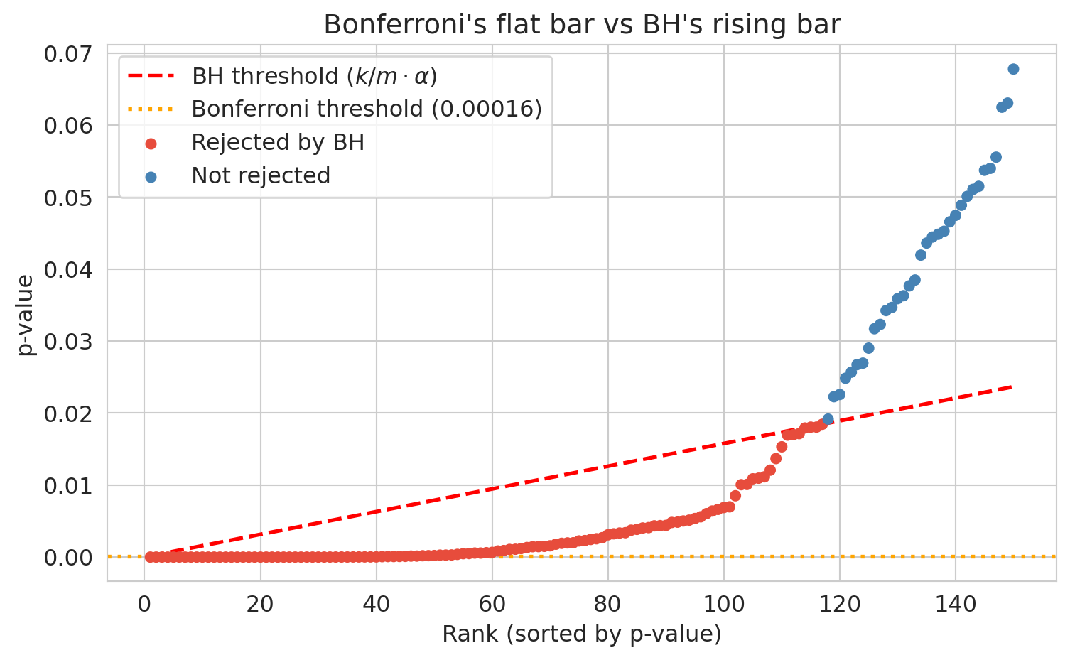
## Correction 2: Benjamini-Hochberg (FDR control)
Bonferroni is willing to miss real effects to guarantee zero false positives. Most analyses don't need that guarantee. If we are screening a few hundred players for further study, we can tolerate a controlled fraction of false positives in exchange for finding more real effects.
**Intuition.** Sort the p-values smallest to largest. Bonferroni asks every one of them to clear the same strict bar, $\alpha/m$. BH instead lets the bar rise with rank: $\alpha/m$ for the first, $2\alpha/m$ for the second, all the way up to $\alpha$ for the last. If you end up calling $k$ results discoveries, then roughly $k\alpha$ of those are expected to be null (since under the null, p-values are uniform), so the false-discovery *fraction* is about $\alpha$. You exchange Bonferroni's "no false positives at all" for "only $\alpha$ of my discoveries are wrong on average," and gain power to detect real effects.
::: {.callout-important}
## Definition: Benjamini-Hochberg procedure and FDR
The **Benjamini-Hochberg (BH) procedure** controls the **false discovery rate (FDR)** — the expected *proportion* of false positives among rejected hypotheses.
The BH procedure:
1. Sort p-values: $p_{(1)} \le p_{(2)} \le \cdots \le p_{(m)}$.
2. Find the largest $k$ such that $p_{(k)} \le \frac{k}{m} \alpha$.
3. Reject all hypotheses whose p-values are among the $k$ smallest.
In expectation, a fraction $\alpha$ of your discoveries are false.
:::
```{python}
sorted_q = qual.sort_values('p_value').reset_index(drop=True)
sorted_q['rank'] = np.arange(1, m + 1)
sorted_q['bh_thresh'] = sorted_q['rank'] / m * alpha
mask = sorted_q['p_value'] <= sorted_q['bh_thresh']
if mask.any():
    k_max = sorted_q.loc[mask, 'rank'].max()
    sorted_q['reject_BH'] = sorted_q['rank'] <= k_max
else:
    sorted_q['reject_BH'] = False
sorted_q['reject_Bonf'] = sorted_q['p_value'] < bonf_threshold

n_bh = sorted_q['reject_BH'].sum()
print(f"Uncorrected (p < 0.05):  {n_unc}")
print(f"Bonferroni (FWER):       {n_bonf}")
print(f"BH (FDR <= 0.05):        {n_bh}")
print(f"\nGap (BH but not Bonferroni): {n_bh - n_bonf}")
```
Bonferroni rejected 47, BH rejects 117, a gap of 70 players. Who are the seventy?
```{python}
gap = sorted_q[sorted_q['reject_BH'] & ~sorted_q['reject_Bonf']].sort_values('p_value')
print("Sample players caught by BH but not by Bonferroni:")
print(gap[['PLAYER_NAME', 'FGM', 'FGA', 'FG_PCT', 'p_value']].head(10).to_string(index=False))
```
These are recognizable names with moderate effects — Lillard, VanVleet, Durant, Holmgren — the kind of "this player shoots about five points off league average" findings that Bonferroni's strict threshold rejects on principle but BH is willing to flag, accepting that a small fraction will be wrong.
::: {.callout-note}
## When Bonferroni gives up
NBA shot data is friendly to Bonferroni: a handful of players (the rim-only big men) deviate so far from league average that their p-values are essentially zero, sailing past any threshold. In other domains the picture is harsher.
The canonical example is the [Hedenfalk et al. (2001) breast-cancer microarray study](https://www.nejm.org/doi/full/10.1056/NEJM200102223440801): for each of $m = 3{,}170$ genes, a t-test of expression in BRCA1 vs BRCA2 tumors. With only 7 vs 8 samples per gene, no individual test has enough power to clear the Bonferroni threshold of $\alpha/m \approx 1.6 \times 10^{-5}$ — Bonferroni rejects roughly **one** gene at $\alpha = 0.05$. Yet the p-value histogram has a clear spike near zero: many genes have moderate effects. BH at $q = 0.05$ rejects roughly **94 genes** (Storey & Tibshirani, 2003). This regime — many moderate effects, no extreme ones — is exactly where Bonferroni gives up and BH's step-up rule does the real work. FDR was invented for it.
:::
The two corrections answer different questions. FWER asks: *did I make any mistake at all?* FDR asks: *among the things I called discoveries, what fraction are wrong?* Use Bonferroni when *any* false positive is costly (drug safety, criminal trials). Use BH when you can tolerate some false discoveries (screening genes, ranking candidates for further study). The stakes determine the correction.
::: {.callout-note collapse="true"}
## Going deeper: when your budget $K$ is fixed
A subtler point: both Bonferroni and BH preserve the p-value ranking. They differ only in where the threshold falls. So when the number of items you act on is fixed by your budget — "the wet lab can run 100 follow-ups," "we have 50 scholarships," "ship the top 5 features" — the correction *doesn't change which items you pick*. You take the top-$K$ by p-value either way.
This splits the use of corrections into two cases:
- **Threshold-driven action** (data determines $K$). The classic case. A regulator approving one drug, a GWAS reporting every SNP that clears $5 \times 10^{-8}$, a published paper claiming "we found 47 significant departures." Here the correction *is* the decision rule, and the choice of FWER vs FDR matters a great deal.
- **Budget-driven action** ($K$ is fixed by resources). The wet lab, the scholarship committee, the feature shortlist. The correction does not change which items make the cut. What it can still do is *characterize* the cut — tell you what fraction of your top-$K$ is expected to be noise.
For the budget-driven case, [Storey (2002)](https://academic.oup.com/jrsssb/article-abstract/64/3/479/7098576) introduced the **q-value**: an FDR-style estimate attached to each rejected hypothesis, defined as the expected proportion of false discoveries among all hypotheses with p-value at most as small as that one. With q-values you can read off "if I take the top 100, the expected FDR is 4.2%" without committing to a threshold rule, and adjust your $K$ to match a tolerance you specify rather than the other way around. This is now the dominant idiom in genomics shortlisting work.
The simpler takeaway: when someone gives you a multiple-testing problem, the *first* question to ask is whether $K$ is data-driven or budget-driven. If it's budget-driven, the right framing is rarely "Bonferroni or BH" — it's "what guarantee do I want to attach to the top-$K$ I was always going to ship?"
:::
```{python}
fig, ax = plt.subplots(figsize=(8, 5))
top_n = 150
sub = sorted_q.head(top_n)

colors = ['#e74c3c' if r else 'steelblue' for r in sub['reject_BH']]
ax.scatter(sub['rank'], sub['p_value'], c=colors, s=25, zorder=3, label='_nolegend_')
ax.plot(sub['rank'], sub['bh_thresh'], 'r--', linewidth=2, label='BH threshold ($k/m \\cdot \\alpha$)')
ax.axhline(y=bonf_threshold, color='orange', linestyle=':', linewidth=2,
           label=f'Bonferroni threshold ({bonf_threshold:.5f})')
ax.scatter([], [], c='#e74c3c', s=25, label='Rejected by BH')
ax.scatter([], [], c='steelblue', s=25, label='Not rejected')
ax.set_xlabel('Rank (sorted by p-value)')
ax.set_ylabel('p-value')
ax.set_title('Bonferroni\'s flat bar vs BH\'s rising bar')
ax.legend()
plt.tight_layout()
plt.show()
```
## The reproducibility crisis
Multiple testing corrections fix the problem when you *know* how many tests you ran. But what happens when the multiplicity is hidden — spread across months of exploratory analysis, dozens of researcher choices, and the publication process itself?
A published false positive doesn't sit on a shelf. Someone *acts* on it.
- **In medicine.** When the biotech company Amgen tried to replicate 53 "landmark" preclinical cancer studies before building drug programs on them, they could confirm only 6 — about 11% (Begley & Ellis, *Nature* 2012). A parallel effort at Bayer found roughly the same rate (Prinz et al., *Nature Reviews Drug Discovery* 2011). Each downstream phase II/III oncology trial costs hundreds of millions of dollars and enrolls hundreds of patients. When the underlying biology doesn't reproduce, the trial fails and the patients took experimental risks for nothing. Freedman, Cockburn, and Simcoe (*PLOS Biology* 2015) estimate that irreproducible preclinical research costs about **\$28 billion per year** in the United States alone.
- **In psychology and policy.** Power posing (Carney, Cuddy, & Yap, 2010) claimed that one-minute "high-power" poses changed cortisol and testosterone. The follow-up TED talk has over 50 million views, and the intervention spread through corporate training programs. The original co-author publicly disavowed it as unreplicable in 2016. Growth-mindset interventions, based on Carol Dweck's research, were deployed in tens of thousands of K-12 classrooms; large-scale randomized trials and meta-analyses (Sisk et al., 2018; Yeager et al., 2019) found average effects near zero. School districts spent millions on programs whose population-level benefit is now in serious doubt.
- **In the public record.** A retracted paper still gets cited. A failed replication takes years to surface. By the time the field has corrected itself, journalists have written headlines, foundations have funded follow-up work, and clinicians have adjusted their practice. The cost compounds.
Replicability is not academic hygiene. It determines what diseases get treated, what students get taught, and what policies get adopted. So how did so many false findings get published in the first place? The answer connects directly to multiple testing.
::: {.callout-note}
## The replication crisis in psychology
In 2011, the psychologist Daryl Bem published a paper in a top journal claiming evidence for *precognition* — that people could sense future events before they happened. The paper used standard methods and passed peer review. The embarrassment lay not in the result being wrong (it almost certainly was), but in the fact that standard methods *allowed* it.
That embarrassment helped spark the **Reproducibility Project** (Open Science Collaboration, 2015), which attempted to replicate 100 published psychology studies. Only about **36%** replicated with a statistically significant result, and effect sizes were roughly half the originals.
A decade later, the **SCORE project** ([*Nature* 2026](https://www.nature.com/articles/s41586-025-10078-y)) attempted 274 claims across 164 papers from 54 social- and behavioral-science journals. Replications showed significant effects in the original direction for **55%** of claims; only **54%** of papers were precisely computationally reproducible; independent analysts given the same data and hypothesis agreed with the original result only **34%** of the time. Economics and political science fared better (over 85% computationally reproducible, 72% of significant estimates surviving reanalysis). The crisis is real, broad, and not limited to a few bad actors — it reflects structural features of how research is done.
:::
How did so many false findings get published?
::: {.callout-warning}
## P-hacking and researcher degrees of freedom
**P-hacking** (also called **data dredging**) means trying many analyses and reporting the one that produces $p < 0.05$. This includes excluding outlier participants until significance appears, testing many outcome variables and reporting only the significant one, collecting data until $p$ dips below 0.05, or splitting groups in various ways until a comparison works.
The statistician Andrew Gelman calls these **researcher degrees of freedom** — the garden of forking paths. At each fork (which variable? which subset? which test?), the researcher makes a choice, and each choice is an implicit hypothesis test. The final reported p-value *looks* like it came from a single test, but it is really the survivor of many.
Simmons, Nelson, and Simonsohn (2011) demonstrated that exploiting just a few common degrees of freedom — optional stopping, controlling for gender, dropping a condition — could produce $p < 0.05$ for a completely nonexistent effect over 60% of the time.
:::
Two structural features of science make the problem worse:
- **The file drawer problem.** Studies with $p > 0.05$ are hard to publish, so they go in the "file drawer." If 20 labs independently test the same false hypothesis, one will get $p < 0.05$ by chance — and that's the only one you'll read about. The published literature is a biased sample of all research conducted.
- **Incentive misalignment.** Careers are built on novel, statistically significant findings. Null results don't get published, don't earn grants, and don't lead to promotions. This pressure (often unconscious) pushes researchers toward significance.
::: {.callout-important}
## Definition: pre-registration
**Pre-registration** means publicly committing to your research question, data collection plan, and analysis plan *before* looking at the data. This commitment eliminates researcher degrees of freedom by fixing the garden of forking paths in advance. A pre-registered analysis is a single, pre-specified test — not the survivor of many. Pre-registration doesn't prevent exploratory analysis; it requires labeling it honestly as exploratory rather than confirmatory.
:::
The lesson: multiple testing corrections (Bonferroni, BH) handle the *known* multiplicity — the hundreds of tests you explicitly ran. Pre-registration and transparent reporting handle the *hidden* multiplicity — the choices made before the final analysis ever appears. Both are manifestations of the same core problem: **if you test many things and cherry-pick, you will find an apparent effect whether or not anything is real.**
## From testing to relationships
We've identified 117 players whose FG% is unlikely to be league-average noise. But before we celebrate, look back at the Bonferroni survivors — the most overwhelmingly significant cases — and notice something. Aaron Gordon at 55.7% is confidently above league. Klay Thompson at 43.3% is confidently below. Are these two findings about *shooting skill*?
The aggregate gap is 12 percentage points in Gordon's favor. Before reasoning about it, just break it down by zone.
```{python}
def zone_table(name):
    row = qual[qual['PLAYER_NAME'] == name].iloc[0]
    return pd.Series({
        'RA':    row['RA_FGM']    / row['RA_FGA'],
        'PAINT': row['PAINT_FGM'] / row['PAINT_FGA'],
        'MID':   row['MID_FGM']   / row['MID_FGA'],
        'LC3':   row['LC3_FGM']   / row['LC3_FGA'],
        'RC3':   row['RC3_FGM']   / row['RC3_FGA'],
        'ATB3':  row['ATB3_FGM']  / row['ATB3_FGA'],
        'TOTAL': row['FGM']       / row['FGA'],
    })

comparison = pd.DataFrame({
    'Klay Thompson': zone_table('Klay Thompson'),
    'Aaron Gordon':  zone_table('Aaron Gordon'),
})
comparison['Klay - Gordon'] = comparison['Klay Thompson'] - comparison['Aaron Gordon']
print((comparison * 100).round(1).to_string())
```
In every single zone, Klay shoots better than Aaron Gordon. In aggregate, Gordon shoots better than Klay. The aggregate flips the within-zone story.
This is **Simpson's paradox** (named after Edward Simpson, 1951): an association reverses when you look inside subgroups. The math isn't wrong — both the aggregate and the within-zone numbers are correctly computed from the same data. They give opposite answers because they answer different questions.
## Why? A lurking variable: shot location
The reversal has a mechanism. Compute, for each player, the share of their shots that come from the restricted area — the easiest zone in basketball.
```{python}
qual['rim_share'] = qual['RA_FGA'] / qual['FGA']

fig, ax = plt.subplots(figsize=(8, 5))
ax.scatter(qual['rim_share'], qual['FG_PCT'], alpha=0.5, s=25, color='steelblue')
ax.axhline(p0, color='black', linewidth=0.7, linestyle='--', label=f'League FG% = {p0:.3f}')
ax.set_xlabel('Share of shots from restricted area')
ax.set_ylabel('Overall FG%')
ax.set_title('Rim share predicts overall FG%')
ax.legend()
plt.tight_layout()
plt.show()

r, p = stats.pearsonr(qual['rim_share'], qual['FG_PCT'])
print(f"Pearson correlation r(rim_share, FG_PCT) = {r:.3f}  (p = {p:.2e})")
```
A strong positive correlation: players who take a larger fraction of their shots near the rim post higher overall FG%. Recall from [Chapter 4](lec04-regression.qmd#correlation) that Pearson's $r$ measures the linear association between two variables, taking values from $-1$ to $+1$ and unitless under any rescaling. Here $r \approx 0.80$ — most of the variation in players' aggregate FG% is captured by where they shoot from.
::: {.callout-warning}
## Ecological correlation
Correlations computed on group averages (one point per state, per team, per player) can be much stronger than correlations computed on individual observations. These **ecological correlations** are misleading — averaging hides within-group variation. Always check whether a correlation is based on individual data or aggregated summaries.
:::
## Correlation is not causation: shot selection
The rim-share-vs-FG% correlation is real, but read it carefully. It does not say "if Klay Thompson started attacking the rim, his FG% would rise to Gordon's." It says "the players who shoot more from the rim happen to also have higher overall FG%." The reason is mechanical, not skillful: the league averages 67% from the restricted area but only 36% from above-the-break threes. Whoever takes the easier shots posts the better aggregate number.
```{python}
def shot_mix(name):
    row = qual[qual['PLAYER_NAME'] == name].iloc[0]
    return {z: row[f'{z}_FGA'] / row['FGA'] for z in ['RA', 'PAINT', 'MID', 'LC3', 'RC3', 'ATB3']}

mix = pd.DataFrame({'Klay Thompson': shot_mix('Klay Thompson'),
                    'Aaron Gordon':  shot_mix('Aaron Gordon')})
print("Share of shots taken in each zone:")
print((mix * 100).round(1).to_string())
```
Gordon takes 65% of his shots from the restricted area where the league shoots 67%; Thompson takes 53% of his shots from above the break where the league shoots 36%. Gordon's high aggregate FG% is not shooting skill — it's where he shoots from.
So when we tested Aaron Gordon's 55.7% against league baseline 47.7% and rejected $H_0$ at vanishingly small $p$, what did we learn? That his shot mix differs from the league's. *Not* that he is a better shooter. The test gave us a true answer to a question that turns out to be the wrong question.
The variable that drives this — shot location — is a **confounder**. It influences both the input (which player is taking the shot) and the output (whether it goes in), creating an aggregate association that doesn't reflect what we actually want to measure: shooting skill. We will formalize confounders using causal diagrams (DAGs) in [Chapter 18](lec18-causal-inference-1.qmd).
::: {.callout-tip}
## Think about it
Bonferroni rejected $H_0$ for both Aaron Gordon (high) and Klay Thompson (low). Both rejections are statistically real — neither player shoots league average. But what *kind* of question would each rejection answer correctly, and what kind would it answer wrongly?
:::
A statistically significant aggregate effect can still be confounded. Multiple testing corrections (Bonferroni, BH) protect against finding effects that aren't there. They do nothing to protect against finding effects that *are* there but reflect the wrong mechanism.
## Within-zone comparison
The fix is to compare each shot to the league baseline *for that zone*. A player whose shots beat the zone-specific baseline really is a better shooter than league average; one whose shots match the baseline is league-average regardless of where they shoot.
```{python}
zone_baseline = {z: qual[f'{z}_FGM'].sum() / qual[f'{z}_FGA'].sum() for z in ['RA','PAINT','MID','LC3','RC3','ATB3']}
print("League FG% by zone:")
for z, p in zone_baseline.items():
    print(f"  {z:6s} {p:.3f}")

# Expected makes if each player shot at league rate for their actual shot mix
def expected_makes(row):
    return sum(row[f'{z}_FGA'] * zone_baseline[z] for z in ['RA','PAINT','MID','LC3','RC3','ATB3'])

qual['expected_FGM'] = qual.apply(expected_makes, axis=1)
qual['shot_mix_FG_PCT'] = qual['expected_FGM'] / qual['FGA']
qual['skill_above_league'] = qual['FG_PCT'] - qual['shot_mix_FG_PCT']

cmp = qual[qual['PLAYER_NAME'].isin(['Klay Thompson', 'Aaron Gordon'])][
    ['PLAYER_NAME', 'FG_PCT', 'shot_mix_FG_PCT', 'skill_above_league']]
print("\nDecomposing aggregate FG% into shot-mix expectation and skill-above-mix:")
print(cmp.to_string(index=False))
```
`shot_mix_FG_PCT` is what each player would have shot if they hit at league rate in every zone — pure shot selection. `skill_above_league` is the residual: how much the player exceeds (or falls short of) the league rate *given their shot mix*. By this measure, Klay is **above** league average and Gordon is **below**, the opposite of the raw FG% comparison.
```{python}
fig, axes = plt.subplots(1, 2, figsize=(14, 5))
players = ['Klay Thompson', 'Aaron Gordon']
colors = ['#3498db', '#e74c3c']

axes[0].bar(players, [qual[qual['PLAYER_NAME']==p]['FG_PCT'].iloc[0] for p in players],
            color=colors, edgecolor='black')
axes[0].axhline(p0, color='black', linewidth=0.7, linestyle='--', label='League average')
axes[0].set_ylabel('Aggregate FG%')
axes[0].set_title('Raw FG%: Gordon looks better')
axes[0].set_ylim(0, 0.65)
axes[0].legend()

skills = [qual[qual['PLAYER_NAME']==p]['skill_above_league'].iloc[0] for p in players]
axes[1].bar(players, skills, color=colors, edgecolor='black')
axes[1].axhline(0, color='black', linewidth=0.7)
axes[1].set_ylabel('Skill above league (given shot mix)')
axes[1].set_title('Adjusted: Klay actually shoots better')

plt.tight_layout()
plt.show()
```
The left panel is what the multiple-testing arc hands us as a discovery. The right panel is the answer to the question we actually meant to ask. Aggregate stats lie not because the test was wrong but because the test answered the wrong question.
## Key takeaways
This chapter has two halves linked by one theme: statistical results can be misleading even when the math is right.
**Multiple testing.**
1. Running $m$ tests at $\alpha$ produces $\sim m\alpha$ false positives even when nothing is real.
2. Bonferroni divides $\alpha$ across tests to control FWER (any false positive). It is conservative but bulletproof.
3. BH lets the threshold rise with rank to control FDR (the *fraction* of false positives among rejections). It catches moderate effects Bonferroni misses.
4. The choice of correction is driven by the cost of a single false positive vs. the cost of missing real effects.
5. The p-value histogram is your diagnostic: flat under the null, spike near zero when real effects exist.
**Confounding and Simpson's paradox.**
6. A correlation between two variables can be driven entirely by a third variable (a confounder). For NBA players, shot location confounds the FG%-vs-skill question.
7. Simpson's paradox is the strong form of confounding: aggregate trends can reverse inside subgroups.
8. A statistically significant aggregate effect can still answer the wrong question. Correction procedures protect against false discoveries; they do not protect against confounded ones.
In Chapter 12 we extend hypothesis testing into regression, where we can adjust for confounders directly by including them in the model.
## Study guide
### Key ideas
- **One-sample z-test for a proportion:** Tests $H_0: p = p_0$ for a binary outcome. The standard error $\sqrt{p_0(1-p_0)/n}$ is *pinned by the null* — no $\hat\sigma$ to estimate from data — so the standardized statistic is asymptotically standard normal, not $t_{n-1}$.
- **One-sample vs two-sample tests:** A *one-sample* test compares a single sample to a fixed null value (e.g., a known baseline rate). A *two-sample* test compares two groups against each other. The choice of test (z, t, permutation) follows from outcome type and scenario, not sample size.
- **Multiple testing (multiple comparisons):** Running many hypothesis tests inflates the chance of false positives. The arithmetic applies whether the tests are run by one analyst or across the entire scientific literature.
- **Family-wise error rate (FWER):** The probability of *any* false positive across all tests. Bonferroni controls this.
- **False discovery rate (FDR):** The expected *proportion* of rejected hypotheses that are false. BH controls this.
- **Bonferroni correction:** Test each hypothesis at $\alpha / m$ instead of $\alpha$. Justified by the union bound.
- **Benjamini-Hochberg (BH) procedure:** Sort p-values; find the largest $k$ where $p_{(k)} \le (k/m) \alpha$; reject hypotheses $1, \ldots, k$. Controls FDR at $\alpha$.
- **p-value histogram:** Diagnostic. Uniform under the null, spike near zero if signal exists.
- **Simpson's paradox:** An aggregate trend reverses (or disappears) when looked at within subgroups.
- **P-hacking (data dredging):** Trying many analyses and reporting only the one that produces $p < 0.05$. Researcher degrees of freedom (Simmons et al., 2011) make invisible multiplicity.
- **Pre-registration:** Publicly committing to research question, data, and analysis plan before seeing data.
### Computational tools
- `scipy.stats.norm` — z-test machinery for one-sample proportion tests.
- BH procedure: sort p-values, compute thresholds $k/m \cdot \alpha$, apply step-up rule.
### For the quiz
- Identify the right test for a scenario: one-sample z-test for a proportion (binary outcome, fixed null), two-sample t-test (continuous outcome, two groups), or permutation test (group labels to shuffle).
- Compute the expected number of false positives given $m$ tests and $\alpha$.
- Compute the positive predictive value of a discovery list — real associations divided by total reported — and explain why most "significant" findings can be false at scale.
- Derive the Bonferroni threshold $\alpha / m$ from the union bound; recognize the GWAS standard $5 \times 10^{-8}$ as $0.05/10^6$.
- Know when to use Bonferroni vs. BH (stakes determine the correction).
- Interpret a p-value histogram.
- Name the cost of a stricter $\alpha$: lower power (more Type II error, missed real effects).
- Recognize Simpson's paradox: aggregate trend differs from within-group trend.