---
title: "Classification — Logistic Regression and Metrics"
execute:
enabled: true
jupyter: python3
---
So far, every model we've built predicts a number — price, readmission rate, test score. But many of the most consequential decisions are yes/no: Will this patient be readmitted? Is this email spam? Should we approve this loan? These are **classification** problems, and they need their own tools.
## The 85% accuracy trap
A hospital wants to predict which patients will be readmitted within 30 days, so they can intervene early. Each avoidable readmission costs roughly \$25,000 to treat, and Medicare's Hospital Readmissions Reduction Program penalizes hospitals with above-expected 30-day readmission rates by up to 3% of reimbursements. But there's a catch: only 15% of patients are readmitted. If you just predict "not readmitted" for everyone, you're right 85% of the time.
**Is that a good model?** An 85%-accurate model that catches zero at-risk patients is worse than useless — it's expensive.
Today we'll see why accuracy is one of the most misleading metrics in statistics — and what to use instead.
```{python}
import numpy as np
import pandas as pd
import matplotlib.pyplot as plt
import seaborn as sns
import warnings
warnings.filterwarnings('ignore')
sns.set_style('whitegrid')
plt.rcParams['figure.figsize'] = (8, 5)
plt.rcParams['font.size'] = 12

from sklearn.linear_model import LogisticRegression, LinearRegression
from sklearn.model_selection import train_test_split
from sklearn.metrics import (confusion_matrix, ConfusionMatrixDisplay,
                             roc_curve, auc, precision_recall_curve)
from sklearn.preprocessing import StandardScaler
from sklearn.calibration import calibration_curve

# Load data
DATA_DIR = 'data'
```
## The Framingham Heart Study
:::{.callout-note}
## The Framingham Heart Study
The Framingham Heart Study has tracked cardiovascular disease risk factors since 1948, following three generations of participants in Framingham, Massachusetts. It transformed our understanding of risk factors like cholesterol and blood pressure.
:::
Our dataset has 4,240 patients with 16 columns (15 predictors plus the outcome): did they develop coronary heart disease (CHD) within 10 years?
Let's look at the data and the class balance.
```{python}
# Load Framingham data
framingham = pd.read_csv(f'{DATA_DIR}/framingham/framingham.csv')
print(f"Shape: {framingham.shape[0]:,} rows x {framingham.shape[1]} columns")
framingham.head()
```
Now let's check the class balance: how many patients actually developed CHD?
```{python}
# Class balance: how many patients developed CHD?
chd_counts = framingham['TenYearCHD'].value_counts()
print("10-year CHD outcomes:")
print(f"  No CHD:  {chd_counts[0]:,} ({chd_counts[0]/len(framingham)*100:.1f}%)")
print(f"  CHD:     {chd_counts[1]:,} ({chd_counts[1]/len(framingham)*100:.1f}%)")
print(f"  Ratio:   {chd_counts[0]/chd_counts[1]:.1f}:1")
```
In the data, **CHD is coded as 1 and no CHD as 0** — the column `TenYearCHD` takes those two values. Only 15.2% of patients developed CHD.
:::{.callout-important}
## Definition: Positive and negative class
The **positive class** is the outcome you are trying to detect, coded 1 in the data. The **negative class** is its absence, coded 0. The terminology comes from signal detection and medical testing: a *positive test result* is one that *detects* the condition — a positive CHD test (or a positive cancer test) is bad news for the patient. "Positive" tracks the 1 in the encoding, not the desirability of the outcome.
:::
This ratio reflects **class imbalance** — the positive class (CHD) is much rarer than the negative class (no CHD). Class imbalance arises frequently in real applications: fraud detection, disease screening, equipment failure.
Class imbalance is going to cause us a lot of trouble today. Let's see why.
```{python}
# Prepare features and target
# Drop rows with missing values (we'll discuss imputation in other lectures)
framingham_clean = framingham.dropna()
print(f"After dropping NaN: {len(framingham_clean):,} rows (dropped {len(framingham) - len(framingham_clean):,})")

features = ['male', 'age', 'cigsPerDay', 'totChol', 'sysBP', 'diaBP',
            'BMI', 'heartRate', 'glucose']
X = framingham_clean[features]
y = framingham_clean['TenYearCHD']

# Train/test split
# We use stratify=y to ensure the train and test sets have the same positive rate.
# Without this, random chance could give us a test set with very few CHD cases.
X_train, X_test, y_train, y_test = train_test_split(
    X, y, test_size=0.3, random_state=42, stratify=y
)
print(f"Training: {len(X_train):,} | Test: {len(X_test):,}")
print(f"Test positive rate: {y_test.mean():.3f}")
```
Let's look at the feature scales before we do anything else. Notice how different the ranges are — age is in years, blood pressure in mmHg, BMI around 20-40. This variation will matter when we interpret coefficients.
```{python}
# Feature scales -- notice the wide variation
X_train.describe().round(1)
```
## From regression to classification
To expose the accuracy trap — and see what to use instead — we first need an actual model to evaluate. In linear regression, we predicted a continuous outcome: price, blood pressure, etc. Now we want to predict a **binary** outcome: CHD or no CHD.
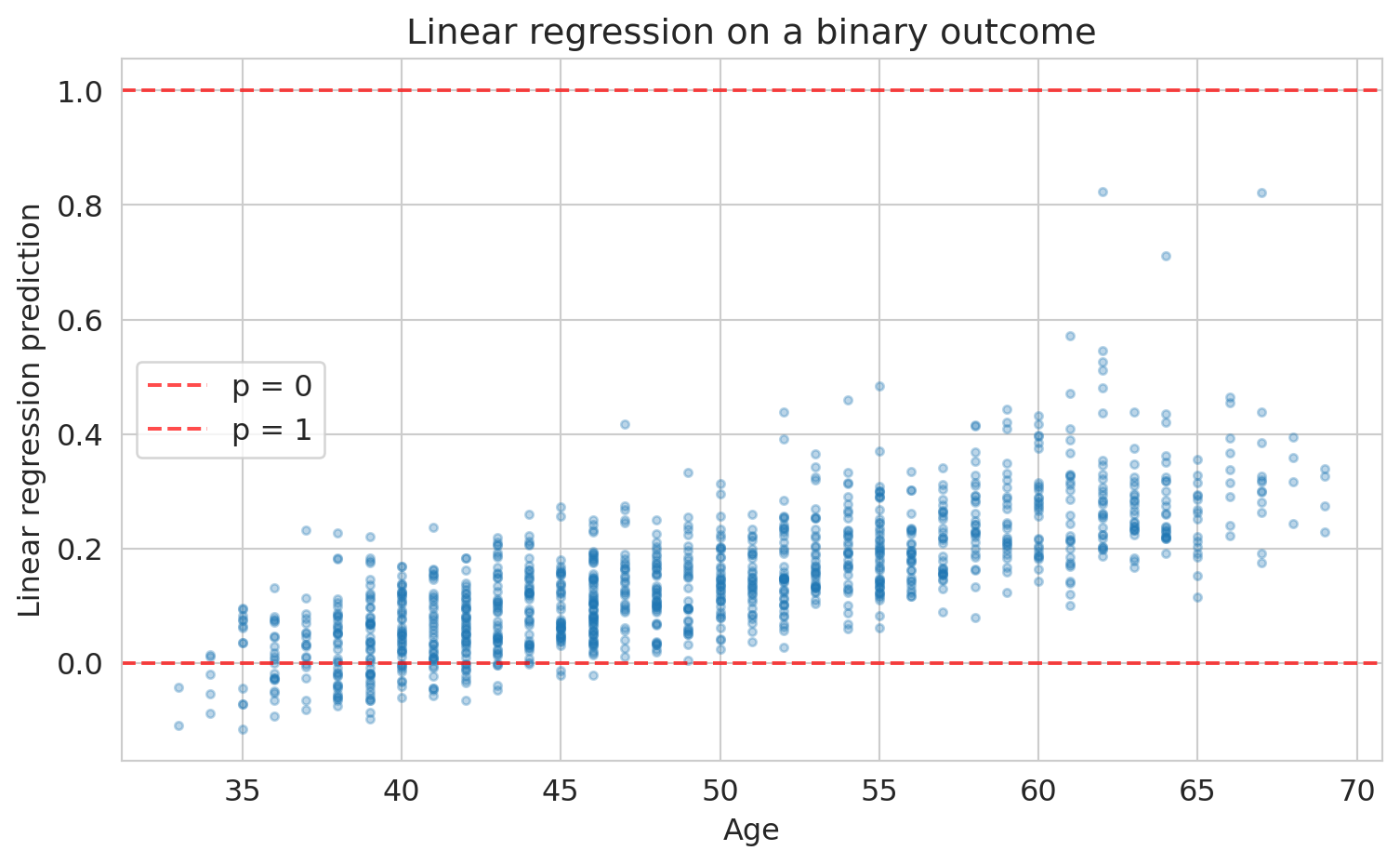
Could we just use linear regression on the 0/1 outcome? Let's try it and see what goes wrong.
```{python}
# What happens if we use linear regression on a binary outcome?
scaler_lin = StandardScaler()
X_train_lin = scaler_lin.fit_transform(X_train)
lin_model = LinearRegression().fit(X_train_lin, y_train)
lin_preds = lin_model.predict(scaler_lin.transform(X_test))

fig, ax = plt.subplots(figsize=(8, 5))
ax.scatter(X_test['age'], lin_preds, alpha=0.3, s=10)
ax.axhline(y=0, color='red', linestyle='--', alpha=0.7, label='p = 0')
ax.axhline(y=1, color='red', linestyle='--', alpha=0.7, label='p = 1')
ax.set_xlabel('Age')
ax.set_ylabel('Linear regression prediction')
ax.set_title('Linear regression on a binary outcome')
ax.legend()
plt.tight_layout()
plt.show()

print(f"Predictions below 0: {(lin_preds < 0).sum()}")
print(f"Predictions above 1: {(lin_preds > 1).sum()}")
```
Some predictions are negative — not a valid probability. The core problem: nothing constrains linear regression to produce values in $[0, 1]$. We need a different approach.
Instead of predicting the probability directly, what if we transformed it into something that *can* range from $-\infty$ to $+\infty$ — and modeled *that* with linear regression?
### From probabilities to odds to log-odds
If you've bet on a sports game, you already know **odds**. If a patient's probability of CHD is $p = 0.20$, their odds are:
$$\text{odds} = \frac{p}{1-p} = \frac{0.20}{0.80} = 0.25 \quad \text{("1 to 4 against")}$$
Odds of 1 means a 50-50 chance. Odds greater than 1 mean the event is more likely than not. Odds range from 0 to $\infty$, which is better than $[0, 1]$ — but still bounded on one side. Take the logarithm:
$$\text{log-odds} = \log\!\left(\frac{p}{1-p}\right)$$
Now we have a quantity that ranges from $-\infty$ to $+\infty$:
| Probability $p$ | Odds | Log-odds |
|:---:|:---:|:---:|
| 0.01 | 0.01 | $-4.6$ |
| 0.20 | 0.25 | $-1.4$ |
| 0.50 | 1.00 | $\phantom{-}0.0$ |
| 0.80 | 4.00 | $+1.4$ |
| 0.99 | 99.0 | $+4.6$ |
The log-odds scale is centered at zero ($p = 0.5$, a coin flip) and stretches symmetrically toward $\pm\infty$. Notice: $p = 0.20$ and $p = 0.80$ produce log-odds of equal magnitude but opposite sign.
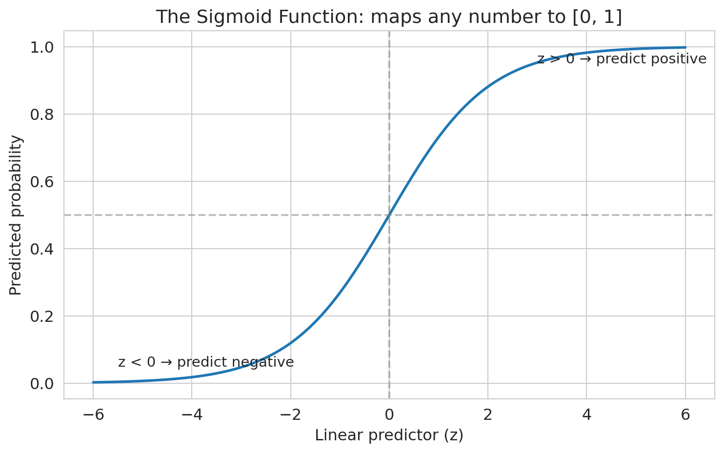
**Log-odds can be any real number — just like a linear regression prediction.** So let's model the log-odds as a linear function of the features:
$$\log\!\left(\frac{p}{1-p}\right) = \beta_0 + \beta_1 x_1 + \cdots + \beta_p x_p$$
This is **logistic regression**. The name reflects the core assumption: the **logit** (log-odds) is a linear function of the features.
To convert back to a probability, solve for $p$:
$$p = \frac{1}{1 + e^{-(\beta_0 + \beta_1 x_1 + \cdots + \beta_p x_p)}}$$
The function $\sigma(z) = 1/(1 + e^{-z})$ — where $z = \beta_0 + \beta_1 x_1 + \cdots + \beta_p x_p$ is called the **linear predictor** — is the **sigmoid function**. It maps any real number to $[0, 1]$ — exactly the constraint we needed.
:::{.callout-warning}
## Logistic regression conditions
Two conditions for logistic regression to be valid: (1) each outcome is independent of the others, and (2) each predictor is linearly related to the log-odds when other predictors are held constant. Because the log-odds are linear in the features, the decision boundary (where $p = 0.5$) is a hyperplane — logistic regression can only produce linear decision boundaries. If the true boundary is curved, add polynomial or interaction features (Chapter 5) to capture it.
:::
```{python}
# Visualize the sigmoid function
z = np.linspace(-6, 6, 200)
sigmoid = 1 / (1 + np.exp(-z))

fig, ax = plt.subplots(figsize=(8, 5))
ax.plot(z, sigmoid, linewidth=2)
ax.axhline(y=0.5, color='gray', linestyle='--', alpha=0.5)
ax.axvline(x=0, color='gray', linestyle='--', alpha=0.5)
ax.set_xlabel('Linear predictor (z)')
ax.set_ylabel('Predicted probability')
ax.set_title('The sigmoid function: maps any number to [0, 1]')
ax.annotate('z > 0 → predict positive', xy=(3, 0.95), fontsize=11)
ax.annotate('z < 0 → predict negative', xy=(-5.5, 0.05), fontsize=11)
plt.tight_layout()
plt.show()
```
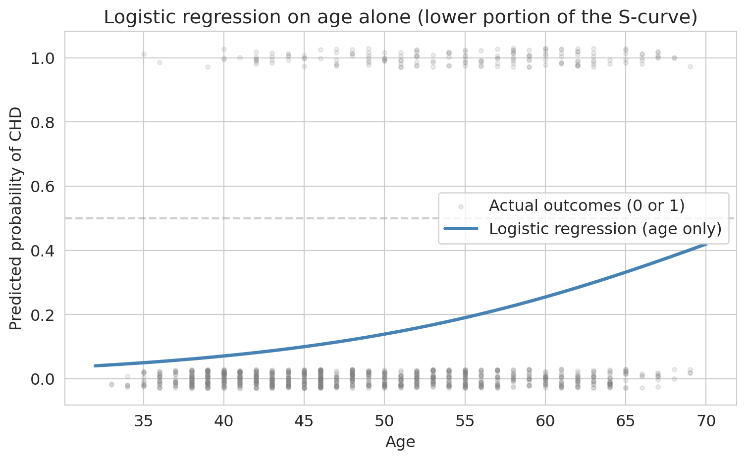
### The S-curve on real data
The sigmoid promises an S-shaped curve. Let's verify: fit logistic regression with just one feature — age — so we can plot the curve in two dimensions.
```{python}
# 1D logistic regression: age only, to see the S-curve
model_age = LogisticRegression(penalty=None, max_iter=1000, random_state=42)
model_age.fit(X_train[['age']], y_train)

# Plot the fitted curve over a grid of ages
age_grid = np.linspace(X['age'].min(), X['age'].max(), 200).reshape(-1, 1)
proba_age = model_age.predict_proba(age_grid)[:, 1]

fig, ax = plt.subplots(figsize=(8, 5))
jitter = np.random.RandomState(42).uniform(-0.03, 0.03, size=len(y_test))
ax.scatter(X_test['age'], y_test + jitter, alpha=0.15, s=10,
           color='gray', label='Actual outcomes (0 or 1)')
ax.plot(age_grid, proba_age, linewidth=2.5, color='steelblue',
        label='Logistic regression (age only)')
ax.axhline(y=0.5, color='gray', linestyle='--', alpha=0.4)
ax.set_xlabel('Age')
ax.set_ylabel('Predicted probability of CHD')
ax.set_title('Logistic regression on age alone (lower portion of the S-curve)')
ax.legend()
plt.tight_layout()
plt.show()
```
With age alone, the S-shape is clear: predicted risk rises from under 5% for the youngest patients to over 30% for the oldest. We're seeing the lower portion of the full sigmoid — the base rate of CHD is low enough that no age group has a majority of positive cases. With a higher base rate or a stronger predictor, the curve would sweep through 50% and show the full S-shape.
When we add more features, each patient's predicted probability depends on all their risk factors, not just age. No single two-dimensional plot captures the full picture anymore.
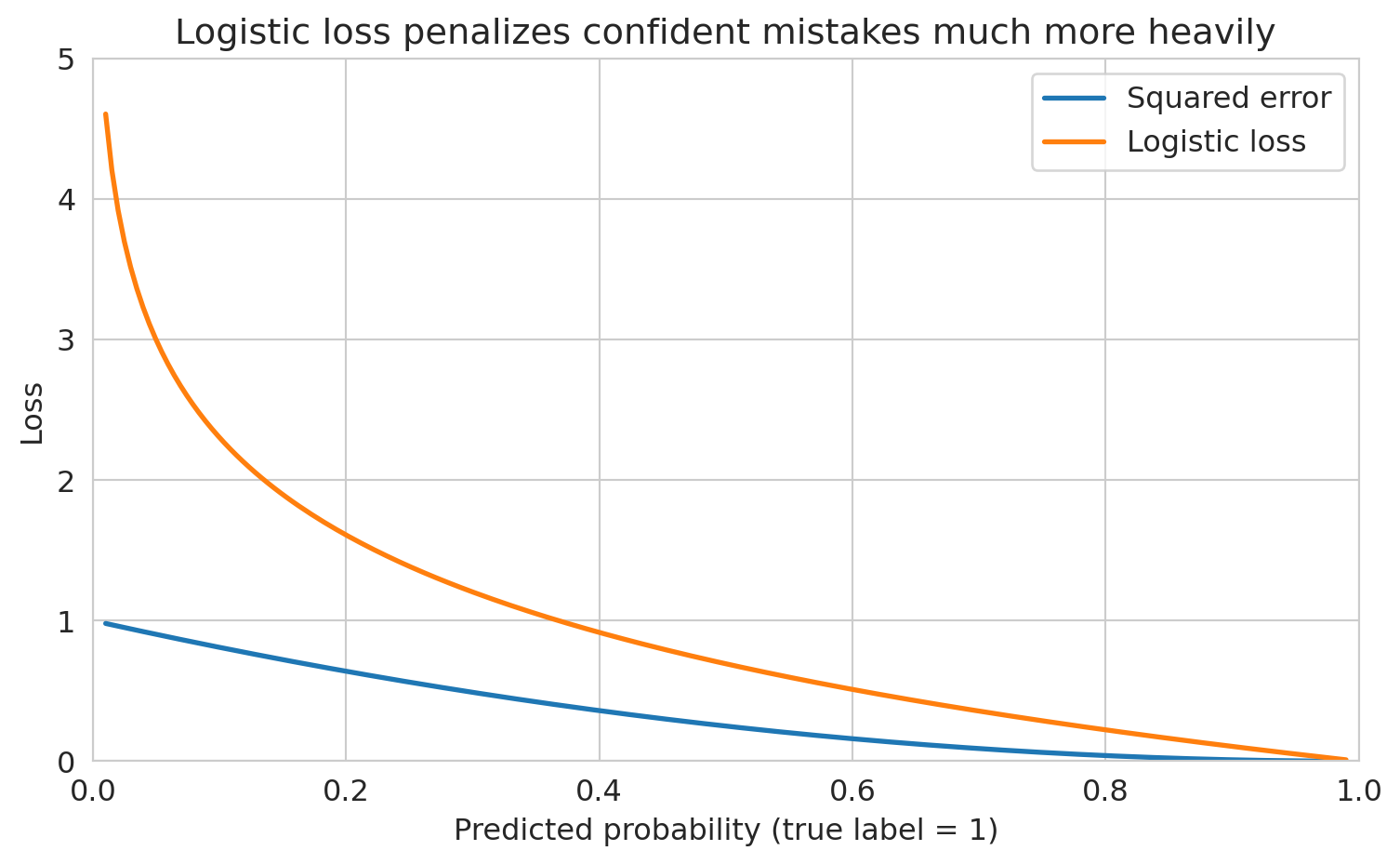
## What does logistic regression optimize?
Why not just use squared error on the 0/1 outcomes? You could, but squared error doesn't penalize confident wrong predictions enough. A prediction of 0.9 for a true 0 has squared error $(0.9)^2 = 0.81$ — but the logistic loss for that same mistake is $-\log(0.1) = 2.3$, much larger. The worse the mistake, the more logistic loss amplifies the penalty.
> *"The loss function determines what the model finds."*
Logistic regression minimizes the **logistic loss** (also called **cross-entropy** or negative log-likelihood). We choose coefficients to maximize the likelihood of the observed outcomes. If a patient had CHD and we predicted probability 0.9, that's good (high likelihood). If we predicted 0.1 for a patient who had CHD, that's bad (low likelihood). Mathematically, the logistic loss for a single observation is:
$$\ell(\beta) = -\left[ y \log(p) + (1-y) \log(1-p) \right]$$
Let's see both losses side by side for a true positive ($y = 1$). As our predicted probability moves away from 1 (a worse and worse prediction), how much does each loss penalize us?
```{python}
# Compare squared error vs logistic loss for a true positive (y = 1)
p_hat = np.linspace(0.01, 0.99, 200)
squared_loss = (1 - p_hat) ** 2
logistic_loss = -np.log(p_hat)

fig, ax = plt.subplots(figsize=(8, 5))
ax.plot(p_hat, squared_loss, linewidth=2, label='Squared error')
ax.plot(p_hat, logistic_loss, linewidth=2, label='Logistic loss')
ax.set_xlabel('Predicted probability (true label = 1)')
ax.set_ylabel('Loss')
ax.set_title('Logistic loss penalizes confident mistakes much more heavily')
ax.legend(fontsize=12)
ax.set_xlim([0, 1])
ax.set_ylim([0, 5])
plt.tight_layout()
plt.show()
```
When the predicted probability is near 1 (a good prediction), both losses are small. But as the prediction drops toward 0 — a confident wrong answer — logistic loss explodes while squared error stays below 1. Logistic loss says: being confidently wrong is *catastrophically* bad.
## Fitting logistic regression: gradient descent
In Chapter 5, we solved linear regression with the normal equations — a closed-form solution. Logistic regression has no such shortcut: the sigmoid makes the loss nonlinear. Instead, we use **gradient descent**, an iterative algorithm that repeatedly steps in the direction that decreases the loss most steeply.
The total loss across all $n$ training observations is $L(\beta) = \frac{1}{n}\sum_{i=1}^n \ell_i(\beta)$. Imagine $L$ as a landscape above the $\beta$ plane, with height = loss. Gradient descent is literal hiking: at each step, compute the gradient $\nabla L(\beta)$ (the vector of partial derivatives, pointing in the *uphill* direction), then step the opposite way.
$$\beta \leftarrow \beta - \eta \cdot \nabla L(\beta)$$
Here $\eta$ is the **learning rate** — how big a step to take. The logistic loss is **convex**: the landscape is shaped like a single bowl with no false valleys. As long as the data isn't pathological (e.g., perfectly separable, which would send the minimum off to infinity), gradient descent converges to the unique global minimum regardless of starting point.
```{python}
# Standardize features (gradient descent is better-behaved when features share a scale)
scaler = StandardScaler()
X_train_scaled = scaler.fit_transform(X_train)
X_test_scaled = scaler.transform(X_test)
```
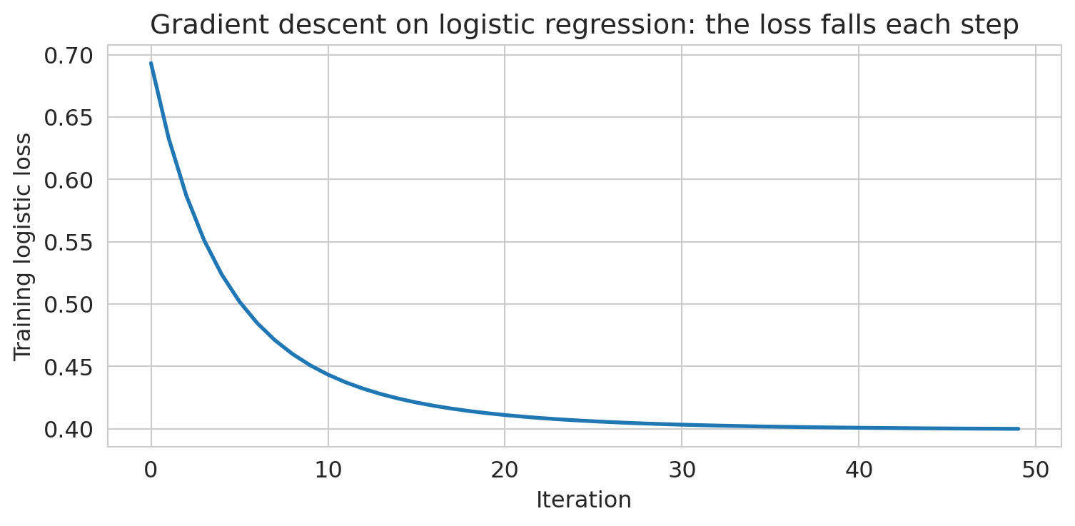
Let's watch gradient descent actually converge. We'll hand-roll it on a small two-feature logistic regression (`age` + `BMI`) so we can see the loss drop step by step.
```{python}
# Hand-rolled gradient descent on a two-feature logistic regression
age_idx, bmi_idx = features.index('age'), features.index('BMI')
X_gd = np.c_[np.ones(len(X_train_scaled)), X_train_scaled[:, [age_idx, bmi_idx]]]
y_gd = y_train.values

beta = np.zeros(X_gd.shape[1])
eta, n_iter = 0.5, 50
losses = []
for _ in range(n_iter):
    p = 1 / (1 + np.exp(-(X_gd @ beta)))
    grad = X_gd.T @ (p - y_gd) / len(y_gd)
    beta -= eta * grad
    losses.append(-np.mean(y_gd * np.log(p + 1e-12) + (1 - y_gd) * np.log(1 - p + 1e-12)))

fig, ax = plt.subplots(figsize=(8, 4))
ax.plot(losses, linewidth=2)
ax.set_xlabel('Iteration')
ax.set_ylabel('Training logistic loss')
ax.set_title('Gradient descent on logistic regression: the loss falls each step')
plt.tight_layout()
plt.show()
```
The loss drops fast in the first few iterations and then settles. Because the problem is convex, "settles" means we've reached the minimum.
Now let's fit the full model using sklearn's `LogisticRegression`, which uses a more sophisticated version of this same idea under the hood.
```{python}
# Fit logistic regression
model = LogisticRegression(penalty=None, max_iter=1000, random_state=42)
model.fit(X_train_scaled, y_train)
print("Logistic regression fitted.")
```
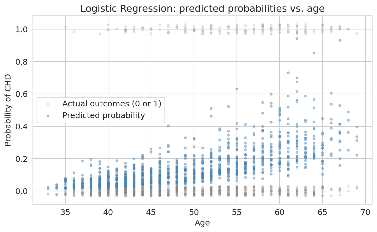
Let's see what the model's predictions look like on the data. Here we plot predicted CHD probability against age, with actual outcomes overlaid.
```{python}
# Visualize the logistic regression fit on data
y_proba_all = model.predict_proba(X_test_scaled)[:, 1]

fig, ax = plt.subplots(figsize=(8, 5))
# Jitter actual outcomes slightly for visibility
jitter = np.random.RandomState(42).uniform(-0.03, 0.03, size=len(y_test))
ax.scatter(X_test['age'], y_test + jitter, alpha=0.15, s=10,
           color='gray', label='Actual outcomes (0 or 1)')
ax.scatter(X_test['age'], y_proba_all, alpha=0.4, s=10,
           color='steelblue', label='Predicted probability')
ax.set_xlabel('Age')
ax.set_ylabel('Probability of CHD')
ax.set_title('Logistic regression: predicted probabilities vs. age')
ax.legend()
plt.tight_layout()
plt.show()
```
Unlike the one-feature fit earlier, the predictions don't trace a clean S-curve against any single feature — each patient's probability depends on all nine predictors simultaneously. The predictions stay between 0 and 1 (the sigmoid guarantees this), but the low base rate means few patients have predicted probabilities above 50%.
### From probabilities to predictions
Logistic regression outputs a probability for each patient. To classify patients as "CHD" or "no CHD," we need a **threshold**: predict positive whenever the predicted probability exceeds the threshold. The default is 0.5, and sklearn's `model.predict()` uses it automatically. We'll see shortly that this default can be a poor choice — but let's start there.
How does the model do? Let's compute test-set accuracy at the default threshold.
```{python}
# Test accuracy at the default threshold (0.5)
test_acc = model.score(X_test_scaled, y_test)
print(f"Test accuracy: {test_acc:.3f}")
```
Sounds great, right?
**But wait.** What's the accuracy of the dumbest possible model — one that just predicts "no CHD" for everyone?
```{python}
# The "always predict negative" baseline
baseline_accuracy = 1 - y_test.mean()
print(f"Baseline accuracy (predict all negative): {baseline_accuracy:.3f}")
print(f"Our model accuracy:                       {test_acc:.3f}")
print(f"Improvement over baseline:                {test_acc - baseline_accuracy:.3f}")
```
Our fancy logistic regression barely beats "predict everyone is fine." That ~85% accuracy is **almost entirely driven by the class imbalance**, not by the model learning anything useful.
:::{.callout-warning}
## The accuracy trap
This phenomenon is the **accuracy trap** (also called the **accuracy paradox**). Accuracy measures how often you're right *overall*, but when one class dominates, being right about that class is easy and uninformative.
:::
## Interpreting coefficients: odds ratios
Before we fix the evaluation problem, let's understand what the model learned. Recall that logistic regression models the log-odds as a linear function of features. Each coefficient $\beta_j$ tells us how much a one-unit increase in $x_j$ shifts the log-odds.
:::{.callout-important}
## Definition: Odds ratio
Exponentiating a coefficient gives the **odds ratio**: $e^{\beta_j}$ is the multiplicative change in odds per one-unit increase in $x_j$, holding other features constant.
:::
Because our features are standardized, each coefficient represents the change in log-odds per one-standard-deviation increase. If you fit without standardizing, the coefficient for age would tell you the odds change per one-year increase instead.
```{python}
# Create coefficient table
coef_df = pd.DataFrame({
    'Feature': features,
    'Coefficient': model.coef_[0],
    'Odds Ratio': np.exp(model.coef_[0])
}).sort_values('Coefficient', ascending=False)
coef_df.round(3)
```
Each odds ratio tells us how the odds of CHD change per one-standard-deviation increase in that feature.
```{python}
# Interpret the coefficients
print("Logistic regression coefficients (standardized features):")
print("=" * 55)
for _, row in coef_df.iterrows():
    print(f"  {row['Feature']:>12s}: odds x {row['Odds Ratio']:.2f} per 1-SD increase")
```
A concrete example: if a patient's predicted CHD probability is 0.20 (odds = 0.25), a one-SD increase in age multiplies those odds by about 1.7x, giving new odds of 0.424 — corresponding to a probability of about 30%.
The model says: age, systolic blood pressure, glucose, and male sex are the strongest risk factors. This ranking matches medical knowledge — but notice that the model treats each feature independently. It doesn't know that high blood pressure and high BMI often go together, or that young smokers face different risks than old smokers (for that, we'd need interaction terms — recall Chapter 5). We'll come back to this.
:::{.callout-tip}
## The divide-by-4 rule
Odds ratios are hard to feel. A quicker way to interpret logistic regression coefficients on the probability scale: **divide the coefficient by 4**. The result is the *maximum* possible change in $\Pr(Y=1)$ per one-unit increase in $x$.
Why does this work? The logistic curve is steepest at $p = 0.5$, where $dp/dx = p(1-p)\cdot\beta = 0.25\cdot\beta = \beta/4$. When $p$ is far from 0.5 the curve is flatter, so $\beta/4$ is an upper bound on the actual change.
**Example.** If the coefficient on "years of education" is 0.6, then each additional year of education increases the probability of the outcome by *at most* $0.6/4 = 0.15$ (15 percentage points). The true change is smaller when the baseline probability is near 0 or 1.
Source: Gelman & Hill, *Data Analysis Using Regression and Multilevel/Hierarchical Models* (2007).
:::
## What does the model predict for individual patients?
Before we evaluate overall performance, let's look at specific patients. This step makes the predicted probabilities concrete.
```{python}
# Pick a few patients to examine
y_proba = model.predict_proba(X_test_scaled)[:, 1]
test_examples = pd.DataFrame(X_test, columns=features).reset_index(drop=True)
test_examples['True CHD'] = y_test.values
test_examples['Predicted Prob'] = y_proba
test_examples['Pred @ 0.5'] = (y_proba >= 0.5).astype(int)

cell_lookup = {(1, 1): 'TP', (0, 0): 'TN', (0, 1): 'FP', (1, 0): 'FN'}
test_examples['Cell'] = [cell_lookup[(t, p)] for t, p in
                         zip(test_examples['True CHD'], test_examples['Pred @ 0.5'])]

# Show a few interesting cases
examples = test_examples.nsmallest(1, 'Predicted Prob')
examples = pd.concat([examples, test_examples.nlargest(2, 'Predicted Prob')])
# Find a borderline case near threshold 0.3
borderline = test_examples.iloc[(test_examples['Predicted Prob'] - 0.3).abs().argsort()[:1]]
examples = pd.concat([examples, borderline])
examples[['age', 'male', 'sysBP', 'cigsPerDay', 'True CHD', 'Predicted Prob', 'Pred @ 0.5', 'Cell']].round(3)
```
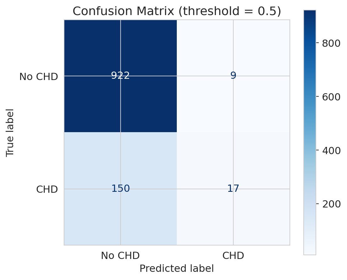
At the default threshold of 0.5, anyone with predicted probability above 0.5 is classified as "CHD." Every patient lands in exactly one cell of a 2×2 grid: **TP** (true positive — said yes, was yes), **TN** (said no, was no), **FP** (said yes, was no), or **FN** (said no, was yes). Aggregating across all test patients gives the **confusion matrix**.
## The confusion matrix: seeing where the model fails
:::{.callout-important}
## Definition: Confusion matrix
The **confusion matrix** is a 2x2 table that cross-tabulates the model's predicted classes against the true classes, showing True Positives, False Positives, True Negatives, and False Negatives.
:::
Accuracy collapses everything into a single number. The confusion matrix shows us the full picture: what did the model get right, and *how* did it get things wrong?
```{python}
# Predictions at default threshold (0.5)
y_pred = model.predict(X_test_scaled)

# Confusion matrix
cm = confusion_matrix(y_test, y_pred)
fig, ax = plt.subplots(figsize=(6, 5))
disp = ConfusionMatrixDisplay(cm, display_labels=['No CHD', 'CHD'])
disp.plot(ax=ax, cmap='Blues', values_format='d')
ax.set_title('Confusion matrix (threshold = 0.5)')
plt.tight_layout()
plt.show()

# Print the numbers
tn, fp, fn, tp = cm.ravel()
print(f"True Negatives  (correctly said 'no CHD'): {tn}")
print(f"False Positives (falsely alarmed):          {fp}")
print(f"True Positives  (correctly caught CHD):     {tp}")
print(f"False Negatives (MISSED actual CHD):        {fn}")
```
Look at the bottom row — actual CHD cases. The model catches very few of them! Most actual CHD patients are predicted as "no CHD." In a medical context, those are people who needed intervention and didn't get it.
This outcome is a **False Negative** — and in medicine, false negatives can be deadly.
:::{.callout-tip}
## Think about it
A follow-up test (the consequence of a false positive) costs roughly \$500. Missing a CHD case and treating it in an emergency (the consequence of a false negative) costs tens of thousands. With those numbers in mind, would you rather the screening tool flag too many patients or too few — and how would that change if the costs were flipped, as they are in spam filtering?
:::
## Precision vs Recall
:::{.callout-important}
## Definition: Precision and Recall
- **Precision** = $\frac{TP}{TP + FP}$ = "Of those I flagged as CHD, how many really had it?"
- **Recall** (Sensitivity) = $\frac{TP}{TP + FN}$ = "Of all actual CHD cases, how many did I catch?"
:::
Precision asks, "I flagged this patient — should I trust my flag?" Recall asks, "Of all sick people, how many did we find?"
Two metrics capture the two types of mistakes, and they tell very different stories.
```{python}
# Precision and recall at default threshold
precision = tp / (tp + fp) if (tp + fp) > 0 else 0
recall = tp / (tp + fn)

print(f"Precision: {precision:.3f}")
print(f"  → Of patients flagged as CHD, {precision*100:.0f}% actually had it")
print()
print(f"Recall:    {recall:.3f}")
print(f"  → Of actual CHD patients, we caught only {recall*100:.0f}%")
print()
print(f"Accuracy:  {(tp+tn)/(tp+tn+fp+fn):.3f}")
print(f"  → This number hides the fact that recall is terrible")
```
Precision is decent — when the model *does* flag someone, it's often right. But recall is abysmal: we're missing the vast majority of actual CHD cases. The low base rate makes the model **too conservative** — it rarely predicts CHD.
Note: if the model never predicts positive, precision is undefined (0/0). We set it to 0 by convention, but the edge case is worth noting — with such a conservative model, it nearly occurs here.
The **F1 score** is the harmonic mean of precision and recall: $F_1 = 2 \cdot \frac{\text{precision} \cdot \text{recall}}{\text{precision} + \text{recall}}$. It balances both concerns in a single number, but it still doesn't capture the *cost* of each type of mistake.
This tension is the fundamental tradeoff: catching more positives (higher recall) means accepting more false alarms (lower precision).
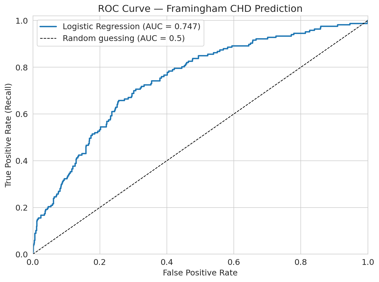
## The ROC curve: evaluating across all thresholds
So far we've been using the default threshold of 0.5: if the predicted probability is above 0.5, predict CHD. But why 0.5?
:::{.callout-important}
## Definition: ROC Curve and AUC
The **ROC curve** shows model performance across *all* possible thresholds. It plots the True Positive Rate (recall) against the False Positive Rate at each threshold.
The **AUC** (area under the ROC curve) summarizes this: a perfect model has AUC = 1.0, and random guessing gives AUC = 0.5.
:::
```{python}
# Get predicted probabilities
y_proba = model.predict_proba(X_test_scaled)[:, 1]

# ROC curve
fpr, tpr, thresholds_roc = roc_curve(y_test, y_proba)
roc_auc = auc(fpr, tpr)

fig, ax = plt.subplots(figsize=(8, 6))
ax.plot(fpr, tpr, linewidth=2, label=f'Logistic Regression (AUC = {roc_auc:.3f})')
ax.plot([0, 1], [0, 1], 'k--', linewidth=1, label='Random guessing (AUC = 0.5)')
ax.set_xlabel('False positive rate')
ax.set_ylabel('True positive rate (recall)')
ax.set_title('ROC Curve — Framingham CHD Prediction')
ax.legend(fontsize=12)
ax.set_xlim([0, 1])
ax.set_ylim([0, 1.02])
plt.tight_layout()
plt.show()
```
The AUC here is about 0.75. Interpretation: if you pick one CHD patient and one non-CHD patient at random, the model ranks the CHD patient higher 75% of the time. This quantity is the **concordance probability** — it measures the model's ability to *rank* patients by risk, not how well it classifies at any threshold.
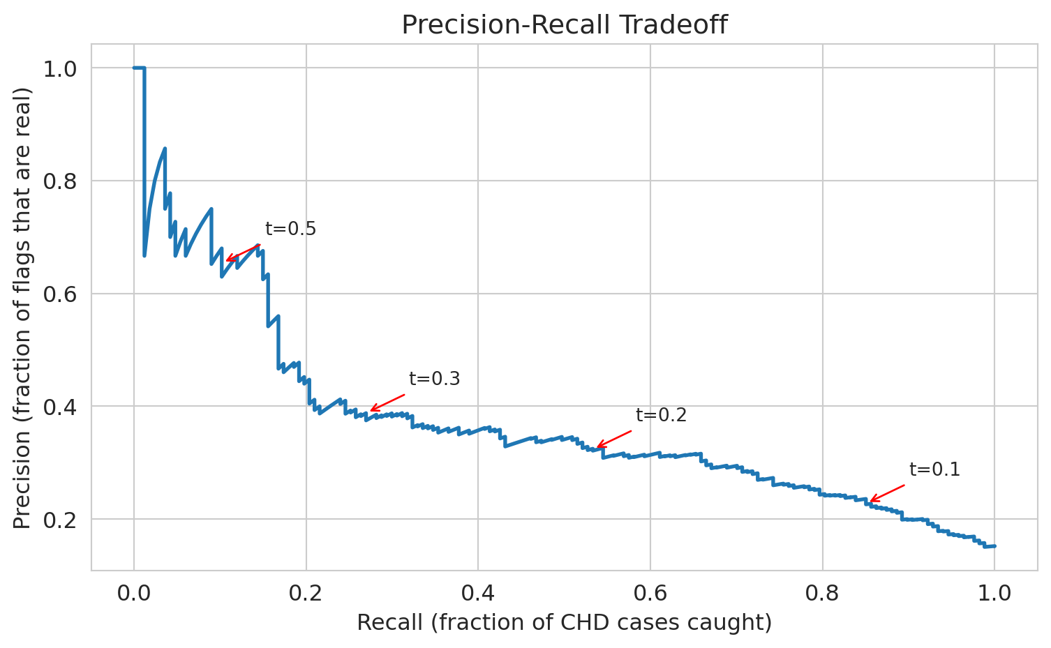
## Threshold choice: the precision-recall tradeoff
The default threshold of 0.5 gives us terrible recall. What if we lower it?
If we set the threshold to 0.3 — flag anyone with >30% predicted CHD risk — we'll catch more true cases but also flag more false positives. Let's see the tradeoff.
```{python}
# Compare thresholds
thresholds_to_try = [0.5, 0.3, 0.1, 0.05, 0.02, 0.01]

print(f"{'Threshold':>10s} {'Precision':>10s} {'Recall':>10s} {'Accuracy':>10s} {'Flagged':>10s}")
print("=" * 55)

# For each threshold, classify patients and compute metrics
for t in thresholds_to_try:
    y_pred_t = (y_proba >= t).astype(int)
    cm_t = confusion_matrix(y_test, y_pred_t)
    tn_t, fp_t, fn_t, tp_t = cm_t.ravel()
    prec_t = tp_t / (tp_t + fp_t) if (tp_t + fp_t) > 0 else 0
    rec_t = tp_t / (tp_t + fn_t)
    acc_t = (tp_t + tn_t) / (tp_t + tn_t + fp_t + fn_t)
    flagged = tp_t + fp_t
    print(f"{t:>10.2f} {prec_t:>10.3f} {rec_t:>10.3f} {acc_t:>10.3f} {flagged:>10d}")
```
See the tradeoff? As we lower the threshold:
- **Recall goes up** — we catch more CHD cases
- **Precision goes down** — more false alarms
- **Accuracy goes down** — more negative cases are now misclassified
There's no free lunch. The right threshold depends on the **cost of each mistake** — a consequential decision, not a statistical one.
If a follow-up test costs \$500 and a missed CHD case costs \$50,000 in emergency care, what threshold minimizes expected cost? In medicine, missing a heart disease case is far worse than ordering an extra test, so we'd choose a low threshold. In spam filtering, false positives (real email in spam) are worse, so we'd choose a high threshold.
### Break-even precision: when is a flag worth it?
We can make this quantitative. Suppose a missed case costs $C_{FN}$ and a false alarm costs $C_{FP}$. Consider one patient whose predicted disease probability is $p$. The expected cost of flagging is $(1-p) \cdot C_{FP}$ — we pay the false-alarm cost only if the patient is actually healthy. The expected cost of *not* flagging is $p \cdot C_{FN}$ — we pay the missed-case cost only if the patient is actually sick. Flag whenever the first is smaller:
$$p > \frac{C_{FP}}{C_{FP} + C_{FN}} = \frac{1}{k+1}, \qquad k = \frac{C_{FN}}{C_{FP}}.$$
Call this the **break-even precision** $p^*$. With our CHD numbers ($C_{FN}=\$50{,}000$, $C_{FP}=\$500$), $k=100$ and $p^* \approx 1\%$. With spam, $C_{FP}$ (a real email in the junk folder) dwarfs $C_{FN}$ (one extra spam in the inbox), so $k \ll 1$ and $p^*$ is close to $1$ — flag only when you're nearly certain.
Now connect $p^*$ to the PR curve. By definition, **precision at an operating point is exactly $P(\text{disease} \mid \text{flagged})$** — the average disease-probability among flagged patients. Because the model flags the most-confident cases first, lowering the threshold one notch adds patients whose disease probability is *lower* than the current precision. So once an operating point's precision approaches $p^*$, the next batch of flags is net-negative in expectation.
**Rule:** push the threshold down until precision approaches $p^*$, and stop.
Look back at the threshold sweep above. With $k=100$ and $p^* \approx 1\%$, every row in the table sits well above break-even — the rule says we should push the threshold even *lower* than 0.01. In a real deployment we'd keep going until the marginal predicted-probability hits $p^*$.
:::{.callout-note collapse="true"}
## Going deeper: marginal vs. average
The rule above uses the *average* precision at an operating point as a stand-in for the *marginal* precision of the next flag. Because precision can only decrease as you flag more, the marginal precision sits below the average — so "stop near $p^*$" is slightly conservative relative to the true optimum (which is "stop where the *marginal* precision equals $p^*$"). The cost ratio $k$ is itself an estimate, so a conservative margin is welcome. For an exact optimum, work directly with confusion-matrix counts at each candidate threshold and minimize $C_{FP} \cdot \text{FP} + C_{FN} \cdot \text{FN}$.
:::
:::{.callout-tip}
## Think about it
If you're the hospital administrator and you have budget for follow-up appointments with 200 patients per month, which threshold would you choose? The break-even rule says "push to $p^* \approx 1\%$" — but capacity is finite. How do you reconcile a clinical break-even with a hard staffing constraint?
:::
```{python}
# Precision-Recall curve
precision_curve, recall_curve, thresholds_pr = precision_recall_curve(y_test, y_proba)

fig, ax = plt.subplots(figsize=(8, 5))
ax.plot(recall_curve, precision_curve, linewidth=2)
ax.set_xlabel('Recall (fraction of CHD cases caught)')
ax.set_ylabel('Precision (fraction of flags that are real)')
ax.set_title('Precision-recall tradeoff')

# Annotate a few thresholds
for t in [0.1, 0.2, 0.3, 0.5]:
    # Find the index of the threshold closest to t
    idx = np.argmin(np.abs(thresholds_pr - t))
    ax.annotate(f't={t}', xy=(recall_curve[idx], precision_curve[idx]),
                fontsize=10, ha='center',
                arrowprops=dict(arrowstyle='->', color='red'),
                xytext=(recall_curve[idx]+0.08, precision_curve[idx]+0.05))

plt.tight_layout()
plt.show()
```
## Base rate neglect: why "99% accuracy" can be meaningless
Precision depends on the base rate. A test with high **sensitivity** (catches most true cases) and high **specificity** (correctly clears most non-cases) can still have low precision when the condition is rare. This is one of the most common ways people are misled by machine learning claims.
:::{.callout-tip}
## Think about it
A vendor pitches a cancer screening test with "99% accuracy" — it catches 99% of cancer cases *and* correctly clears 99% of healthy patients (sensitivity = specificity = 99%). Cancer prevalence in the screened population is 0.5%. A patient tests positive. What is the probability they actually have cancer?
:::
Work it out with a concrete population of 10,000 patients.
```{python}
# Base rate neglect: "99% accuracy" (i.e., sensitivity = specificity = 99%) with a rare condition
n = 10_000
prevalence = 0.005       # 0.5% have cancer
sens_spec = 0.99         # sensitivity and specificity both 99%

n_cancer = n * prevalence              # 50 have cancer
n_healthy = n * (1 - prevalence)       # 9,950 don't

true_positives = n_cancer * sens_spec         # 49.5 correctly detected
false_positives = n_healthy * (1 - sens_spec) # 99.5 false alarms
total_positive = true_positives + false_positives

ppv = true_positives / total_positive  # precision = P(cancer | positive test)

print(f"Population:       {n:,}")
print(f"Cancer cases:     {n_cancer:.0f} ({prevalence*100:.1f}%)")
print(f"True positives:   {true_positives:.1f}")
print(f"False positives:  {false_positives:.1f}")
print(f"Total positive:   {total_positive:.1f}")
print(f"")
print(f"P(cancer | positive test) = {true_positives:.1f} / {total_positive:.1f} = {ppv:.1%}")
print(f"")
print(f"Two-thirds of positive results are wrong.")
```
A "99% accurate" test delivers two-thirds wrong positives. The false positives swamp the true positives because the condition is so rare.
This is why mass screening programs are controversial — and why a vendor claiming "99% accuracy" should immediately prompt the question: *what is the base rate?* Without knowing how common the condition is, accuracy tells you almost nothing about the chance that a positive result is real.
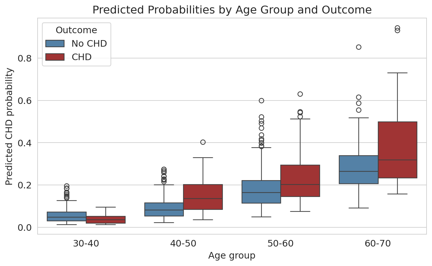
## Who does the model fail for?
The overall AUC is ~0.75. Not amazing, but not terrible. But *overall* performance can hide dramatic failures in subgroups.
:::{.callout-tip}
## Think about it
Before we look at the numbers — for which age group do you think the model performs worst? Why?
:::
Let's check: does the model work equally well for all ages?
```{python}
# Create age groups in the test set
test_df = pd.DataFrame(X_test, columns=features)
test_df['y_true'] = y_test.values
test_df['y_proba'] = y_proba

# Decade-based age groups for interpretability
test_df['age_group'] = pd.cut(test_df['age'], bins=[30, 40, 50, 60, 70],
                                labels=['30-40', '40-50', '50-60', '60-70'])

# AUC by age group
print(f"{'Age Group':>10s} {'N':>6s} {'CHD Rate':>10s} {'AUC':>8s}")
print("=" * 40)

for group in ['30-40', '40-50', '50-60', '60-70']:
    mask = test_df['age_group'] == group
    sub = test_df[mask]
    n = len(sub)
    chd_rate = sub['y_true'].mean()
    if sub['y_true'].nunique() < 2:
        auc_val = float('nan')
    else:
        fpr_g, tpr_g, _ = roc_curve(sub['y_true'], sub['y_proba'])
        auc_val = auc(fpr_g, tpr_g)
    print(f"{group:>10s} {n:>6d} {chd_rate:>10.3f} {auc_val:>8.3f}")
```
For patients under 40, the AUC is about 0.36 — *below* 0.5, which would be random guessing. In this subgroup, the model ranks a CHD patient higher than a non-CHD patient only 36% of the time; *inverting* its predictions would actually do better. The positive class is tiny here (~6 CHD cases in 191 patients), so the estimate is noisy — the true AUC could be anywhere near 0.5. But the point stands: the overall AUC of 0.75 hides a subgroup where the model has essentially no useful signal. It learned "older people get heart disease" and has almost no ability to identify risk in younger patients.
This failure is critical for a screening tool. Young patients who *do* develop CHD are exactly the cases where early intervention matters most — and the model is blind to them.
```{python}
# Box plot: predicted probabilities by age group and actual outcome
test_df['Outcome'] = test_df['y_true'].map({0: 'No CHD', 1: 'CHD'})

fig, ax = plt.subplots(figsize=(8, 5))
sns.boxplot(data=test_df.dropna(subset=['age_group']),
            x='age_group', y='y_proba', hue='Outcome',
            palette={'No CHD': 'steelblue', 'CHD': 'firebrick'}, ax=ax)
ax.set_xlabel('Age group')
ax.set_ylabel('Predicted CHD probability')
ax.set_title('Predicted probabilities by age group and outcome')
plt.tight_layout()
plt.show()
```
For older patients, the model separates CHD from non-CHD reasonably well (the distributions don't overlap as much). For younger patients, the predicted probabilities are all bunched near zero — the model thinks *nobody* young is at risk.
**Why this matters:** A naive analysis would report the overall AUC of 0.75, declare the model "moderately good," and move on — without checking subgroup performance. But in practice, a model that fails for young patients is dangerous — it creates a false sense of security for exactly the people who most need screening.
What could we do about it? Options include training separate models for different age groups, adding interaction terms (recall Chapter 5), or collecting more data on young CHD patients. There's no easy fix — but the first step is always checking.
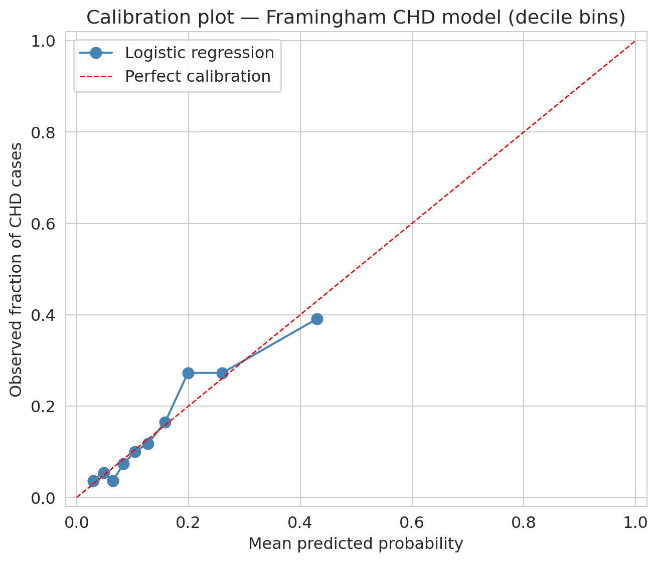
## Calibration: do predicted probabilities mean what they say?
Logistic regression outputs a probability for each patient. But do those probabilities mean what they claim? If the model says "30% risk" for a group of patients, does roughly 30% of that group actually develop CHD?
:::{.callout-important}
## Definition: Calibration
A model is **well-calibrated** if its predicted probabilities match observed frequencies. Among all observations that received a predicted probability near $p$, the fraction of positive outcomes should be approximately $p$.
:::
A **calibration plot** checks this visually: bin predictions by predicted probability, compute the observed fraction of positives in each bin, and plot observed vs. predicted. A perfectly calibrated model lies on the diagonal.
:::{.callout-tip}
## Think about it
Before you look at the plot — if you sorted patients into ten groups by predicted risk (lowest 10%, next 10%, ..., highest 10%), would you expect the observed CHD rate in each group to match the average predicted risk for that group? Why or why not, given everything you've already seen about this model?
:::
```{python}
# Bin test-set predictions into deciles (equal counts per bin) and compare observed vs. predicted
prob_true, prob_pred = calibration_curve(y_test, y_proba, n_bins=10, strategy='quantile')

fig, ax = plt.subplots(figsize=(7, 6))
ax.plot(prob_pred, prob_true, 'o-', color='steelblue', markersize=8, label='Logistic regression')
ax.plot([0, 1], [0, 1], 'r--', linewidth=1, label='Perfect calibration')
ax.set_xlabel('Mean predicted probability')
ax.set_ylabel('Observed fraction of CHD cases')
ax.set_title('Calibration plot — Framingham CHD model (decile bins)')
ax.legend()
ax.set_xlim(-0.02, 1.02)
ax.set_ylim(-0.02, 1.02)
plt.tight_layout()
plt.show()
```
Points near the diagonal mean the model's probabilities are trustworthy at face value. Points above the line mean the model **underestimates** risk; points below, it **overestimates** risk. With decile bins — each containing ~10% of the test set — the plot is dominated by low predicted probabilities, where most patients sit. Across that range, the curve tracks the diagonal reasonably well; the model's "10% risk" label really does correspond to roughly a 10% observed rate.
### Calibration and decisions
Calibration directly affects decision-making. Suppose a doctor uses a 30% predicted-risk threshold to recommend preventive treatment. If the model systematically overestimates risk — predicting 30% when the true rate is 15% — patients receive unnecessary interventions. If it underestimates, patients who need treatment are missed.
Calibration and AUC measure different things. A model can have high AUC yet be poorly calibrated: it ranks patients correctly (high risk above low risk) while getting the absolute risk levels wrong. Whether that gap is a problem depends on how you use the probabilities.
:::{.callout-tip}
## Think about it
A model with good AUC but poor calibration ranks observations correctly but gets the absolute probabilities wrong. When is ranking enough? When do you need well-calibrated probabilities?
:::
## Closing the loop: back to hospital readmissions
We opened with a hospital predicting 30-day readmissions, where 15% of patients are readmitted and "predict no one" scores 85% accuracy. The setup is the same as Framingham. Every tool from this chapter now applies to that problem: the confusion matrix exposes which patients the model misses; precision and recall frame the clinical tradeoff; the ROC curve shows performance across thresholds; the threshold itself is a cost-benefit call about intervention dollars and patient outcomes; subgroup analysis checks whether the model works across demographics; calibration asks whether the model's "25% readmission risk" label really means one in four. **Where on the precision-recall curve should the hospital operate?** There's no purely statistical answer — it depends on intervention costs, staff availability, and patient outcomes. That pattern — statistics narrows the choices, context picks one — is what every classification deployment looks like.
## Key takeaways
- **Logistic regression** predicts probabilities using the sigmoid function. The **logit** (log-odds) is a linear function of the features, and coefficients tell you the multiplicative change in odds.
- **The loss function determines what the model finds.** Linear regression minimizes squared error. Logistic regression minimizes logistic loss (cross-entropy). The choice of loss function is a modeling decision.
- **Gradient descent** finds the coefficients by iteratively walking downhill on the loss landscape. For logistic regression (convex), it converges to the unique global minimum (assuming the data isn't perfectly separable). For neural networks (non-convex), it can get stuck in a local minimum.
- **Accuracy is misleading** with imbalanced classes. A model that predicts "everyone is fine" gets 85% accuracy but catches zero actual cases.
- **The confusion matrix** reveals what accuracy hides: look at True Positives, False Positives, True Negatives, and False Negatives separately.
- **Precision vs Recall** captures the fundamental tradeoff: catching more positives (recall) means more false alarms (lower precision). The right balance depends on the cost of each type of mistake — a consequential decision.
- **Always check subgroup performance.** An overall AUC of 0.75 can hide the fact that the model is *useless* for certain patient groups. Models that work "on average" can fail exactly where it matters most.
- **Calibration** asks whether predicted probabilities match observed frequencies. A model can rank well (high AUC) yet miscalibrate — predicting 30% when the true rate is 15%. Calibration is load-bearing whenever the probabilities themselves drive decisions, not just their ordering.
## Metrics cheat sheet
| Metric | Formula | What it measures |
|--------|---------|-----------------|
| **Accuracy** | (TP + TN) / N | Overall correctness (misleading with imbalance) |
| **Precision** | TP / (TP + FP) | Of those flagged, how many are real? |
| **Recall** | TP / (TP + FN) | Of real cases, how many caught? |
| **F1 score** | 2 * Prec * Rec / (Prec + Rec) | Harmonic mean of precision and recall |
| **AUC** | Area under ROC curve | Overall ranking ability (threshold-free) |
## Study guide
### Key ideas
1. Logistic regression models the probability of a binary outcome by passing a linear combination through the sigmoid function.
2. OLS has a closed-form solution; logistic regression does not. The sigmoid makes the loss nonlinear, requiring gradient descent.
3. The logistic loss is the negative log-likelihood under a Bernoulli model — the Bernoulli distribution models a single binary outcome with probability $p$, and logistic regression estimates that $p$ as a function of features. This loss penalizes confident wrong predictions heavily.
4. Gradient descent finds the coefficients by iteratively stepping in the direction that reduces the loss; convexity guarantees convergence to the global minimum.
5. Accuracy is misleading with class imbalance — always look at precision, recall, and the confusion matrix.
6. Threshold choice is a cost-benefit decision, not a statistical one.
7. Subgroup analysis can reveal dramatic failures hidden by aggregate performance.
8. Calibration checks whether predicted probabilities match observed frequencies; a calibration plot (observed vs. predicted per bin) should lie on the diagonal.
### Definitions
- **Sigmoid function**: maps any real number to $[0, 1]$, converting linear predictions to probabilities
- **Logit (log-odds)**: $\log(p/(1-p))$, the inverse of the sigmoid; linear in the features
- **Odds ratio**: $e^{\beta_j}$, the multiplicative change in odds per unit increase in $x_j$
- **Logistic loss (cross-entropy)**: the loss function logistic regression minimizes; heavily penalizes confident wrong predictions
- **Gradient descent**: iterative optimization algorithm that follows the negative gradient downhill
- **Learning rate**: step size in gradient descent; too large causes overshoot, too small causes slow convergence
- **Convex**: a loss landscape with a single valley; gradient descent finds the global minimum
- **Confusion matrix**: 2x2 table of TP, FP, TN, FN
- **Precision**: fraction of positive predictions that are correct
- **Recall (sensitivity)**: fraction of actual positives that are caught
- **F1 score**: harmonic mean of precision and recall
- **ROC curve**: True Positive Rate vs. False Positive Rate across all thresholds
- **AUC**: area under the ROC curve; 1.0 = perfect, 0.5 = random guessing
- **Calibration**: predicted probabilities match observed frequencies (the calibration plot lies on the diagonal)
### Computational tools
- `LogisticRegression()` — fit a logistic regression model
- `model.predict_proba()` — get predicted probabilities (not just 0/1 predictions)
- `confusion_matrix()` — compute the 2x2 confusion matrix
- `ConfusionMatrixDisplay()` — plot the confusion matrix
- `roc_curve()`, `auc()` — compute the ROC curve and its area
- `precision_recall_curve()` — compute the precision-recall curve
- `calibration_curve(y_true, y_prob, n_bins=10, strategy='quantile')` — observed frequency vs. mean predicted probability per bin
### For the quiz
Be able to (1) interpret logistic regression coefficients as odds ratios, (2) compute precision and recall from a confusion matrix, (3) explain why accuracy is misleading with class imbalance, (4) describe the gradient descent update rule and what convexity guarantees, (5) choose a threshold given the costs of false positives and false negatives, (6) interpret a calibration plot and explain when ranking is enough vs. when well-calibrated probabilities are needed.
## Coming up next
Chapter 7 closes Act 1: we now have a toolkit of regression and classification models. [Chapter 8](lec08-sampling.qmd) opens **Act 2** with the **bootstrap** — a surprisingly powerful way to quantify uncertainty in any estimate, including the accuracy, AUC, and odds ratios we just computed. [Chapter 12](lec12-regression-inference.qmd) returns to logistic regression for formal inference on coefficients (confidence intervals and p-values on the odds ratios). In Act 3, [Chapter 13](lec13-trees.qmd) extends classification to decision trees and random forests, and [Chapter 17](lec17-working-with-ai.qmd) shows how gradient descent powers **gradient boosting** — today's state-of-the-art tabular predictor, built on this chapter's machinery.