---
title: "Exploratory Data Analysis & Visualization"
execute:
enabled: true
jupyter: python3
---
## How should you price an Airbnb listing?
You've just rented an apartment in New York City, and you want to list a spare room on Airbnb. How much should you charge per night? Too high and the listing sits empty; too low and you leave money on the table. You could ask an AI assistant — but how would you know if its answer makes sense?
Before you model, predict, or optimize, you need to *see* your data. **Exploratory Data Analysis (EDA)** is the practice of examining a dataset's structure, distributions, and quirks before fitting any model. EDA is the most important step in any analysis.
:::{.callout-important}
## Definition: Exploratory data analysis (EDA)
**Exploratory Data Analysis (EDA)** is the practice of examining a dataset's structure, distributions, and quirks before fitting any model. The goal is to build understanding: what variables do you have, what do they look like, and what relationships exist between them?
:::
In Chapter 1, we introduced four modes of reasoning with data: summary, prediction, inference, and causation. This chapter focuses on the first: **summary**. We'll explore 29,000+ Airbnb listings in New York City, learning to visualize distributions, compare groups, and spot patterns that summary statistics alone would miss.
We'll also return to the hospital readmissions data to see how a naive analysis can get the answer dangerously wrong.
```{python}
import numpy as np
import pandas as pd
import matplotlib.pyplot as plt
import seaborn as sns
import warnings
warnings.filterwarnings('ignore')
sns.set_style('whitegrid')
plt.rcParams['figure.figsize'] = (8, 5)
plt.rcParams['font.size'] = 12

# Load data
DATA_DIR = 'data'
```
## Part 1: First look at the data
The EDA checklist:
- **Shape** — how many rows and columns?
- **Types** — what are the column types? Any surprises?
- **Distributions** — what does each variable look like?
- **Missing data** — how much, and where?
- **Relationships** — how do variables relate to each other?
We'll work through each step on the NYC Airbnb dataset from Inside Airbnb.
```{python}
# Load Airbnb data
# low_memory=False prevents mixed-type warnings for large files
airbnb = pd.read_csv(f'{DATA_DIR}/airbnb/listings.csv', low_memory=False)
print(f"Shape: {airbnb.shape}")

# Select key columns for exploration
cols = ['name', 'neighbourhood_group_cleansed', 'neighbourhood_cleansed',
        'room_type', 'price', 'bedrooms', 'beds', 'security_deposit',
        'number_of_reviews', 'review_scores_rating', 'accommodates']
airbnb = airbnb[cols].copy()
airbnb.head()
```
### Shape, types, and first impressions
The `.info()` method shows each column's type and how many non-null values it has — a fast way to spot problems.
```{python}
airbnb.info()
```
Scan the `Dtype` column. Most columns are what you'd expect: `int64` for counts, `float64` for ratings, `object` for text. But check the non-null counts: several columns have fewer values than the 29,000+ rows. Those gaps are **missing values** — encoded as `NaN` (Not a Number) in pandas.
The `Dtype` column reports how pandas *stores* each column — but storage type and semantic type are different things. Before going further, let's name the six data types you'll encounter throughout this course.
:::{.callout-important}
## Definition: Data types
- **Continuous**: values on a number line (price, rating score, temperature). Pandas dtype: `float64`.
- **Discrete**: countable values (number of bedrooms, number of reviews). Pandas dtype: `int64`.
- **Nominal / categorical**: unordered categories (neighbourhood, room type, borough). Pandas dtype: `pd.Categorical` with `ordered=False`.
- **Ordinal**: ordered categories with a meaningful rank but no fixed spacing (rarely/sometimes/often, star ratings, education level). Pandas dtype: `pd.Categorical` with `ordered=True`.
- **Text**: free-form strings (listing name, review text, doctor's notes). Pandas dtype: `object` or `str`.
- **Identifier**: codes that look numeric but aren't (ZIP code, hospital ID, phone number). Should be stored as `str`, but pandas often misreads them as `int64`.
:::
Notice that pandas maps these six semantic types to a smaller set of storage types. By default, pandas loads both nominal and text columns as `object` — it can't tell `neighbourhood_cleansed` from `name`. Converting nominal and ordinal columns to `pd.Categorical` (with `ordered=False` or `ordered=True`) makes the semantic type explicit and enables pandas to enforce it. An identifier stored as `int64` looks numeric, but arithmetic on it is meaningless (what is ZIP code 10003 + 1?). Keeping the distinction between semantic type and storage type in mind will save you from subtle errors — Chapter 3 explores what goes wrong when the two don't match.
The `.describe()` method summarizes numeric columns: count, mean, standard deviation, min, quartiles, and max.
```{python}
airbnb.describe()
```
Already some surprises. The minimum price is $0 — are those real listings? The max accommodates 16 guests. And `bedrooms` has fewer entries than other columns, suggesting missing values.
## Part 2: Distributions — what does "typical" look like?
### The price distribution: beware the right tail
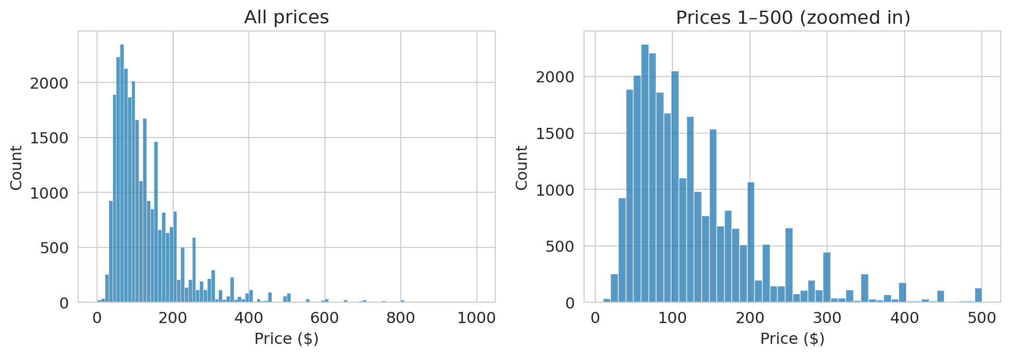
Let's look at the distribution of nightly prices.
```{python}
fig, axes = plt.subplots(1, 2, figsize=(11, 4))

# Raw distribution
sns.histplot(airbnb['price'], bins=100, ax=axes[0], edgecolor='white')
axes[0].set_xlabel('Price ($)')
axes[0].set_ylabel('Count')
axes[0].set_title('All prices')

# Zoomed in
sns.histplot(airbnb[airbnb['price'].between(1, 500)]['price'], bins=50, ax=axes[1], edgecolor='white')
axes[1].set_xlabel('Price ($)')
axes[1].set_ylabel('Count')
axes[1].set_title('Prices $1–$500 (zoomed in)')

plt.tight_layout()
plt.show()
```
The left plot wastes space — the distribution is so skewed that most data piles up on the left. A long tail of expensive listings dominates the scale.
The zoomed-in version on the right is more informative. Most listings fall between \$50 and \$200/night, with a peak around \$100.
:::{.callout-tip}
## Think about it
Before looking at the numbers below: how large do you think the gap between mean and median price is? $5? $20? $100? What does the size of that gap tell you about the distribution?
:::
```{python}
print(f"Mean price:   ${airbnb['price'].mean():.0f}/night")
print(f"Median price: ${airbnb['price'].median():.0f}/night")
print(f"Listings at $0: {(airbnb['price'] == 0).sum()}")
print(f"Max price: ${airbnb['price'].max():,.0f}")
print(f"Listings over $500: {(airbnb['price'] > 500).sum()}")
```
The mean is noticeably higher than the median. A few hundred expensive listings pull the average up. If you're an Airbnb host pricing a typical apartment, the mean is misleading — the median better represents a typical listing.
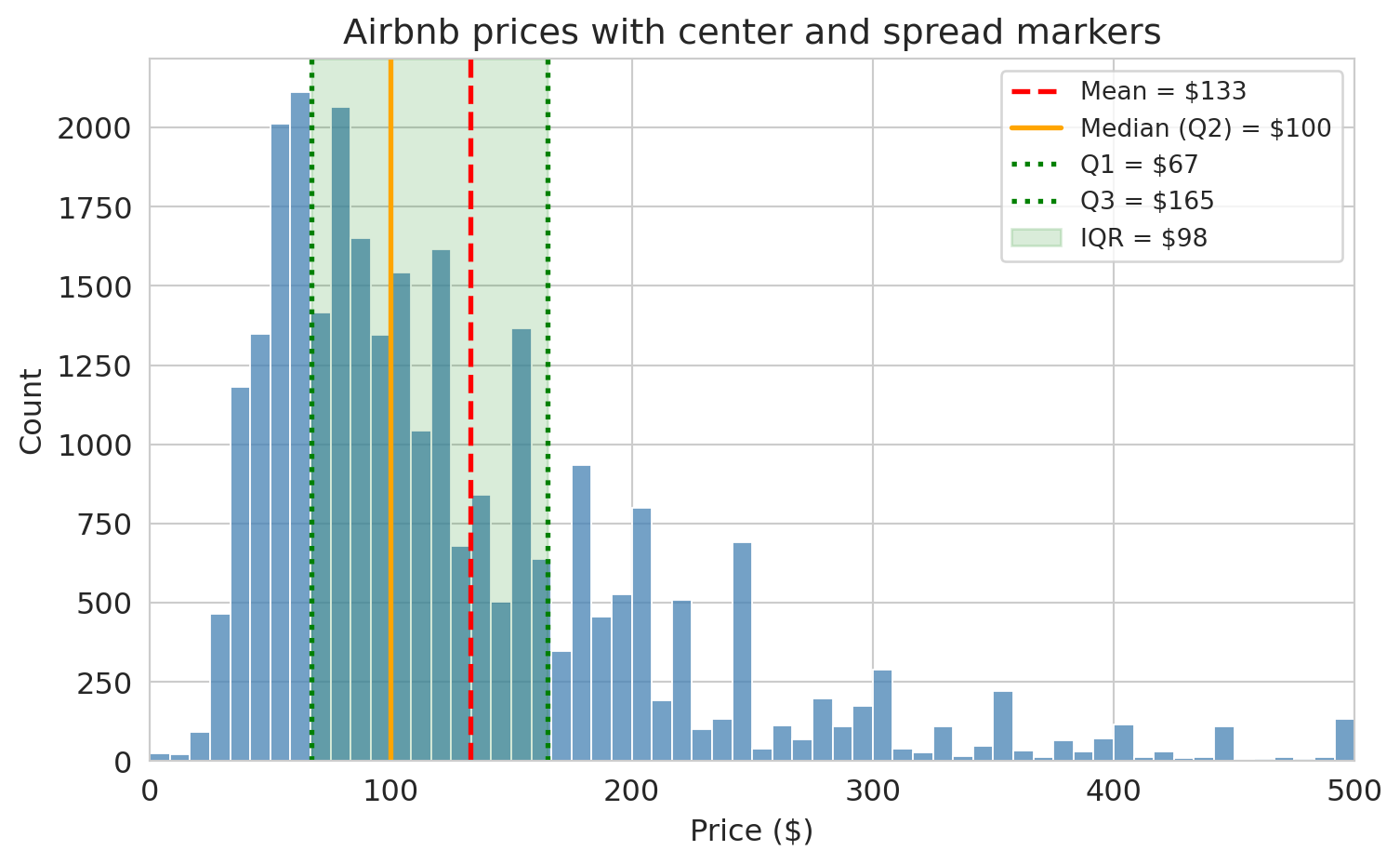
### Center and spread
We just saw that the mean and median can disagree. Let's define the key summaries precisely.
:::{.callout-important}
## Definitions: Center and Spread
- **Mean** ($\bar{x}$): the arithmetic average, $\bar{x} = \frac{1}{n}\sum_{i=1}^n x_i$. Sensitive to extreme values.
- **Median**: the middle value when observations are sorted. Half the data falls below it, half above. Robust to outliers.
- **Quartiles**: sort the data and split into four equal parts. **Q1** (25th percentile) is the median of the lower half, **Q2** is the median itself (50th percentile), and **Q3** (75th percentile) is the median of the upper half.
- **Interquartile Range (IQR)**: $\text{IQR} = Q3 - Q1$. The width of the middle 50% of the data. Robust to outliers.
:::
Let's see these on the Airbnb price distribution.
```{python}
prices = airbnb['price'].dropna()

q1 = prices.quantile(0.25)
median = prices.median()
q3 = prices.quantile(0.75)
mean = prices.mean()

fig, ax = plt.subplots(figsize=(8, 5))
sns.histplot(prices[prices <= 500], bins=60, ax=ax, color='steelblue', edgecolor='white')

# Vertical lines for mean, median, Q1, Q3
ax.axvline(mean, color='red', linestyle='--', linewidth=2, label=f'Mean = ${mean:.0f}')
ax.axvline(median, color='orange', linestyle='-', linewidth=2, label=f'Median (Q2) = ${median:.0f}')
ax.axvline(q1, color='green', linestyle=':', linewidth=2, label=f'Q1 = ${q1:.0f}')
ax.axvline(q3, color='green', linestyle=':', linewidth=2, label=f'Q3 = ${q3:.0f}')

# Shaded IQR band
ax.axvspan(q1, q3, alpha=0.15, color='green', label=f'IQR = ${q3 - q1:.0f}')

ax.set_xlabel('Price ($)')
ax.set_ylabel('Count')
ax.set_title('Airbnb prices with center and spread markers')
ax.set_xlim(0, 500)
ax.legend(fontsize=10)
plt.tight_layout()
plt.show()
```
The mean (red dashed line) is pulled to the right of the median (orange solid line) by the long tail of expensive listings. The shaded green band shows the IQR — the middle 50% of prices. Most listings fall in a fairly narrow range, but the tail extends far to the right.
:::{.callout-important}
## Definition: Robust statistics
A statistic is **robust** if extreme values barely affect it. The **median** and **interquartile range (IQR)** are robust: moving one observation to \$100,000 hardly changes either one. The **mean** and **standard deviation** are not robust: a single extreme value can shift them dramatically. When a distribution has heavy tails or outliers, robust summaries give a more reliable picture of the typical value and spread.
:::
:::{.callout-tip}
## Think about it
You're reporting Airbnb price spread to a city council considering rent regulation. The standard deviation is \$85, but the IQR is \$45. Which number do you present, and how does your choice affect the policy conversation?
:::
> **Key principle**: When a distribution has a heavy tail, the mean doesn't represent a typical value. Always plot the distribution before relying on any single number.
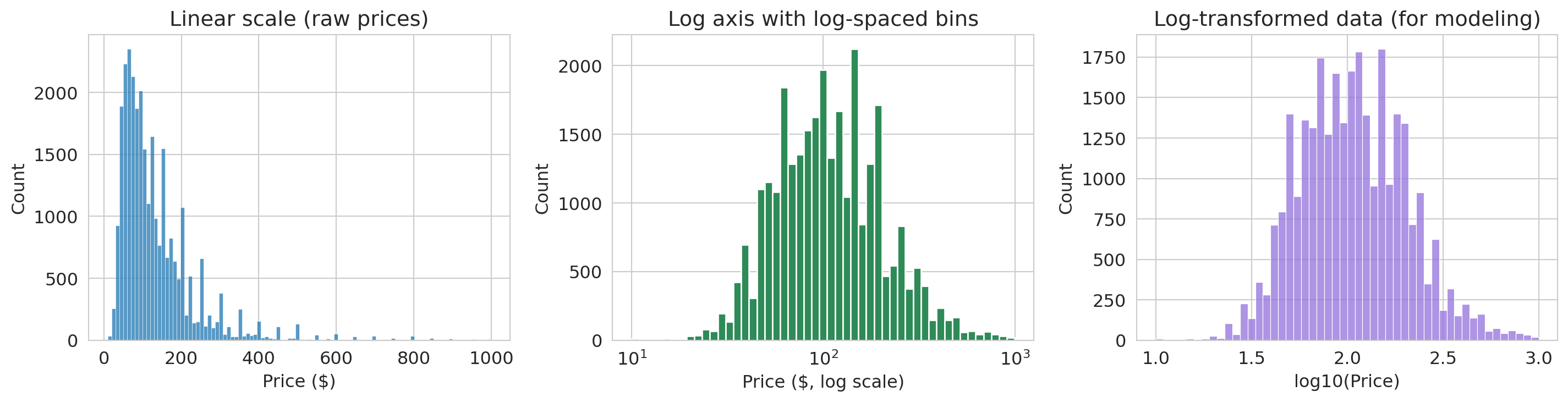
### Log scales for skewed data
When data is heavily right-skewed, the first tool to reach for is a **log axis**. A log scale compresses the long right tail and stretches out the bunched-up left side — without changing the data itself.
```{python}
# Filter out $0 listings
airbnb_pos = airbnb[airbnb['price'] > 0].copy()

fig, axes = plt.subplots(1, 3, figsize=(15, 4))

# Panel 1: Linear scale — heavily skewed
sns.histplot(airbnb_pos['price'], bins=100, ax=axes[0], edgecolor='white')
axes[0].set_xlabel('Price ($)')
axes[0].set_ylabel('Count')
axes[0].set_title('Linear scale (raw prices)')

# Panel 2: Log axis with log-spaced bins (equal visual area = equal count)
log_bins = np.logspace(np.log10(airbnb_pos['price'].min()),
                       np.log10(airbnb_pos['price'].max()), 50)
axes[1].hist(airbnb_pos['price'], bins=log_bins, edgecolor='white', color='seagreen')
axes[1].set_xscale('log')
axes[1].set_xlabel('Price ($, log scale)')
axes[1].set_ylabel('Count')
axes[1].set_title('Log axis with log-spaced bins')

# Panel 3: Log-transformed data — for modeling
airbnb_pos['log_price'] = np.log10(airbnb_pos['price'])
sns.histplot(airbnb_pos['log_price'], bins=50, ax=axes[2], edgecolor='white', color='mediumpurple')
axes[2].set_xlabel('log10(Price)')
axes[2].set_ylabel('Count')
axes[2].set_title('Log-transformed data (for modeling)')

plt.tight_layout()
plt.show()
```
The linear histogram (left) is nearly useless — everything piles up on the left. The log-axis histogram (center) uses logarithmically-spaced bins so that each bar covers an equal range on the log scale — bar *areas* stay proportional to counts, avoiding the visual distortion that equal-width bins create on a log axis. (We use `axes[1].hist()` from matplotlib here instead of `sns.histplot()`, since custom bin edges require direct access to the matplotlib API.) The log-transformed histogram (right) plots $\log_{10}(\text{price})$ directly — useful when you need to feed the data into a model.
> **Use a log *axis* when you want to *look* at skewed data. Use a log *transform* when you need to *model* it (e.g., in a regression).**
## Part 3: Relationships between variables
### Scatter plots and their limits
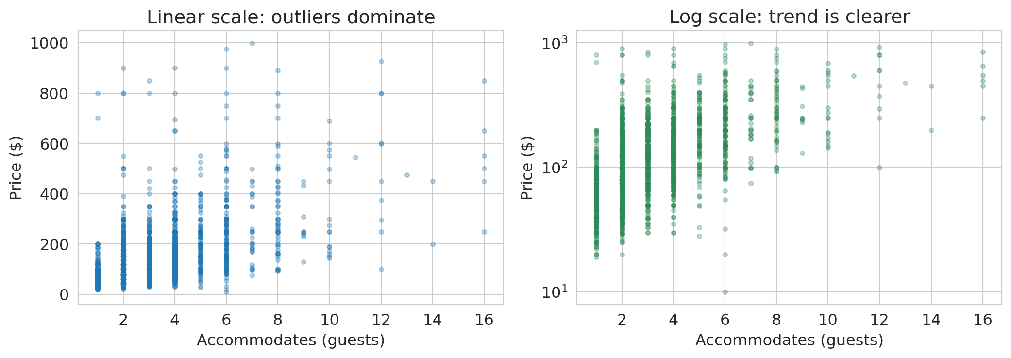
Do larger listings cost more? Let's plot price against the number of guests a listing accommodates.
```{python}
fig, axes = plt.subplots(1, 2, figsize=(11, 4))

sample = airbnb_pos.dropna(subset=['accommodates']).sample(3000, random_state=42)

axes[0].scatter(sample['accommodates'], sample['price'], alpha=0.3, s=10)
axes[0].set_xlabel('Accommodates (guests)')
axes[0].set_ylabel('Price ($)')
axes[0].set_title('Linear scale: outliers dominate')

axes[1].scatter(sample['accommodates'], sample['price'], alpha=0.3, s=10, color='seagreen')
axes[1].set_yscale('log')
axes[1].set_xlabel('Accommodates (guests)')
axes[1].set_ylabel('Price ($)')
axes[1].set_title('Log scale: trend is clearer')

plt.tight_layout()
plt.show()
```
On the linear scale, expensive listings in the \$500–\$999 range make it hard to see any pattern among the majority. On the log scale, a clear upward trend emerges: each additional guest corresponds to roughly a **multiplicative** increase in price. Notice the y-axis still shows dollar amounts — the log axis just spreads them out.
:::{.callout-tip}
## Think about it: reading a log-scale plot
A straight line on a semilog plot (log y-axis, linear x-axis) means each unit increase in x **multiplies** y by a fixed factor. That's exactly what we see here: each additional guest corresponds to roughly a multiplicative increase in price. On a linear plot, by contrast, a straight line means each unit increase in x **adds** a fixed amount to y.
We'll formalize this interpretation — and cover the other log-transform cases — when we fit regression models in Chapter 5.
:::
We'll use this idea extensively when we build regression models.
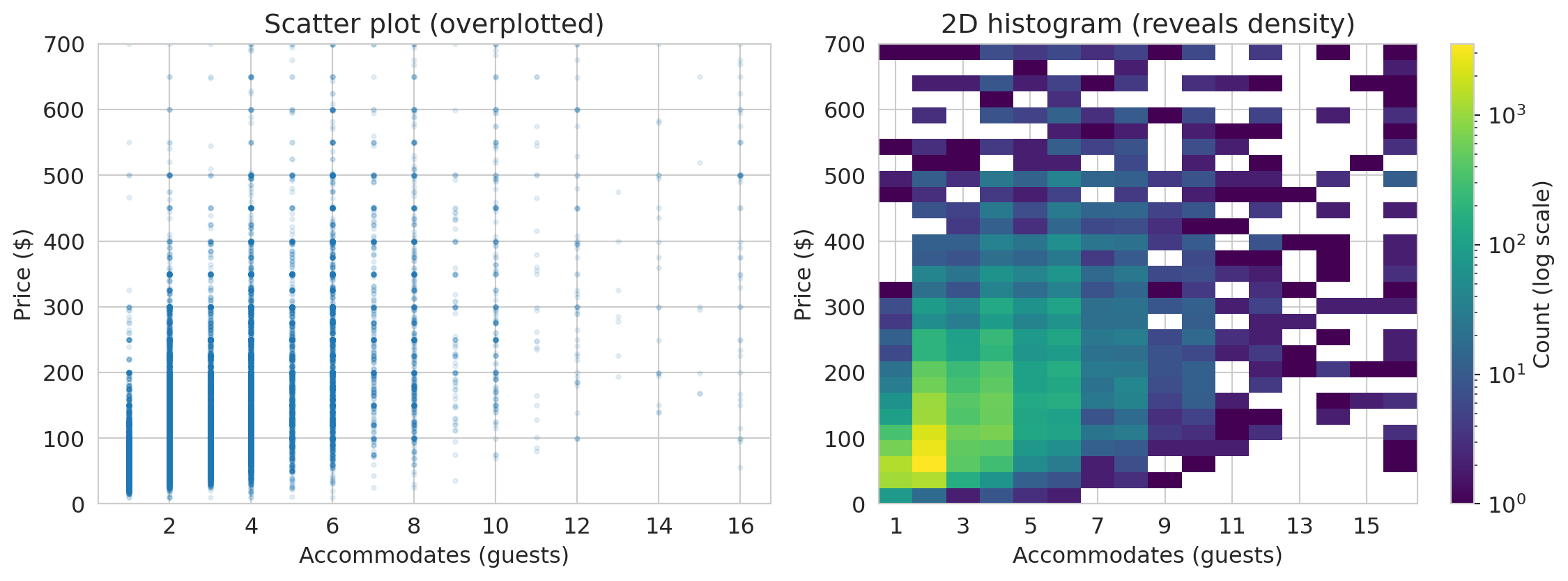
### When scatter plots fail: 2D histograms
With thousands of points, scatter plots become **overplotted** — every point lands on top of the others and you can't see where the data is concentrated. A **2D histogram** bins the data in both directions and uses color to show density. We use matplotlib's `.hist2d()` to create one below.
```{python}
fig, axes = plt.subplots(1, 2, figsize=(12, 4.5))
prices_pos = airbnb[airbnb['price'] > 0]

# Scatter — overplotted
axes[0].scatter(prices_pos['accommodates'], prices_pos['price'],
                alpha=0.1, s=5)
axes[0].set_xlabel('Accommodates (guests)')
axes[0].set_ylabel('Price ($)')
axes[0].set_title('Scatter plot (overplotted)')
axes[0].set_ylim(0, 700)

# 2D histogram with log color scale to reveal structure in dense regions
from matplotlib.colors import LogNorm
mask = prices_pos['price'] <= 700
x_bins = np.arange(0.5, prices_pos['accommodates'].max() + 1.5, 1)  # center bins on integers
y_bins = np.linspace(0, 700, 30)
h = axes[1].hist2d(prices_pos['accommodates'][mask],
                   prices_pos['price'][mask],
                   bins=[x_bins, y_bins], cmap='viridis', norm=LogNorm())
plt.colorbar(h[3], ax=axes[1], label='Count (log scale)')
axes[1].set_xlabel('Accommodates (guests)')
axes[1].set_ylabel('Price ($)')
axes[1].set_title('2D histogram (reveals density)')
axes[1].set_xticks(range(1, 17, 2))

plt.tight_layout()
plt.show()
```
The 2D histogram reveals that the overwhelming majority of listings accommodate 1–4 guests at \$50–\$200/night — a pattern invisible in the overplotted scatter.
## Part 4: Categorical variables and group comparisons
Not all data is numeric. The Airbnb dataset includes categorical variables like `room_type` (Entire home, Private room, Shared room) and `neighbourhood_group_cleansed` (borough). Different variable types call for different plots — the study guide at the end of this chapter includes a reference table.
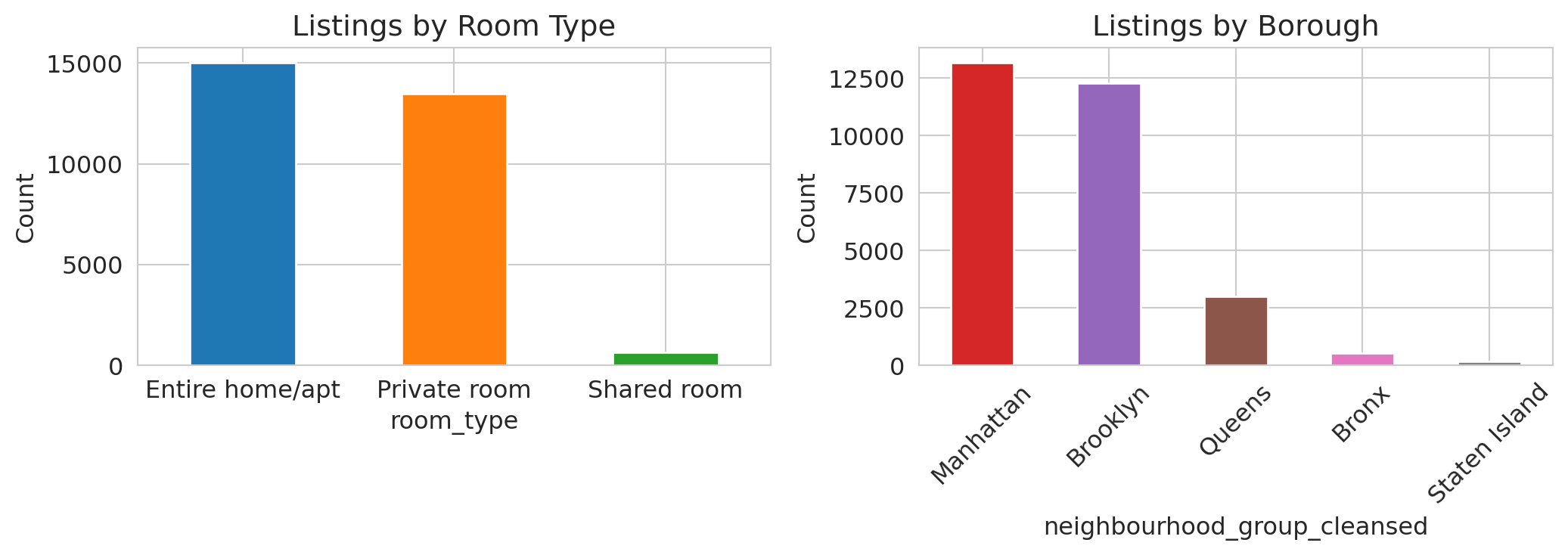
### Bar charts beat pie charts
```{python}
fig, axes = plt.subplots(1, 2, figsize=(11, 4))

# Room type
room_counts = airbnb['room_type'].value_counts()
room_counts.plot.bar(ax=axes[0], color=sns.color_palette()[:len(room_counts)], edgecolor='white')
axes[0].set_title('Listings by room type')
axes[0].set_ylabel('Count')
axes[0].tick_params(axis='x', rotation=0)

# Borough
borough_counts = airbnb['neighbourhood_group_cleansed'].value_counts()
borough_counts.plot.bar(ax=axes[1], color=sns.color_palette()[3:8], edgecolor='white')
axes[1].set_title('Listings by Borough')
axes[1].set_ylabel('Count')
axes[1].tick_params(axis='x', rotation=45)

plt.tight_layout()
plt.show()
```
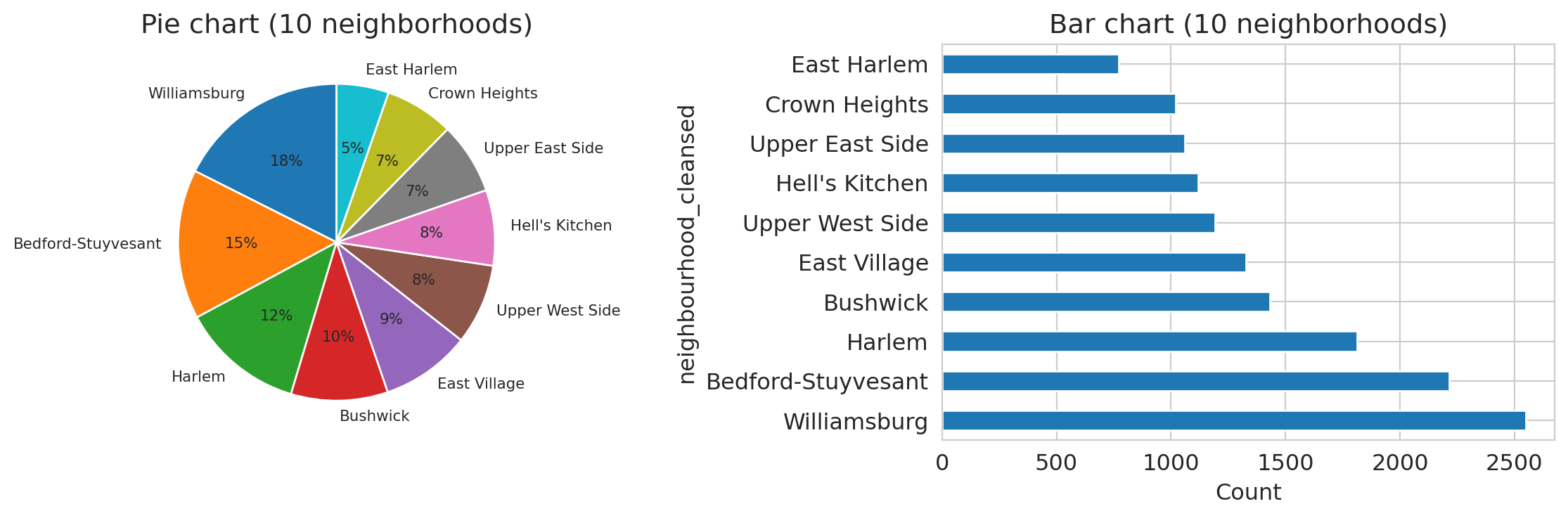
Compare the same borough data in two formats:
```{python}
fig, axes = plt.subplots(1, 2, figsize=(12, 4))

# Top 10 neighborhoods by listing count
hood_counts = airbnb['neighbourhood_cleansed'].value_counts().head(10)

# Pie chart — too many similarly-sized slices
axes[0].pie(hood_counts, labels=hood_counts.index, autopct='%1.0f%%',
            startangle=90, textprops={'fontsize': 8})
axes[0].set_title('Pie chart (10 neighborhoods)')

# Bar chart — differences are obvious
hood_counts.plot.barh(ax=axes[1], edgecolor='white')
axes[1].set_title('Bar chart (10 neighborhoods)')
axes[1].set_xlabel('Count')

plt.tight_layout()
plt.show()
```
Which neighborhood has the most listings? In the pie chart, the slices blur together — Williamsburg, Bedford-Stuyvesant, and Harlem look nearly the same size. In the bar chart, the ranking and relative sizes are immediately clear. Pie charts fail badly once you have more than 3–4 categories with similar proportions. Bar charts are almost always better.
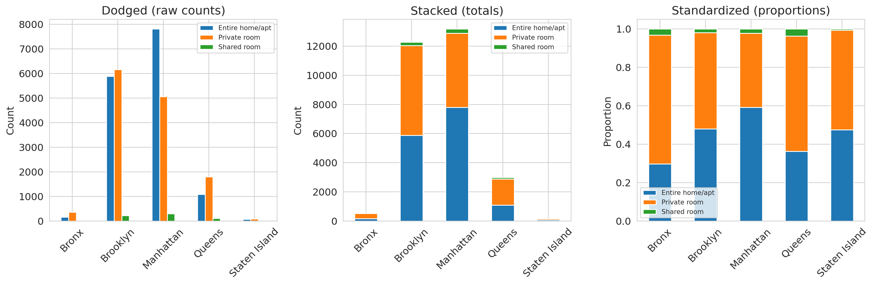
### Comparing composition across groups
When you want to compare how a categorical variable is distributed across groups, there are three useful views: **dodged**, **stacked**, and **standardized** bar charts.
```{python}
ct_room = pd.crosstab(airbnb['neighbourhood_group_cleansed'], airbnb['room_type'])

fig, axes = plt.subplots(1, 3, figsize=(15, 5))

# Dodged
ct_room.plot.bar(ax=axes[0], edgecolor='white')
axes[0].set_title('Dodged (raw counts)')
axes[0].set_ylabel('Count')
axes[0].set_xlabel('')
axes[0].tick_params(axis='x', rotation=45)
axes[0].legend(fontsize=8)

# Stacked
ct_room.plot.bar(stacked=True, ax=axes[1], edgecolor='white')
axes[1].set_title('Stacked (totals)')
axes[1].set_ylabel('Count')
axes[1].set_xlabel('')
axes[1].tick_params(axis='x', rotation=45)
axes[1].legend(fontsize=8)

# Standardized (proportions)
ct_room_pct = ct_room.div(ct_room.sum(axis=1), axis=0)
ct_room_pct.plot.bar(stacked=True, ax=axes[2], edgecolor='white')
axes[2].set_title('Standardized (proportions)')
axes[2].set_ylabel('Proportion')
axes[2].set_xlabel('')
axes[2].tick_params(axis='x', rotation=45)
axes[2].legend(fontsize=8)

plt.tight_layout()
plt.show()
```
Each format answers a different question:
- The dodged chart (left) lets you compare counts across room types within each borough.
- The stacked chart (center) reveals that Manhattan has the most listings overall.
- The standardized chart (right) shows Manhattan has a higher *proportion* of entire homes than Brooklyn does.
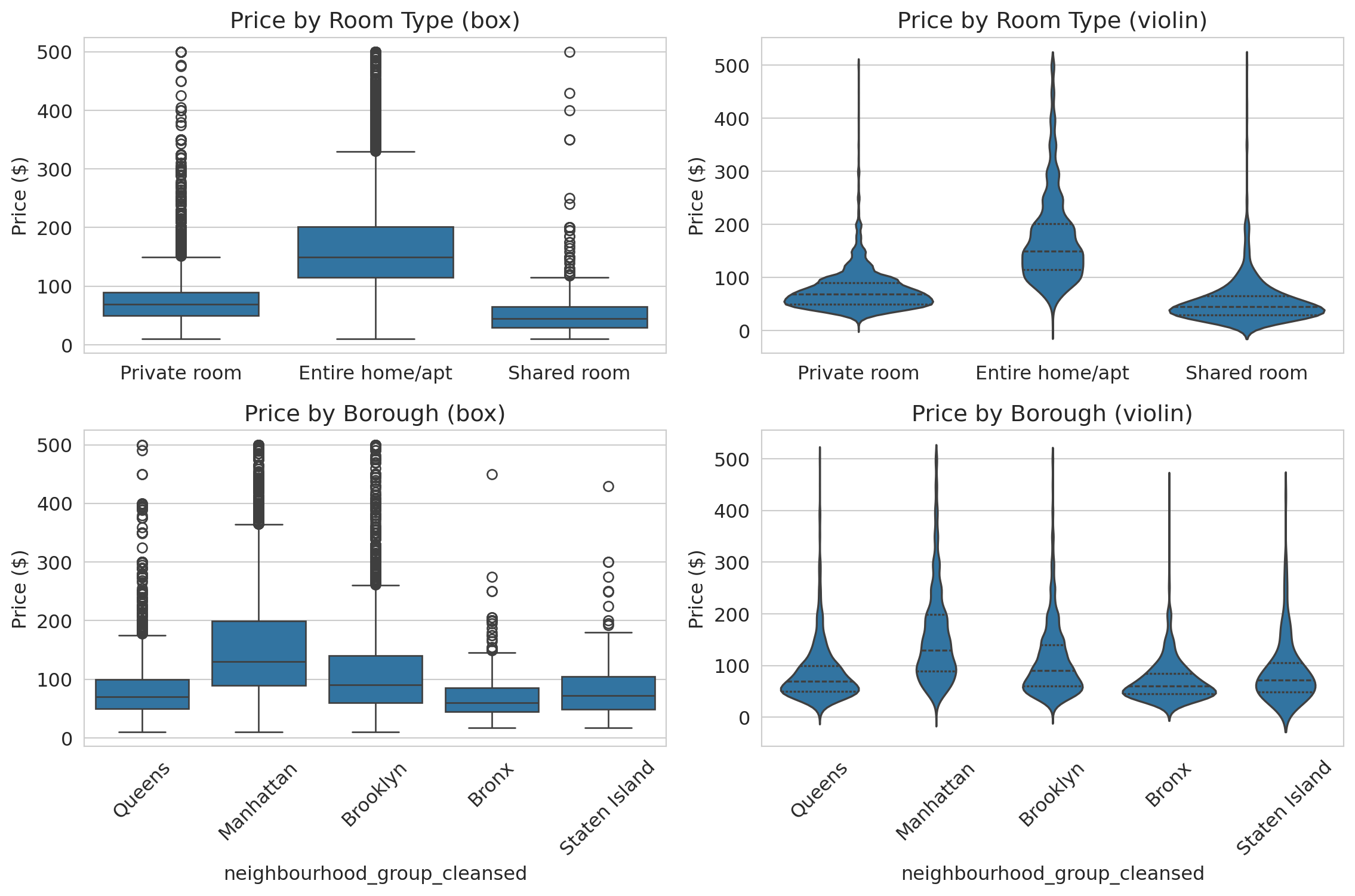
### Comparing distributions: box plots and violin plots
How does price vary across room types and boroughs? Two tools compare distributions across groups:
- A **box plot** summarizes each group with five numbers: min, Q1, median, Q3, max. Good for comparing medians and spotting outliers at a glance.
- A **violin plot** shows the full distribution shape — revealing patterns (bimodality, tight clustering) that the five-number summary hides.
Let's see both, side by side, for the same data.
```{python}
filtered = airbnb[airbnb['price'].between(1, 500)]

fig, axes = plt.subplots(2, 2, figsize=(12, 8))

# Top row: by room type
sns.boxplot(data=filtered, x='room_type', y='price', ax=axes[0, 0])
axes[0, 0].set_title('Price by room type (box)')
axes[0, 0].set_ylabel('Price ($)')
axes[0, 0].set_xlabel('')

sns.violinplot(data=filtered, x='room_type', y='price', ax=axes[0, 1], inner='quartile')
axes[0, 1].set_title('Price by room type (violin)')
axes[0, 1].set_ylabel('Price ($)')
axes[0, 1].set_xlabel('')

# Bottom row: by borough
sns.boxplot(data=filtered, x='neighbourhood_group_cleansed', y='price', ax=axes[1, 0])
axes[1, 0].set_title('Price by Borough (box)')
axes[1, 0].set_ylabel('Price ($)')
axes[1, 0].tick_params(axis='x', rotation=45)

sns.violinplot(data=filtered, x='neighbourhood_group_cleansed', y='price',
               ax=axes[1, 1], inner='quartile')
axes[1, 1].set_title('Price by Borough (violin)')
axes[1, 1].set_ylabel('Price ($)')
axes[1, 1].tick_params(axis='x', rotation=45)

plt.tight_layout()
plt.show()
```
The box plots (left column) show that entire homes cost roughly 2x more than private rooms, and that Manhattan is the most expensive borough. But the violin plots (right column) add detail the boxes miss: private room prices cluster tightly around \$60, while entire home prices spread broadly from \$100 to \$300. Manhattan's violin has a wider body than Brooklyn's, reflecting more price dispersion — not just a higher median.
**When to use which:** Box plots are better for quick comparisons across many groups (the medians and quartiles are easy to scan). Violin plots are better when the *shape* of the distribution tells part of the story — bimodality, tight clustering, or heavy tails.
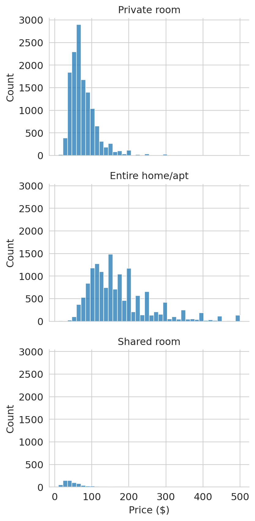
### Faceted histograms for aligned comparisons
When overlapping histograms get crowded, **faceting** splits the data into separate panels that share the same x-axis. We use `sns.displot()` to create faceted histograms:
```{python}
prices_filt = airbnb[(airbnb['price'] > 0) & (airbnb['price'] <= 500)]
g = sns.displot(data=prices_filt, x='price', col='room_type',
                col_wrap=1, bins=40, height=3, aspect=1.5)
g.set_titles('{col_name}')
g.set_xlabels('Price ($)')
plt.tight_layout()
plt.show()
```
Faceting splits the data into separate panels that share the same axis. Comparing distributions — here, prices across room types — is much easier when the axes are aligned.
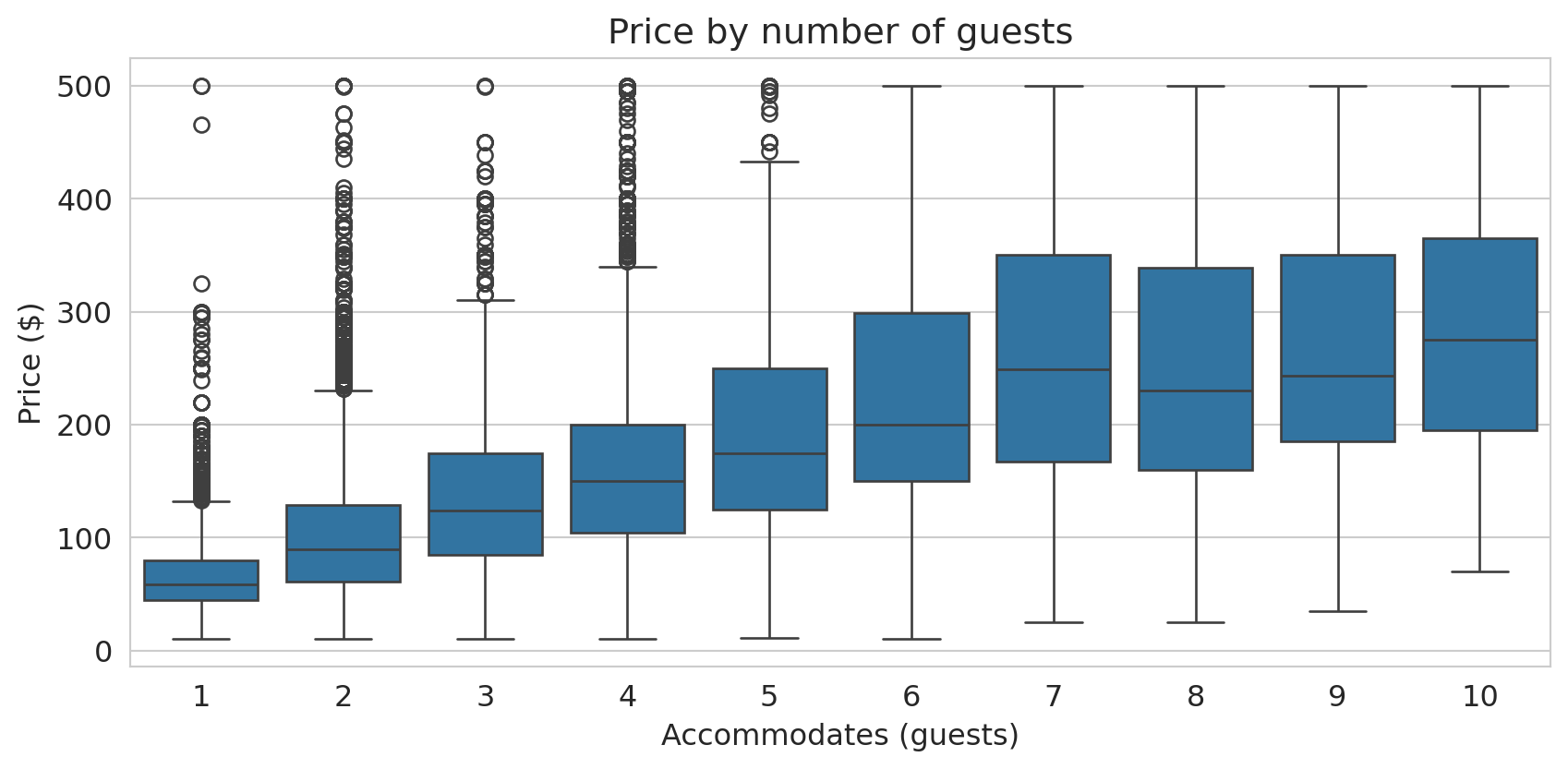
Box plots also clarify the relationship between two numeric variables when you discretize one of them. The scatter plot of accommodates vs. price was hard to read; treating accommodates as a categorical variable produces a much clearer box plot:
```{python}
fig, ax = plt.subplots(figsize=(9, 4.5))
box_data = airbnb[(airbnb['price'] > 0) & (airbnb['price'] <= 500) &
                  (airbnb['accommodates'] <= 10)]
sns.boxplot(data=box_data, x='accommodates', y='price', ax=ax)
ax.set_xlabel('Accommodates (guests)')
ax.set_ylabel('Price ($)')
ax.set_title('Price by number of guests')
plt.tight_layout()
plt.show()
```
The median price roughly doubles from 1-guest to 6-guest listings. The boxes also show that spread increases with group size — larger listings have more price variability.
## Part 5: Missing data — what's absent and why?
Missing values are data too. Before handling them, you need to see them. In the Airbnb dataset, missing values are encoded as `NaN` — pandas' standard marker for absent data. Let's count them.
```{python}
missing = airbnb.isnull().sum()
missing_pct = (missing / len(airbnb) * 100).round(1)
pd.DataFrame({'Missing': missing, '% Missing': missing_pct}).query('Missing > 0')
```
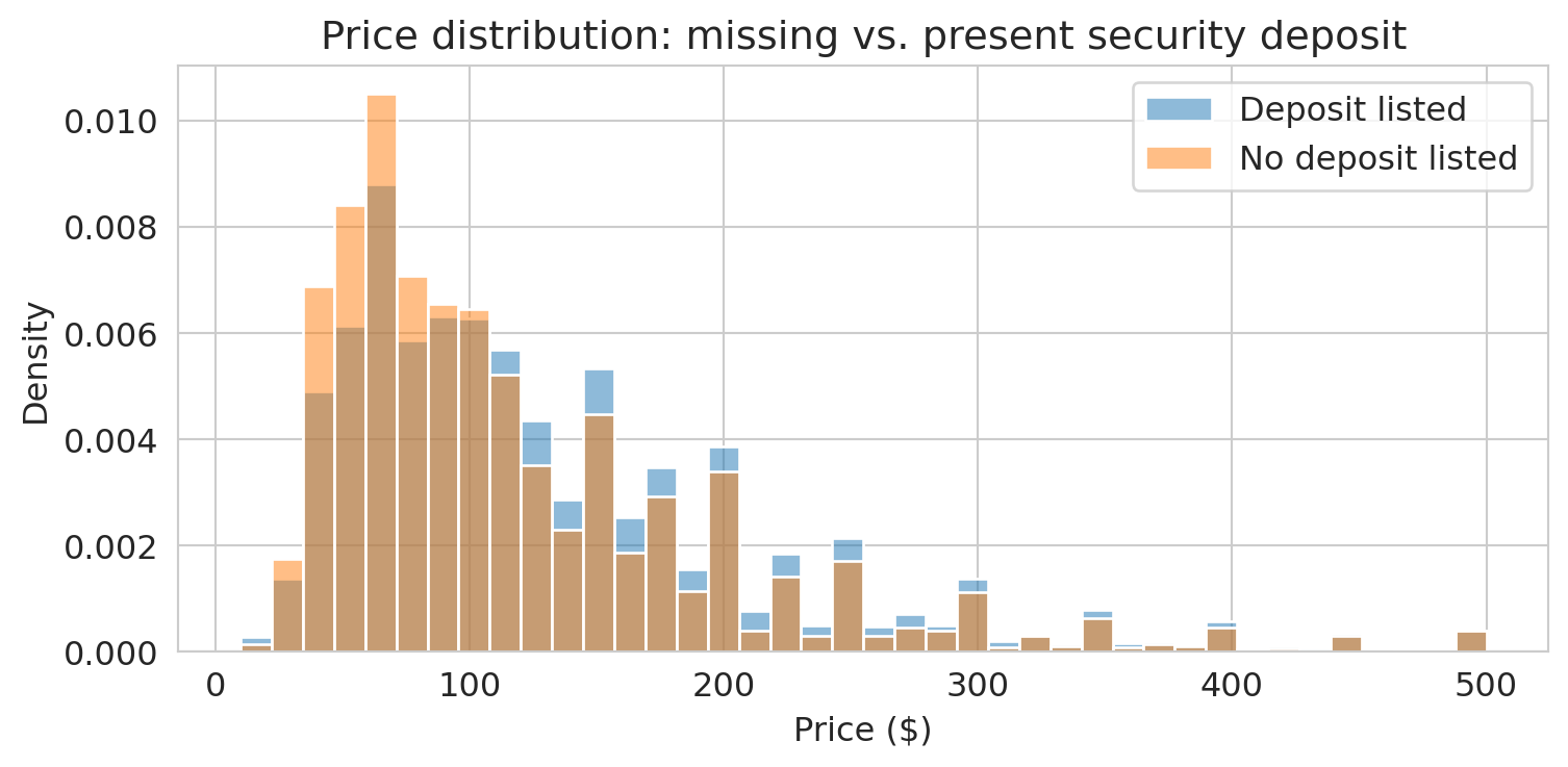
About 40% of listings have no security deposit recorded. Is that meaningful, or just a nuisance?
```{python}
# Do listings with missing deposits have different prices?
airbnb['deposit_missing'] = airbnb['security_deposit'].isna()
fig, ax = plt.subplots(figsize=(8, 4))
for label, group in airbnb[airbnb['price'] > 0].groupby('deposit_missing'):
    tag = 'No deposit listed' if label else 'Deposit listed'
    sns.histplot(group['price'][group['price'] <= 500], bins=40, ax=ax,
                 label=tag, alpha=0.5, stat='density')
ax.set_xlabel('Price ($)')
ax.set_ylabel('Density')
ax.set_title('Price distribution: missing vs. present security deposit')
ax.legend()
plt.tight_layout()
plt.show()
```
If the distributions differ, the missingness may be informative — a signal, not just a gap to fill. Making missingness visible is the first step; Chapter 3 will develop a full framework for understanding *why* data is missing and what to do about it.
:::{.callout-warning}
## Silent NA dropping
Functions like `sns.histplot()`, `sns.boxplot()`, and `.describe()` all drop `NaN` values silently — they won't warn you that rows were excluded. Before plotting or summarizing, always check how much data is missing:
```python
df['col'].isna().sum()
```
If a large fraction is missing, your histogram may not represent the full dataset.
:::
> **Key principle**: Before you handle missing data, you must understand *why* it's missing. The "why" determines the "how."
## Part 6: Confounding — when associations mislead
Manhattan is more expensive than Brooklyn. But Manhattan also has more entire homes. Is the borough difference real, or is it explained by the mix of room types?
```{python}
# Overall median price by borough
borough_median = (airbnb[airbnb['price'] > 0]
                  .groupby('neighbourhood_group_cleansed')['price'].median()
                  .sort_values(ascending=False))
print("Median price by borough:")
print(borough_median.to_string())
print(f"\nManhattan − Brooklyn overall gap: ${borough_median['Manhattan'] - borough_median['Brooklyn']:.0f}")
```
Manhattan looks substantially more expensive. But what happens when we control for room type?
The chained expression below computes the median price for every borough-room type combination. `.groupby()` splits the data into groups; `.median()` summarizes each group; `.unstack()` pivots the room type index level into columns, producing a **contingency table** — a table where each cell summarizes a combination of two categorical variables.
```{python}
# Median price by borough AND room type
borough_room = (airbnb[airbnb['price'] > 0]
                .groupby(['neighbourhood_group_cleansed', 'room_type'])['price']
                .median().unstack())
borough_room
```
```{python}
# Compute the Manhattan-Brooklyn gap within each room type
gap_by_type = borough_room.loc['Manhattan'] - borough_room.loc['Brooklyn']
print("Manhattan − Brooklyn gap by room type:")
print(gap_by_type.to_string())
print(f"\nOverall gap: ${borough_median['Manhattan'] - borough_median['Brooklyn']:.0f}")
print(f"Gaps by room type: ${gap_by_type.min():.0f}–${gap_by_type.max():.0f}")
```
:::{.callout-tip}
## Think about it
The overall Manhattan-Brooklyn gap is *larger* than the gap within any individual room type. How is that possible? (Hint: what fraction of Manhattan listings are entire homes vs. Brooklyn?)
:::
The overall gap exceeds every room-type-specific gap. Part of what looked like a "Manhattan premium" was actually a **composition effect**: Manhattan has a higher proportion of entire homes (the most expensive room type), which pulls up its overall median. When we compare like with like — entire homes to entire homes, private rooms to private rooms — the borough difference shrinks.
This pattern, where an overall comparison overstates a difference that shrinks or reverses within subgroups, is related to **Simpson's paradox** (which we'll study formally in Chapter 11). The driver is **confounding**.
In the Airbnb example, the **treatment** (the variable whose effect we want to isolate) is borough. The **outcome** is price. Room type is a **confounder**: it affects both where a listing is located (Manhattan has more entire homes) *and* the price (entire homes cost more). The raw borough comparison mixes the effect of location with the effect of room type.
:::{.callout-important}
## Definition: Confounding
A **confounder** is a variable that affects both the treatment (or exposure) and the outcome, creating an association between them that does not reflect a direct causal effect of the treatment on the outcome. The association between the treatment and outcome is real — but it doesn't mean the treatment causes the outcome. Confounding is inherently a *causal* concept: it only arises when you interpret an association as evidence for or against a causal claim.
:::
Here's a second example. Suppose you survey Stanford undergrads and find that students who attend office hours get higher grades. The treatment is attending office hours; the outcome is your grade. But **student motivation** is a confounder: it drives both office hours attendance *and* study habits. Some of the grade benefit attributed to office hours actually reflects motivation.
We'll develop formal tools for reasoning about confounders — including directed acyclic graphs (DAGs) and the potential outcomes framework — in Chapters 18–19. For now, the key habit: when you see an association, ask *what else could be driving both variables?*
In Chapter 3, we'll see a higher-stakes version of confounding in the hospital data, where naive rankings penalize hospitals that treat the sickest patients. And we'll return to hospitals one final time in Chapter 18 to ask a causal question: does the penalty actually reduce readmissions, or does it just punish hospitals that serve vulnerable populations?
## Key takeaways
- **EDA comes first** — understand your data before modeling it.
- **Distributions reveal what summaries hide.** The mean can be misleading when distributions are skewed. Always plot a histogram. Use a log axis for heavy-tailed data.
- **Missing data tells a story.** Visualize missingness before handling it. In this chapter, missing values appeared as `NaN` — but real datasets encode absence in many other ways.
- **An association can be real without being causal.** A confounder drives both the treatment and the outcome, creating an association that doesn't reflect a causal effect. Manhattan looks expensive partly because it has more entire homes.
## Study guide
### Key ideas
- **Exploratory Data Analysis (EDA)**: examining a dataset's structure, distributions, and quirks before fitting any model.
- **Mean, median, quartiles, IQR**: The mean is the arithmetic average (sensitive to outliers). The median is the middle value (robust). Quartiles divide data into four parts. IQR = Q3 − Q1 measures spread of the middle 50%.
- **Robust statistics**: The median and IQR are robust — barely affected by extreme values. The mean and standard deviation are not.
- **Outlier**: An observation far from the bulk of the data. Can be a genuine extreme or a data error. Outliers can dominate non-robust summaries like the mean.
- **Log axis vs. log transform**: Use a log axis to *visualize* skewed data (keeps original units on the axis). Use a log transform to *model* skewed data (creates a new variable for regression).
- **Confounding**: A confounder is a variable that affects both the **treatment** (the variable whose effect you want to isolate) and the **outcome** (the variable you measure), creating an association that does not reflect a causal effect. The overall Manhattan-Brooklyn price gap overstates the effect of borough because room type confounds the comparison.
- Plotting functions (`sns.histplot`, `sns.boxplot`, `.describe()`) drop NAs silently. Always check `df['col'].isna().sum()` first.
- Pie charts fail badly with more than 3–4 similar-sized categories. Bar charts are almost always better.
### Plot type reference
| Variable types | Plot | When to use |
|----------------|------|-------------|
| One numeric | Histogram | Shape, center, spread |
| One numeric (skewed) | Histogram with log axis | Reveal structure in heavy-tailed data |
| One categorical | Bar chart | Counts/proportions per category |
| One categorical | Pie chart | Almost never — use bar chart instead |
| Two numeric | Scatter plot | Relationships (small-moderate n) |
| Two numeric (dense) | 2D histogram / heatmap | Relationships (large n) |
| Numeric x categorical | Box plot | Compare distributions across groups |
| Numeric x categorical | Violin plot | Compare full distribution shapes |
| Numeric x categorical | Faceted histogram | Compare with aligned axes |
| Two categorical | Stacked/dodged/standardized bar | Compare composition across groups |
: {.striped .hover}
### Computational tools
- `df.shape`, `df.head()`, `df.info()`, `df.describe()` — first moves in any EDA
- `df['col'].isna().sum()` — count missing values
- `df['col'].value_counts()` — frequency table for categorical data
- `sns.histplot()` — histogram of one numeric variable
- `sns.boxplot(data=df, x='cat', y='num')` — compare distributions across groups
- `sns.violinplot(data=df, x='cat', y='num')` — compare full distribution shapes across groups
- `sns.displot(col='group')` — faceted histograms for comparing distributions
- `df.groupby([col1, col2])[val].median().unstack()` — contingency table of summaries
- `pd.crosstab()` — contingency table of counts for two categorical variables
- `ax.set_xscale('log')` — set axis to log scale
- `df.plot.bar(stacked=True)` — stacked bar chart
### For the quiz
You should be able to: (1) describe the EDA workflow and why each step matters, (2) explain why the mean is misleading for skewed data, (3) interpret a histogram, box plot, and scatter plot, (4) explain why adjusting for context matters when comparing groups (confounding), and (5) choose the right plot type for a given combination of variables.