---
title: "Introduction to Applied Statistics"
execute:
enabled: true
jupyter: python3
---
## Consequential decisions with data
A hospital gets fined \$500K for "too many" readmissions — but does it actually have a quality problem, or does it just serve sicker patients? A home-pricing algorithm overpays on thousands of houses — why? A pharmaceutical company must decide whether a \$2 billion drug actually works.
These are the kind of questions that drive this course.
Each one involves real data, a model that could be wrong,
and a decision with a major impact.
Here are ten examples we'll return to throughout the quarter:
| Question | Data | Decision |
|----------|------|----------|
| Hospital readmission penalties | CMS readmission rates by hospital | Which hospitals should be fined? |
| NBA shot selection | NBA shot charts (location, outcome) | Are mid-range twos a bad shot? |
| Wealthfront tax-loss harvesting | Portfolio returns, covariance matrices | Which lots to sell today to save on taxes? |
| WFP food allocation in Yemen | Hunger indicators from surveys and satellites | How to feed 2M more people at the same cost? |
| NextEra solar farm siting | 30 years of hourly solar irradiance (NREL) | Which parcels maximize energy per dollar? |
| Pfizer vaccine efficacy | Randomized trial: 8 vs. 162 cases in 43K patients | Enough evidence for emergency authorization? |
| NC gerrymandering | Precinct-level votes + 24K simulated district maps | Was the 10–3 seat split geographic luck or manipulation? |
| Zillow's iBuying loss | Home prices, Zestimate predictions | Why did the algorithm overpay on most homes? |
| COMPAS bail scores | Risk scores and recidivism outcomes by race | Why is the false positive rate 45% for Black defendants vs. 23% for white? |
| Netflix recommendations | 100M ratings from 480K users on 17K movies | Which movies to recommend to which users? |
: {.striped .hover tbl-colwidths="[30,35,35]"}
**How do you make these decisions with data?**
We'll spend the quarter building the tools to answer these questions.
> *"In God we trust; all others must bring data."* — W. Edwards Deming
```{python}
import numpy as np
import pandas as pd
import matplotlib.pyplot as plt
import seaborn as sns
import warnings
warnings.filterwarnings('ignore')
sns.set_style('whitegrid')
plt.rcParams['figure.figsize'] = (8, 5)
plt.rcParams['font.size'] = 12

# Load data
DATA_DIR = 'data'
```
## What makes a decision consequential?
A decision is **consequential** when getting it wrong has serious impact — and someone has to live with the outcome. The examples above aren't just interesting data problems; they're decisions where the cost of being wrong is high.
**Financial impact.** Zillow's iBuying algorithm overpaid on nearly every home it purchased in Q3 2021, leading to an \$881M write-down and the shutdown of an entire business unit. On the other side, Wealthfront manages \$50B in assets — a bug in its tax-loss harvesting algorithm costs real clients real money.
**Human impact.** CMS hospital readmission penalties can cost a hospital \$500K–\$1M per year, directly affecting the resources available for patient care. COMPAS bail scores determine who walks free and who waits in jail — and as we'll see in Act 3, the algorithm's errors fall unevenly across racial groups in a way that no single fix can resolve. The Pfizer vaccine trial — 8 cases vs. 162 in 43,000 patients — determined whether millions of people got vaccinated.
**Irreversibility.** Some decisions can't be undone. A prison sentence served on a false positive can't be returned. A candidate elected based on gerrymandered districts can't be un-elected. Surgical decisions, infrastructure investments, closing a business unit — these are one-way doors.
:::{.callout-note}
## The fairness impossibility
The COMPAS controversy reveals a deep mathematical constraint, not just a software bug. ProPublica found that Black defendants who did *not* reoffend were nearly twice as likely to be flagged high-risk (false positive rate: 45% vs. 23%). Northpointe, the algorithm's maker, countered that among defendants *scored* as high-risk, the actual recidivism rate was similar across races (~60%). Both were correct — but they measured fairness differently.
It turns out that when two groups have different base rates of reoffending, it is *mathematically impossible* to equalize both false positive rates and predictive values at the same time (Chouldechova 2017; Kleinberg, Mullainathan, and Raghavan 2016). This constraint isn't a bug to fix — it's a tradeoff to navigate. Which fairness criterion to prioritize is a values question, not a statistical one. We formalize this in [Chapter 20](lec20-fairness.qmd).
:::
**Scale.** The World Food Programme's reallocation model affects 2 million people simultaneously. Netflix's recommendation algorithm shapes what 200 million users watch. When a decision affects many people at once, even small errors can be consequential.
:::{.callout-tip}
## Think about it
Look back at the ten questions in the table above. Pick three from different domains. Which of these four dimensions (financial, human, irreversible, scale) applies to each? Most consequential decisions hit more than one.
:::
MS&E graduates will make exactly these kinds of decisions.
This course is designed to teach you the tools — building models, quantifying uncertainty, reasoning about causation — to make these decisions with data.
By the end of this course, you will know when *not* to trust a model's output — when the data is insufficient, when the assumptions are violated, when the metric is misleading, and when a confident prediction should be met with skepticism. [Chapter 17](lec17-working-with-ai.qmd) distills these instincts into a short critical-evaluation checklist organized around five questions — a portable tool you can apply to any analysis, in any domain, for the rest of your career. The rest you can learn online.
## What is applied statistics?
**Applied statistics** is the science of making decisions under uncertainty using data. You'll learn to work at the intersection of three disciplines:
- **Probability** (from MS&E 120) — the mathematics of uncertainty
- **Computing** — the tools for wrangling real datasets
- **Domain knowledge** — the context that turns numbers into insight
As John Tukey put it: *"The best thing about being a statistician is that you get to play in everyone's backyard."* The same tools you'll learn here apply to healthcare, housing, sports, and drug development.
## Four ways to reason with data
The same dataset can answer very different questions depending on how you reason about it. Consider the hospital readmissions data. Here are four questions — each requiring a different mode of thinking:
| Mode | Question | Decision |
|------|----------|----------|
| **Summary** | What does the ERR distribution look like across U.S. hospitals? | Which hospitals are outliers? |
| **Prediction** | Given a hospital's characteristics, what ERR should we expect? | Should CMS flag this hospital for review? |
| **Inference** | Is this hospital's ERR of 1.05 statistically different from 1.0? | Should the hospital be fined? |
| **Causation** | Do the fines actually reduce readmissions? | Should CMS continue the penalty program? |
: {.striped .hover tbl-colwidths="[15,40,45]"}
These four modes — **summary, prediction, inference, and causation** — form the backbone of applied statistics. Each one requires different tools and answers a fundamentally different kind of question.
**Summary** asks: *what happened?* You compute statistics, make plots, and describe the data as it is. Later in this chapter, we'll do exactly that — loading hospital data, counting conditions with `value_counts()`, and plotting the ERR distribution. Summary is the starting point, but it's not the end. A histogram tells you what the data looks like; it doesn't tell you what to do about it.
**Prediction** asks: *what will happen next?* Given a new hospital's patient mix, neighborhood, and staffing levels, what ERR should we expect? Prediction doesn't require understanding *why* — a model can predict accurately without explaining the mechanism. In Act 1, we'll build prediction models using regression, feature engineering, and decision trees.
**Inference** asks: *what can we conclude about the population?* If a hospital's ERR is 1.05, is that a real signal or just noise from a small sample? Inference quantifies uncertainty — it tells you how confident to be. Consider the Pfizer vaccine trial: the prediction is that the vaccine works (8 cases vs. 162 in 43,000 patients). But should we authorize it for hundreds of millions of people based on one trial? Inference answers that question — by telling us how likely the observed result would be if the vaccine had no effect. In Act 2, we'll build the tools for inference: confidence intervals, hypothesis tests, and p-values.
**Causation** asks: *what would happen if we intervened?* Does fining hospitals actually reduce readmissions — or do penalized hospitals just learn to game the metrics? Causal questions are the hardest because correlation doesn't imply causation. Observing that fined hospitals improve doesn't prove the fine caused the improvement — maybe those hospitals were already investing in quality. The comparison may be **confounded** by other changes happening at the same time. We'll define and study confounding starting in Chapter 2. In Act 3, we'll develop frameworks for causal reasoning.
:::{.callout-tip}
## Think about it
Pick one of the ten questions from the opening table. Which of the four modes — summary, prediction, inference, or causation — does it primarily involve? Most involve more than one.
:::
Each mode builds on the last. You can't predict without first summarizing. You can't infer without a prediction model. And you can't reason about causation without understanding what inference can and can't tell you. The three acts of this course follow this progression.
## The three acts of this course
The course follows a three-act structure. Each act builds on the last:
**Act 1: Build Models** (Chapters 1–7) — Explore data, clean it, and build predictive models. We'll use regression, feature engineering, and decision trees on real datasets.
**Act 2: Trust Models** (Chapters 8–12) — Sampling, hypothesis testing, and regression inference. We'll ask: how precise are our estimates? Is the drug effect real? Which coefficients matter?
**Act 3: See Further** (Chapters 13–19) — Classification, PCA, clustering, time series, tree-based methods, and causal inference. We'll move from "what happened" to "why."
Acts 1–3 correspond to the four modes of reasoning: Act 1 covers summary and prediction, Act 2 covers inference, and Act 3 adds causation.
We'll see the ten questions from the opening recur throughout the course:
| Question | Topics | Act |
|----------|--------|-----|
| Hospital readmission penalties | EDA, hypothesis testing | I → II |
| NBA shot selection | EDA, conditional expected value | I |
| Wealthfront tax-loss harvesting | Optimization, regression | I |
| WFP food allocation | Linear algebra, optimization | I |
| NextEra solar farm siting | Feature engineering, regression | I |
| Pfizer vaccine efficacy | Hypothesis testing, multiple testing | II |
| NC gerrymandering | Permutation tests, simulation | II |
| Zillow's iBuying algorithm | Regression, prediction intervals, backtesting | I → II |
| COMPAS bail scores | Classification, fairness | III |
| Netflix recommendations | PCA, SVD, matrix completion | III |
: {.striped .hover tbl-colwidths="[30,40,30]"}
## A first look at real data
Let's put these ideas to work on a real dataset. The Centers for Medicare & Medicaid Services (CMS) tracks how often patients are readmitted to hospitals within 30 days of discharge. Hospitals with "too many" readmissions get fined.
We load the data with `pd.read_csv()` and inspect the first few rows with `.head()`:
```{python}
# Load hospital readmissions data
readmissions = pd.read_csv(f'{DATA_DIR}/hospital-readmissions/hrrp_full.csv')
print(f"Shape: {readmissions.shape[0]:,} rows × {readmissions.shape[1]} columns")
readmissions.head(10)
```
Each row is one hospital-condition pair. The table above is a **DataFrame** — the fundamental data structure in data science. Nearly every dataset you'll encounter lives in a DataFrame.
### Selecting a column
To grab a single column from a DataFrame, use bracket notation:
```{python}
# Select one column — this returns a Series
readmissions['Measure Name']
```
The expression `readmissions['Measure Name']` pulls out one column as a **Series** — a labeled array of values. This move — selecting a column from a DataFrame — is one you'll use constantly.
### Counting categories
What conditions are tracked?
```{python}
readmissions['Measure Name'].value_counts()
```
`value_counts()` tallies each unique value. Six medical conditions, each measured across thousands of hospitals.
### Summarizing a numeric column
:::{.callout-important}
## Definition: Excess readmission ratio (ERR)
The **Excess Readmission Ratio (ERR)** compares a hospital's predicted readmissions to its expected number, after adjusting for patient risk. A value above 1.0 means more readmissions than expected.
:::
```{python}
readmissions['Excess Readmission Ratio'].describe()
```
The mean is close to 1.0 — most hospitals are near the expected rate. But the spread tells the real story: some hospitals are well above or below.
### Visualizing a distribution
Before plotting, note that some ERR values are missing. The `.dropna()` call below removes them — always check how many are absent before dropping:
```{python}
print(f"Missing ERR values: {readmissions['Excess Readmission Ratio'].isna().sum():,} "
      f"out of {len(readmissions):,}")
```
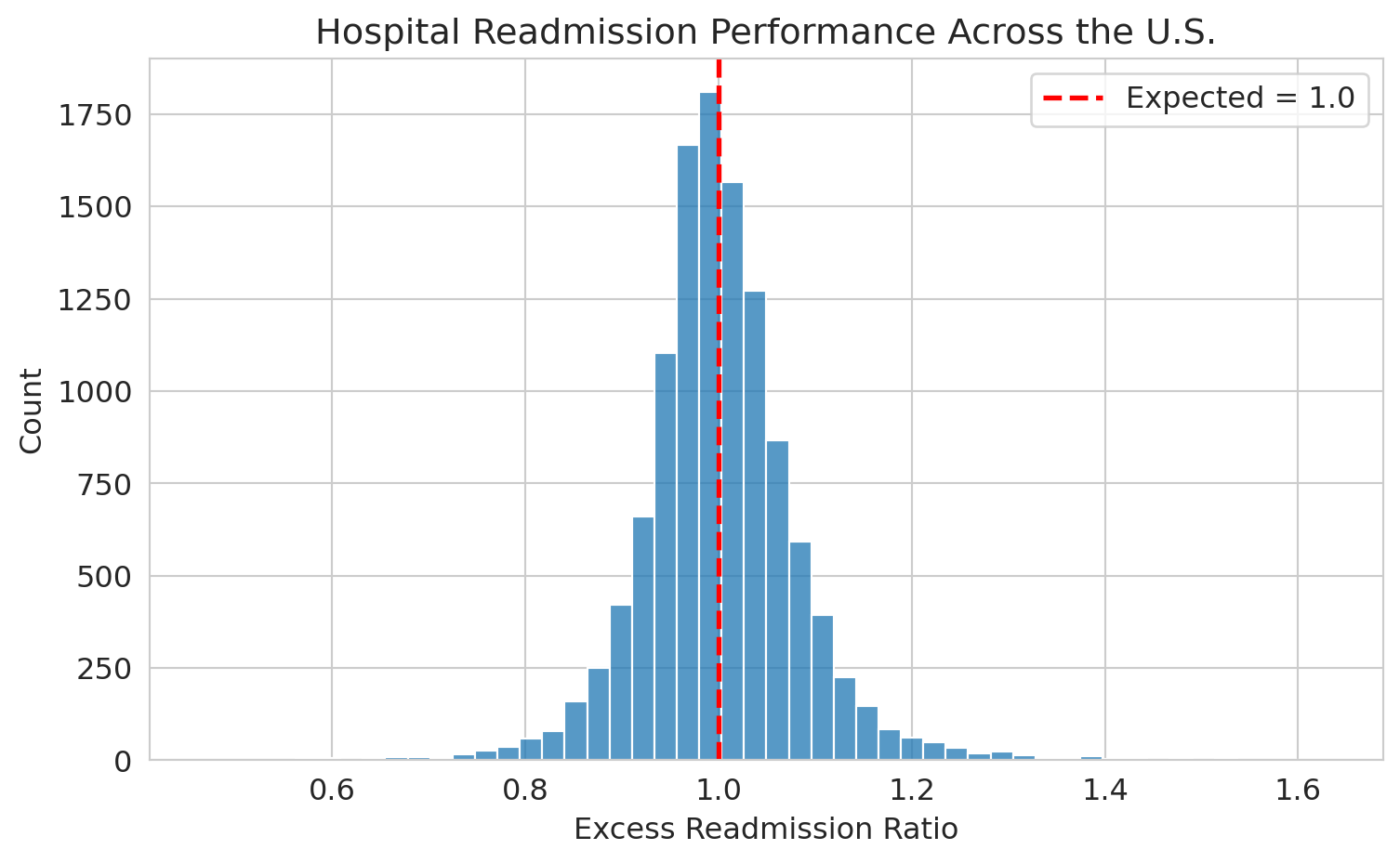
Now we use `sns.histplot()` to visualize the distribution:
```{python}
fig, ax = plt.subplots()
sns.histplot(readmissions['Excess Readmission Ratio'].dropna(), bins=50, ax=ax,
             edgecolor='white')
ax.axvline(x=1.0, color='red', linestyle='--', linewidth=2, label='Expected = 1.0')
ax.set_xlabel('Excess readmission ratio')
ax.set_ylabel('Count')
ax.set_title('Hospital readmission performance across the U.S.')
ax.legend()
plt.tight_layout()
plt.show()
```
The distribution is centered near 1.0, with real spread. Hospitals to the right of the red line have more readmissions than expected.
### Filtering rows
What if we want to focus on just one condition? Use boolean filtering:
```{python}
# Filter to heart failure only
heart_failure = readmissions[readmissions['Measure Name'] == 'READM-30-HF-HRRP']
print(f"Heart failure rows: {heart_failure.shape[0]:,}")
heart_failure[['Facility Name', 'State', 'Excess Readmission Ratio']].head()
```
The expression inside the brackets — `readmissions['Measure Name'] == 'READM-30-HF-HRRP'` — produces a True/False value for each row. Only the True rows are kept. Boolean filtering — selecting rows that satisfy a condition — is a fundamental pandas operation.
:::{.callout-tip}
## Think about it
If you ran a hospital and your heart failure ERR was 1.05, would you worry? How would you decide if that number reflects a real quality problem or just random variation? That's a statistics question — and one we'll answer in Act 2.
:::
## Key takeaways
- **Applied statistics is about decisions under uncertainty**, not formulas in a vacuum.
- The same dataset supports four different modes of reasoning: **summary** (what happened?), **prediction** (what will happen?), **inference** (what can we conclude?), and **causation** (what would happen if we intervened?).
- Each mode requires different tools and answers a different kind of question. The three acts of this course build them in sequence.
- Any analysis — from an AI, a colleague, or your own first pass — deserves skepticism. Your job is to verify.
- Every dataset has a story. Learning to read that story — and question it — is the core skill of a statistician.
## Study guide
### Key ideas
- **Applied statistics** is the science of making decisions under uncertainty using data.
- Four modes of reasoning with data: **summary** (describe what happened), **prediction** (forecast what will happen), **inference** (quantify uncertainty about a conclusion), **causation** (determine what would happen under an intervention).
- These four modes map onto the course: summary and prediction in Act 1, inference in Act 2, causation in Act 3.
- The **Excess Readmission Ratio (ERR)** compares a hospital's readmissions to what's expected given its patient mix. Above 1.0 = more readmissions than expected.
- Real data is **noisy** (errors, corruption), **missing** (not recorded, suppressed), and **heterogeneous** (numbers, categories, text, networks).
- A single number without an uncertainty estimate is dangerous — Zillow's $881M loss illustrates why prediction intervals matter.
- Any quick analysis — from an AI, a script, or a first pass — can produce plausible-looking results that miss critical problems in the data.
### Computational tools
- `pd.read_csv()` — load a CSV file into a DataFrame
- `df['column_name']` — select a single column (returns a Series)
- `.head()` — peek at the first few rows
- `.describe()` — summary statistics (mean, std, min, max, quartiles)
- `.value_counts()` — count unique values in a column
- `sns.histplot()` — plot a histogram
- `df[df['col'] == value]` — filter rows by a condition (boolean indexing)
### For the quiz
- No quiz this week, but expect one every Wednesday starting next week. The quizzes are closed-book, closed-notes, and designed to test your understanding of the key ideas and tools from the lectures. They often involve interpreting code snippets, analyzing data outputs, or applying concepts to new scenarios. The best way to prepare is to review the lecture notes, understand the examples we covered, and practice with the datasets on your own.