---
title: "Backtesting and Time Series Validation"
execute:
enabled: true
jupyter: python3
---
You build a model to predict tomorrow's air quality. It scores R² = 0.66 on your test set — not bad. But when you deploy it, the model can't even beat the simplest baseline: predicting "same as yesterday." *What happened?*
The problem isn't just your model — it's how you evaluated it. When data has a **temporal structure**, the standard random train/test split can silently mislead you, and metrics like R² can hide the fact that your model adds no value over a trivial baseline. This chapter shows exactly how, and demonstrates the right way to validate time series models.
```{python}
import numpy as np
import pandas as pd
import matplotlib.pyplot as plt
import seaborn as sns
from sklearn.linear_model import LinearRegression
from sklearn.metrics import r2_score, mean_absolute_error
import warnings
warnings.filterwarnings('ignore')
sns.set_style('whitegrid')
plt.rcParams['figure.figsize'] = (7, 4.5)
plt.rcParams['font.size'] = 12

DATA_DIR = 'data'
```
## Air quality in California
The EPA publishes daily Air Quality Index (AQI) measurements for every U.S. county. AQI measures how polluted the air is — 0 is pristine, 50 is "good," and anything above 150 is "unhealthy." In California, wildfire smoke can push AQI into the thousands.
Let's load four years of data and focus on a few counties with good coverage.
```{python}
# Load all four years of EPA data, filtered to California
dfs = []
for year in range(2021, 2025):
    df_year = pd.read_csv(f'{DATA_DIR}/epa-air-quality/daily_aqi_by_county_{year}.csv')
    df_year = df_year[df_year['State Name'] == 'California']
    dfs.append(df_year)

aqi = pd.concat(dfs, ignore_index=True)
aqi['Date'] = pd.to_datetime(aqi['Date'])
aqi = aqi.sort_values(['county Name', 'Date']).reset_index(drop=True)

print(f"California records: {len(aqi):,}")
print(f"Counties: {aqi['county Name'].nunique()}")
print(f"Date range: {aqi['Date'].min().date()} to {aqi['Date'].max().date()}")
```
We'll focus on three counties with good daily coverage and distinct air quality patterns: Los Angeles (urban smog), Sacramento (valley pollution), and Mono (extreme dust events).
```{python}
# Pick 3 counties with good daily coverage and interesting patterns
counties = ['Los Angeles', 'Sacramento', 'Mono']
aqi_sub = aqi[aqi['county Name'].isin(counties)].copy()

# Check coverage
for county in counties:
    n = aqi_sub[aqi_sub['county Name'] == county].shape[0]
    print(f"{county}: {n} daily observations")
```
### What does air quality look like over time?
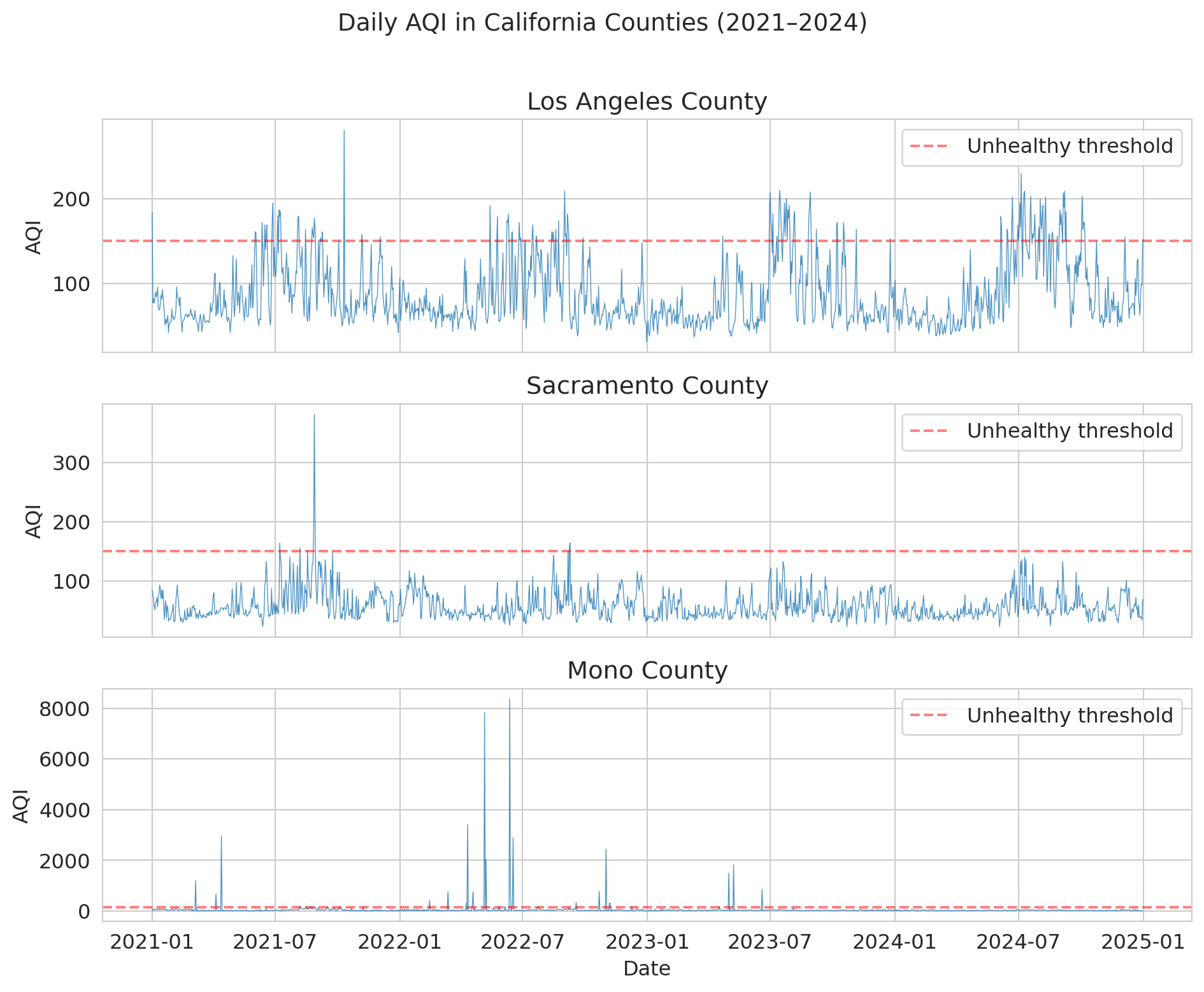
Before modeling anything, let's look at the data. Notice the **seasonal pattern** — summer and fall have worse air quality (wildfire season). And notice the **spikes**: these are smoke events that dwarf normal variation.
```{python}
fig, axes = plt.subplots(3, 1, figsize=(10, 8), sharex=True)

for ax, county in zip(axes, counties):
    county_data = aqi_sub[aqi_sub['county Name'] == county]
    ax.plot(county_data['Date'], county_data['AQI'], linewidth=0.5, alpha=0.8)
    ax.set_ylabel('AQI')
    ax.set_title(f'{county} County')
    ax.axhline(y=150, color='red', linestyle='--', alpha=0.5, label='Unhealthy threshold')
    ax.legend(loc='upper right')

axes[-1].set_xlabel('Date')
fig.suptitle('Daily AQI in California Counties (2021–2024)', fontsize=14, y=1.01)
plt.tight_layout()
plt.show()
```
Mono County is wild — AQI values above 1,000 (and once above 8,000!) from extreme dust storms near Mono Lake. Los Angeles and Sacramento show the typical California pattern: seasonal wildfire spikes layered on top of baseline urban pollution.
:::{.callout-important}
## Definition: Non-Stationarity
A time series is **non-stationary** when its statistical properties (mean, variance) change over time. The AQI data above is non-stationary: the mean and variance shift with the seasons, and extreme events (wildfire spikes) appear unpredictably. The rest of this chapter explores why non-stationarity undermines standard evaluation methods.
:::
## Building a prediction model
Let's try to predict tomorrow's AQI. A natural approach: use **lag features** — yesterday's AQI, the 7-day average, etc. This approach is just the feature engineering from Chapter 6, applied to time.
We'll focus on Los Angeles for a clean demonstration.
```{python}
# Work with Los Angeles
la = aqi_sub[aqi_sub['county Name'] == 'Los Angeles'][['Date', 'AQI']].copy()
la = la.sort_values('Date').reset_index(drop=True)

# Create lag features
la['aqi_lag1'] = la['AQI'].shift(1)       # yesterday
la['aqi_lag7_avg'] = la['AQI'].rolling(7).mean().shift(1)  # 7-day average (as of yesterday)
la['aqi_lag3_avg'] = la['AQI'].rolling(3).mean().shift(1)  # 3-day average
la['day_of_year'] = la['Date'].dt.dayofyear  # seasonality feature

# Drop rows with NaN from lagging
la = la.dropna().reset_index(drop=True)
print(f"LA dataset: {len(la)} days with features")
la.head(10)
```
## The standard split — and why it fails here
Recall from Chapter 7 that we split data randomly into training and test sets. That approach assumed each observation was independent of the others. Time-ordered observations violate that assumption.
Here's what most tutorials (and most AI tools) would do — randomly shuffle the data and split 80/20. Let's see how well it works.
```{python}
# Random 80/20 split -- THE WRONG WAY
np.random.seed(42)
features = ['aqi_lag1', 'aqi_lag7_avg', 'aqi_lag3_avg', 'day_of_year']

mask = np.random.rand(len(la)) < 0.8
train_std = la[mask]
test_std = la[~mask]

model_std = LinearRegression()
model_std.fit(train_std[features], train_std['AQI'])

pred_std = model_std.predict(test_std[features])
r2_std = r2_score(test_std['AQI'], pred_std)
mae_std = mean_absolute_error(test_std['AQI'], pred_std)

print(f"Random split results:")
print(f"  R-squared = {r2_std:.3f}")
print(f"  MAE = {mae_std:.1f}")
print(f"  Train size: {len(train_std)}, Test size: {len(test_std)}")
print()
print("Looks great! Ship it?")
```
R² about 0.66 — not bad for a first attempt. But a hidden problem lurks in the evaluation itself.
:::{.callout-tip}
## Think About It
With a random split, your test set includes days *from the middle* of the time series. A test-set day from June 2022 has its neighbors (June 1, June 3, ...) in the training set. The lag features — "yesterday's AQI" — are computed from data that's *right next to* training points.
:::
:::{.callout-important}
## Definition: Data Leakage (Temporal)
**Data leakage** occurs when information from the future (or from the test set) contaminates training, producing optimistically biased results. In time series, a random split causes leakage: test observations are highly correlated with nearby training observations. The lag feature "yesterday's AQI" for a test-set day was likely in the training set.
:::
## Proper backtesting: temporal split
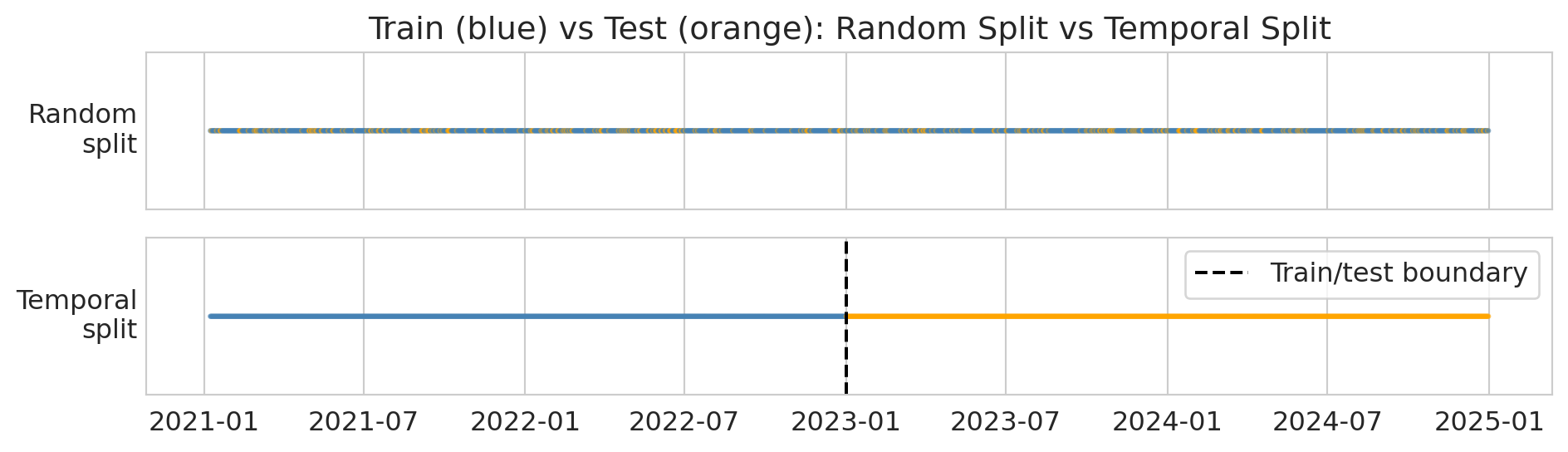
The fix is simple: **train on the past, test on the future**. This protocol mimics how the model would actually be used — you'd train it on historical data and deploy it to predict tomorrow. The diagram below shows the difference: random splitting scatters test points throughout the timeline, while a temporal split draws a clean boundary.
```{python}
# Visualize random vs temporal split
fig, axes = plt.subplots(2, 1, figsize=(10, 3), sharex=True)

dates = la['Date'].values
n = len(dates)

# Random split
colors_random = np.where(mask[:n], 'steelblue', 'orange')
axes[0].scatter(dates, np.ones(n), c=colors_random, s=2, alpha=0.6)
axes[0].set_yticks([])
axes[0].set_ylabel('Random\nsplit', rotation=0, ha='right', va='center')
axes[0].set_title('Train (blue) vs Test (orange): Random Split vs Temporal Split')

# Temporal split
cutoff = pd.Timestamp('2023-01-01')
colors_temporal = np.where(la['Date'] < cutoff, 'steelblue', 'orange')
axes[1].scatter(dates, np.ones(n), c=colors_temporal, s=2, alpha=0.6)
axes[1].axvline(x=cutoff, color='black', linewidth=1.5, linestyle='--', label='Train/test boundary')
axes[1].set_yticks([])
axes[1].set_ylabel('Temporal\nsplit', rotation=0, ha='right', va='center')
axes[1].legend(loc='upper right')

plt.tight_layout()
plt.show()

print("Top: random split scatters test points everywhere (leakage!).")
print("Bottom: temporal split puts all test points in the future (correct).")
```
:::{.callout-tip}
## Think About It
We're about to train on 2021--2022 and test on 2023. Will R-squared be higher, lower, or about the same as the random split? Why?
:::
Let's train on 2021–2022 and test on 2023.
```{python}
# Temporal split -- THE RIGHT APPROACH
train_temporal = la[la['Date'] < '2023-01-01']
test_temporal = la[(la['Date'] >= '2023-01-01') & (la['Date'] < '2024-01-01')]

model_temporal = LinearRegression()
model_temporal.fit(train_temporal[features], train_temporal['AQI'])

pred_temporal = model_temporal.predict(test_temporal[features])
r2_temporal = r2_score(test_temporal['AQI'], pred_temporal)
mae_temporal = mean_absolute_error(test_temporal['AQI'], pred_temporal)

print(f"Temporal split results (train: 2021-2022, test: 2023):")
print(f"  R-squared = {r2_temporal:.3f}")
print(f"  MAE = {mae_temporal:.1f}")
print(f"  Train size: {len(train_temporal)}, Test size: {len(test_temporal)}")
```
Now let's compare the two approaches side by side.
```{python}
# Side-by-side comparison
print("=" * 50)
print(f"{'Method':<25} {'R-sq':>8} {'MAE':>8}")
print("=" * 50)
print(f"{'Random split (WRONG)':<25} {r2_std:>8.3f} {mae_std:>8.1f}")
print(f"{'Temporal split (RIGHT)':<25} {r2_temporal:>8.3f} {mae_temporal:>8.1f}")
print("=" * 50)
print(f"{'Leakage gap':<25} {r2_std - r2_temporal:>8.3f} {mae_temporal - mae_std:>8.1f}")
print()
gap = r2_std - r2_temporal
if gap > 0.01:
    print(f"The random split inflated R-squared by {gap:.3f} -- that's the leakage.")
elif gap < -0.01:
    print(f"Here the temporal split slightly outperforms (gap = {gap:.3f}).")
    print("The leakage didn't help much -- but the correct evaluation is still the temporal one.")
else:
    print(f"The gap is small ({gap:.3f}), but the temporal split is the only honest evaluation.")
    print("Even when the numbers are similar, the random split's validity is compromised.")
```
In this dataset, the two R² values are close — the random split didn't dramatically inflate performance. But **the random split is still the wrong evaluation**. Its validity is compromised: test-set days have their neighbors in the training set, so the lag features get to "cheat." The fact that the numbers happen to be similar here doesn't justify the method. The temporal split is the only honest evaluation because it mimics how the model would actually be deployed.
:::{.callout-important}
## Definition: Naive Baseline
The **naive forecast** predicts that tomorrow's value equals today's value: $\hat{y}_{t+1} = y_t$. This baseline is the simplest possible forecast and the bar any model must clear. In the forecasting literature, other standard benchmarks include the **seasonal naive** method (predict the value from the same season last year) and the **drift** method (extrapolate the line between the first and last observations). These methods are collectively called **benchmark forecasting methods**.
:::
```{python}
# Naive forecast baseline: predict "same as yesterday"
naive_pred = test_temporal['aqi_lag1']  # yesterday's AQI IS the naive forecast
mae_naive_baseline = mean_absolute_error(test_temporal['AQI'], naive_pred)
r2_naive_baseline = r2_score(test_temporal['AQI'], naive_pred)

print(f"Naive baseline (same as yesterday):")
print(f"  R-squared = {r2_naive_baseline:.3f}")
print(f"  MAE = {mae_naive_baseline:.1f}")
print()
print(f"Linear model (temporal split):")
print(f"  R-squared = {r2_temporal:.3f}")
print(f"  MAE = {mae_temporal:.1f}")
print()
print("The naive baseline is surprisingly hard to beat!")
print("This is common in time series: yesterday is a strong predictor of today.")
```
This result illustrates why backtesting is essential. In production, your model only ever sees the past. Your evaluation should reflect that constraint.
### Scale-independent accuracy: MAPE and MASE
MAE tells you the average error in the same units as your target — useful for one series, but hard to compare across series with different scales. Is an MAE of 5 good for Los Angeles (typical AQI ~50) and Mono County (typical AQI ~30, but spikes to 8,000)?
**MAPE** (Mean Absolute Percentage Error) expresses errors as percentages:
$$\text{MAPE} = \frac{1}{n} \sum_{i=1}^{n} \left| \frac{y_i - \hat{y}_i}{y_i} \right| \times 100\%.$$
MAPE is intuitive — "the forecast is off by 15% on average" — but it breaks when actual values are near zero (division by zero) and penalizes under-forecasts more heavily than over-forecasts. When the actual value is small, even a modest error produces a large percentage — MAPE disproportionately penalizes forecasts for low-value days.
**MASE** (Mean Absolute Scaled Error) compares your model's error to the naive baseline's error:
$$\text{MASE} = \frac{\text{MAE of your model}}{\text{MAE of the naive forecast}}.$$
MASE < 1 means you beat the naive forecast; MASE > 1 means you did worse than just predicting "same as yesterday." This metric connects directly to the baseline comparison above.^[Strictly, MASE uses the in-sample naive MAE as denominator (Hyndman & Koehler, 2006); we use the test-set version for simplicity.]
```{python}
# Compute MAPE and MASE on the temporal test set
actual = test_temporal['AQI'].values
predicted = pred_temporal
naive = test_temporal['aqi_lag1'].values

# MAPE — watch out for zeros
nonzero = actual != 0
mape = np.mean(np.abs((actual[nonzero] - predicted[nonzero]) / actual[nonzero])) * 100

# MASE — scale by naive forecast error
mae_model = np.mean(np.abs(actual - predicted))
mae_naive_ref = np.mean(np.abs(actual - naive))
mase = mae_model / mae_naive_ref

print(f"LA County AQI forecasts (temporal split, 2023):")
print(f"  MAE  = {mae_model:.2f}")
print(f"  MAPE = {mape:.1f}%")
print(f"  MASE = {mase:.3f}")
print()
if mase < 1:
    print(f"MASE = {mase:.3f} < 1: the model beats the naive baseline.")
else:
    print(f"MASE = {mase:.3f} >= 1: the model does NOT beat the naive baseline.")
print("MAPE gives an intuitive percentage, but would blow up if AQI hit 0.")
```
A MASE near 1 means our linear model barely matches the naive "same as yesterday" baseline. That's not a failure of the method — it's a genuine finding. AQI is highly autocorrelated, so yesterday's value is a strong predictor that's hard to improve on with a simple linear model. More sophisticated models (nonlinear, with weather covariates) might do better, but the naive baseline sets a high bar.
## Walk-forward validation
A single temporal split gives you one number. But model performance can *change over time*. **Walk-forward validation** trains on an expanding window and tests on the next period, giving you a performance curve. In the forecasting literature, this is called **time series cross-validation** — the same idea as k-fold cross-validation, but respecting temporal order.
Here's the idea. Each row is one "fold." The training set (blue) expands forward in time, and the model is tested on the next month (orange):
```
Fold 1: [===== TRAIN =====][TEST]
Fold 2: [======= TRAIN =======][TEST]
Fold 3: [========= TRAIN =========][TEST]
Fold 4: [=========== TRAIN ===========][TEST]
         2021              2022              2023
```
We used an **expanding window** here (all past data). An alternative is a **sliding window** (fixed-width training set that moves forward), which can be better when very old data is from a different regime — exactly the distribution shift problem we'll see later.
This distinction is especially important when the data has regime changes — like wildfire season.
```{python}
# Walk-forward: train on expanding window, test on next month
# (freq='MS' = month start: generates the 1st of each month)
results = []
test_months = pd.date_range('2023-01-01', '2024-01-01', freq='MS')

for i, test_start in enumerate(test_months[:-1]):
    test_end = test_months[i + 1]

    train_wf = la[la['Date'] < test_start]
    test_wf = la[(la['Date'] >= test_start) & (la['Date'] < test_end)]

    if len(test_wf) < 10 or len(train_wf) < 100:
        continue

    model_wf = LinearRegression()
    model_wf.fit(train_wf[features], train_wf['AQI'])
    pred_wf = model_wf.predict(test_wf[features])

    month_mae = mean_absolute_error(test_wf['AQI'], pred_wf)
    month_r2 = r2_score(test_wf['AQI'], pred_wf)
    results.append({
        'month': test_start,
        'mae': month_mae,
        'r2': month_r2,
        'n_test': len(test_wf),
        'max_aqi': test_wf['AQI'].max()
    })
    print(f"  {test_start.strftime('%b %Y')}: MAE = {month_mae:.1f}, R² = {month_r2:.3f}")

wf_results = pd.DataFrame(results)
wf_results['month_label'] = wf_results['month'].dt.strftime('%b %Y')
print(wf_results[['month_label', 'mae', 'r2', 'max_aqi']].to_string(index=False))
```
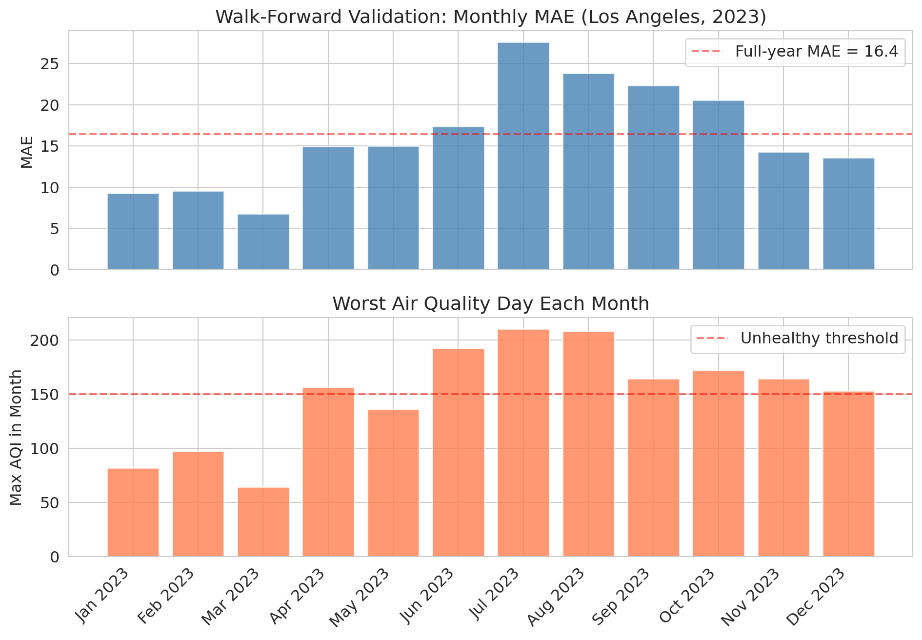
The monthly results tell a richer story than a single annual number. Let's visualize the performance over time.
```{python}
fig, (ax1, ax2) = plt.subplots(2, 1, figsize=(10, 7), sharex=True)

ax1.bar(wf_results['month_label'], wf_results['mae'], color='steelblue', alpha=0.8)
ax1.set_ylabel('MAE')
ax1.set_title('Walk-Forward Validation: Monthly MAE (Los Angeles, 2023)')
ax1.axhline(y=mae_temporal, color='red', linestyle='--', alpha=0.5,
            label=f'Full-year MAE = {mae_temporal:.1f}')
ax1.legend()

ax2.bar(wf_results['month_label'], wf_results['max_aqi'], color='coral', alpha=0.8)
ax2.set_ylabel('Max AQI in Month')
ax2.set_title('Worst Air Quality Day Each Month')
ax2.axhline(y=150, color='red', linestyle='--', alpha=0.5, label='Unhealthy threshold')
ax2.legend()

plt.xticks(rotation=45, ha='right')
plt.tight_layout()
plt.show()
```
Notice how the model's error **spikes during summer months** when wildfire smoke events push AQI to extremes. The model was trained on mostly "normal" air quality patterns and hasn't seen enough extreme events to handle them.
This pattern is the value of walk-forward validation: it reveals *when* your model breaks, not just how well it does on average.
## Lag features are just feature engineering
Recall from Chapter 6 that feature engineering transforms raw data into more useful predictors. Lag features are the same idea applied to time:
| Feature | What it captures |
|---------|-----------------|
| Yesterday's AQI | Short-term momentum |
| 3-day average | Recent trend |
| 7-day average | Weekly baseline |
| Day of year | Seasonal pattern |
| Same day last year | Year-over-year pattern |
Let's see which features matter most.
```{python}
# Which features contribute most?
print("Feature coefficients (temporal model):")
for feat, coef in zip(features, model_temporal.coef_):
    print(f"  {feat:<20s} {coef:+.4f}")
print(f"  {'intercept':<20s} {model_temporal.intercept_:+.4f}")
print()
print("Yesterday's AQI dominates -- AQI is highly autocorrelated.")
print("The seasonal feature (day_of_year) adds a small boost.")
```
## A second example: NBA performance prediction
You might be thinking: "This example is an air quality problem. My field is tech/finance/sports." The temporal leakage trap can appear anywhere data has a time dimension. Let's see what happens in a completely different domain.
If you could reliably predict how many points an NBA player will score tonight, you could make a fortune betting. Let's try — predicting a player's performance from their last 5 games. The temporal split is still the right evaluation: you'd train on past seasons and predict the current one.
```{python}
# Load NBA data
nba = pd.read_csv(f'{DATA_DIR}/nba/nba_load_management.csv')
nba['GAME_DATE'] = pd.to_datetime(nba['GAME_DATE'])
nba = nba.sort_values(['PLAYER_NAME', 'GAME_DATE']).reset_index(drop=True)

# Focus on players with enough games across all 3 seasons
games_per_player = nba.groupby('PLAYER_NAME').size()
active_players = games_per_player[games_per_player >= 150].index
nba_active = nba[nba['PLAYER_NAME'].isin(active_players)].copy()

print(f"Active players (150+ games): {len(active_players)}")
print(f"Records: {len(nba_active):,}")
print(f"Seasons: {nba_active['SEASON'].unique()}")
```
We construct rolling lag features for each player using `groupby` combined with `.shift()` and `.rolling()` — the same temporal feature engineering from the AQI example, but now grouped by player.
```{python}
# Create rolling features: last-5-game averages
nba_active = nba_active.sort_values(['PLAYER_NAME', 'GAME_DATE']).reset_index(drop=True)
nba_active['pts_lag1'] = nba_active.groupby('PLAYER_NAME')['PTS'].shift(1)
nba_active['pts_lag5_avg'] = nba_active.groupby('PLAYER_NAME')['PTS'].transform(
    lambda x: x.rolling(5).mean().shift(1)
)
nba_active['min_lag5_avg'] = nba_active.groupby('PLAYER_NAME')['MIN'].transform(
    lambda x: x.rolling(5).mean().shift(1)
)

nba_model = nba_active.dropna(subset=['pts_lag1', 'pts_lag5_avg', 'min_lag5_avg']).copy()
nba_features = ['pts_lag1', 'pts_lag5_avg', 'min_lag5_avg', 'HOME']

print(f"Modeling dataset: {len(nba_model):,} player-games")
```
Now we repeat the same experiment: random split versus temporal split. For the temporal split, we train on the first two seasons and test on the third.
```{python}
# Standard random split vs temporal split
np.random.seed(42)
mask_nba = np.random.rand(len(nba_model)) < 0.8

# Random split
model_r = LinearRegression()
model_r.fit(nba_model[mask_nba][nba_features], nba_model[mask_nba]['PTS'])
pred_r = model_r.predict(nba_model[~mask_nba][nba_features])
r2_r = r2_score(nba_model[~mask_nba]['PTS'], pred_r)

# Temporal split: train on seasons 1-2, test on season 3
train_nba = nba_model[nba_model['SEASON'].isin(['2021-22', '2022-23'])]
test_nba = nba_model[nba_model['SEASON'] == '2023-24'].copy()

model_t = LinearRegression()
model_t.fit(train_nba[nba_features], train_nba['PTS'])
pred_t = model_t.predict(test_nba[nba_features])
r2_t = r2_score(test_nba['PTS'], pred_t)

print(f"NBA prediction (points scored):")
print(f"  Random split R-squared:   {r2_r:.3f}")
print(f"  Temporal split R-squared: {r2_t:.3f}")
print(f"  Gap:                      {r2_r - r2_t:.3f}")
print()
gap_nba = r2_r - r2_t
if gap_nba > 0.01:
    print(f"Same pattern as AQI -- the random split is optimistically biased (gap = {gap_nba:.3f}).")
elif gap_nba < -0.01:
    print(f"Interesting: the temporal split slightly outperforms (gap = {gap_nba:.3f}).")
    print("The model generalizes well across seasons -- no leakage bias here.")
else:
    print(f"The two splits give similar results (gap = {gap_nba:.3f}).")
    print("The model generalizes well across seasons, but the temporal split is still the valid evaluation.")
```
Unlike the AQI example, the NBA model generalizes well across seasons — the temporal split performs comparably to the random split. Player scoring patterns are more stable across years than air quality is across seasons. When temporal structure doesn't create strong distribution shift, the random split may not inflate performance. But the temporal split is still the correct evaluation: it's the only one that mirrors how you'd actually deploy the model (train on past seasons, predict the current one).
Even a model with decent R-squared doesn't necessarily translate to profit in a betting market — the market already incorporates the information your model uses. The gap between statistical performance and economic value is a recurring theme in applied statistics.
## When the future doesn't look like the past
Let's go back to air quality and look at something the model has *never seen*.
Mono County, near Mono Lake in eastern California, occasionally experiences extreme dust/wildfire events that push AQI into the thousands — sometimes above 8,000. That's roughly 16x the "Hazardous" threshold of 500.
:::{.callout-tip}
## Think About It
If we train a model on "normal" days (AQI below 300), what would it predict for an AQI of 8,000? How far off would it be?
:::
```{python}
# Mono County extremes
mono = aqi_sub[aqi_sub['county Name'] == 'Mono'][['Date', 'AQI']].copy()
mono = mono.sort_values('Date').reset_index(drop=True)

# Create lag features
mono['aqi_lag1'] = mono['AQI'].shift(1)
mono['aqi_lag7_avg'] = mono['AQI'].rolling(7).mean().shift(1)
mono['aqi_lag3_avg'] = mono['AQI'].rolling(3).mean().shift(1)
mono['day_of_year'] = mono['Date'].dt.dayofyear
mono = mono.dropna().reset_index(drop=True)

print("Mono County AQI distribution:")
print(mono['AQI'].describe().to_string())
print(f"\nDays above 500: {(mono['AQI'] > 500).sum()}")
print(f"Max AQI: {mono['AQI'].max()}")
```
Let's train a linear model on "normal" days (AQI below 300) and see what it predicts during extreme events.
```{python}
# Train a model on "normal" data (AQI < 300) and see what it predicts for extremes
normal_mono = mono[mono['AQI'] < 300]
extreme_mono = mono[mono['AQI'] >= 300]

model_mono = LinearRegression()
model_mono.fit(normal_mono[features], normal_mono['AQI'])

if len(extreme_mono) > 0:
    pred_extreme = model_mono.predict(extreme_mono[features])

    print("Model predictions vs reality during extreme events:")
    print(f"{'Actual AQI':>12} {'Predicted':>12} {'Error':>12}")
    print("-" * 40)
    for actual, pred in list(zip(extreme_mono['AQI'].values, pred_extreme))[:10]:
        print(f"{actual:>12.0f} {pred:>12.0f} {actual - pred:>12.0f}")
    print()
    print("The model can't extrapolate to values it's never seen.")
    print("This is DISTRIBUTION SHIFT -- the future can be fundamentally")
    print("different from the past.")
else:
    print("No extreme events found in Mono County subset.")
```
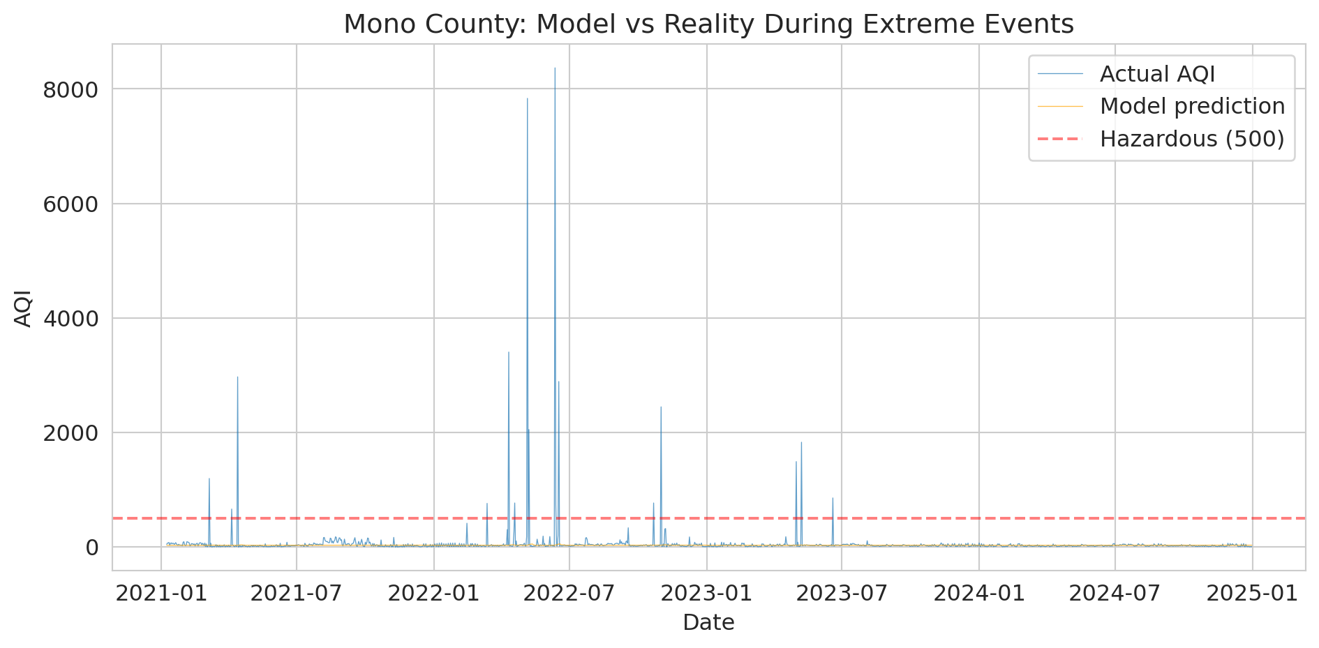
The numbers are stark, but the visualization makes the failure visceral.
```{python}
# Visualize the model's failure during extreme events
fig, ax = plt.subplots(figsize=(10, 5))

ax.plot(mono['Date'], mono['AQI'], linewidth=0.5, alpha=0.7, label='Actual AQI')

# Predict on all data
pred_all = model_mono.predict(mono[features])
ax.plot(mono['Date'], pred_all, linewidth=0.5, alpha=0.7, color='orange',
        label='Model prediction')

ax.axhline(y=500, color='red', linestyle='--', alpha=0.5, label='Hazardous (500)')
ax.set_ylabel('AQI')
ax.set_xlabel('Date')
ax.set_title('Mono County: Model vs Reality During Extreme Events')
ax.legend()
plt.tight_layout()
plt.show()

print("The orange line (predictions) can't reach the spikes.")
print("A linear model trained on normal conditions extrapolates nonsensically.")
```
:::{.callout-important}
## Definition: Distribution Shift
**Distribution shift** occurs when future data comes from a fundamentally different regime than the training data. It is a severe form of non-stationarity — not just gradual changes in the mean, but a qualitative change the training data never captured.
:::
Distribution shift is the deepest problem in time series forecasting:
- Your training data covers *normal* conditions
- The events that matter most — wildfires, pandemics, financial crashes — are precisely the ones your model has never seen
- No amount of clever cross-validation alone fixes this; it's a fundamental limitation of purely data-driven models
> "Prediction is very difficult, especially about the future." — attr. Niels Bohr
In Chapter 10, we saw that a clinical trial on adults can't tell you about children. Same idea here: a model trained on AQI 0--300 can't tell you what happens at AQI 8,000. You can't extrapolate beyond the range of your data.
In Chapter 17, we'll see that AutoML tools often make this same mistake — they use standard cross-validation by default and don't know your data is temporal.
Distribution shift can also be gradual — styles of play, market conditions, or climate patterns that evolve slowly can erode model performance without triggering obvious alarms.
## Prediction intervals: quantifying forecast uncertainty
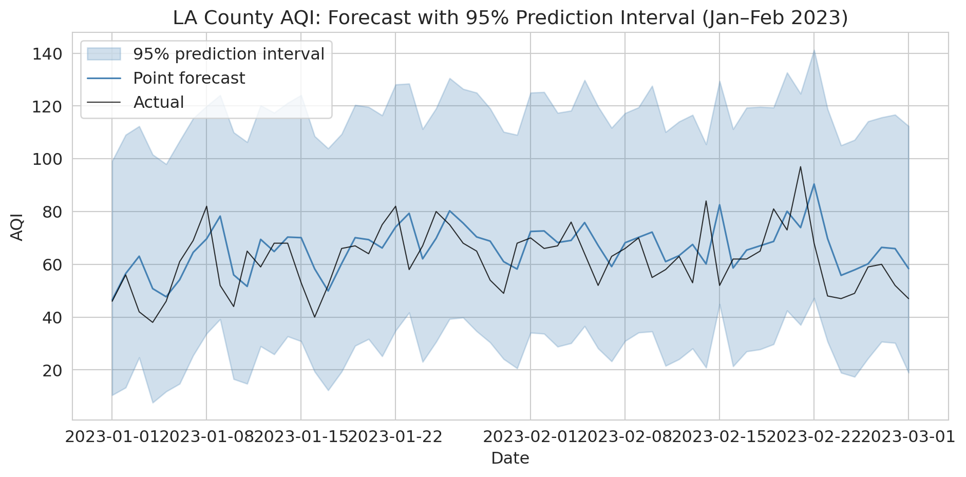
A point forecast — "tomorrow's AQI will be 62" — hides everything that matters for decision-making. Should the county issue a health advisory? That depends on whether 62 means "almost certainly between 55 and 70" or "could easily be 200." **Prediction intervals** give you that range.
The idea: use the bootstrap. Resample residuals from the training set, add them to each forecast, and repeat many times. The spread of the resulting forecasts gives you a prediction interval.
```{python}
# Bootstrap prediction intervals for the temporal test set
np.random.seed(42)
train_resid = train_temporal['AQI'].values - model_temporal.predict(train_temporal[features])
n_boot = 1000

# Generate bootstrap forecasts by resampling residuals
boot_preds = np.zeros((n_boot, len(test_temporal)))
point_pred = model_temporal.predict(test_temporal[features])
for b in range(n_boot):
    resampled_resid = np.random.choice(train_resid, size=len(test_temporal), replace=True)
    boot_preds[b, :] = point_pred + resampled_resid

# 95% prediction interval: 2.5th and 97.5th percentiles
lower = np.percentile(boot_preds, 2.5, axis=0)
upper = np.percentile(boot_preds, 97.5, axis=0)

# How often does the actual value fall inside the interval?
coverage = np.mean((test_temporal['AQI'].values >= lower) & (test_temporal['AQI'].values <= upper))
avg_width = np.mean(upper - lower)

print(f"95% bootstrap prediction interval:")
print(f"  Coverage: {coverage:.1%} of test days (target: 95%)")
print(f"  Average width: {avg_width:.1f} AQI points")
```
Let's visualize the prediction intervals for the first two months of the test period. The shaded band shows the 95% interval around each point forecast.
```{python}
# Visualize prediction intervals for a 60-day window
fig, ax = plt.subplots(figsize=(10, 5))
window = slice(0, 60)
dates_w = test_temporal['Date'].values[window]

ax.fill_between(dates_w, lower[window], upper[window],
                alpha=0.25, color='steelblue', label='95% prediction interval')
ax.plot(dates_w, point_pred[window], color='steelblue', linewidth=1.2, label='Point forecast')
ax.plot(dates_w, test_temporal['AQI'].values[window], color='black',
        linewidth=0.8, alpha=0.8, label='Actual')
ax.set_ylabel('AQI')
ax.set_xlabel('Date')
ax.set_title('LA County AQI: Forecast with 95% Prediction Interval (Jan–Feb 2023)')
ax.legend()
plt.tight_layout()
plt.show()

print("Point forecasts alone are dangerous for decision-making.")
print("Always report intervals so stakeholders can plan for the plausible range.")
```
This resampling approach is completely general: you can construct prediction intervals for *any* model, not just linear regression. And you're not limited to our residual-resampling scheme — you can devise your own null model, simulate from it, and compare. The key principle is that a forecast without a measure of uncertainty isn't a complete forecast.
These intervals assume stationary residuals. In practice, intervals should be wider during high-variance periods like wildfire season. A model that uses the same residual distribution year-round will undercover extreme events and overcover calm ones.
## Key takeaways
- **Never randomly split time series data.** Use temporal splits: train on the past, test on the future.
- **Walk-forward validation** reveals *when* your model breaks, not just how well it does on average.
- **Lag features are feature engineering** — yesterday's value, rolling averages, same-day-last-year are all transformations of the raw data.
- **Backtesting is not prediction.** A strategy that looks profitable in backtest may fail in production — the market already knows the same signals.
- **Distribution shift is the hardest problem.** Models trained on normal conditions fail during extreme events.
- **Use scale-independent metrics** (MAPE, MASE) to compare forecasts across different series. MASE < 1 means you beat the naive baseline.
- **Always report prediction intervals**, not just point forecasts. Bootstrap resampling of residuals is a simple, general-purpose method.
## Study guide
### Key ideas
- **Backtesting (temporal split):** Evaluating a model by training on past data and testing on future data, mimicking real deployment.
- **Data leakage:** When information from the future (or the test set) contaminates training, producing optimistically biased results. Random train/test splits create leakage in time series: test observations are correlated with nearby training observations.
- **Lag features:** Predictors constructed from past values of the time series (e.g., yesterday's value, 7-day rolling average).
- **Non-stationarity:** A time series whose statistical properties (mean, variance) change over time.
- **Walk-forward validation (time series cross-validation):** Repeatedly training on an expanding (or sliding) window of past data and testing on the next period. Reveals *when* a model fails, not just its average performance.
- **Distribution shift:** When future data comes from a fundamentally different regime than the training data. Models trained on normal conditions cannot predict unprecedented events.
- **Benchmark forecasting methods:** The naive forecast ("same as yesterday"), seasonal naive ("same day last year"), and drift method ("extrapolate the trend") are standard baselines. Any useful model must beat these.
- **MAPE** (Mean Absolute Percentage Error): expresses forecast error as a percentage. Intuitive but undefined when actual values are zero.
- **MASE** (Mean Absolute Scaled Error): ratio of your model's MAE to the naive forecast's MAE. MASE < 1 means you beat the naive baseline. Scale-independent, so useful for comparing across different series.
- **Prediction intervals:** A range (e.g., 95%) around a point forecast capturing plausible future values. Bootstrap resampling of training residuals is a general-purpose method for constructing them.
- Backtesting a strategy does not guarantee future profitability — markets already incorporate public information.
### Computational tools
- `pd.Series.shift(n)` — create lag features by shifting values forward or backward
- `pd.Series.rolling(k).mean()` — compute rolling window averages
- Temporal train/test split: filter by date (`df[df['Date'] < cutoff]`)
- Walk-forward loop: iterate over time periods with an expanding training window
### For the quiz
You should be able to: (1) explain why random splitting fails for time series data, (2) implement a temporal train/test split given a date cutoff, (3) describe walk-forward validation (expanding and sliding window variants), (4) explain what distribution shift is and why no cross-validation method can fully address it, (5) compute and interpret MAPE and MASE, and (6) explain why prediction intervals matter and how bootstrap resampling produces them.